Join a DRAWING CLUB

Do you like to sketch, doodle, and draw? Would you like to mingle with other doodlers, and learn from a professional artist along the way? Great!
Join The Doodle Club. as one of my Patreon tiers.

WHAT IS THE DOODLE CLUB

The DOODLE CLUB is a monthly subscription to a virtual classroom, with advanced content that I never share on YouTube or other public platforms.

Every month in Doodle Club I share a newly recorded drawing video, with emphasis on free-hand technique. My pre-med background and general obsession with anatomy allows me to dive deeper into the structure of my subjects and explain WHY something looks the way that it does, rather than only presenting a set of step-by step instructions. When I teach how to draw big cats, for instance, I want my students to be able to draw ALL big cats in any situation, not just to be able to copy one of my drawings.

Video lessons are recorded and uploaded for students to watch as webinars on their own time.

“I’M JUST A BEGINNER. CAN I JOIN?”

Absolutely! You are welcome, you’ll have a great time and learn a lot. In my lessons, I focus on approach above technique. This is a place to learn to let go, to loosen up your hand, and to learn to see objects and subjects in a different light, which will allow you to draw more freely on your own. This is a great place to get started if you don’t have much experience.

You will see noticeable improvement every month. The longer you stay, the more you will learn.

“I ALREADY KNOW HOW TO DRAW, WILL I BENEFIT FROM THIS?”

It depends on how advanced and how comfortable you are. Are you a pro who can draw anything, free-hand, and then perfect it to look photorealistic? If so, you probably already know everything I teach here.

If however, you draw often and you draw well, but your proportion on animals just seem off, or your portraits don’t really resemble their real-life models, or you would like learn to be able to draw more without the aid of photography or relying on tracing – THIS CLUB IS FOR YOU.

HOW TO JOIN

Simply click on the button below and select the Patreon tier called Doodle Club.

I’ll see you there!

Perception of beauty – a painting study

Have you ever wondered what is it about a certain face that we find attractive, or boring, or scary? How about your own face? I have days when I wake up, look in the mirror, and I swear it’s a totally different face, and not a flattering one at that. On the other hand, I also have days when I catch a glimpse of myself in a mirror and think to myself “hm, I look really nice today.” I am sure you have moments like that too. You know your face doesn’t magically change overnight though. It’s the same face, but somehow it looks more or less attractive on day to day basis.

To demonstrate one of the ways in which we perceive attractiveness I created a character for us to play with. I painted this character in a digital painter program (Corel Painter 18), using artist oils. It is essentially an oil painting of an imaginary girl of more or less my age, displaying a more or less neutral expression. She will be our model for today.

Since this is not an oil painting tutorial, I will not take you through the step by step process of her creation, but rather jump straight from sketch to (fast forward 24 hours) the finished oil painting of our Jane Doe.

A rough sketch of what my girl will look like.


Paint, paint, paint…..


A day of painting later, she is complete.

Now that we have a face to work with, let’s study it for a minute. Obviously we all have different tastes and our own personal reactions to every face. Some of you may find this girl attractive, some may find her rather dull, some may not care one way or the other. Probably, very few people will find her ugly. In this painting I went for a more classical painting approach, presenting a face that is pleasant to look at, but not distracting with exotic beauty or an unusual  emotional expression. I wanted her to be just a girl, like me.

I painted my girl in what I imagine to be soft, defused daylight, illuminating her face pretty evenly. This way we don’t have any extreme shadows adding to the way we perceive her.

Let’s see what happens to her if we add just a little bit of definition to the areas around her eyes.

I am adding just a little bit more color and shadow to the eyelashes, eyelids, and eyebrows.


I am not changing the shape of the eye or the eyebrows. I am simply adding a touch of dark brown tones around the eyes and to the eyebrows.

I was very gentle with my edits, but look at the difference that it made. She is the same girl, but somehow she looks a bit more vibrant. Just a touch of definition on the eyelashes and the eyebrows, and we intuitively perceive this face as more lively.

Let’s see what happens if we go from our neutral face in the other direction, removing some of the definition around the eyes.

In this case, I am softening the definition around the eyes, making the eyebrows and the eye lashes more pale, and also smoothing out some of the lines around the eyes.


Once again, the edits were minor, yet her face changed quite noticeably.

A pretty dramatic change, isn’t it? Whether you find her more or less attractive, you must agree that she looks somehow more vulnerable, her expression plainer. She doesn’t have that glow and intensity of the eyelash girl. Her eyes, without the definition of lashes, brows and shadows, seem smaller and further apart.

Our limbic brain naturally perceives bigger eyes as more attractive. That stereotype has nothing to do with Hollywood, or fashion, or modern makeup trends. In fact, those trends work because they are based on what our brains already perceive as attractive. So, as a painter, illustrator, colorist, or make-up artist, if you wish to make your character look, I hesitate to say less attractive, but rather plainer, tone down the definition around the eyes. On the other hand, if you want to make them more interesting, more seductive, more expressive, try adding just a touch of definition to the eye area.

Notice that we never changed the face. The bone structure, the direction of the gaze, the lighting, the parting of the lips, none of these things were ever touched in this experiment. We only played with adding and removing definition around the eyes.

Let’s get back to the mystery of my ever-changing morning face. Most of the time, the definition around the eyes is created by the changing light throughout the day. In the morning we wake up with our eyes slightly poofy and squinting and we usually admire ourselves in brightly lit bathrooms that are anything but flattering to the perception of the face. What we see is smaller, less defined eyes and we immediately perceive them as unattractive. Run that through an emotional filter of “I just woke up and I am not exactly filled with positivity” and you got yourself a recipe for seeing yourself as plain awful in the morning.

As the day progresses, however, we wake up, wind up, start interacting with people or animals. The sun rises, and we are now illumined by natural light that is cast from above, creating those beautiful eyelash shadows on our eyes. Even without the use of makeup, our eyes look more defined and vibrant in daylight than they do in that awful morning bathroom light. Plus, now we are adding (hopefully positive) emotion to our face, which naturally makes it more attractive, and viola – your face has transformed into something that is pleasant to look at even to yourself.


I hope this has been helpful and inspiring to you not only as artists but also as people struggling with your self-image. Now, go out there and practice making your characters and yourselves look more vibrant, and don’t forget to smile.

Feathers and bubbles coloring techniques

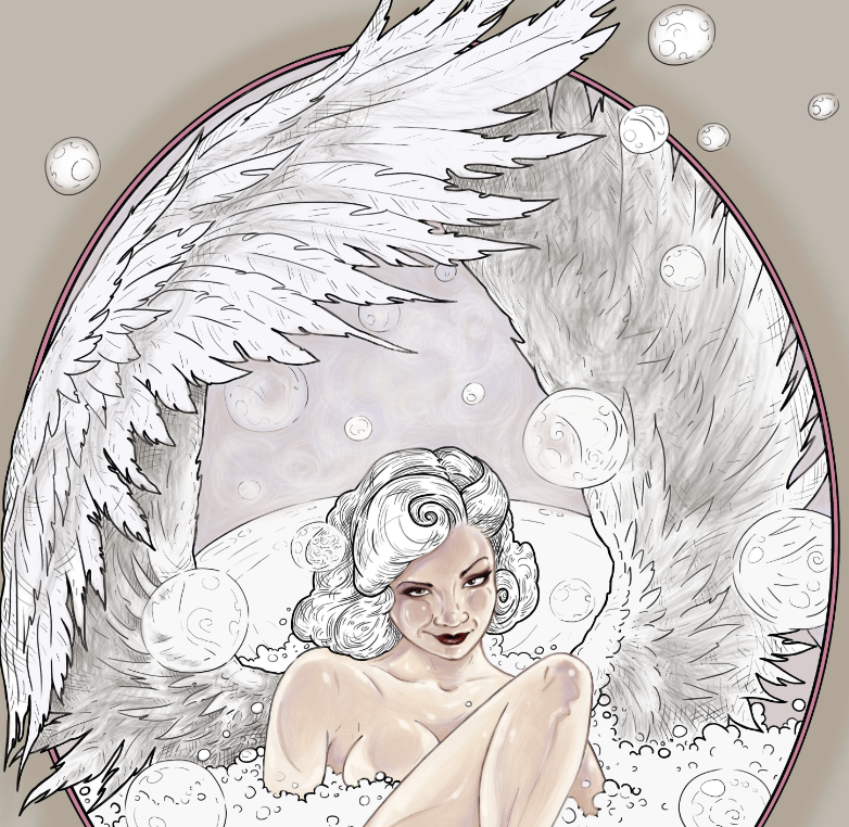
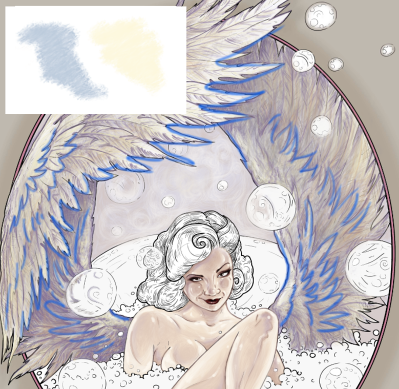
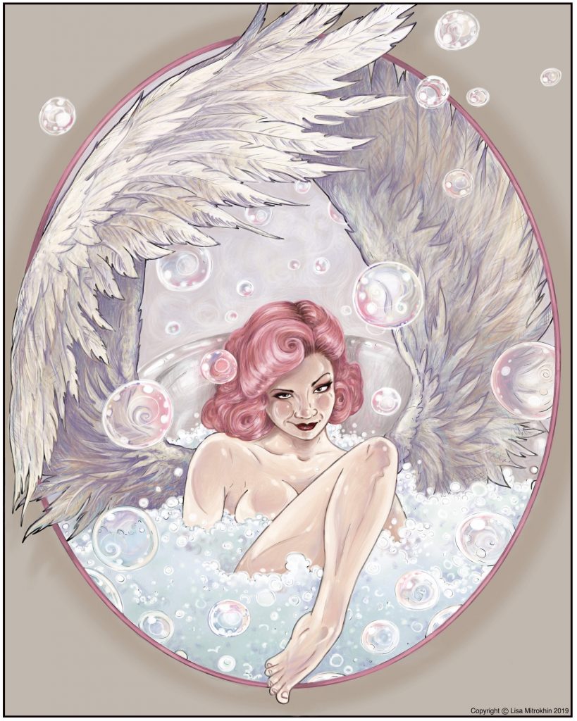
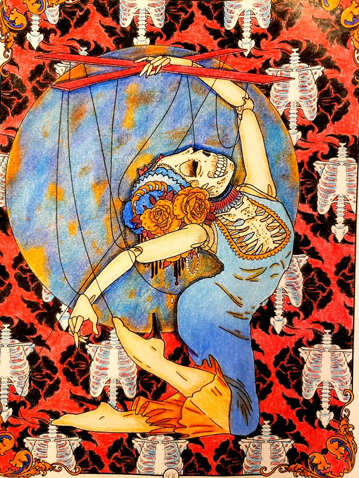
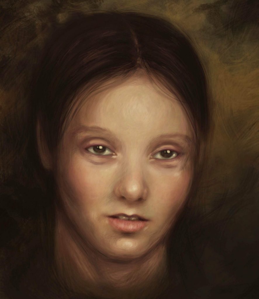
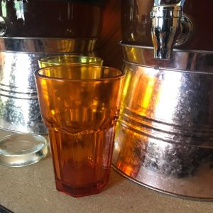
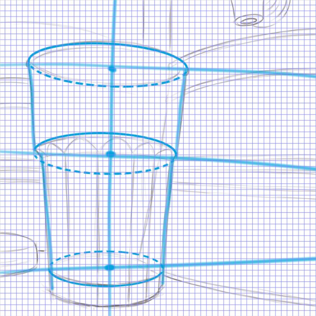
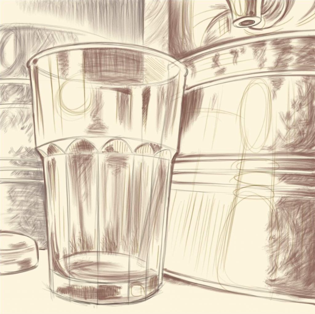
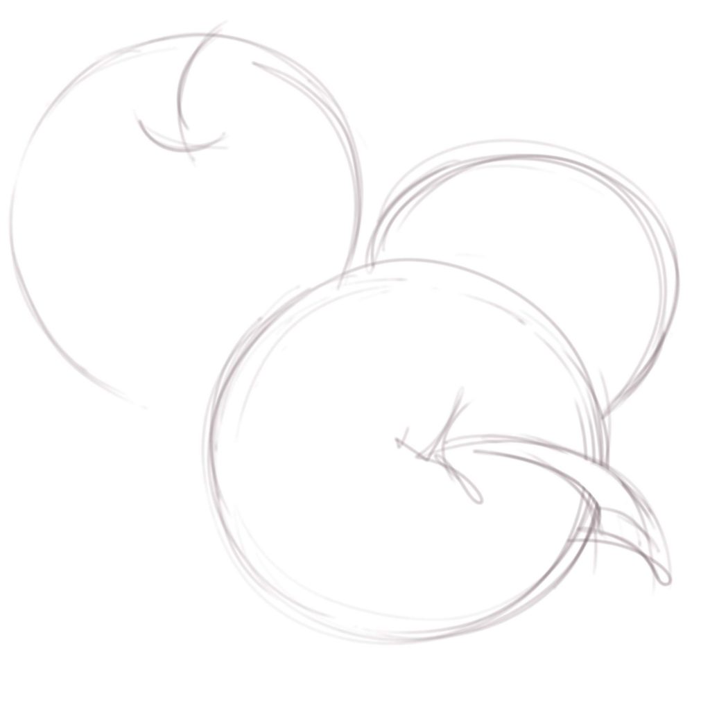
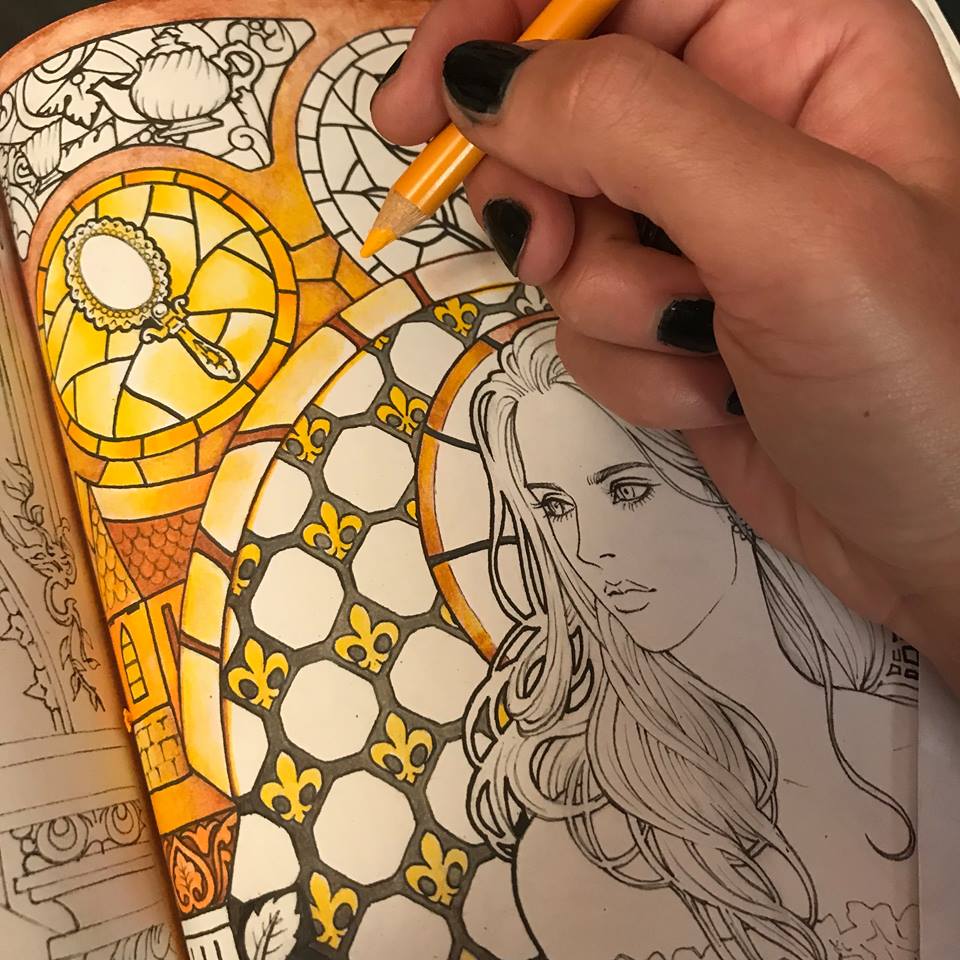
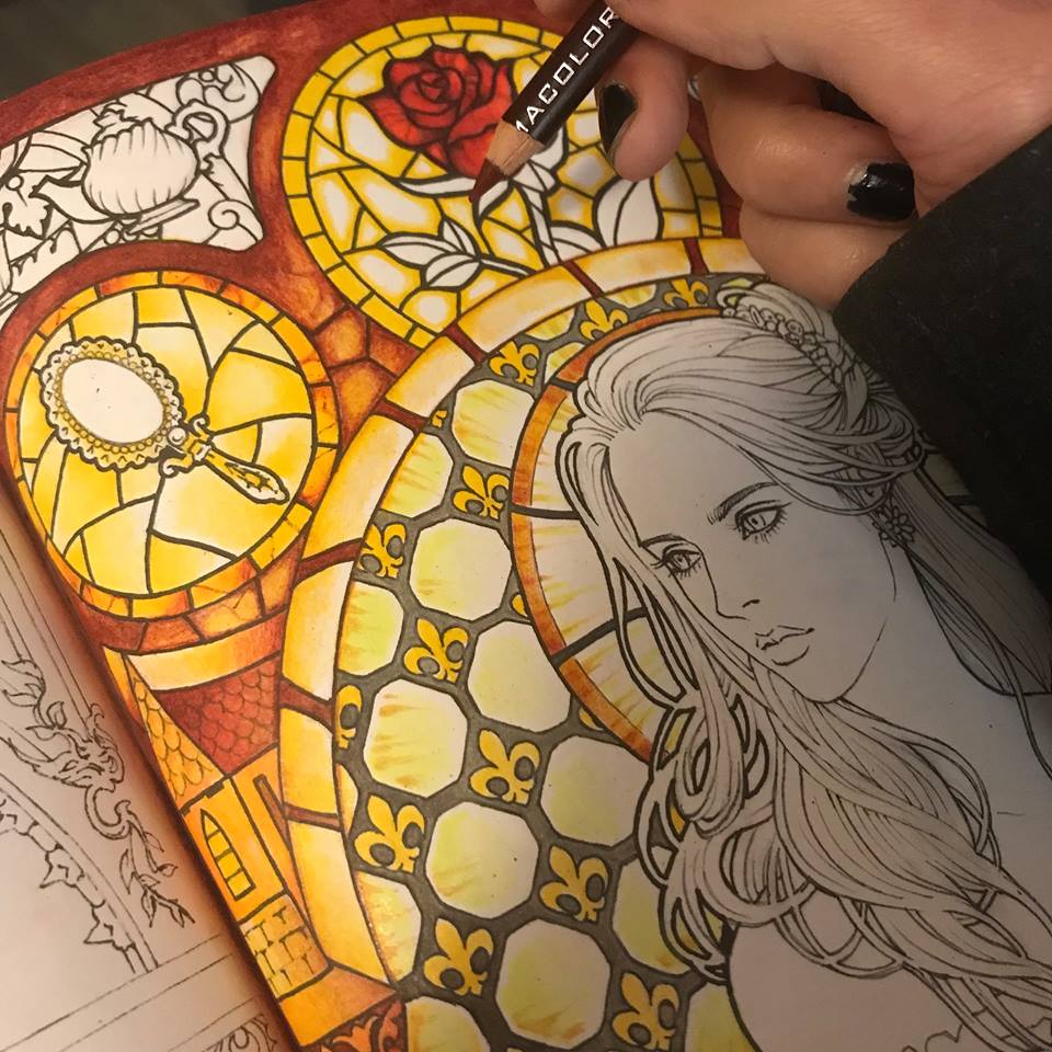
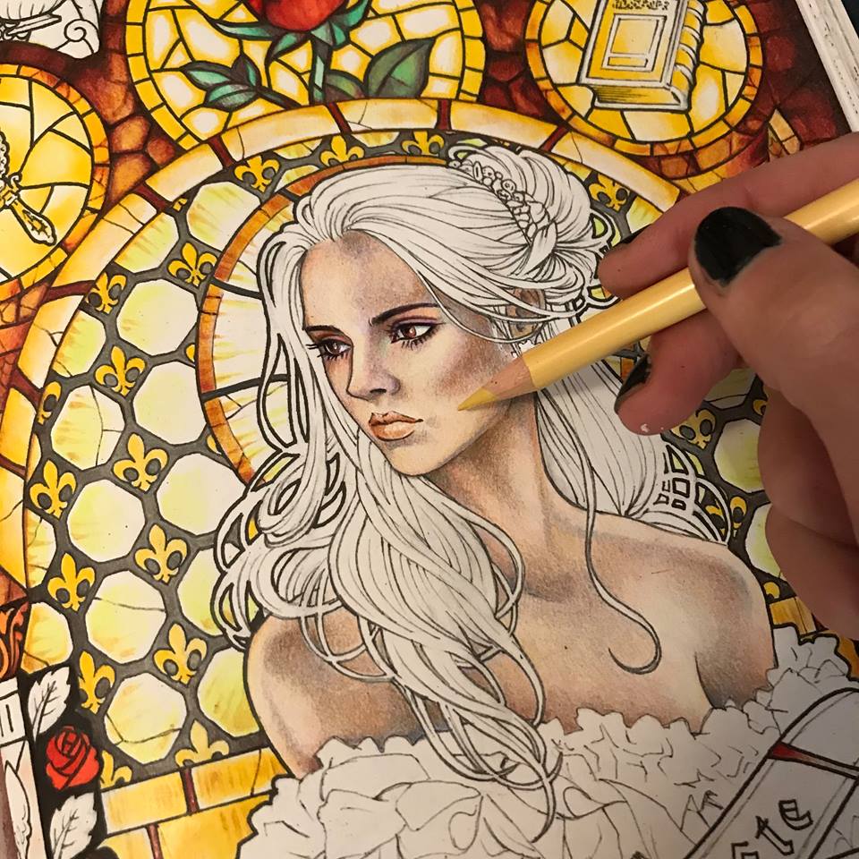
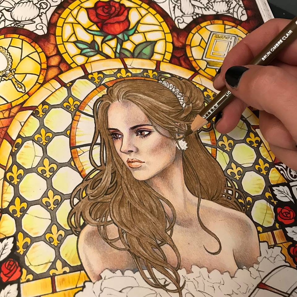
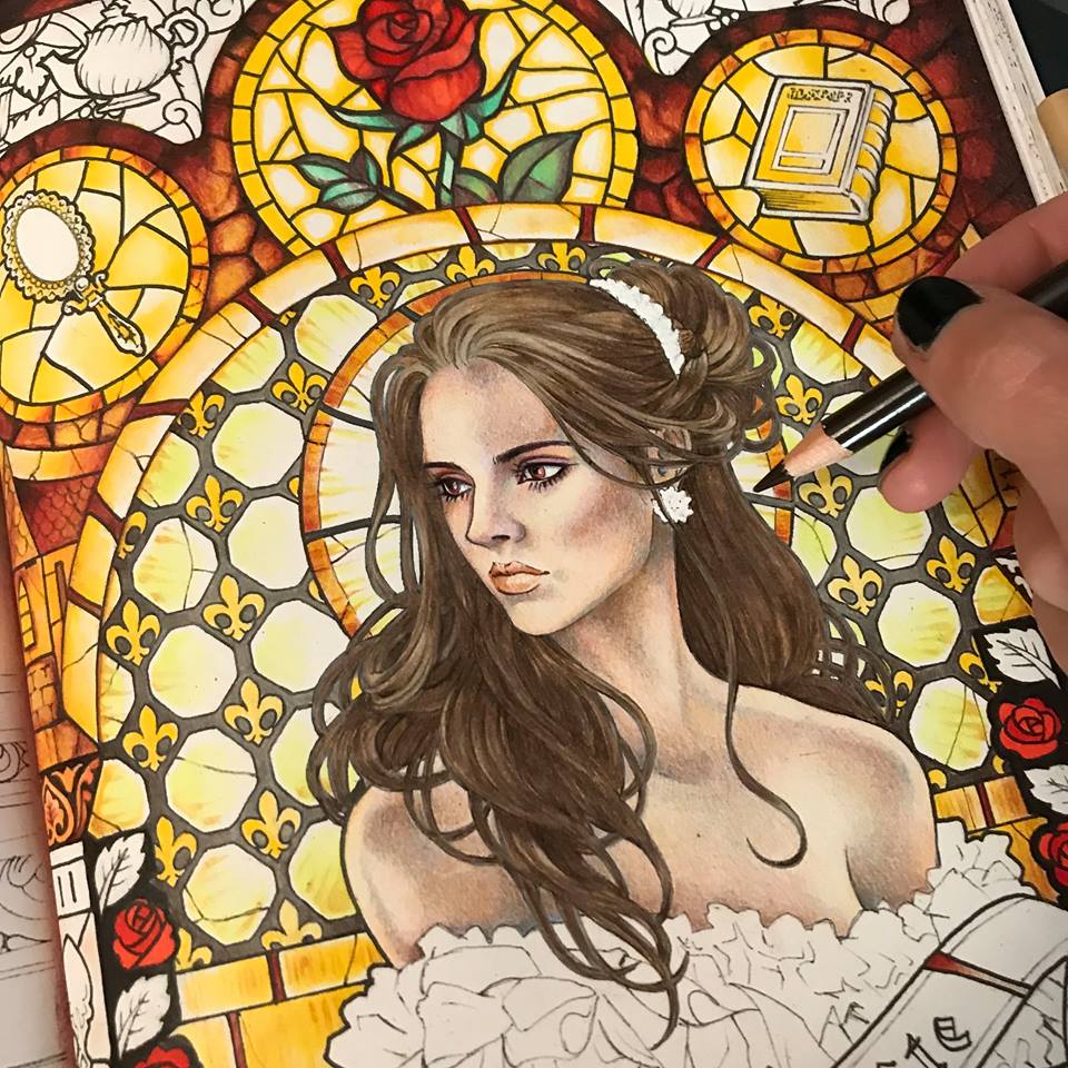
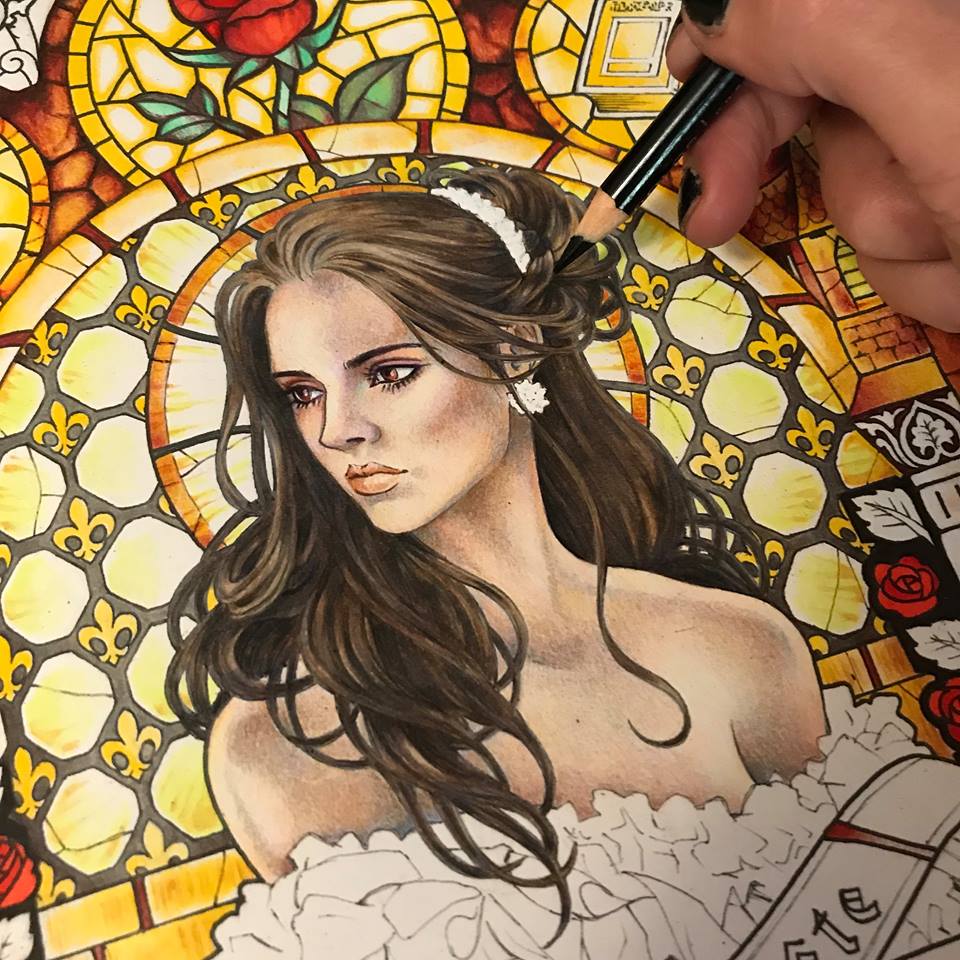
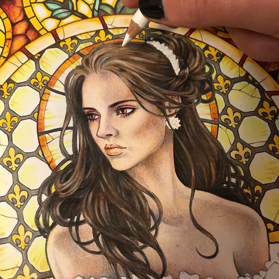
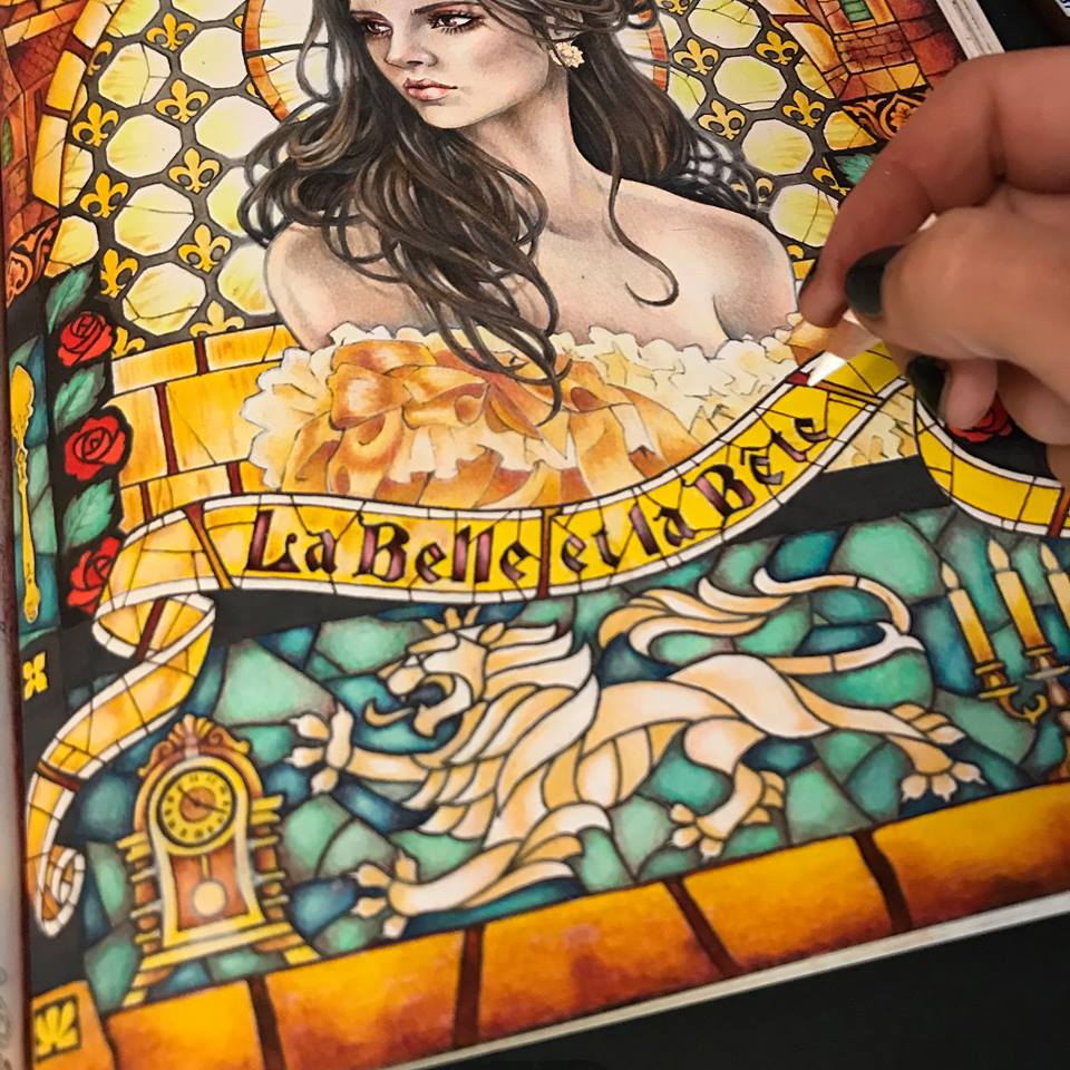
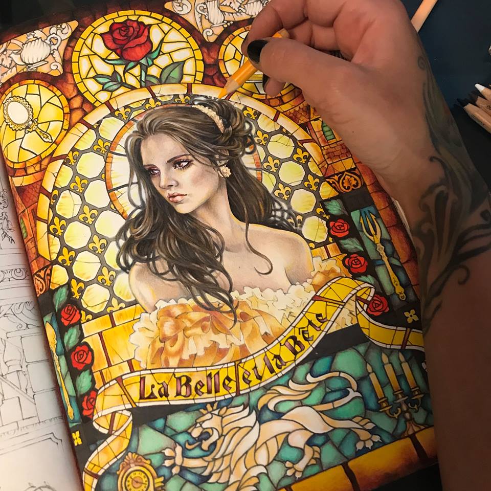
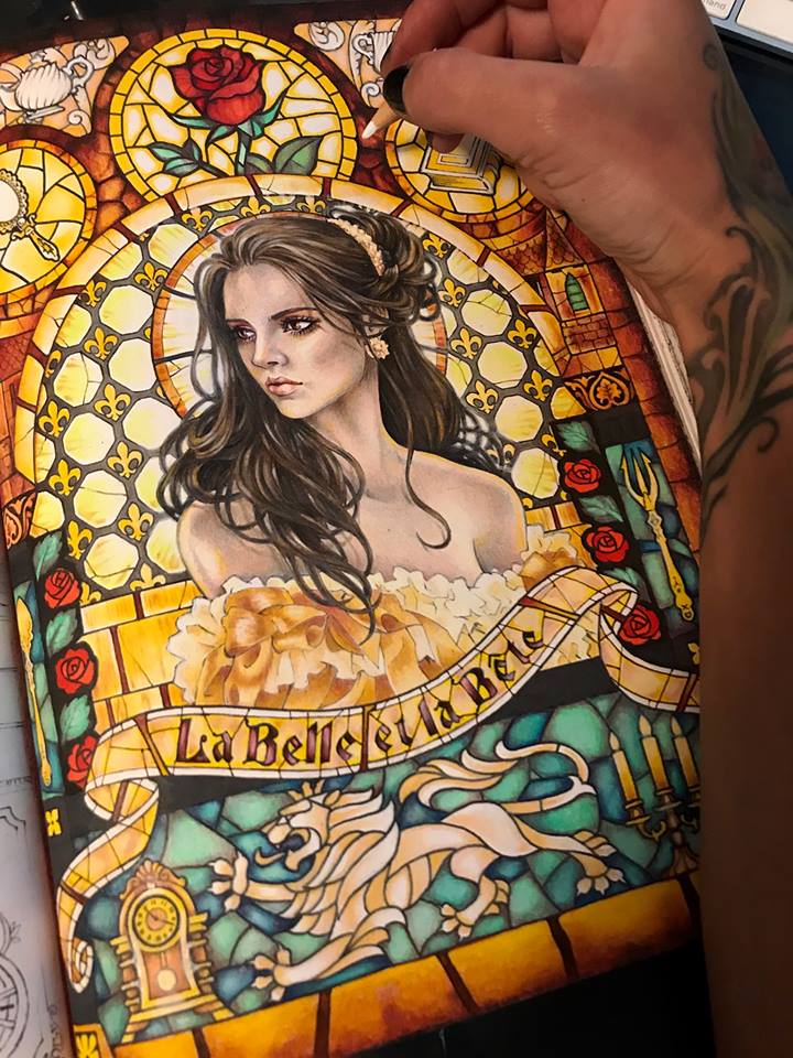
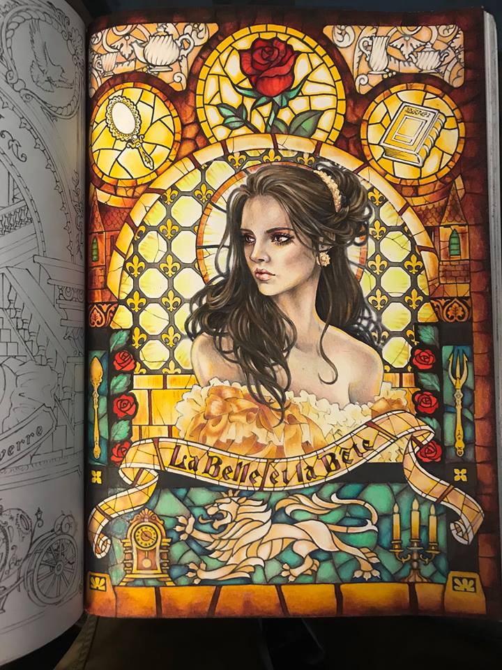
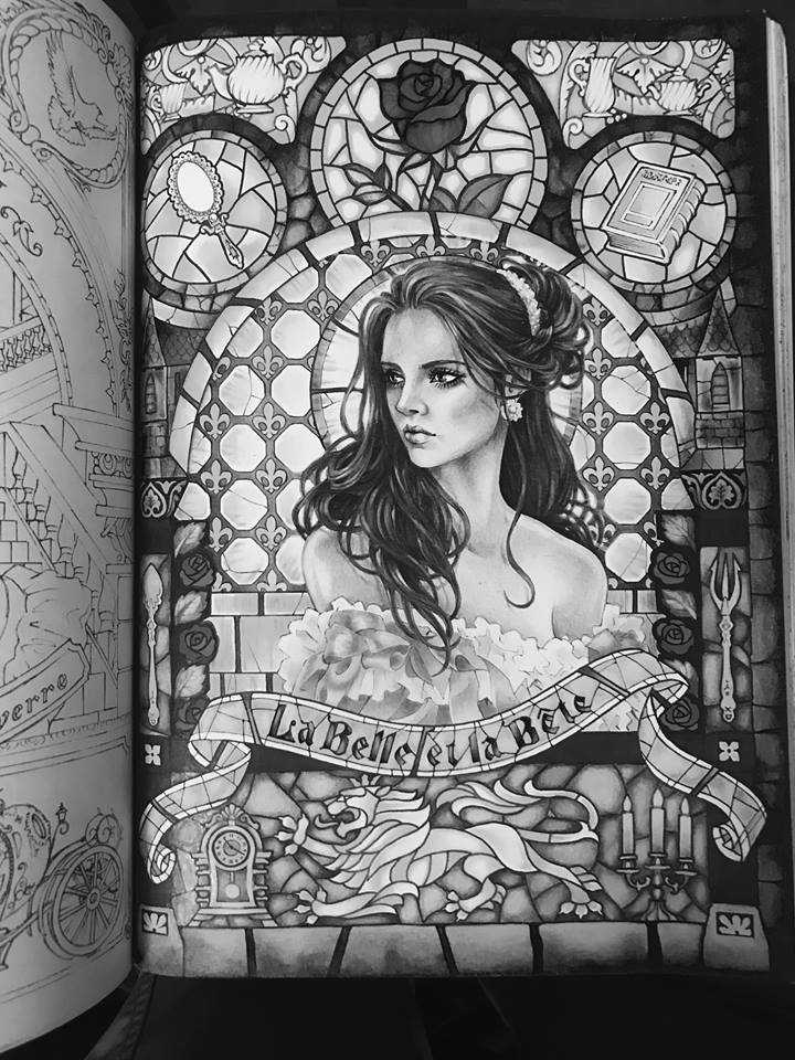
In my art group TALM, I offer monthly coloring events. Each event is unique in subject, theme, and goal, and each always ends with one chosen winner. The winner of the event is rewarded with a unique prize. As a reward for winning my 5 de Mayo event, the winner got to request any tutorial topic from me on either coloring or drawing. She asked me to go over how I color feathers and bubbles. Excited by the unusual topic, I drew a coloring page of a winged angel in a bubble bath. It is this line drawing that we will be coloring today, paying particular attention to feathers and bubbles. Let’s get started.

I will be coloring this image digitally in Corel Painter, but the techniques I am about to apply are specifically tailored for color pencils. As a matter of fact, I will set my drawing tool to be the same types pencils as I would use in real life.

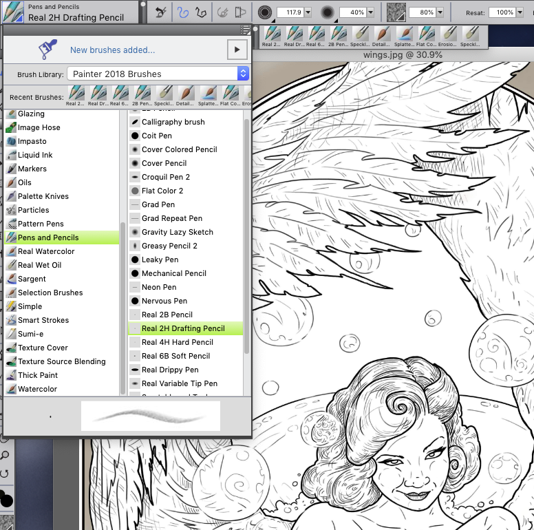
My pencil settings in Corel Painter

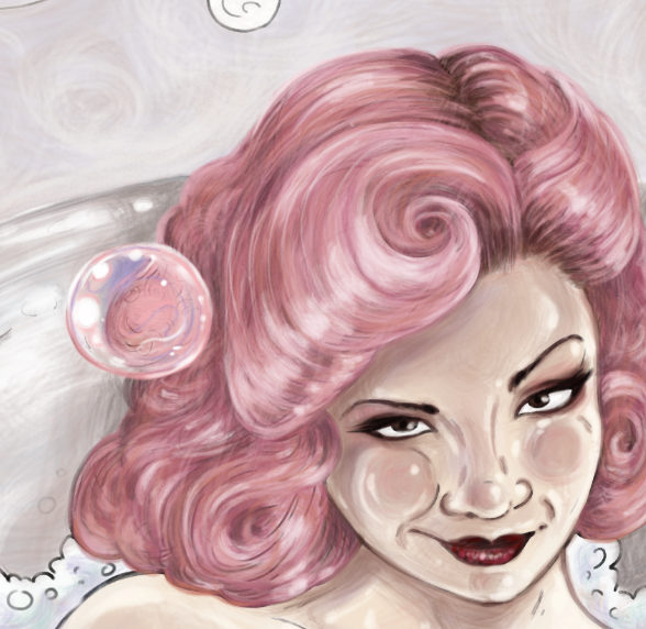
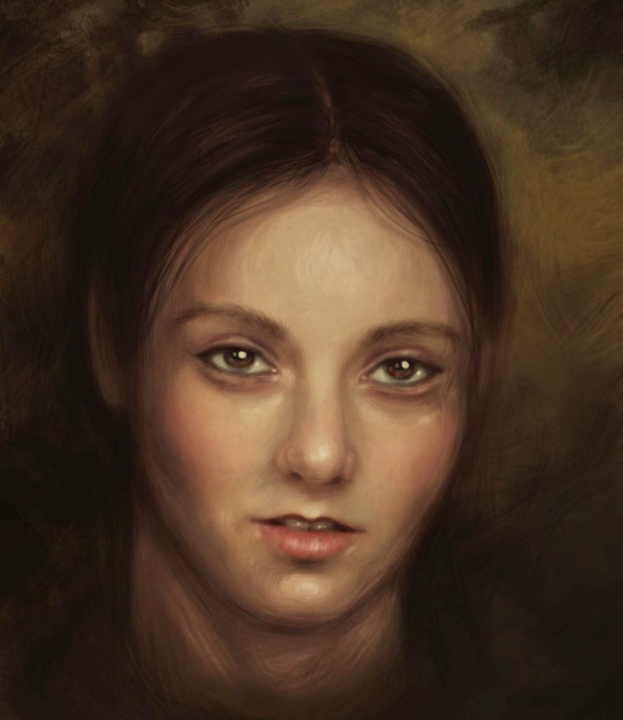
Because we are focusing only on feathers and bubbles, I will skip the step by step portion of how I colored the angel’s body. Let’s just jump to the part where her skin and the details of her face are already done.

The order in which you color the subjects of the page is very important. I would not start with the wings and I would most definitely not start with the bubbles. Here’s why. The wings are an accessory to her. We need to know what she looks like first and then decide what kind of wings match her complexion. The bubbles should be the last thing to color because they are opaque and transparent. They reveal and reflect all the colors of the scene. How can you possibly know what color your transparent bubbles should be painted if you didn’t yet paint the scene?

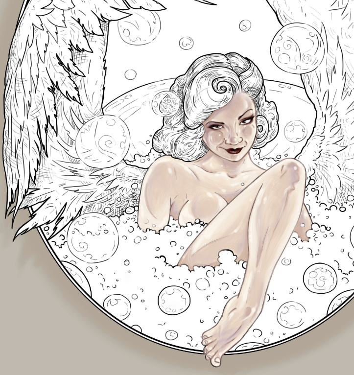
We skip to the part where the body and the face are already colored.

The next part that I like to establish is the background. This will set the mood for my overall color scheme. Many people leave the background for last, but I find that in most instances that is not the best way to go. Establish your settings and your atmospheric conditions first, and then the colors and the lighting of  your main subjects will be established for you.

In this case, I want the scene to be soft and dreamy. I pick very delicate pastel tones of lilac. I may adjust them later on, but for now I am happy with this color. Notice how I didn’t just click-and-fill the space. I took the time to actually color it with my pencil tool, giving it some blurry swirl effects. Whether you are working digitally or with physical pencils, try to avoid solid color backgrounds. That makes the backdrop look flat. Instead, try to suggest some atmospheric perspective with blurry effects and using several similar tones instead of one solid color. When working with pencils, blurry effects can be achieved by smearing and smudging your pencil marks with q-tips, soft erasers, cotton balls, and even your finger.

I have a very clear idea in my head of what color scheme my finished drawing will have in the end. I can close my eyes and literally see the finished piece. When I draw, paint or color, I am actually just reproducing what I already see in front of me. Many people don’t approach drawing and coloring this way, and that’s perfectly fine.

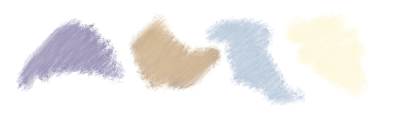
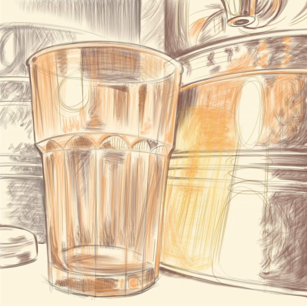
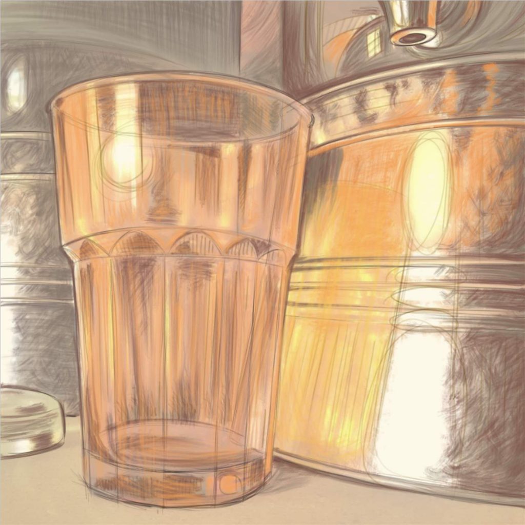
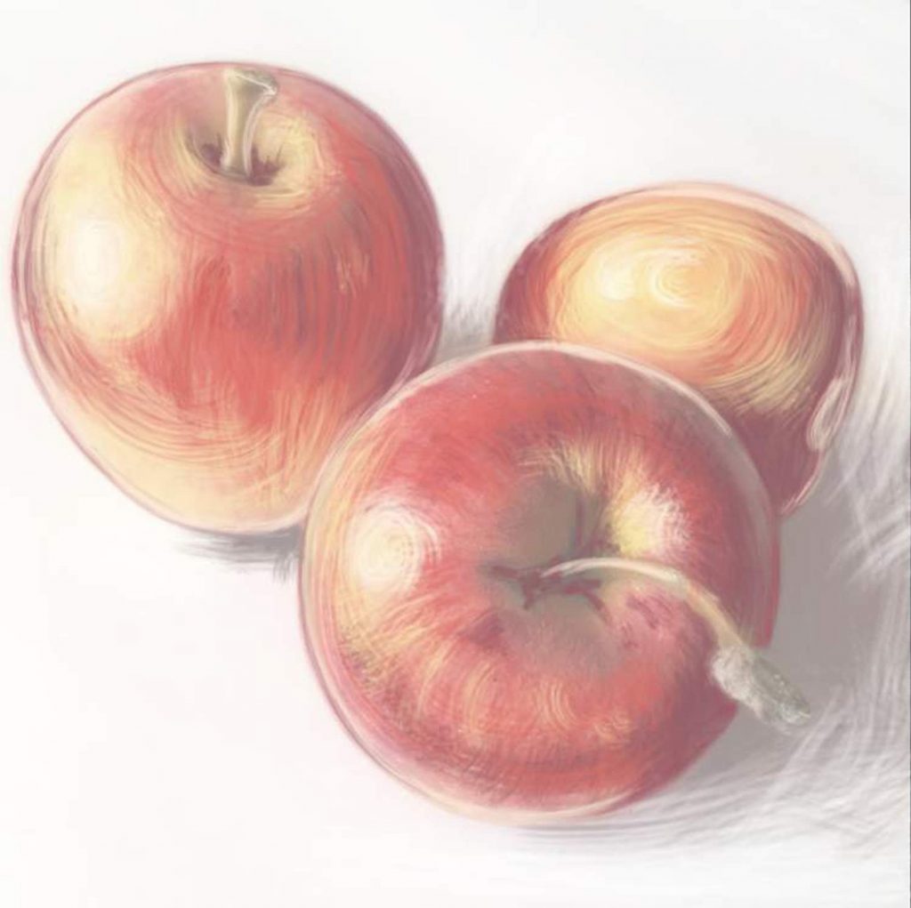
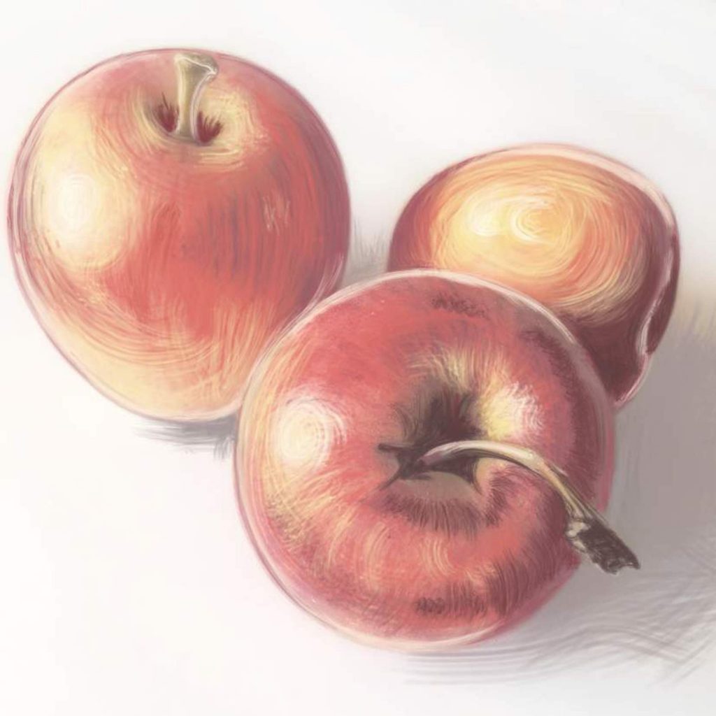
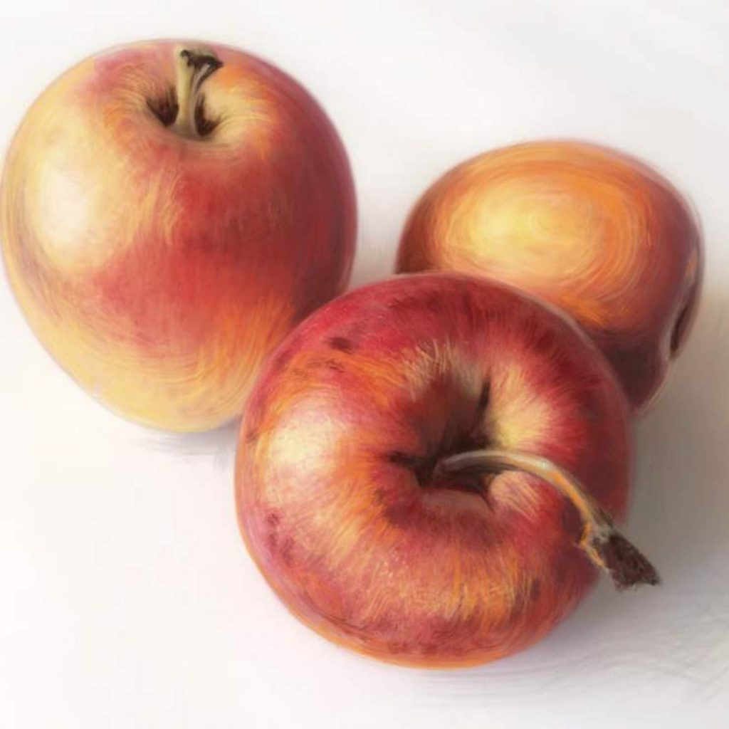
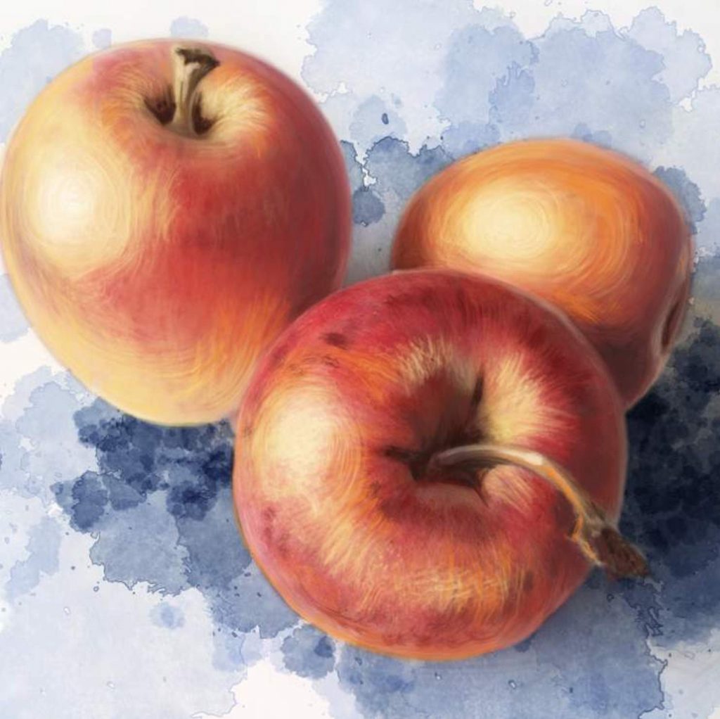
If you cannot clearly see the finished colors or have difficulty deciding what color schemes to use, I highly suggest using what I call inspiration pieces. It’s simple, especially now that we have a world of images at our fingertips. Just look through a whole bunch of images until you see ones that speak to you in terms of light and color. A good idea is to search for various types of photography, and just let the image links take you down a rabbit hole until you come across color palettes that you like. Keep in mind, these should be completely unrelated images. They can be paintings, photographs, screensavers, whatever strikes your fancy. As long as you find pictures in color schemes that look beautiful to you. Pick one and use it as a guide when selecting colors for you piece.

Here are some examples of photography that I found online that are interesting to me for some other projects I have roaming around in my head. Remember, we are only looking at colors and their distribution on the page, not the subject matter. There are literally millions of images out there. Take a a few minutes to look through some of them to find the color inspirations that work for you.

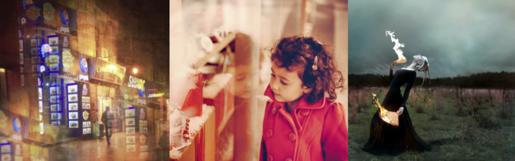
Examples of photography that I found online.


Ok. Let’s continue. Now that you, hopefully, have an idea of your color mood, let’s get those wings painted. I want her wings to be almost white. Not quite perfectly white, but kind of cream-colored. I begin with some very basic grey shadows.

The most common mistake that people make when coloring wings is focusing too much on each individual feather, and losing track of the structure of the wings. Don’t start with feather details. Instead look at the wings as at two objects. How are they positioned? Is one closer to you than the other? Are they reaching forward or back? Is there a curve to them? Where is the light coming from? Where would the shadows be?

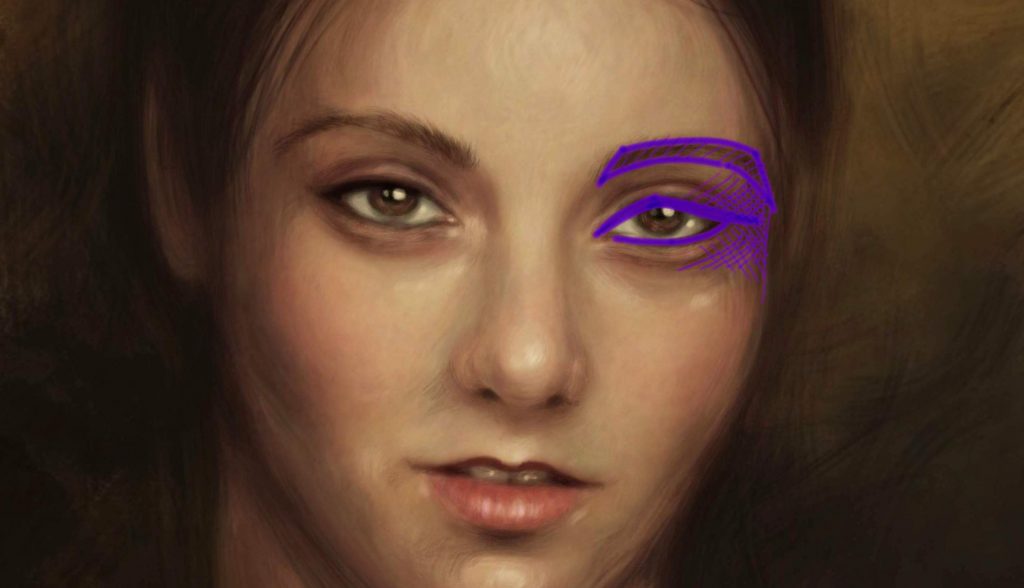
In my case, the light in the bath-house is very diffused. There isn’t really one strong light source. The light is soft and generally reflected off all the steam that I imagine is in the air. So I don’t have to worry too  much about harsh shadows, but I do have to give my wings structure. I use a regular grey pencil to start adding shadows to the parts of the wings that are the furthers from us, and little bit here and there to start defining the shape of the wings.

I place my shadows here. I am working very lightly, because every new layer of color that I will add will go on top of this grey. I don’t want to compete with it, but I do want to establish my shadows.

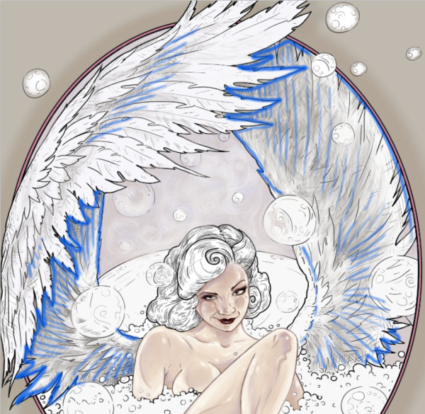
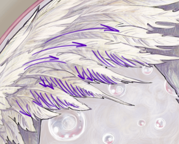
The blue lines indicate the areas where I placed the shadows.

Now I move on to my first color – a soft grayish-purple tone. I add it to the parts of the wings where I’ve already indicated some shadows. This time, I take more care to add more pigment and to make my pencil marks with the direction of the feathers. Feathers are very textured. Part of what will define your texture is your pencils marks.

Notice that my pencil marks are still very rough, but they are starting to give the wings shape. Aways work with the shape of your object and don’t just color blocks of color between the lines. This will give your piece more dimension.

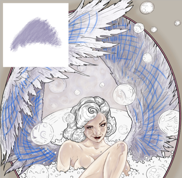
My first color on the wings and the direction of pencil marks.

The other way to add more dimension and depth to your subjects is using several colors to build one color effect. Even though I’ve decided that my wings are a solid cream color, I am actually using multiple colors to make the wings look more realistic and 3-dimensional. Granted, we are working in a more cartoony style, but I am going for the semi-realistic coloring of a comic character effect.

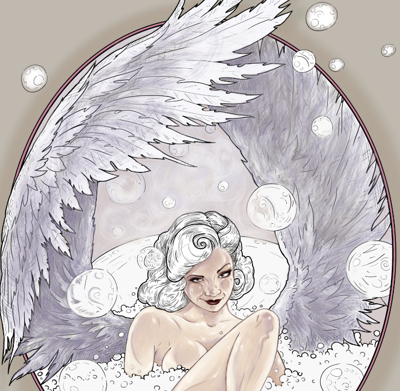
My second color for the wings is an ivory blush tone of light brown. I add it lightly here and there, like makeup powder. If I hadn’t told you that I added it, you probably wouldn’t even notice. But compare this screenshot with our previous step where I only added the purple. It’s not a dramatic difference, but somehow there is already a little bit more shape definition to the wings.

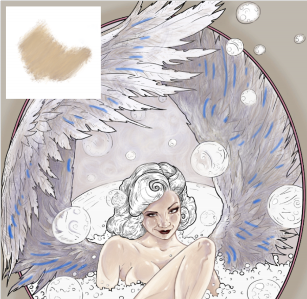
The blue lines indicate some locations where I added minor beige highlights.

So far, my wings just look kind of grey and dull. Let’s start working with the actual cream color that I promised. I select a very pale, almost yellow, beige and a complementary pale blue to go with it. I am working very delicately with both pale yellow and pale blue to complete my wing illusion, adding the lightest tones to the parts of the wings the are physically closer to us.

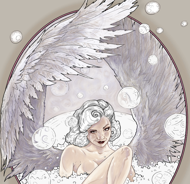
At this point, I actually switch back between all four of my color pencils to balance the coloring. I hide some of the black outlines with my purple pencils, and you can see that I’ve started adding some detail to the individual feathers. Note that I am only adding detail to the feathers that are closest to us. I am barely defining any feather shapes on the wing that is further away. That lack of definition helps create an illusion space. Add more detail to the objects that are closer and less detail to the objects that are further away. You can even use your smudging tool to blur that darker wing a bit.

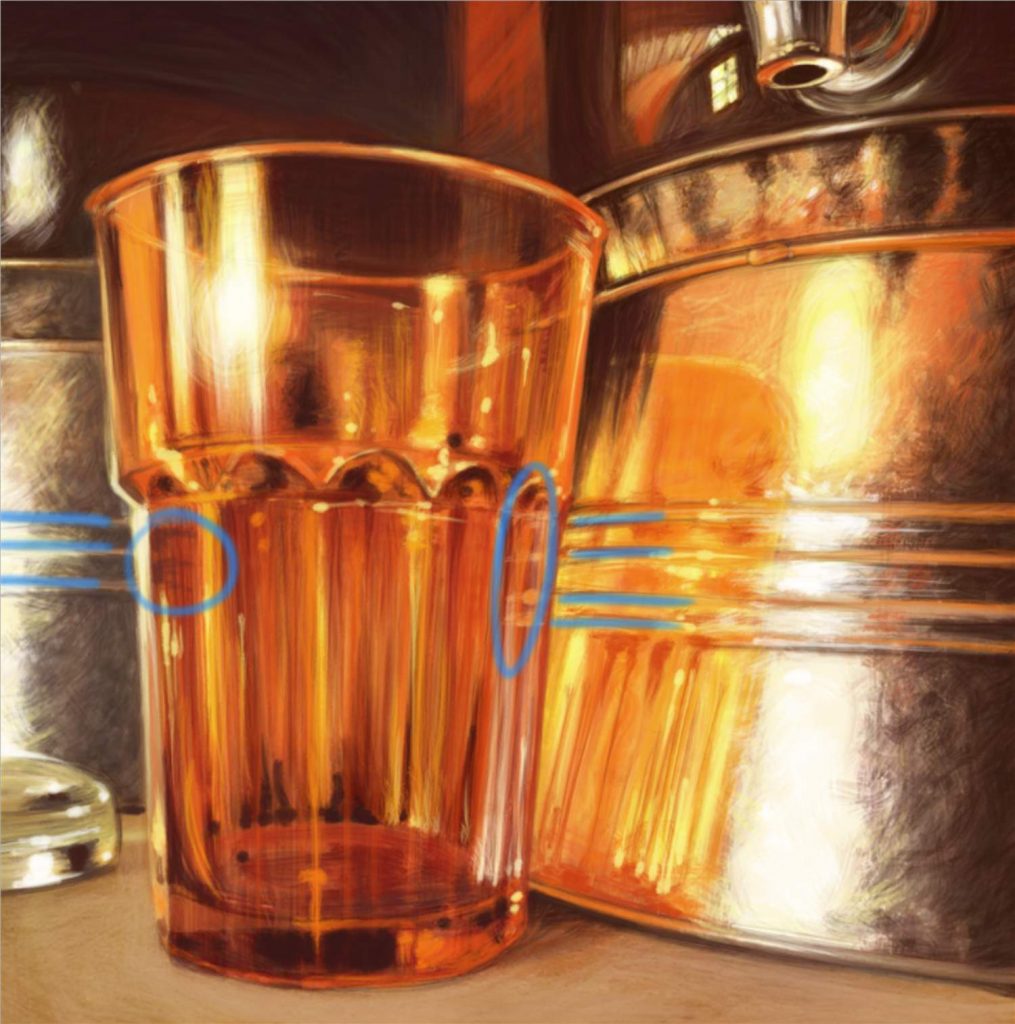
Notice how I’ve retraced the outlines in these areas with my purple pencil. That gives the coloring a softer feel, which is of course what we want, given the subject matter.

The blue lines indicate places where I retraced black lines with a softer purple.

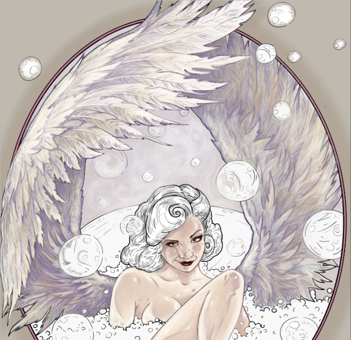
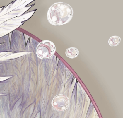
All in all, these are the only colors that I used to paint the wings. You may finalize your wings with a  touch of white highlights here and there.

Remember to always make your pencils marks in the direction of the fur or the hair or the feathers flow. The feathers are growing left to right here. My pencils strokes are also left to right. The eye of the viewer will pick up on that and see it as more natural, even if the brain doesn’t realize why the illusion works.


Now, I could take this further and eliminate all of the black lines. Some people take the time to do that. If this was a piece for publication or print, I would invest in that effect, but for the sake of the tutorial, I’m ok with leaving some traces of the original black outlines here and there.

You can also take this further and add really fine hyper-realistic detail to some of the feathers, but take care not to overdo the effect. When we look at objects we see concepts, not full detail. When you look at a bird with open wings, your brain does not register every single feather. It registers two symmetrical wings, the overall feather color, the overall feather texture, the darkest parts, and the lightest parts of the wings. A successful, drawing, coloring or painting is one that delivers the message in a way that our brain already interprets information. So, don’t sweat those tiny details. Sometimes, less is more. Light and shadow are far more important than detail.


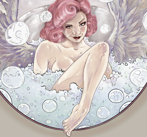
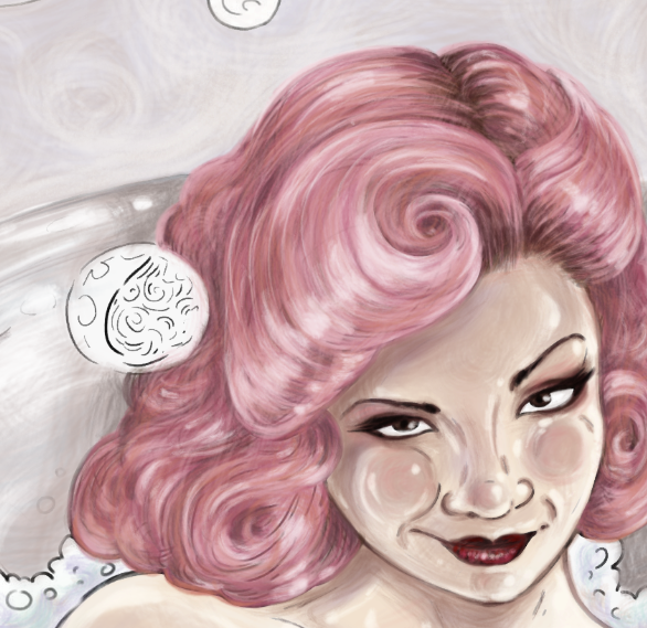
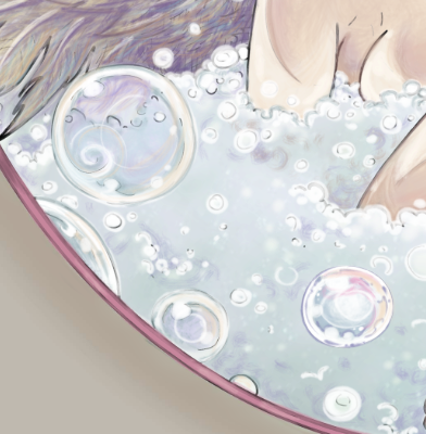
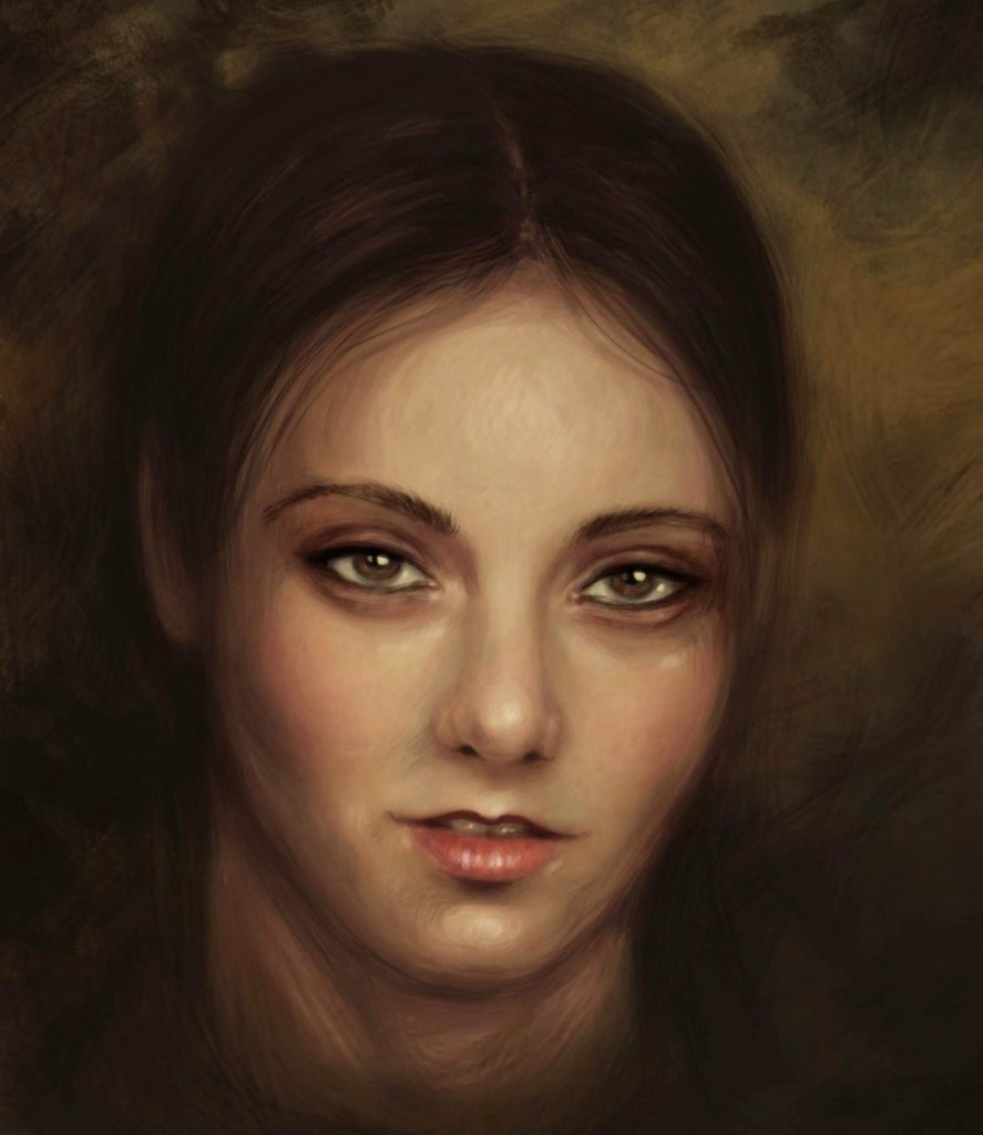
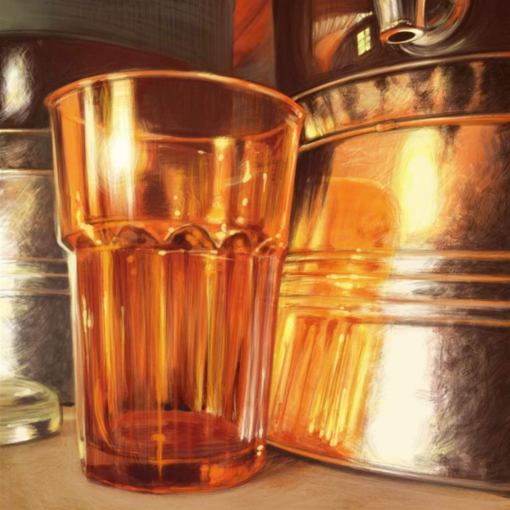
All right, let’s move on. Before we can start adding bubbles all over the place, we need to finish coloring everything else that remains uncolored in the scene. In this case it’s the tub, the soapy water and her hair. I chose to paint her hair in a color that will stand out. This color will be the centerpiece of my drawing. A little burst of visual emotion in an otherwise pale and subdued scene. Plus, with a vibrant color, I can clearly demonstrate the color selection for the bubble painting.

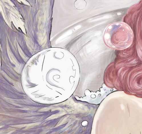
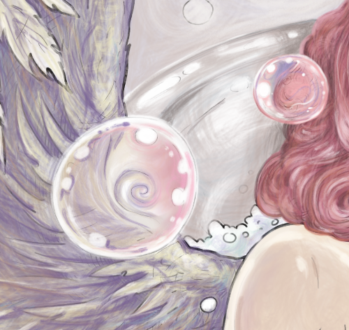
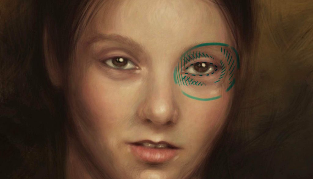
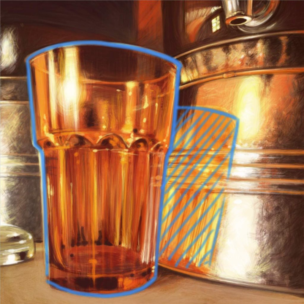
Let’s start on our first bubble. There is one floating in front of her hair.

I start by working with the same pencils that I used for the tub and for the hair, and very lightly adding those tones to my bubble. I am not going for detail here at all. In fact, on the contrary, I want the effect to be blurry. In real life I would use a q-tip to smudge the color all over the bubble.

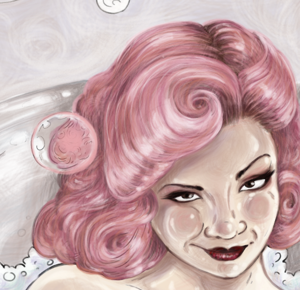
Keep in mind that soap bubbles are not just 100% clear. They are opaque, and they kind of distort everything that you can see through them. In this case, the line drawing already suggests where the colors should go. (The line drawing, of course, being made by me 😀 I like to give my colorists enough suggested information to guide them, but not so much that there is no room for their own artistic decisions).

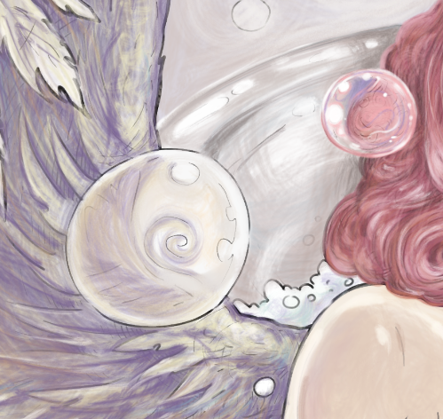
Looking at the overall color scheme of my whole composition, I pick one other color to put into my bubble to make it stand out a bit. I pick purple. I could have picked blue or beige, and they would have worked just as well. There is no one perfect or correct way to draw a soap bubble. All soap bubbles are unique and each has an element of randomness to its swirls and blurry effects.

Experiment. See what works in your composition. For instance, if you paint the rest of your scene with completely different colors from the ones I chose, making her hair green and the tub blue, inserting this soap bubble painted exactly the way that I did, will make absolutely no sense. Your bubble has to work with your color scheme.

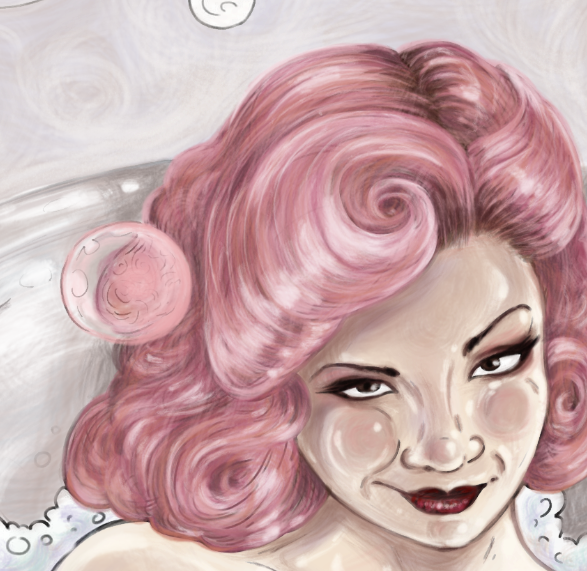
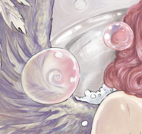
I add some white to the suggested places and also hide the black outline with pink and white. As much you can, try to make the soap bubble outline white. That will really help with the illusion of weightlessness. You can do this with a white marker, a white pen, whiteout, white pencils of certain brands (I like Prismacolors the best), acrylic paint, white charcoal, and many other easily available art tools. Try different things to see what works best for you.

Finally, having observed my new soap bubble, I decided to add a few more little white highlights here and there, to make it a little shiny. If you are not adding white with a separate white pigment tool, take care to leave the designated areas uncolored, using the white of the paper as your lightest sections.

Remember the element of randomness. There is no one formula for where the white dots and circles should go. It’s all about what feels right to your eye. I tend to keep the center of the bubble a little darker and the edges lighter. For me, this is the perfect effect.

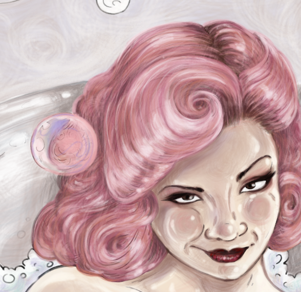
I am happy with how this bubble turned out. Let’s move on to the next. How will this bubble be different? Well, the most obvious thing we can see about this one is that it is in a different location, with different colors surrounding it.

I use all the colors that are around this bubble, but I make them slightly more pale, because bubbles are soapy, and once again I am going for the smudgy effect.

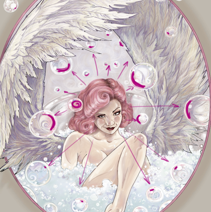
I add some pink glow on the side of the bubble that is closest to the pink hair. This is very import. This will be true for every bubble that we color. I want an obvious pink reflection on every significant bubble, on the side that is closest to her hair. This should be consistent throughout my piece.

I complete this bubble with some white highlights. Notice that they are different in size and placement from our first bubble. A common mistake that colorists make is coloring every bubble in exact same stencil way. That just doesn’t look natural. The light is playing off of everything in this setting. Bubbles are even reflecting other bubbles. We are not going to get technical and photorealistic here. I want to stick with the cartoony style, but we can imitate a realistic look by staying true to that element of randomness we talked about.

Every bubble should be unique and working with its surroundings. Let’s take a look at a few other examples. Notice that the bubbles are in fact colorless. This is why you cannot “color” a bubble without first coloring the rest of the scene. They are little prisms for other colors around them.

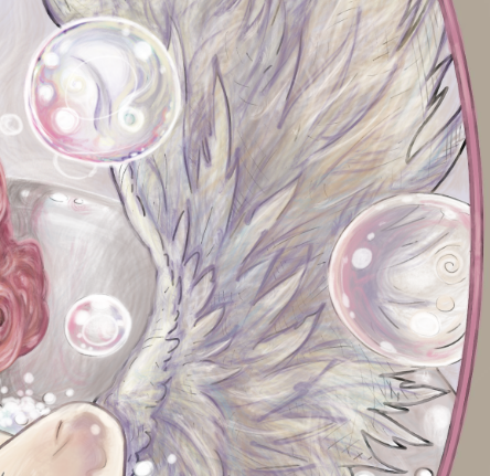
Now that all my bubbles are complete, note how each of them is perfectly unique and random, yet they all have one consistent principle – the reflection of the pink hair color. The pink glow is not just randomly placed here and there. It is very strategically placed on each bubble directly opposite the source of the color.

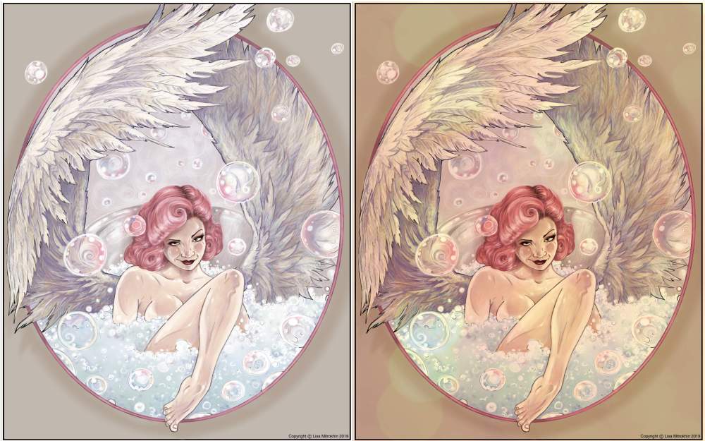
Now that my coloring is complete. I look over the entire composition, and study it. Is anything off balance? Does anything look too dark or too light? Do any of the bubbles stand out in some awkward way? This is the time to tweak little things here and there to bring everything to perfect harmony. I don’t see anything obviously wrong with my coloring, other than my overall tone. Looking at it now, it’s too crisp and there is too much pure white. I would prefer to look at this scene through a yellow or an orange filter. If I were working with real pencils, I would pick a few golden yellow tones and begin to carefully add some highlights here and there. Working digitally, I can skip 15 or 20 minutes of tedium by adding a single layer in the filter color that I like. Sorry, had to cheat at least once during this tutorial. You know me. 😉

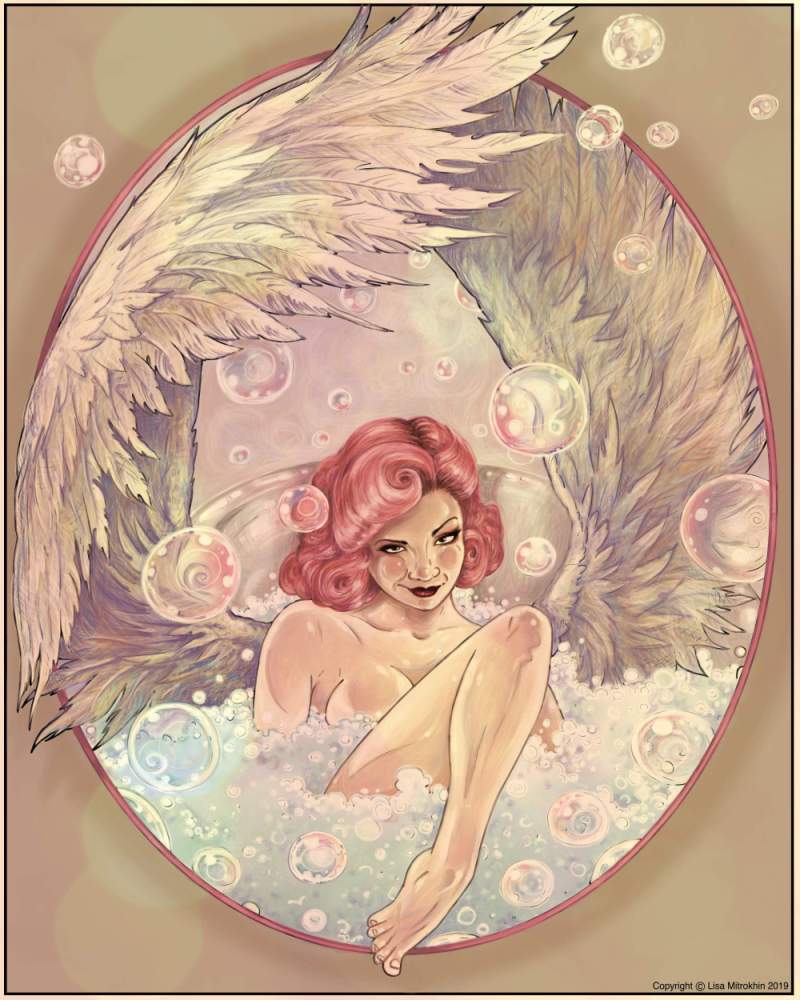
Here are the two versions of my finished piece. Honestly I like them both. Both are perfectly fine, and I could have achieved the second effect from the very start. The yellow light effect just didn’t occur to me until I saw the final piece.

So, here she is – a winged angel in a bubble bath.


I hope you enjoyed this tutorial. The line drawing version of this page will be offered for a one-time coloring event in TALM, the winner of which will also receive a kick-ass prize, like this one. Remember that this is by no means the one and only way to approach feathers and bubbles. I highly encourage you to experiment and also to remain true to your own style.

If you enjoy my work, and wish to come join us in these fun events for a chance to win cool prizes, I hope to see in my group, TALM. Just click here, and join the fun.


Special thanks and congratulations go to Leatha Loftis, the winner of my 5 de Mayo event. This was the coloring that won her this tutorial.


Painting reflective and transparent surfaces

Today, I will be digitally painting a still life, concentrating on composition, multiple light sources, reflective and transparent surfaces and light as its own character. I will be working in Corel Painter 18 with mainly acrylic brushes. As always, I invite you to join me and try something similar on your own time. You can apply the principles that i am about to show you to both manual and digital painting.

The final painting


Interesting still life subjects

The first and most important thing in still life painting is, of course, selecting interesting subjects to depict. But what makes subjects interesting? You may think that that you need fancy trinkets or exquisite bouquets of flowers to paint a beautiful still life, but you would be wrong. The only thing you need for a gorgeous composition is interesting lighting and a good vantage point.

In fact, simple, everyday objects, often make the best compositions because most viewers will be able to relate to these things. If you do your job right as an artist and depict an ordinary object in an extraordinary way, that magic that you envelop your subject in will remain with the viewer for many hours, days and years to come. The next time they see a broom or a set of keys, or ordinary drinking glasses they may just see them in the same magnificent light that you introduced in your depiction.

Searching for a better angle

For my ordinary subjects, I chose to work with these colorful glasses. There is nothing special about them. I have one of every color in my kitchen. I chose only the yellow and the orange, however, because the day is very warm and cheerful, and there is gorgeous golden sunlight coming in through all the windows. I place my two chosen glasses near some other interesting reflective surfaces and begin looking for a fun angle to view them from.

I took some photographs of my subjects from different angles solely to illustrate the process of seeking the perfect composition. I highly recommend that you do not draw form photography but rather from real life. Set up your subjects, set up a drawing or painting area nearby, and paint the three-dimensional objects that you actually see, not a photograph of these objects. Once you are comfortable painting from real life compositions as well as from memory and imagination, you may use photographs for reference, but the process then will be very different than just copying the photo. For now, let’s work with what we actually see.

After moving my subjects around a bit, and myself shifting around them, looming over them and kneeling to look up at them, I finally find an angle that is the most interesting to me. From this vantage point, down on one knee, the yellow glass becomes completely obstructed by the orange one giving it an extra burst of color. I really like this effect and will go with this composition. In a photography course that I am taking, I learned that most subjects become more interesting when photographed slightly from below. I will apply that principle here and situate myself slightly lower than my subject. Relocating the subject to your work station is of course also an option, especially if you have great natural lighting in your room or studio.

As always, we begin with a rough sketch. This is the composition that I finally decided to capture. Working in my digital painting program I create a square canvas and begin sketching the scene that I already cropped in my mind. I am only interested in the composition and the simple structure of the objects at this point.


When drawing geometrically accurate and symmetrical objects it is often tempting to use guides, rulers or a compass when working both digitally and analog. I strongly encourage you not to fall into that trap. We are not creating a blueprint. We are depicting what your eyes tell your brain to perceive. We do not see perfect lines. We see concepts. Here, from where I’m sitting, I see a glass that is slightly warped by perspective. I will sketch it exactly as I see it, and if it comes out a little bit crooked it will be received even better. There will be an element of imperfection, of cuteness to it.


Because I am working in a digital program I can apply geometry to my sketch AFTER it is done just for the sake of demonstration. Notice that while my glass appears to have realistic proportions, it is slightly inaccurate. The three virtual ovals are not exactly parallel to each other. Yet, they are not randomly placed either. From where I’m sitting the glass looks almost like it is slightly curved. I want to exaggerate it a bit to give it kind of a cute sense of grandeur.


For the sake of demonstration, I will apply a virtual grid so that you can see that the perspective lines I have created for my glass are not perfect, yet consistent. Had I applied the grid to begin with and used the circle tool to create perfect ovals, my glass would have looked too graphic and unnatural. I do not wish to create a graphic design. I wish to create a painting.


I remove the grid and continue with my free-hand sketch. It is important to keep your composition simple and readable. Mine consists of three main layers/subjects. The first and most important layer is, of course, the glass itself. It will receive the most attention to detail as I paint it.


The second most important layer in this composition is the lovely reflective metal and a little glass weight that I have laying around. They are there to demonstrate space and depth of field. They create the scene for our glass. They will receive a lot of attention, but they don’t need to be quite as polished in the final draft as the main character.


Finally, there is another object visible in the background. It is not very importanyt in terms of detail or even focus. It is pretty much a backdrop. It will receive the least amount of attention.

Now that I’ve established what I am depicting, I begin adding little structure lines to my most important subjects to begin building their shapes. At this point, I am also marking the lightest parts of my subjects, the brightest glow that appears on their surfaces.


Inspecting my still life I realize that light is as much a character in this scene as the objects that it illuminates. In fact, it is really the sunshine that I am painting with the help of these objects. I’ve marked the potentially lightest parts of painting as a demonstartion for you in this graphic.


Since light is now a character that we are depicting, I shift my attention to the beautiful orange and yellow glow that is cast through the glasses onto the shiny metal. The glass in combination with this delightful artifact now become my main subjects.


Now that I have the scene built, I prosede to apply rough brushstrokes to the parts of the objects that look the darkest to me.


This will take a while, especially if you are working with pencils. This light technique, however, is ideal for brush painting with acrylic or oil paint, or the digital equivalent of the two.


At this point, I realize that I actually prefer to be working on a tonted background. Thankfully, I an drawing digitally, so I can simply add a cream colored layer underneath. When working on actual paper, I recommend that you start with tanned paper, or prep your paper by paining it with a base layer of a ligt cream color. However, working on a pure white background is not a problem at all. Starting with a bit of a tone is just a way to speed things up a bit. If you have a way to add pure white as final details, try tinted paper.


Keep an eye on your light source. If it is artificial light, it will remain constant. However, working with natural light, you do need to get all the light information down on paper as quickly as possible, becasue eventually, the sun will rise or set and your light source with shift.


Becasue this image is all about light and color, I don’t spend much time on shading and building up details. I start introducing color right away. My glass is actually orange in color, so I introduce orange. The orange gets reflected in the tin behind it. Remember that yellow glass that is hidden behind the main object? I see that tone reflected in the tin as well. These are points of interest. They are the colors I will continue to build up.


A common beginner mistake is to focus too much on individual details and lose track of the bigger picture. Don’t worry about all the little light artifacts on the glass at this point (unless you are working with watercolor. That technique is completely different from what we are doing now) Instead, start giving your objects shape by building up shadows and adding more and more color where you actually see color. I like to use a softer digital brush to add faded soft grey shadows to my background layers.

Always look at your subject. Your eyes should be going up and down between the composition and the page all the time.


Continue buidling up shape and color by applying dabs of paint all around your composition. Do not fixate on one part yet. Pay a little bit more attention to the objects in the foreground, keep your brush strokes broader and messier on objects in the background, and build and build your composition up.


I like for my paintings to get gradually brighter and more sturated, rather than go staright into strong colors. Whether working manually or digitally, I create many layers of paint, each a little bit more saturated, each a little bit more defined.


I continue to add detail with each layer.


Adding darker brush strokes here and there helps define the shapes of the objects.


To make the dark parts appear even darker, I add more contrast with light yellow and near white highlights.


Now I have enough information to start adding the little artifacts of light that I see on the surface of the glass. Little dots and bads here and there that suggest glitter and glow.


These do not have to be exact. Nor do they have to be exactly where you see them in real life. When I zoom in a bit, you can see that my brush strokes are by no means flawless, and you have no way of knowing if every dab of white and yellow that I have depicted here really corresponds to what I see on the objects, but it feels realistic. It is believable. That’s the goal of this kind of painting, to convey a recognizable scene.


I always continue studying my subject as I paint it. The glass is thick and colorful and it’s easy to overlook that it is also transparent. Not very obviously trasparent, but some lines can be seen through it. I add the necessary transparency suggestions.


As I am nearing the completion of my painting, I check my light source. It is still coming from the same direction (from up and left). As this is morning light, I notice that the angle of the sun has changed a little bit as the day progressed, but not significantly enough to change what I see. I check my lightest spots and confirm that they are consistent with the current light source.


I check my main subject and its colorful shadow artifact. They are indeed the brightest and most interesting parts of this composition and appear to capture the natural light quite beautifully. If anything feels awkward or uneblievable at this point I tweak it without referencing the still life. Remember, this doesn’t have to be 100% true. We are more inetersted in the feel.


Now that we are nearly done, let’s revisit the shape of the glass. Remember those perspective lines I drew earlier? The vertical is a little bit curved and the parallel ovals are not exactly parallel. I chose to make this glass a little bit warped, and not 100% geometrically accurate. Looking at my painting now I am very pleased with the trick that this warp plays on the eye.


For the final touches, I use pure black to really bring out the darkest parts of the painting. I only use a few brush strokes, and only in the areas indicated here with green circles. This step is optional. I actually debated doing it for a few minutes. I like the soft, fuzzy look that I already achieved, but in the end, I chose to add just a touch of sharpness and higher contrast by introducing a few dabs of pure black.


I call that complete. I sign my work, and save my file.


I hope you enjoyed creating this digital painting with me. This tutorial was a result of several requests from my fans on Facebook. If you enjoyed this painting process and would like to see more, please don’t hesitate to propose new topics. Come join me on Facebook at my personal art group TALM – The Art of Lisa Mitrokhin, and tell me which art techniques interest you.

Back to the basics

Regardless of how comfortable you get drawing complex objects and composition, it’s always important to practice and review the basics. Today I will be drawing three apples and I want to invite you to join me.

I am working in my digital program Corel Painter 18, using pencils and dry acrylic brushes. I am doing this digitally for two reasons. One, I am involved in a lot of digital painting projects at this time, and it’s the Corel brushes that I personally need to practice using. Two, I can take high-resolution screenshots. This way you see exactly what I see. Taking photographs of pencils drawings always introduces a level of distortion, depending on lighting and the angle at which the photo is taken. The principles that I am about to introduce apply to any style of drawing, however. You can achieve the same exact effects with pencils, pastels, chalks, watercolor, acrylic paint, oil paint, etc. I hope you join me on this little journey. So grab your paper and pencils and let’s begin.

Ideally, the best way to practice drawing is to draw from life. I set up my three apples on the table. Because I am taking you guys along, and because I want you to practice drawing the same exact subjects with a fixed light source, I took a photograph of my apples. Feel free to save it, print it, blow it up on your computer screen. However you choose to do it, you should always have your subject clearly displayed in front of you as you draw it.


A photograph that I took especially for this exercise

I will be drawing my apples in a realistic style with a touch of dry brush strokes. I want the final result to obviously look like a color drawing or a painting. I am not going for photorealism. Yet, I am aiming to have the apples look as much as the photograph in shape, color, and light as possible. I will not be adding elements of fantasy or caricature or any type of abstraction. I am going for mathematical and biological accuracy, depicted in a painterly style. You may choose a different drawing/painting style, ranging from simple sketchy illustration all the way to highly-polished photorealism.

My finished drawing

Now that you have your photo of the apples and a blank page to work on, where to begin? First, we must observe what we are about to draw. Don’t rush to start sketching. Look at what you are about draw and decide what exactly you are depicting and why. In this case, we have three apples. Why three? We want to practice drawing an apple, and having multiple apples in one scene allows us to practice color, shape, and position variation in a single composition. Having multiple apples will also allow us to practice a little bit of depth perception. Finally, three is a great number for this exercise because anything more than three would be either too busy, too boring to work with, or so large a number that the subject would no longer be a few apples, but a pile of apples. The pile would become a single object, and we approach drawing something like that differently. Finally, when depicting multiple objects, it’s always good practice to use an odd number rather than even. Our eye just responds to odd numbers more positively. Odd numbers suggest natural randomness, while even numbers suggest arranged symmetry.

Inspecting this photo, we clearly see three apples, with one obviously in the foreground. I mentally mark my apples in order from more to least important. The apple closest to us the most important one to me. It’s in focus and it displays the most interesting details, like the imperfections of the skin and the little extending stem. This is the most valuable subject here and I will spend the most time working on it. The second apple is the one on the left. It also shows some level of detail and a stem, but it is slightly out of focus and is less interesting. The third is barely a spherical shape in the background. Its job is just to help set the scene and suggest space and distance. I will spend the least amount of time on it.

Assigning value to your subjects

Now that we know what we are looking at, what it means to us, and what we want to show our audience, let’s begin.

For many, it’s good practice to begin with a light sketch. Using a pencil or a piece of chalk, mark out where your subjects will be. Make sure to keep your lines very light, and barely visible. You want to be able to either erase or cover them completely as you proceed. Some may feel comfortable making only mental sketches, as I often do. But, it’s ok to actually draw your lines. Just make sure to not draw thick and defined outlines. There are styles that call for nice clean contours, but that is not what we are practicing here.

The sketch lines should be quick, rough and barely visible


Depending on your tool, style of sketching, and hand stability, you may sketch cleaner, simpler lines. It’s all very personal.

For the ease of presentation, I made the sketch lines a bit thicker and bit darker than I would when drawing. Working digitally, of course, I have the luxury of erasing the outline layer with a click of a button. When working with real pencils, do take care to keep the lines very light.

Personally, on something like this I do not use sketch lines. I go straight into building shapes with larger brushes. Selecting a dry acrylic brush and a neutral greyish-purplish color, I begin to roughly shape my apples by marking the darkest parts of the fruit.

First brush strokes


Still working with very rough and very casual brush strokes, I add more color to begin building my spherical shapes

When drawing from life or photographs, many people make the mistake of fixating on the tiny detail, and that is how they lose track of the whole picture. Examine the photograph once more. Do you see all the tiny specs and marks on the skin of the apples? To copy them all exactly as they appear in life would be madness. It would take a really long time, and unless you are going for some kind of a photorealism record, it would be completely pointless. After all, the photo already captured all that detail. In art, we aim to convey the feeling of the object rather than its absolute accuracy. How do you see these apples? They are obviously round in shape, they are vivid in color, and they are somewhat glossy in texture. That’s what we aim to depict. At this point, we are focusing mainly on the shape through the basic use of color.

I keep adding color while referencing my photograph. I also take a moment to roughly place the shadows to begin the three-dimensional feel


Layer by layer, I add more color, still using very broad brushstrokes

While you are building your shapes, it is important to be aware of your light source. It’s a good idea to set up direct lighting to create a fixed artificial light source that will introduce sharp and dramatic shadows. In this case, I took the photograph in soft, natural sunlight, but you can still clearly tell that the light is coming from up and left. I, therefore, make sure to place the shadows cast by the apples to the bottom right of the canvas. I also make sure to keep the lighter parts of the apples on the left and the darker on the right.

Always keep your light source consistent

At this point, the composition and the light source are pretty well established and I can proceed to the fun part – the detail. Now, there isn’t that much detail in apple painting, but we can still have fun with color and texture.

I now use smaller brushes to clean up the edges and to introduce detail to the stems and the skins


I keep adding minor detail to my number 1 apple

At this point, you may have noticed that I am paying a lot more attention to my number 1 apple while leaving 2 and 3 more imperfect. Note that I did not give clean edges to my fruit. Apple 3 barely has an outline at all. This is softer on the eye and a lot closer to how we actually perceive objects in space.

Now onto the really fun part – a bit of artistic expression. I am happy with the level of detail on my apples and I want to make them stand out more, so I am adding a splash of blue to the background. Here I switched to watercolor effect. On paper, you can use real watercolor to achieve a similar result. I am a huge fan of mixing media.

I experiment with color in a different medium

Our eye tends to see shadows as slightly blue. You may notice a touch of a bluish hint in the photograph. This is why I chose blue for my background. Also, blue really makes those red apples pop. The contrast of blue and red todgether makes both colors appear brighter than they really are.

I keep working with my dry brush to smooth out the flat background

While working with my somewhat abstract background, I still follow the rules of light and shadow. I do not just blindly place blue watercolor splashes behind the apples. I make sure that the blue is darker where the shadows would be darker in real life. Finally, I smooth out my watercolor layer with more dry acryslic work to really bring the whole composition together. I am almost happy with how this looks.

Applying final touches

I switch back to the large brushes and go over the whole picture, adding a bit more color and contrast. I notice that while my light source is strong and consistent, the apples will look better with their stems casting shadows. Now in the photograph, we do not see clear shadows cast by the stems. That is because the light source was too soft. I made my light source a bit sharper in this composition and I want to enhance it even more. I add the shadows that I cannot see in real life but that I know will be there if the light source is inhanced. Now I’m happy.

It is important not to overwork your piece. I can keep painting this for many more hours, perfecting every little blemish on the fruit surface, and making the stems hyperrealistic, but that is not what I set out to do. When I look at this painting, I cearly see three very vibrant apples. I can imagine the sound that one of them might make when I bite into it, and the sound another might make if I drop it on the floor. These apples have clearly defined shapes. You can tell that they have some weight to them as they seem to be rolling off to different sides. They are a little bit reflective, therefore probably very smooth to the touch, and they are very bright, made even more so with the introduction of that beautiful blue. I call this a success and I will leave it at this.


Now it’s your turn. Grab some apples, or eggs, or rocks, and start drawing. I will be posting some photos to work from in my Facebook group, TALM. Please feel free to drop by, grab some photos, and post your work in progress as well. I hope to see you there.

Coloring Ms Beauty

It is a rare occasion when I approach a coloring page with only minor or no alterations at all. Usually I add my own characters or even rearrange or remove some of the existing lines or patterns to create my own scenes with my own back stories. This page in my favorite coloring book by Takumi, however, is perfect the way it is. Not to mention it has hardly any space for additional characters.

I decided to take you along on this coloring journey of Takumi’s Beauty, from Beauty And The Beast.

This is the original page. By the end of this journey you will notice that the delicate alterations I will impose on it will be minor, especially compared with my other coloring projects.


I don’t believe in pencil brands, but I do have my favorites in the towering piles of mixed and matched pencils, that occasionally collapse onto my work space and get pushed away with as a sweep of an arm. I tend to favor softer pencils that lay onto paper, colored or otherwise, almost like pastels, or oil paint. I decided to start with the background. I want it to be daytime and I want the stained glass window behind Beauty to be vibrant in color, but light in atmosphere. I begin with a soft grey.


I now have a vision of what my stained glass window will look like. I imagine amber tones that are darker at the edges and golden in the center. I lay down a layer of auburn brown, kind of a middle town to my amber effect.


I proceed with a the brightest, most sunshine-like yellow I can find in my piles of art supplies, and I introduce the most vibrant tone of my honey glass.


I contrast it with a deep burgundy, beginning to establish structure and give my glass some body.


I use the same burgundy to begin the rose.


Here’s where having soft pencils comes in handy. I now use a light red for my next layer of the rose, using the pencil itself to bland the burgundy and create a nice gradient. In this particular case I am using Prismacolor pencils.


I find a deeper burgundy yet and add some more contrast to the rose. I want that light red to really look like it’s glowing in contrast to the darker reds.


I approach the green leaves with the same principle of darker tones at the edges with lighter tones in the center. Here I use a turquoise green for the main color, the same dark burgundy for the edges and a touch of white for the center. Blending the whole time.


Now, because my artistic mind gets bored working on one element before moving on to another, I feel that I have enough background light and color established to begin coloring the face. I start with the same soft grey I used on the glass frame.


I then add some pale peachy pink as my main base color, playing a little bit with higher and lower saturation all throughout.


I move on to lilac. Just a few shadows here and there.


A touch of blue. Just a touch.


I use one of the lighter burgundy tones to give some volume to the cheek bones and also the eyelids.


Now it’s time to define the eyes a bit more. I have already been building them up with greys and browns. Finally I add black.


I look around at my yellow light and realize that her skin needs a lot more yellowish tones, so I add a soft layer of pale yellow.


Now it’s time for the hair. I want her to have dark, but somewhat mousy brown hair. I begin with a solid layer or a dull light brown.


I proceed to give it volume by going over certain parts with a darker brown tone.


I emphasize the darker parts with actual black.


Now that her hair looks three-dimensional, I give it even more volume by adding an occasional white highlight. A soft white pencil is excellent for this purpose. It won’t actually “paint” white over your colors, but it will layer on a soft gentle highlight.


I look at her face and realize I want her to have more pink and peach tones. I want her to look alive and maybe even a bit flushed. Just a bit. I add some rose around her eyes, her cheeks, her lips and the tip of her nose. I also tweak her jewelry.


Now that I like her face and hair I feel that her outlines are too stark against the glowing background of the stained glass. The light does not look natural. I take a little bit of  white acrylic paint onto a small brush and blur the edges around her hair where the light is the brightest.


I decorate her dress with silk caramel colored ribbons to match her jewelry and return to the background. I feel that the whole composition is looking a bit monotone is all yellow and gold. It needs some zing. I decide that the turquoise green of the rose leaves needs to be balanced by similar tones. Just perfect to display our golden Beast.


I notice that the stark yellow ribbon with bright red letters looks a little flat and boring, and way to bright. It was a good start, but it needs something else. I mute the colors with a white pencil and add some texture to the glass. You may have noticed that I have also been adding my own glass cracks and some occasional definitions missing in the original drawing. Just tiny tweaks along the way.  I’ve also extended my stained glass pattern all the way to the edges of the page.


I now step back and look at my composition. The background is so vibrant it mutes all the intricacies of Beautie’s skin. She needs bold golden yellow highlights on her skin, mainly around the edges. That’s better.


At last I think she is complete. I go over the entire page, scanning it, blending some parts with my rapidly disappearing white pencil, and adding the final highlights all over.


And there she is, in all her beauty, La Belle.


However, having spent three days on this image and feeling a bit overwhelmed by all these colors blasting back at me, I take a moment and run my photograph of the page through a black and white filter. That’s better. I can rest my overworked eyes now and just enjoy the darkness and contrast. If you’ve treated your light and color appropriately, respecting the light source and the saturation levels, resetting your image to black and white should not effect its appearance any more than a digital photograph of your own face may be effected by being suddenly switched to black and white. I rather like it this way.


I hope you’ve enjoyed following me on this little adventure as I colored Takumi’s Beauty. I hope to see some of your lovely ladies in all their colors soon. Cheers, and happy coloring.


A behind-the-scenes of drawing a coloring page

Many of you already enjoy my published coloring books and various individual coloring pages that I create from time to time to entertain my group members. I invite you now on a small journey behind the scenes of actually creating one of such pages. I create all of my line art designs in a program called Corel Painter, using a stylus to draw directly onto my Wacom drawing screen. (For a more technical description of the process check out my articles How I Paint Digitally and What Is Digital Painting)

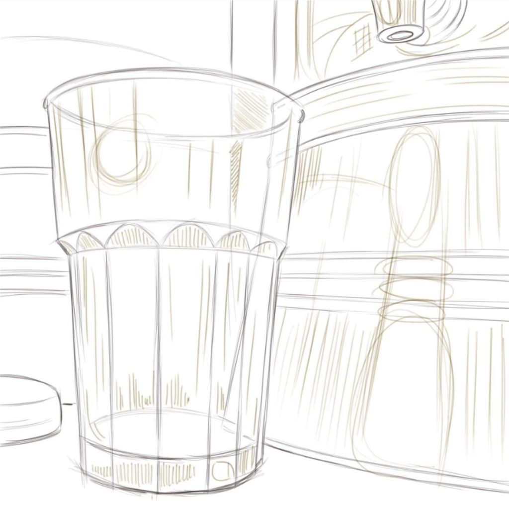
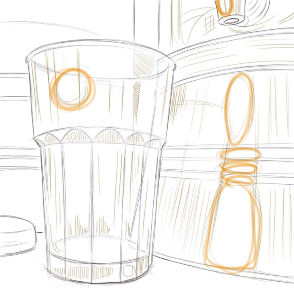
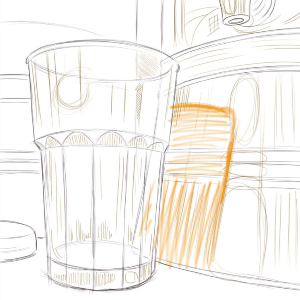
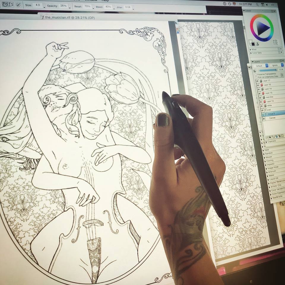
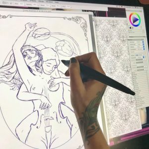
It all begins with an idea. Once I have a clear character concept in my head (which is teaming with ideas at any given moment) I open a new blank document and begin a rough sketch with my pencil tool set to a charcoal or a rough pencil, and usually in a color other than black. I tend to sketch in purple or brown. At this point I am only interested in working on the composition. I freehand my characters the way that I would on a notepad with an actual pencil. I erase a lot to correct my lines as I shape the desired composition. I continue sculpting in this manner for the next hour or so, depending on the complexity of my design. In this case, you will be following the creation of “The Musician” page for an upcoming book. Since this is a book project, instead of a blank page, I am working on a pre-made “frame” page that will be consistent throughout the book.

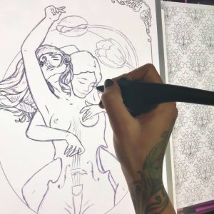
Once I have my composition I create a new layer. I dim the purple layer a bit, and begin drawing clean black lines over the transparent sketch. At this point I have my pencil tool set to “single, circular, (soft) cover” and, generally working on a 2400 x 3000 at a 300 px/in resolution, I set the pencil/brush in the range of 3.2 and 4.2 at a medium to lower opacity, with a rest value of 70%, bleed 40% and jitter at 0.04. The combination variations on these settings are of course unlimited, and every artist sets his own stats according to personal preference. This is by no means an instruction manual on how to set your controls. This is simply what I find to be the most effective given my screen with its wear and tear, the pressure of my hand as I draw, the current tip of my stylus, etc. These numbers are set and adjusted according to so many variables that it would take a book to explain it all. For our immediate purposes, let’s just say that I found my sweet spot and I work with it for best results and consistency, in coloring pages only. I have completely different preferences for other types of digital creations. As a matter of fact I have several palette layouts saved in my window arrangements, and I switch between them depending on my project.

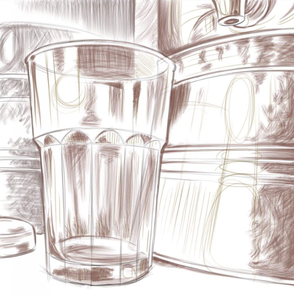
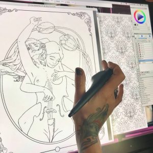
Once my clean black line work is done – a tedious and careful process – I can kill my purple layer. It is no longer needed. Of course I don’t have to erase it all together. I can dim it, or just make it invisible for the time being. Looking at just the black line work, I can see imperfections and inconsistencies. I now zoom in and out a lot, looking for anything that needs cleaner lines, smoother turns, etc. Because this is to be a coloring page, my lines need to be flawless.


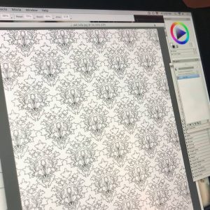
This particular book will be a character centered fantasy compilation, with each individual page presenting a new character drawn in a style closer to my natural drawing style rather than a traditional color-in mosaic page. However, to compensate for this fluidity that may be intimidating to some colorists, each page will also be embellished with elaborate background designs and patterns. Knowing that I will be drawing this character, I already created her background pattern days ago. All of my patterns are my original creations, drawn in the same manner as I am drawing this page, and saved as .jpg files for further use. Now that I have my background pattern, I can copy and paste it onto “The Musician”, resized, styled, and otherwise altered to suit my needs.

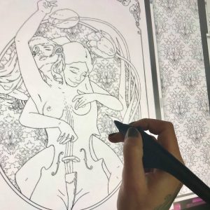
In this case, I minimize my pattern and make it into a gel layer, which I place under the main line layer. Now I can play with cropping and shaping it to appear just in the oval behind my characters. There are multiple ways of doing this. The first being simply starting my design with a patterned oval, then dimming it to comfortably draw my characters in a different layer, and once drawn filling my characters with white inside the outlines, and then bringing up the background pattern. There are many other methods of creating this effect using the fill tool and multiple layer arrangements, and even multiple file combinations, but I chose to do this in a bit of a primitive way this time. When I began this page I had a clear vision of my characters and their positioning in relation to each other and the page, but I did not yet know where and how I may use the pattern that I created days ago, or if I would even use that pattern at all. Having left my pattern work to the last minute, and having under-layed it in a gel layer, I just work around with my eraser tool, taking off all unwanted spill. A bit tedious, I know. With all this technology you would imagine that I can just click this and drag that and voila! a pattern fill, but no. Now I sit for nearly half an hour carving my pattern out to fit its shape. Sometimes that just feels like the better way to do it. This way I know I have complete control of my edges and their cleanliness.

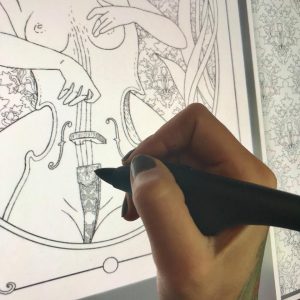
Now I look over my creation and take some time to add tiny detail and decoration. On this particular page, my characters are not wearing any fabrics nor ornaments, so my only decorative bits are the cello details. In some cases I like to draw very fine lines in the hair, giving it shape and volume that is almost realistic, but in this case the background is too thin and busy. If I add many new lines to the characters’ hair, It will be difficult to see its general shape. I chose to leave the hair on both girls nearly blank, with just enough lines to define its structure, allowing the colorist variation in coloring style. There will be many more characters in this book with very finely drawn hair.

Finally, when all is done, I create yet another layer to give my line work more definition. In these complex compositions with multiple layers of fine detail, I like to use lines of various thickness to make the design “readable” and not overwhelmingly complicated. I carefully outline my two main characters and the two tulips with a thicker liner. I take yet more time to slowly revise every single line at a very close zoom. This is the most important part of the entire project. Usually I leave it to another day. After having worked on this page for so long, it is difficult to see mistakes or imperfections. After I’ve been away from the image for some time, I review it again with a fine toothed comb. When I am satisfied that there are no artifacts, spills, or ghost lines, I fuse all my layers into one and save my .riff creation as a .jpg copy. I actually print the image on my layer jet home printer to make sure that on paper it looks exactly as it does on the Wacom. Looking at a printed version may also reveal imperfections that I failed to see on the glowing screen that I’ve now been staring at for days. If any final imperfections are located, I make the necessary adjustments, make more test prints until I am happy with the result, save my image as a PDF file, and it is now ready for publication.


I hope you enjoyed this little journey along with me as I drew “The Musician”. In a couple of months you will see it among several dozen other images in the new book flip-through.