
Regardless of how comfortable you get drawing complex objects and composition, it’s always important to practice and review the basics. Today I will be drawing three apples and I want to invite you to join me.
I am working in my digital program Corel Painter 18, using pencils and dry acrylic brushes. I am doing this digitally for two reasons. One, I am involved in a lot of digital painting projects at this time, and it’s the Corel brushes that I personally need to practice using. Two, I can take high-resolution screenshots. This way you see exactly what I see. Taking photographs of pencils drawings always introduces a level of distortion, depending on lighting and the angle at which the photo is taken. The principles that I am about to introduce apply to any style of drawing, however. You can achieve the same exact effects with pencils, pastels, chalks, watercolor, acrylic paint, oil paint, etc. I hope you join me on this little journey. So grab your paper and pencils and let’s begin.
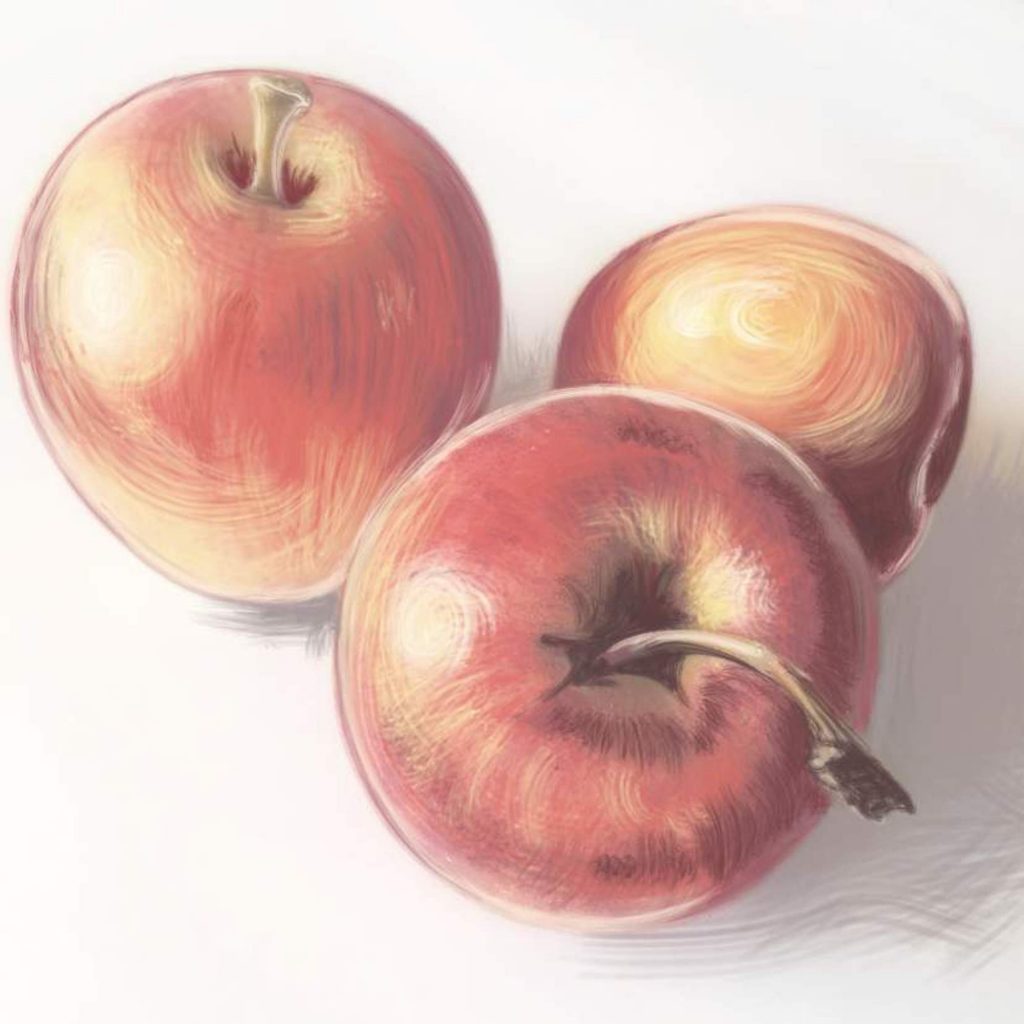
Ideally, the best way to practice drawing is to draw from life. I set up my three apples on the table. Because I am taking you guys along, and because I want you to practice drawing the same exact subjects with a fixed light source, I took a photograph of my apples. Feel free to save it, print it, blow it up on your computer screen. However you choose to do it, you should always have your subject clearly displayed in front of you as you draw it.
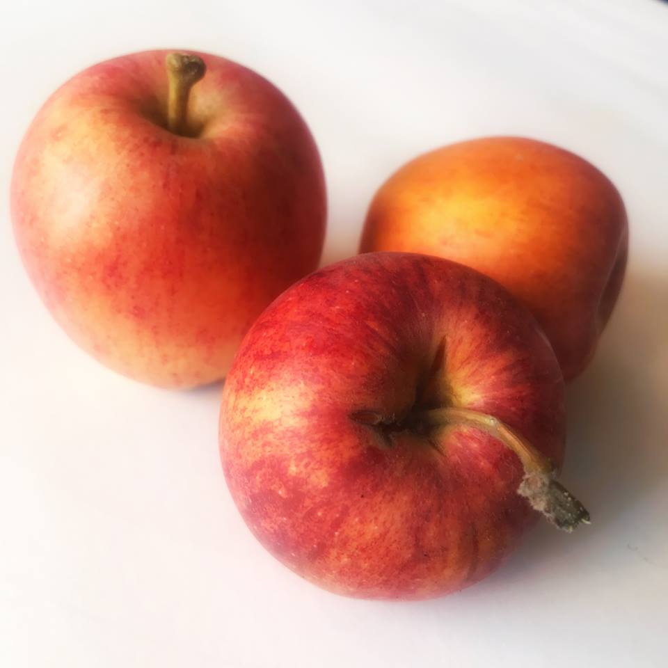
A photograph that I took especially for this exercise
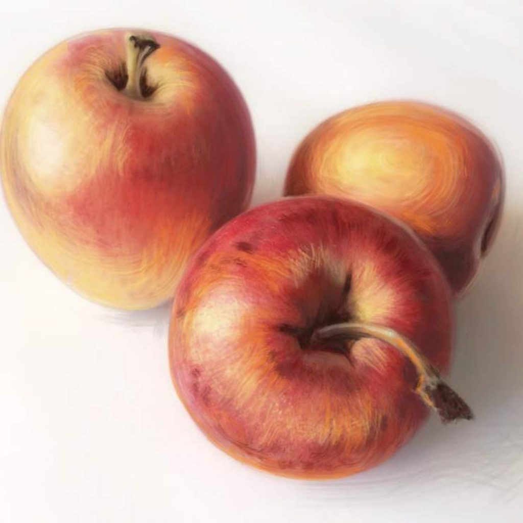
I will be drawing my apples in a realistic style with a touch of dry brush strokes. I want the final result to obviously look like a color drawing or a painting. I am not going for photorealism. Yet, I am aiming to have the apples look as much as the photograph in shape, color, and light as possible. I will not be adding elements of fantasy or caricature or any type of abstraction. I am going for mathematical and biological accuracy, depicted in a painterly style. You may choose a different drawing/painting style, ranging from simple sketchy illustration all the way to highly-polished photorealism.
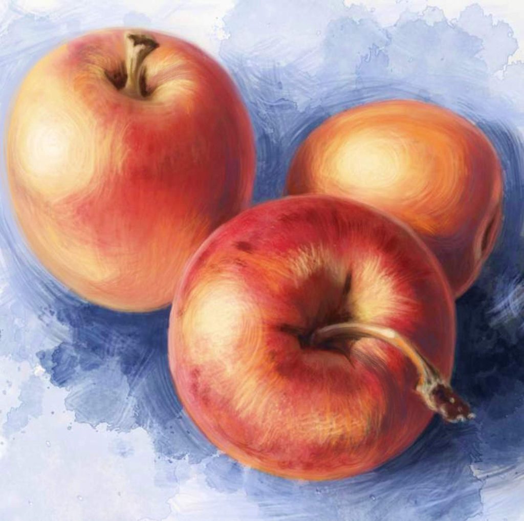
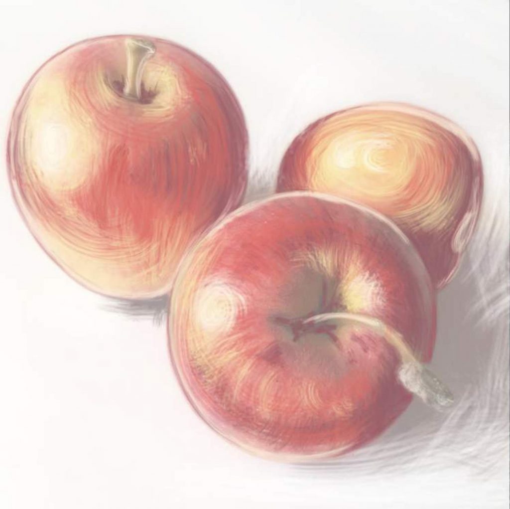
My finished drawing
Now that you have your photo of the apples and a blank page to work on, where to begin? First, we must observe what we are about to draw. Don’t rush to start sketching. Look at what you are about draw and decide what exactly you are depicting and why. In this case, we have three apples. Why three? We want to practice drawing an apple, and having multiple apples in one scene allows us to practice color, shape, and position variation in a single composition. Having multiple apples will also allow us to practice a little bit of depth perception. Finally, three is a great number for this exercise because anything more than three would be either too busy, too boring to work with, or so large a number that the subject would no longer be a few apples, but a pile of apples. The pile would become a single object, and we approach drawing something like that differently. Finally, when depicting multiple objects, it’s always good practice to use an odd number rather than even. Our eye just responds to odd numbers more positively. Odd numbers suggest natural randomness, while even numbers suggest arranged symmetry.
Inspecting this photo, we clearly see three apples, with one obviously in the foreground. I mentally mark my apples in order from more to least important. The apple closest to us the most important one to me. It’s in focus and it displays the most interesting details, like the imperfections of the skin and the little extending stem. This is the most valuable subject here and I will spend the most time working on it. The second apple is the one on the left. It also shows some level of detail and a stem, but it is slightly out of focus and is less interesting. The third is barely a spherical shape in the background. Its job is just to help set the scene and suggest space and distance. I will spend the least amount of time on it.
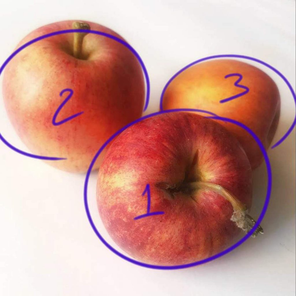
Assigning value to your subjects
Now that we know what we are looking at, what it means to us, and what we want to show our audience, let’s begin.
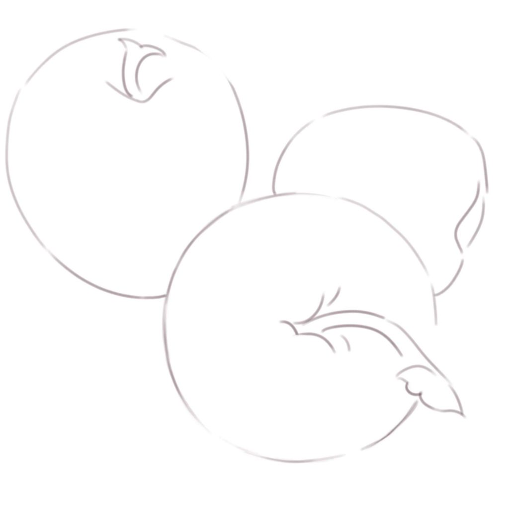
For many, it’s good practice to begin with a light sketch. Using a pencil or a piece of chalk, mark out where your subjects will be. Make sure to keep your lines very light, and barely visible. You want to be able to either erase or cover them completely as you proceed. Some may feel comfortable making only mental sketches, as I often do. But, it’s ok to actually draw your lines. Just make sure to not draw thick and defined outlines. There are styles that call for nice clean contours, but that is not what we are practicing here.
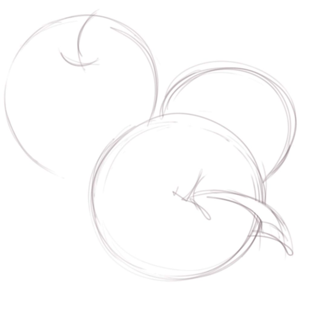
The sketch lines should be quick, rough and barely visible
Depending on your tool, style of sketching, and hand stability, you may sketch cleaner, simpler lines. It’s all very personal.
For the ease of presentation, I made the sketch lines a bit thicker and bit darker than I would when drawing. Working digitally, of course, I have the luxury of erasing the outline layer with a click of a button. When working with real pencils, do take care to keep the lines very light.
Personally, on something like this I do not use sketch lines. I go straight into building shapes with larger brushes. Selecting a dry acrylic brush and a neutral greyish-purplish color, I begin to roughly shape my apples by marking the darkest parts of the fruit.
First brush strokes
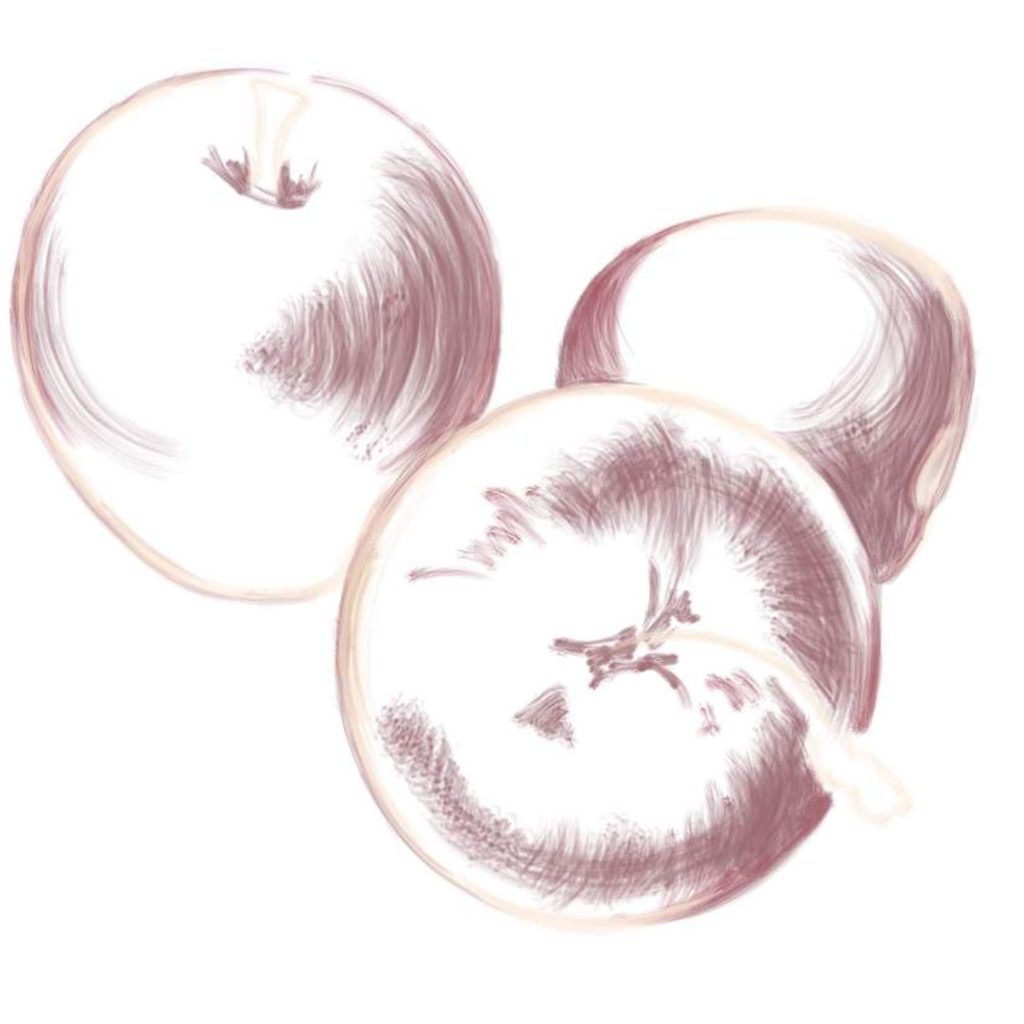
Still working with very rough and very casual brush strokes, I add more color to begin building my spherical shapes
When drawing from life or photographs, many people make the mistake of fixating on the tiny detail, and that is how they lose track of the whole picture. Examine the photograph once more. Do you see all the tiny specs and marks on the skin of the apples? To copy them all exactly as they appear in life would be madness. It would take a really long time, and unless you are going for some kind of a photorealism record, it would be completely pointless. After all, the photo already captured all that detail. In art, we aim to convey the feeling of the object rather than its absolute accuracy. How do you see these apples? They are obviously round in shape, they are vivid in color, and they are somewhat glossy in texture. That’s what we aim to depict. At this point, we are focusing mainly on the shape through the basic use of color.
I keep adding color while referencing my photograph. I also take a moment to roughly place the shadows to begin the three-dimensional feel
Layer by layer, I add more color, still using very broad brushstrokes
While you are building your shapes, it is important to be aware of your light source. It’s a good idea to set up direct lighting to create a fixed artificial light source that will introduce sharp and dramatic shadows. In this case, I took the photograph in soft, natural sunlight, but you can still clearly tell that the light is coming from up and left. I, therefore, make sure to place the shadows cast by the apples to the bottom right of the canvas. I also make sure to keep the lighter parts of the apples on the left and the darker on the right.
Always keep your light source consistent
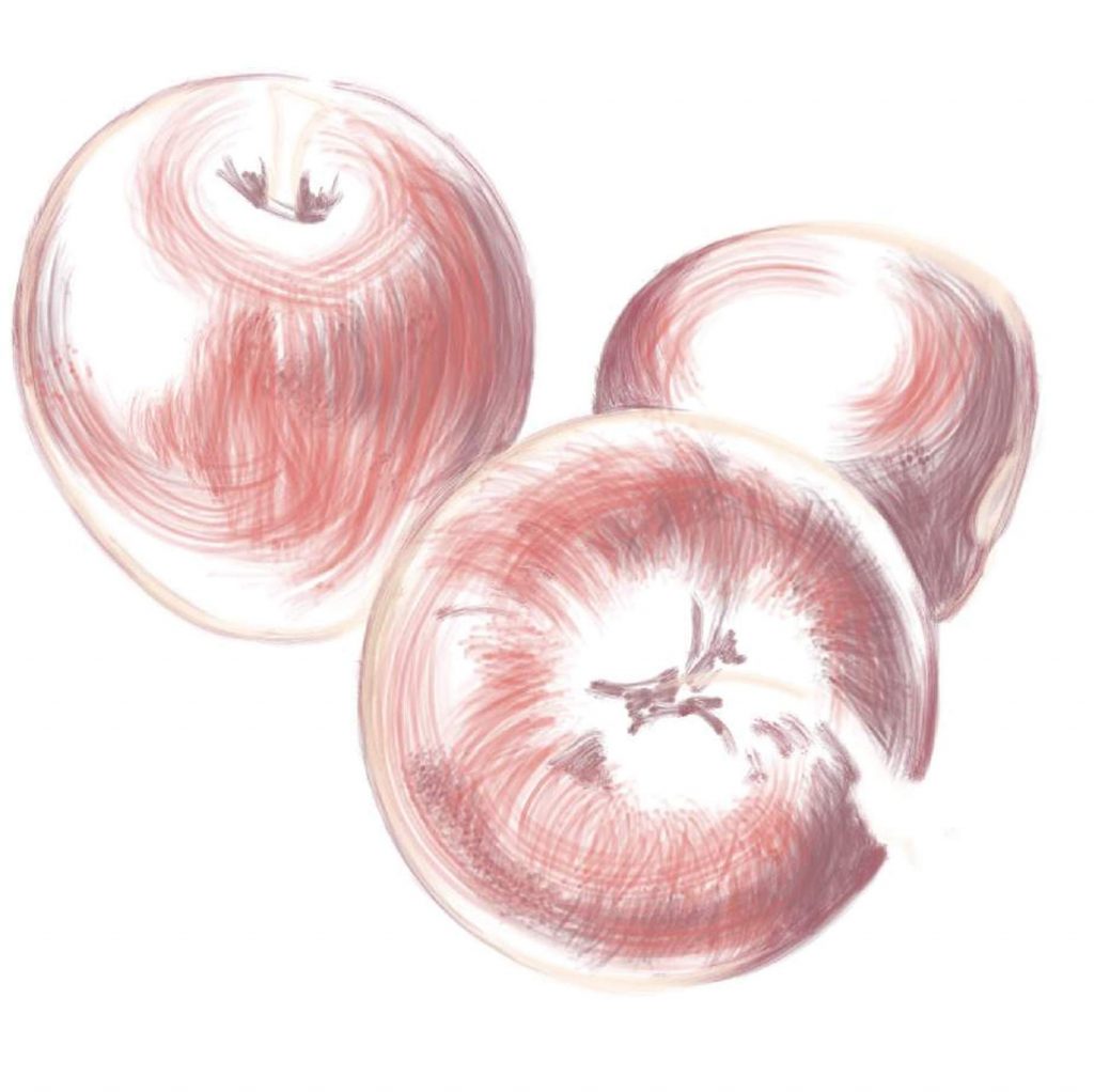
At this point, the composition and the light source are pretty well established and I can proceed to the fun part – the detail. Now, there isn’t that much detail in apple painting, but we can still have fun with color and texture.

I now use smaller brushes to clean up the edges and to introduce detail to the stems and the skins
I keep adding minor detail to my number 1 apple
At this point, you may have noticed that I am paying a lot more attention to my number 1 apple while leaving 2 and 3 more imperfect. Note that I did not give clean edges to my fruit. Apple 3 barely has an outline at all. This is softer on the eye and a lot closer to how we actually perceive objects in space.
Now onto the really fun part – a bit of artistic expression. I am happy with the level of detail on my apples and I want to make them stand out more, so I am adding a splash of blue to the background. Here I switched to watercolor effect. On paper, you can use real watercolor to achieve a similar result. I am a huge fan of mixing media.
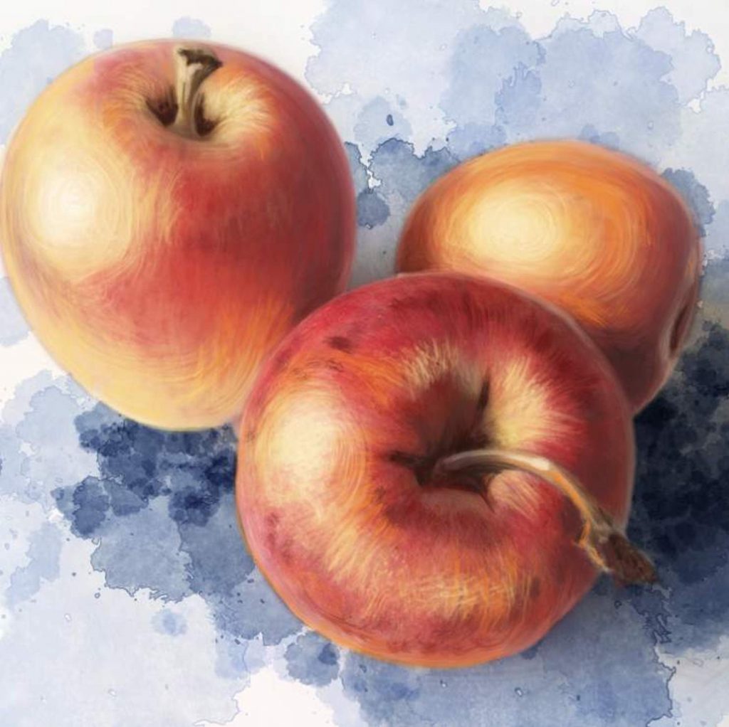
I experiment with color in a different medium
Our eye tends to see shadows as slightly blue. You may notice a touch of a bluish hint in the photograph. This is why I chose blue for my background. Also, blue really makes those red apples pop. The contrast of blue and red todgether makes both colors appear brighter than they really are.
I keep working with my dry brush to smooth out the flat background
While working with my somewhat abstract background, I still follow the rules of light and shadow. I do not just blindly place blue watercolor splashes behind the apples. I make sure that the blue is darker where the shadows would be darker in real life. Finally, I smooth out my watercolor layer with more dry acryslic work to really bring the whole composition together. I am almost happy with how this looks.
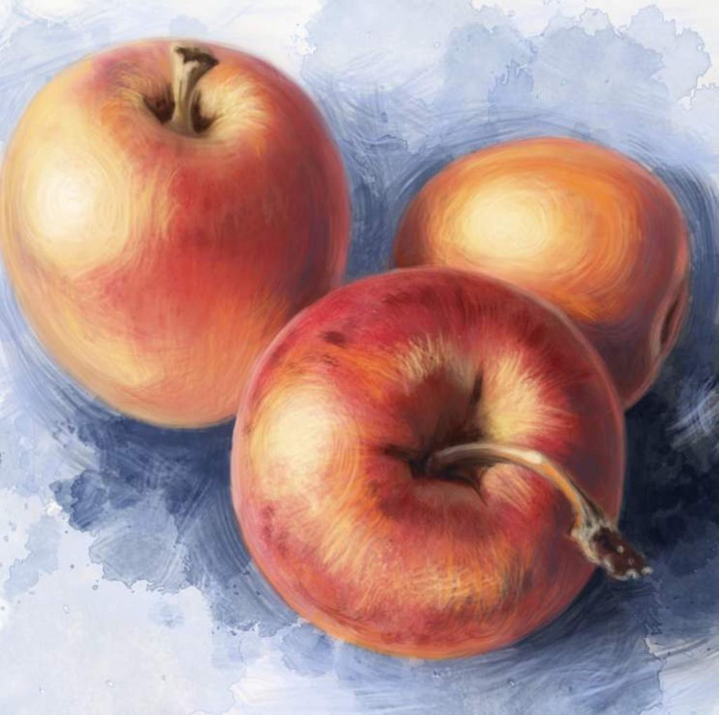
Applying final touches
I switch back to the large brushes and go over the whole picture, adding a bit more color and contrast. I notice that while my light source is strong and consistent, the apples will look better with their stems casting shadows. Now in the photograph, we do not see clear shadows cast by the stems. That is because the light source was too soft. I made my light source a bit sharper in this composition and I want to enhance it even more. I add the shadows that I cannot see in real life but that I know will be there if the light source is inhanced. Now I’m happy.
It is important not to overwork your piece. I can keep painting this for many more hours, perfecting every little blemish on the fruit surface, and making the stems hyperrealistic, but that is not what I set out to do. When I look at this painting, I cearly see three very vibrant apples. I can imagine the sound that one of them might make when I bite into it, and the sound another might make if I drop it on the floor. These apples have clearly defined shapes. You can tell that they have some weight to them as they seem to be rolling off to different sides. They are a little bit reflective, therefore probably very smooth to the touch, and they are very bright, made even more so with the introduction of that beautiful blue. I call this a success and I will leave it at this.
Now it’s your turn. Grab some apples, or eggs, or rocks, and start drawing. I will be posting some photos to work from in my Facebook group, TALM. Please feel free to drop by, grab some photos, and post your work in progress as well. I hope to see you there.