Today, I will be digitally painting a still life, concentrating on composition, multiple light sources, reflective and transparent surfaces and light as its own character. I will be working in Corel Painter 18 with mainly acrylic brushes. As always, I invite you to join me and try something similar on your own time. You can apply the principles that i am about to show you to both manual and digital painting.
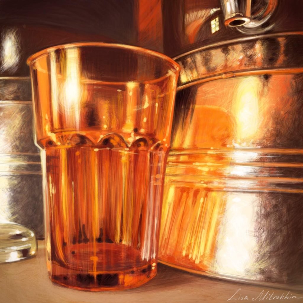
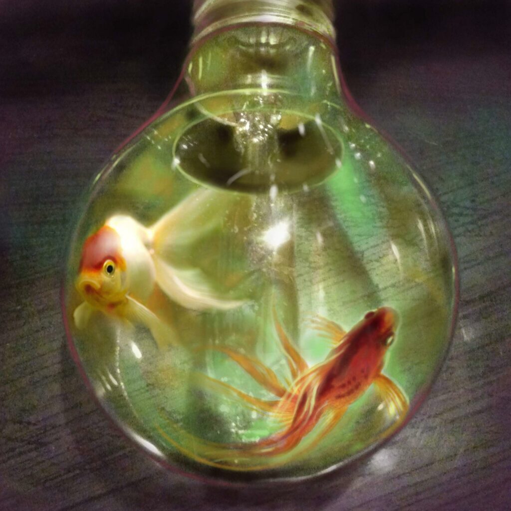
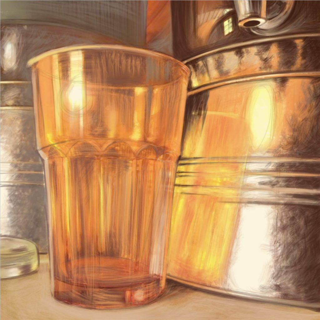
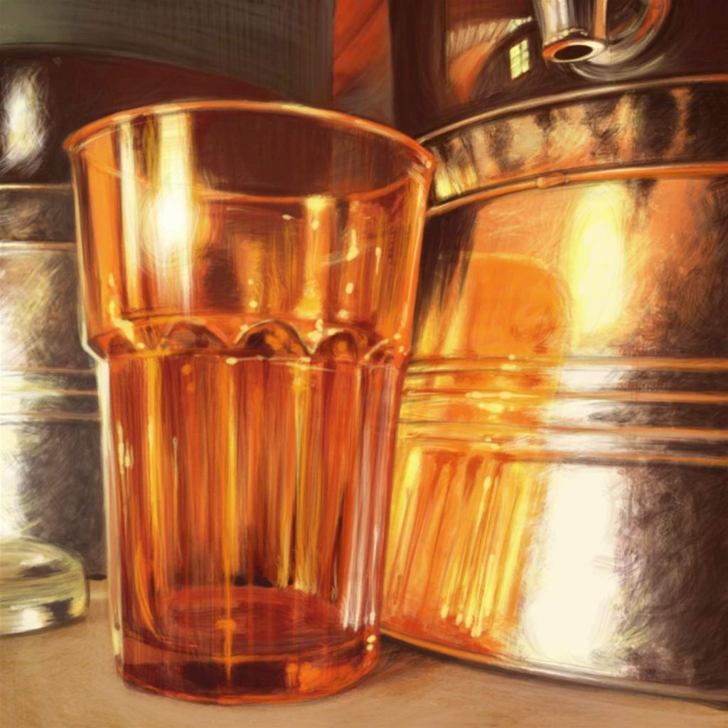
The final painting
Interesting still life subjects
The first and most important thing in still life painting is, of course, selecting interesting subjects to depict. But what makes subjects interesting? You may think that that you need fancy trinkets or exquisite bouquets of flowers to paint a beautiful still life, but you would be wrong. The only thing you need for a gorgeous composition is interesting lighting and a good vantage point.
In fact, simple, everyday objects, often make the best compositions because most viewers will be able to relate to these things. If you do your job right as an artist and depict an ordinary object in an extraordinary way, that magic that you envelop your subject in will remain with the viewer for many hours, days and years to come. The next time they see a broom or a set of keys, or ordinary drinking glasses they may just see them in the same magnificent light that you introduced in your depiction.
Searching for a better angle
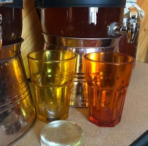
For my ordinary subjects, I chose to work with these colorful glasses. There is nothing special about them. I have one of every color in my kitchen. I chose only the yellow and the orange, however, because the day is very warm and cheerful, and there is gorgeous golden sunlight coming in through all the windows. I place my two chosen glasses near some other interesting reflective surfaces and begin looking for a fun angle to view them from.
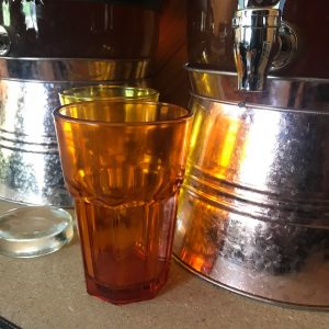
I took some photographs of my subjects from different angles solely to illustrate the process of seeking the perfect composition. I highly recommend that you do not draw form photography but rather from real life. Set up your subjects, set up a drawing or painting area nearby, and paint the three-dimensional objects that you actually see, not a photograph of these objects. Once you are comfortable painting from real life compositions as well as from memory and imagination, you may use photographs for reference, but the process then will be very different than just copying the photo. For now, let’s work with what we actually see.
After moving my subjects around a bit, and myself shifting around them, looming over them and kneeling to look up at them, I finally find an angle that is the most interesting to me. From this vantage point, down on one knee, the yellow glass becomes completely obstructed by the orange one giving it an extra burst of color. I really like this effect and will go with this composition. In a photography course that I am taking, I learned that most subjects become more interesting when photographed slightly from below. I will apply that principle here and situate myself slightly lower than my subject. Relocating the subject to your work station is of course also an option, especially if you have great natural lighting in your room or studio.
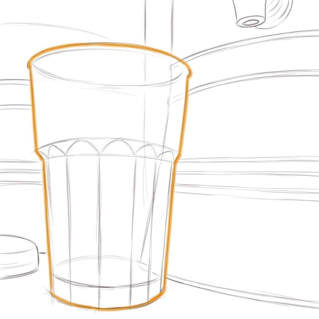
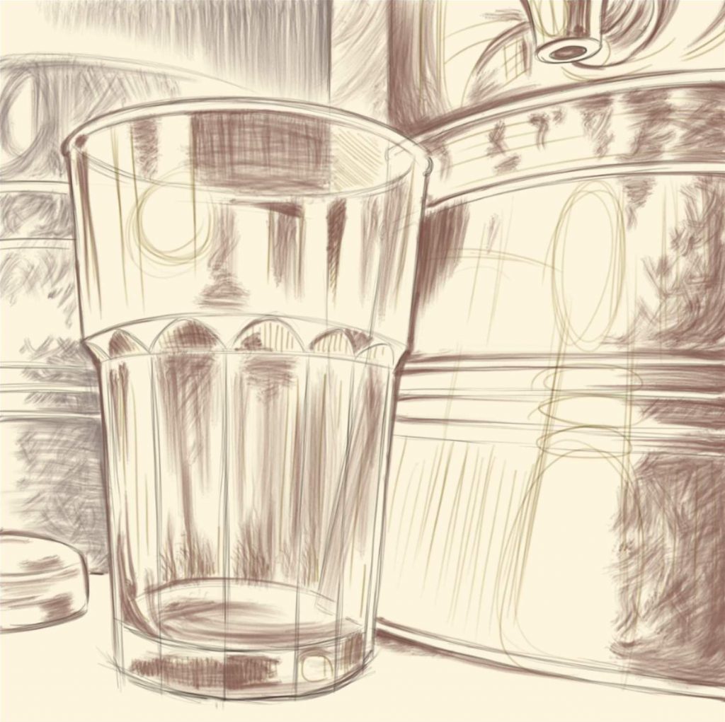
As always, we begin with a rough sketch. This is the composition that I finally decided to capture. Working in my digital painting program I create a square canvas and begin sketching the scene that I already cropped in my mind. I am only interested in the composition and the simple structure of the objects at this point.
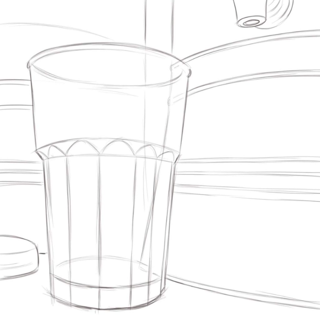
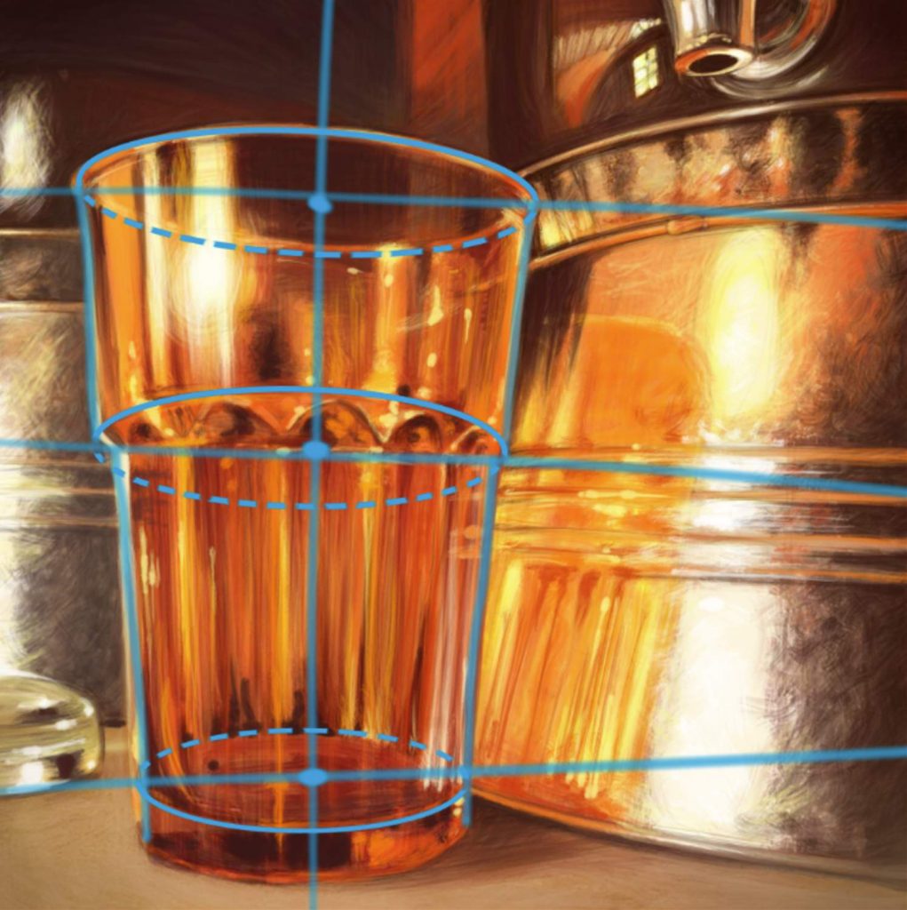
When drawing geometrically accurate and symmetrical objects it is often tempting to use guides, rulers or a compass when working both digitally and analog. I strongly encourage you not to fall into that trap. We are not creating a blueprint. We are depicting what your eyes tell your brain to perceive. We do not see perfect lines. We see concepts. Here, from where I’m sitting, I see a glass that is slightly warped by perspective. I will sketch it exactly as I see it, and if it comes out a little bit crooked it will be received even better. There will be an element of imperfection, of cuteness to it.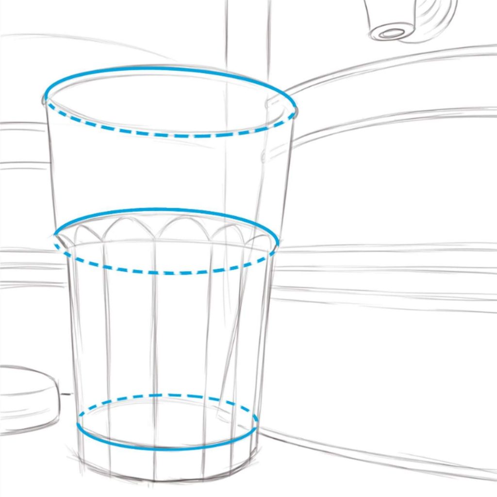
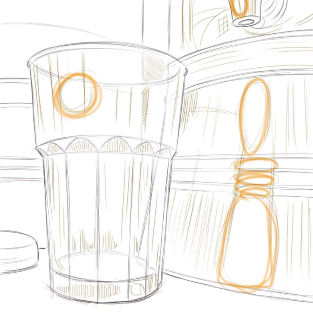
Because I am working in a digital program I can apply geometry to my sketch AFTER it is done just for the sake of demonstration. Notice that while my glass appears to have realistic proportions, it is slightly inaccurate. The three virtual ovals are not exactly parallel to each other. Yet, they are not randomly placed either. From where I’m sitting the glass looks almost like it is slightly curved. I want to exaggerate it a bit to give it kind of a cute sense of grandeur.
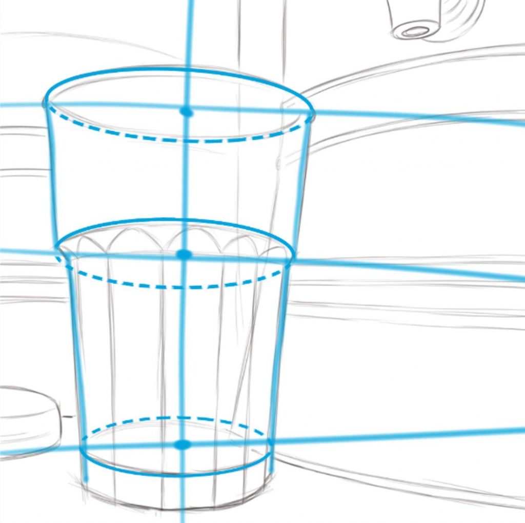
For the sake of demonstration, I will apply a virtual grid so that you can see that the perspective lines I have created for my glass are not perfect, yet consistent. Had I applied the grid to begin with and used the circle tool to create perfect ovals, my glass would have looked too graphic and unnatural. I do not wish to create a graphic design. I wish to create a painting.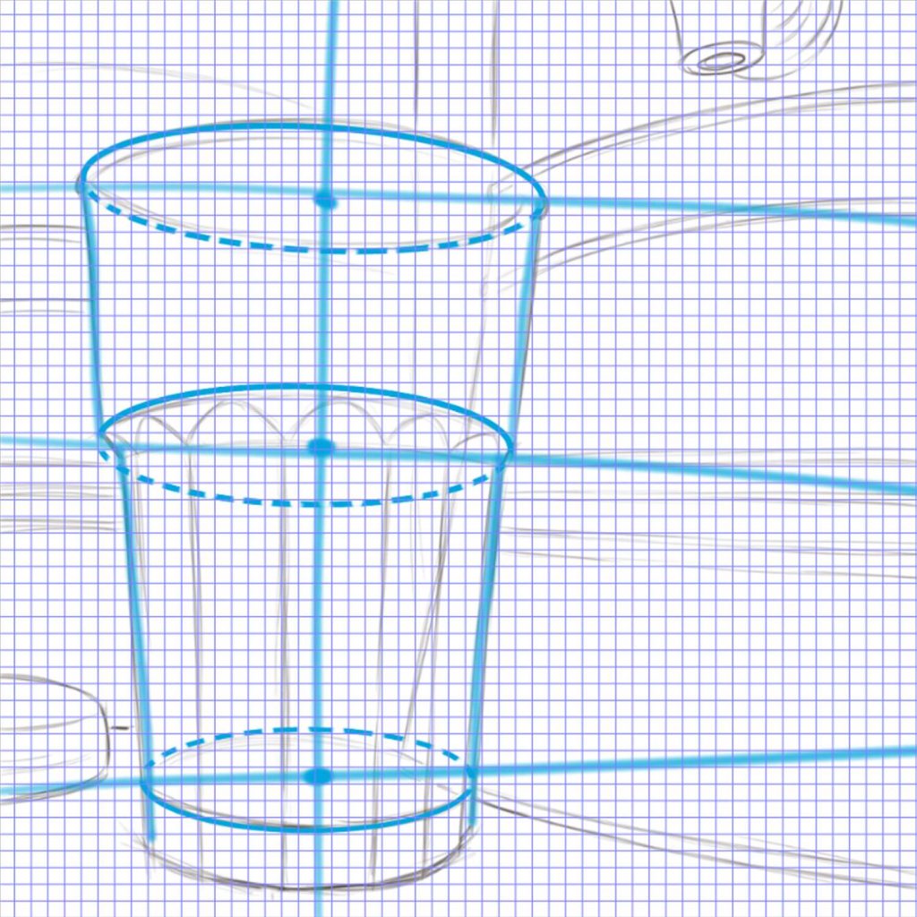
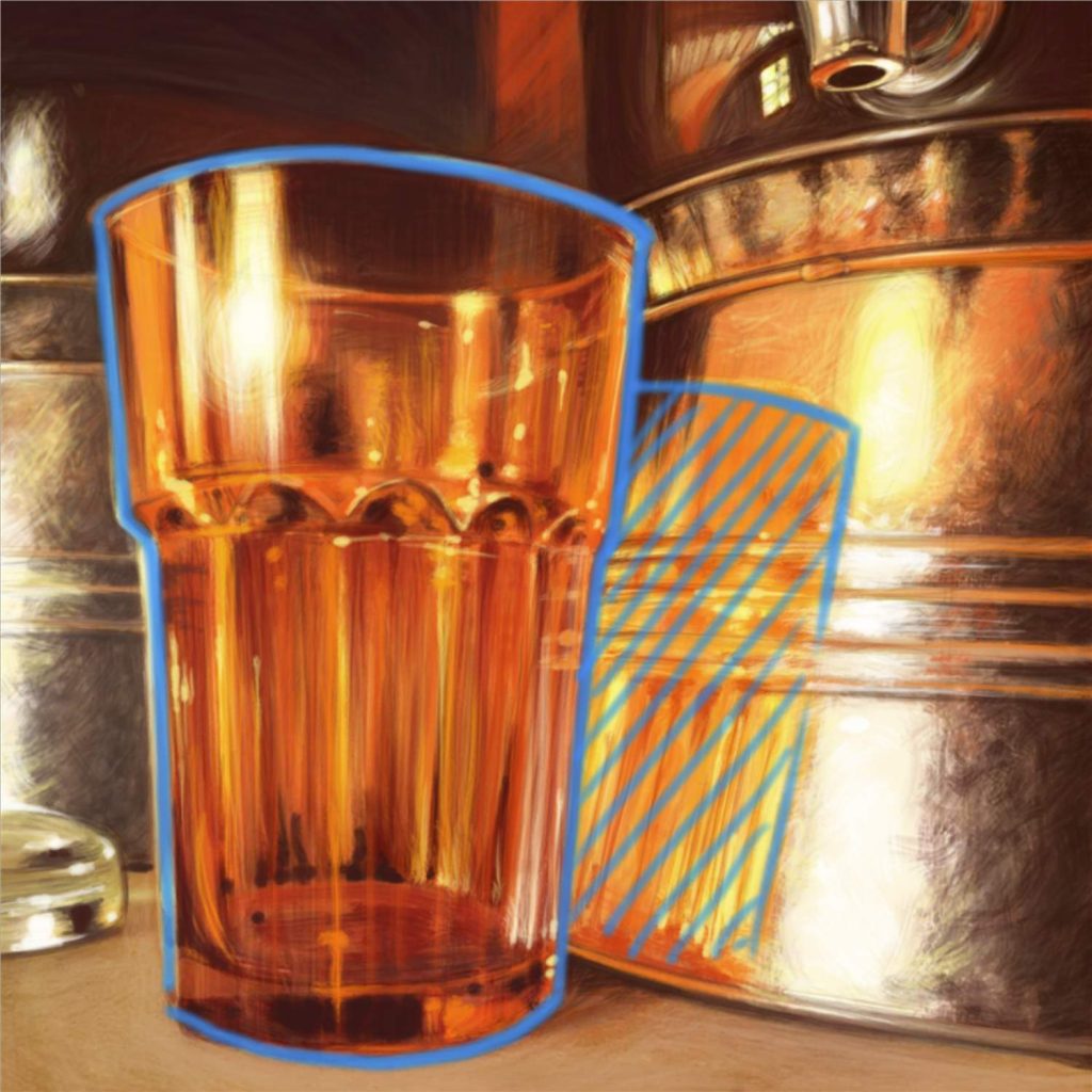
I remove the grid and continue with my free-hand sketch. It is important to keep your composition simple and readable. Mine consists of three main layers/subjects. The first and most important layer is, of course, the glass itself. It will receive the most attention to detail as I paint it.
The second most important layer in this composition is the lovely reflective metal and a little glass weight that I have laying around. They are there to demonstrate space and depth of field. They create the scene for our glass. They will receive a lot of attention, but they don’t need to be quite as polished in the final draft as the main character.
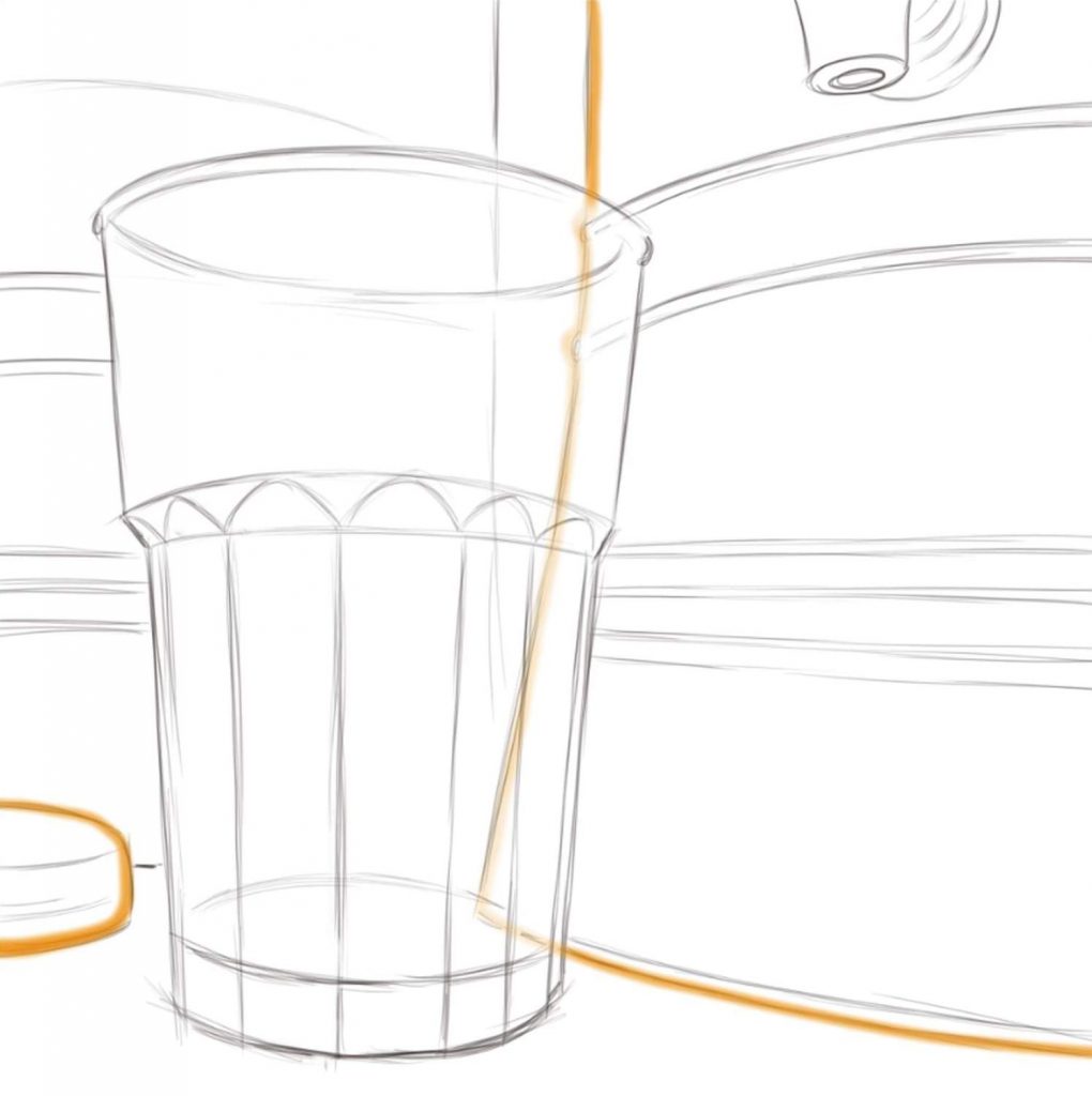
Finally, there is another object visible in the background. It is not very importanyt in terms of detail or even focus. It is pretty much a backdrop. It will receive the least amount of attention.
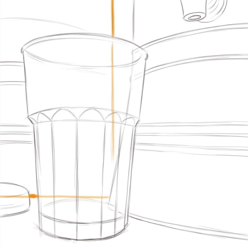
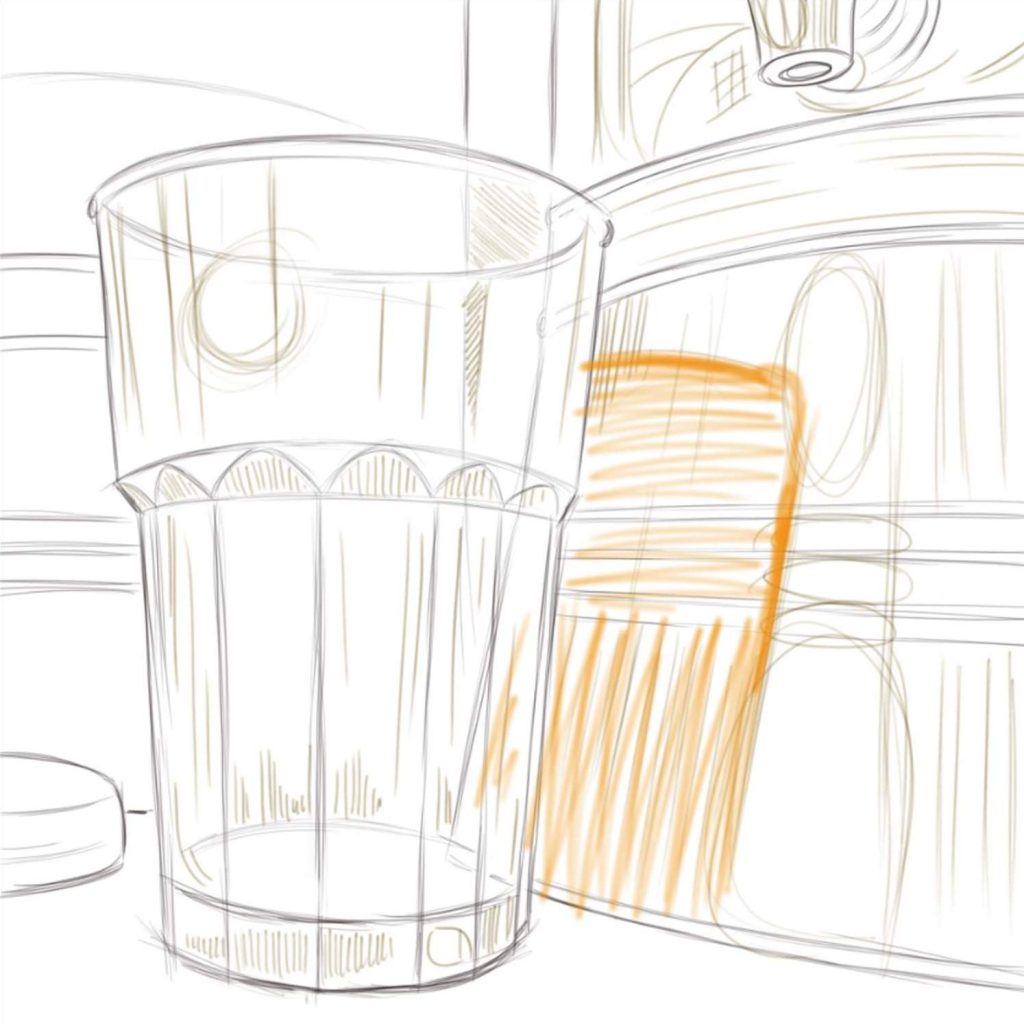
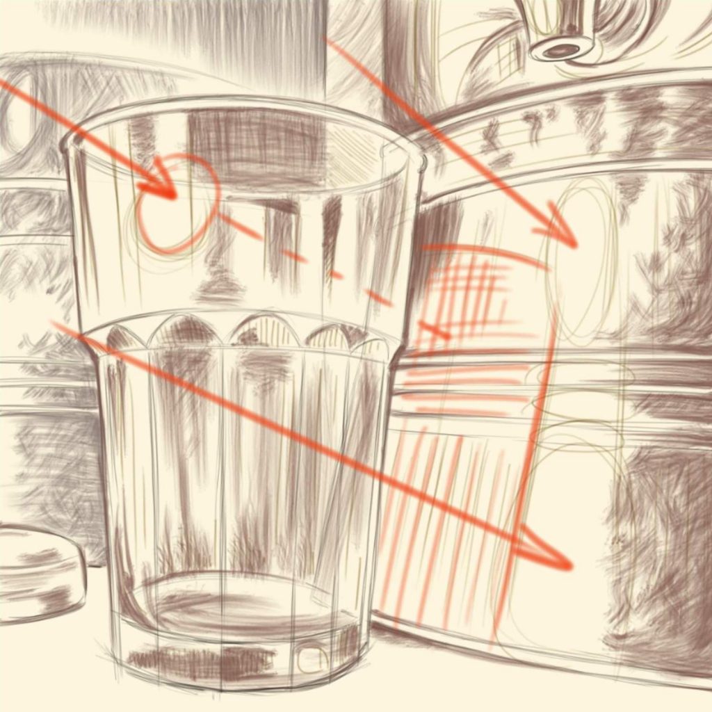
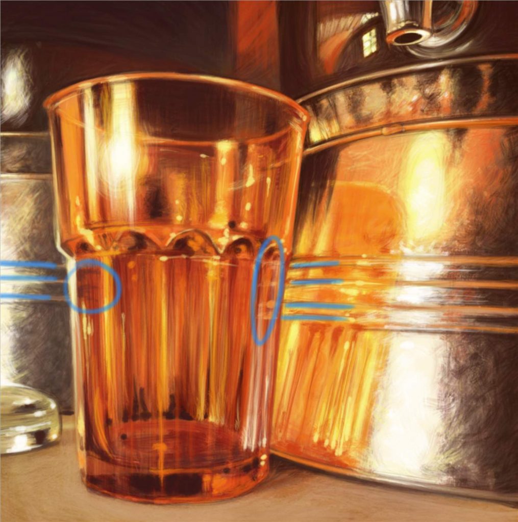
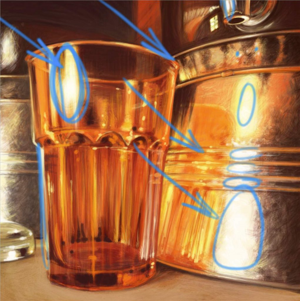
Now that I’ve established what I am depicting, I begin adding little structure lines to my most important subjects to begin building their shapes. At this point, I am also marking the lightest parts of my subjects, the brightest glow that appears on their surfaces.
Inspecting my still life I realize that light is as much a character in this scene as the objects that it illuminates. In fact, it is really the sunshine that I am painting with the help of these objects. I’ve marked the potentially lightest parts of painting as a demonstartion for you in this graphic.
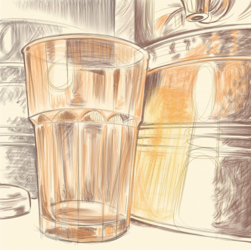
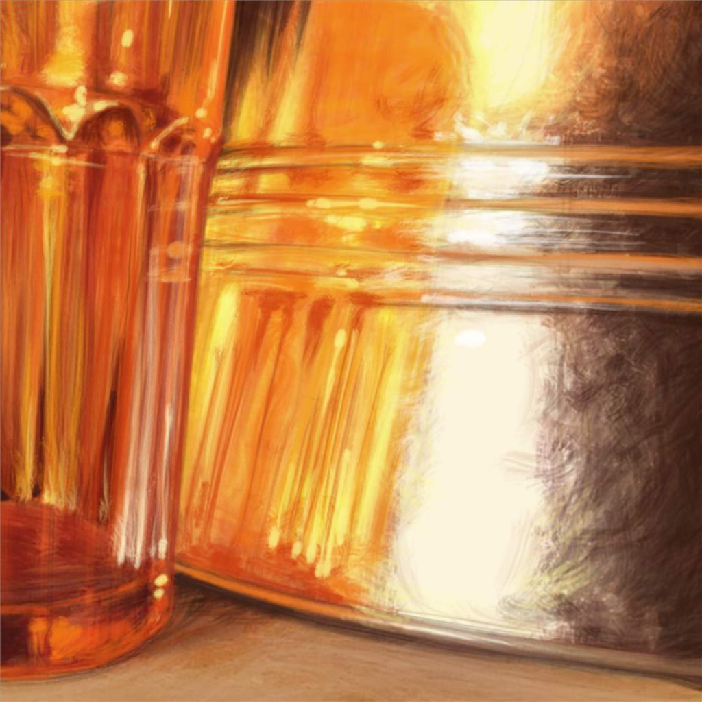
Since light is now a character that we are depicting, I shift my attention to the beautiful orange and yellow glow that is cast through the glasses onto the shiny metal. The glass in combination with this delightful artifact now become my main subjects.
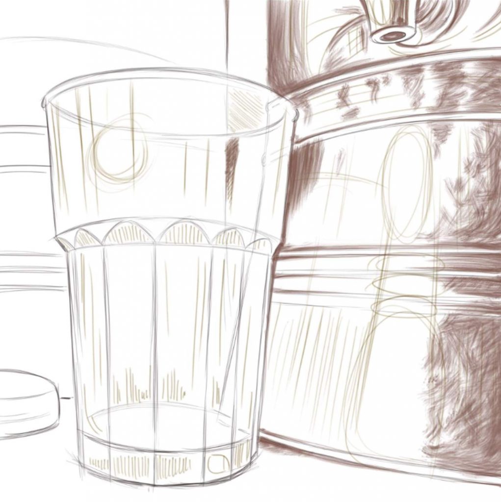
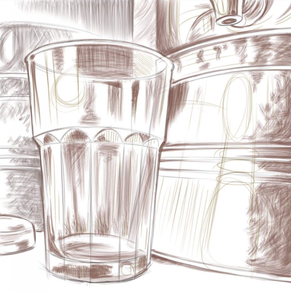
Now that I have the scene built, I prosede to apply rough brushstrokes to the parts of the objects that look the darkest to me.
This will take a while, especially if you are working with pencils. This light technique, however, is ideal for brush painting with acrylic or oil paint, or the digital equivalent of the two.
At this point, I realize that I actually prefer to be working on a tonted background. Thankfully, I an drawing digitally, so I can simply add a cream colored layer underneath. When working on actual paper, I recommend that you start with tanned paper, or prep your paper by paining it with a base layer of a ligt cream color. However, working on a pure white background is not a problem at all. Starting with a bit of a tone is just a way to speed things up a bit. If you have a way to add pure white as final details, try tinted paper.
Keep an eye on your light source. If it is artificial light, it will remain constant. However, working with natural light, you do need to get all the light information down on paper as quickly as possible, becasue eventually, the sun will rise or set and your light source with shift.
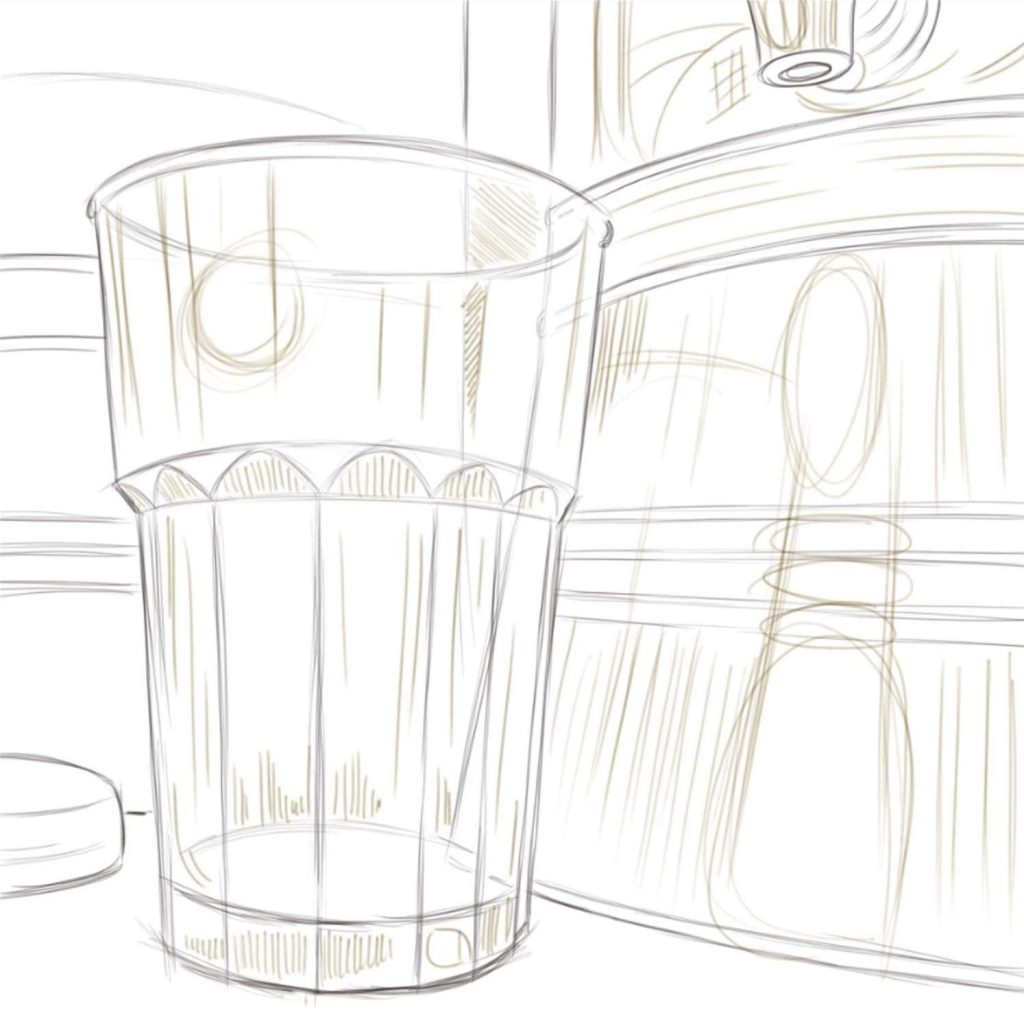
Becasue this image is all about light and color, I don’t spend much time on shading and building up details. I start introducing color right away. My glass is actually orange in color, so I introduce orange. The orange gets reflected in the tin behind it. Remember that yellow glass that is hidden behind the main object? I see that tone reflected in the tin as well. These are points of interest. They are the colors I will continue to build up.
A common beginner mistake is to focus too much on individual details and lose track of the bigger picture. Don’t worry about all the little light artifacts on the glass at this point (unless you are working with watercolor. That technique is completely different from what we are doing now) Instead, start giving your objects shape by building up shadows and adding more and more color where you actually see color. I like to use a softer digital brush to add faded soft grey shadows to my background layers.
Always look at your subject. Your eyes should be going up and down between the composition and the page all the time.
Continue buidling up shape and color by applying dabs of paint all around your composition. Do not fixate on one part yet. Pay a little bit more attention to the objects in the foreground, keep your brush strokes broader and messier on objects in the background, and build and build your composition up.
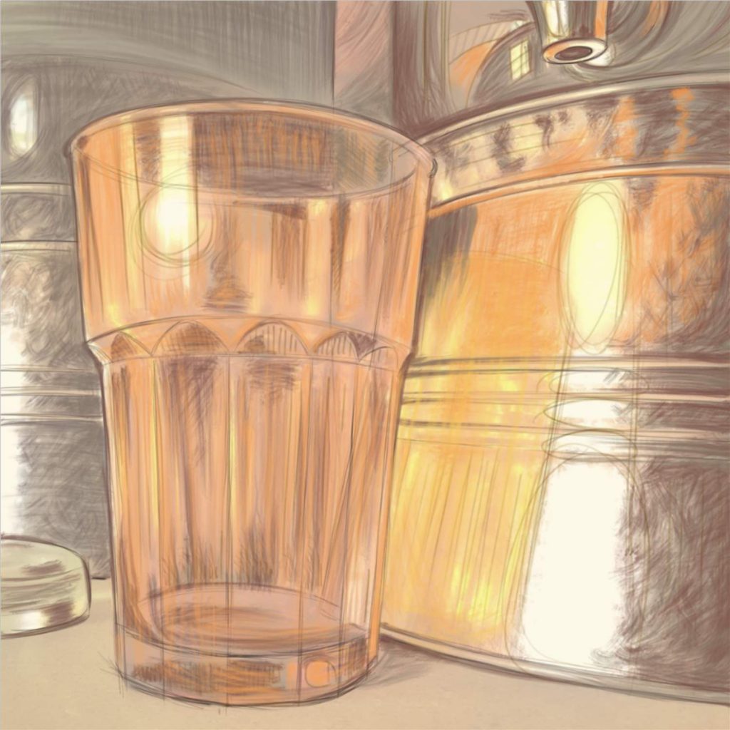
I like for my paintings to get gradually brighter and more sturated, rather than go staright into strong colors. Whether working manually or digitally, I create many layers of paint, each a little bit more saturated, each a little bit more defined.
I continue to add detail with each layer.
Adding darker brush strokes here and there helps define the shapes of the objects.

To make the dark parts appear even darker, I add more contrast with light yellow and near white highlights.
Now I have enough information to start adding the little artifacts of light that I see on the surface of the glass. Little dots and bads here and there that suggest glitter and glow.
These do not have to be exact. Nor do they have to be exactly where you see them in real life. When I zoom in a bit, you can see that my brush strokes are by no means flawless, and you have no way of knowing if every dab of white and yellow that I have depicted here really corresponds to what I see on the objects, but it feels realistic. It is believable. That’s the goal of this kind of painting, to convey a recognizable scene.
I always continue studying my subject as I paint it. The glass is thick and colorful and it’s easy to overlook that it is also transparent. Not very obviously trasparent, but some lines can be seen through it. I add the necessary transparency suggestions.
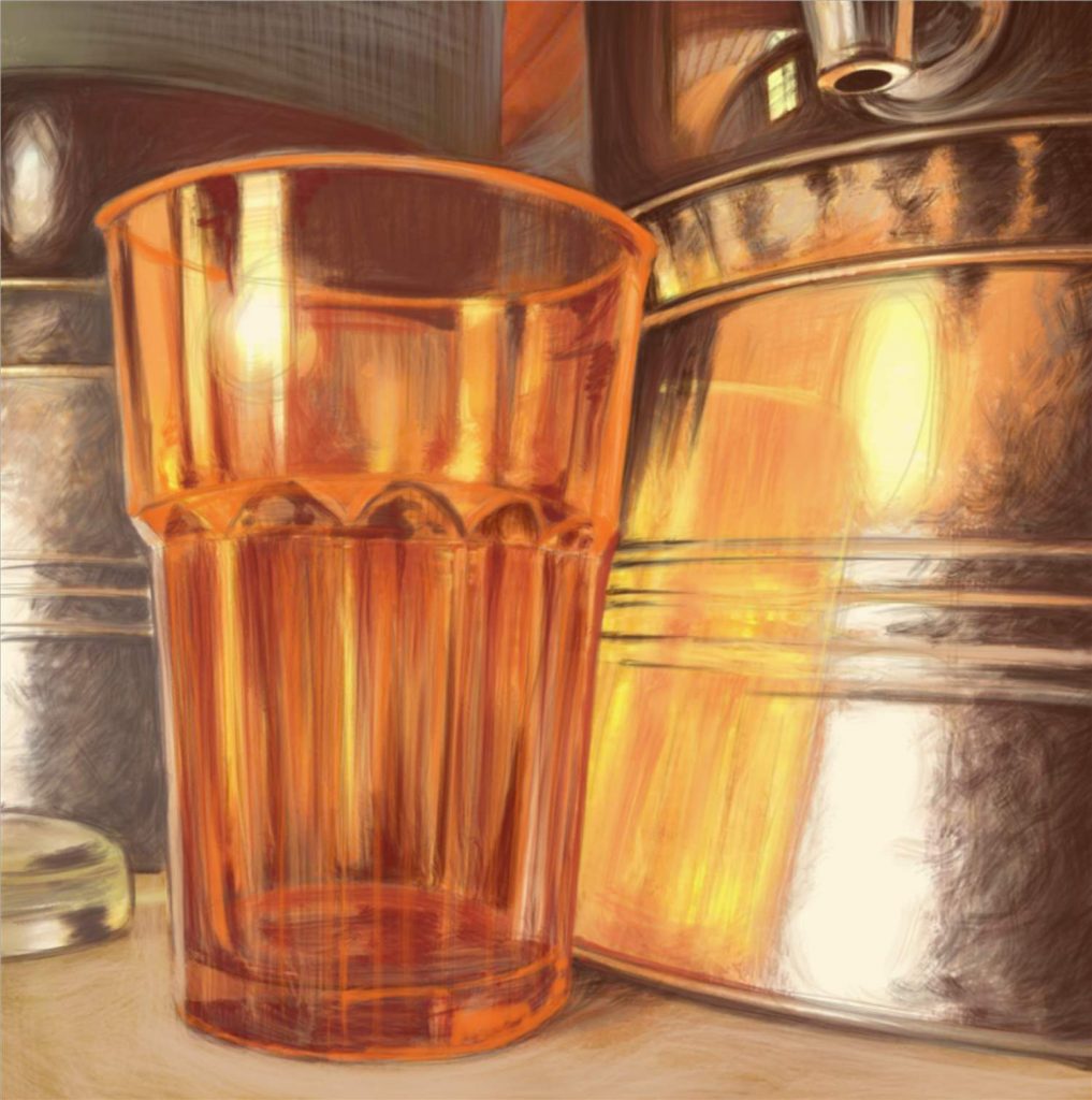
As I am nearing the completion of my painting, I check my light source. It is still coming from the same direction (from up and left). As this is morning light, I notice that the angle of the sun has changed a little bit as the day progressed, but not significantly enough to change what I see. I check my lightest spots and confirm that they are consistent with the current light source.
I check my main subject and its colorful shadow artifact. They are indeed the brightest and most interesting parts of this composition and appear to capture the natural light quite beautifully. If anything feels awkward or uneblievable at this point I tweak it without referencing the still life. Remember, this doesn’t have to be 100% true. We are more inetersted in the feel.
Now that we are nearly done, let’s revisit the shape of the glass. Remember those perspective lines I drew earlier? The vertical is a little bit curved and the parallel ovals are not exactly parallel. I chose to make this glass a little bit warped, and not 100% geometrically accurate. Looking at my painting now I am very pleased with the trick that this warp plays on the eye.
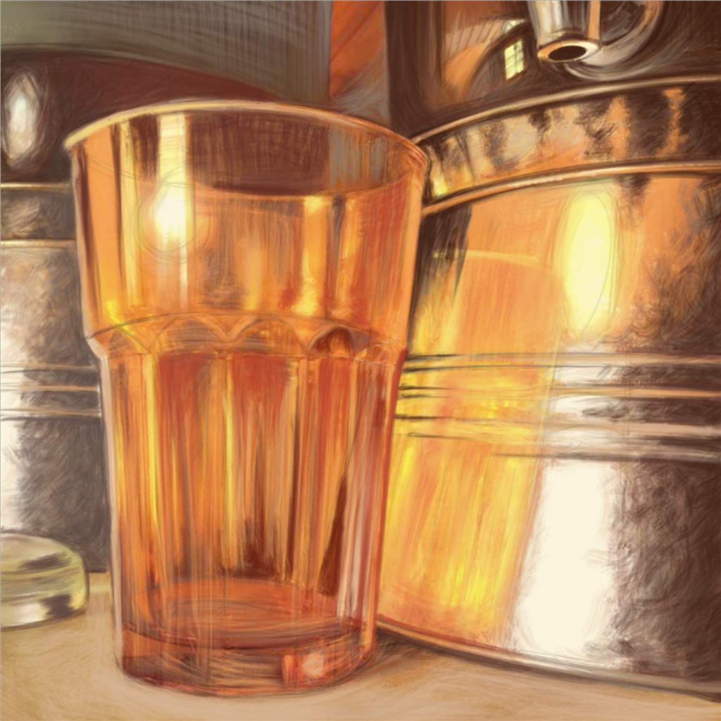
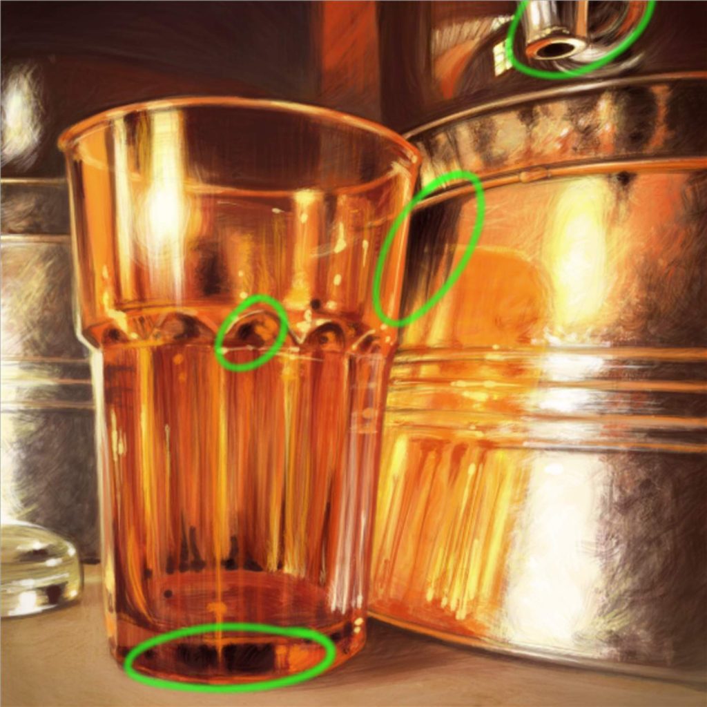
For the final touches, I use pure black to really bring out the darkest parts of the painting. I only use a few brush strokes, and only in the areas indicated here with green circles. This step is optional. I actually debated doing it for a few minutes. I like the soft, fuzzy look that I already achieved, but in the end, I chose to add just a touch of sharpness and higher contrast by introducing a few dabs of pure black.
I call that complete. I sign my work, and save my file.
I hope you enjoyed creating this digital painting with me. This tutorial was a result of several requests from my fans on Facebook. If you enjoyed this painting process and would like to see more, please don’t hesitate to propose new topics. Come join me on Facebook at my personal art group TALM – The Art of Lisa Mitrokhin, and tell me which art techniques interest you.