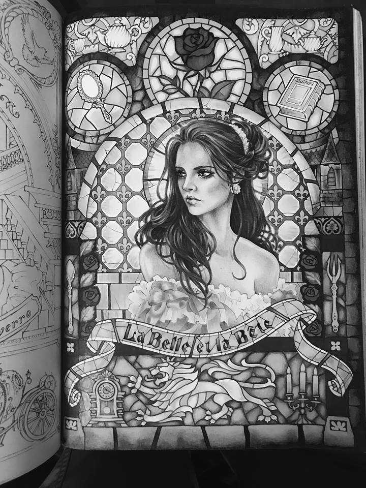
It is a rare occasion when I approach a coloring page with only minor or no alterations at all. Usually I add my own characters or even rearrange or remove some of the existing lines or patterns to create my own scenes with my own back stories. This page in my favorite coloring book by Takumi, however, is perfect the way it is. Not to mention it has hardly any space for additional characters.
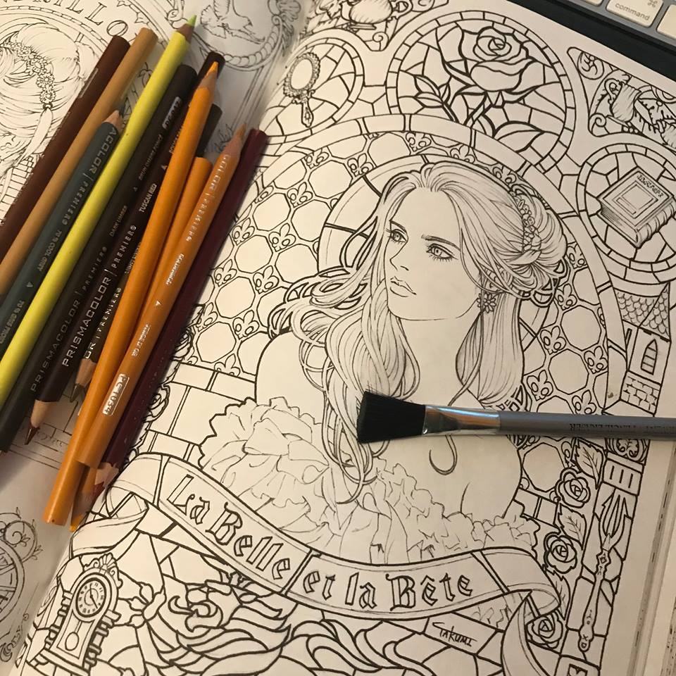
I decided to take you along on this coloring journey of Takumi’s Beauty, from Beauty And The Beast.

This is the original page. By the end of this journey you will notice that the delicate alterations I will impose on it will be minor, especially compared with my other coloring projects.
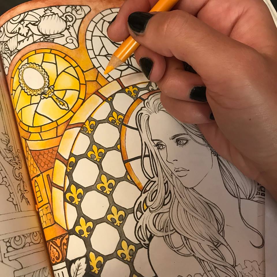
I don’t believe in pencil brands, but I do have my favorites in the towering piles of mixed and matched pencils, that occasionally collapse onto my work space and get pushed away with as a sweep of an arm. I tend to favor softer pencils that lay onto paper, colored or otherwise, almost like pastels, or oil paint. I decided to start with the background. I want it to be daytime and I want the stained glass window behind Beauty to be vibrant in color, but light in atmosphere. I begin with a soft grey.
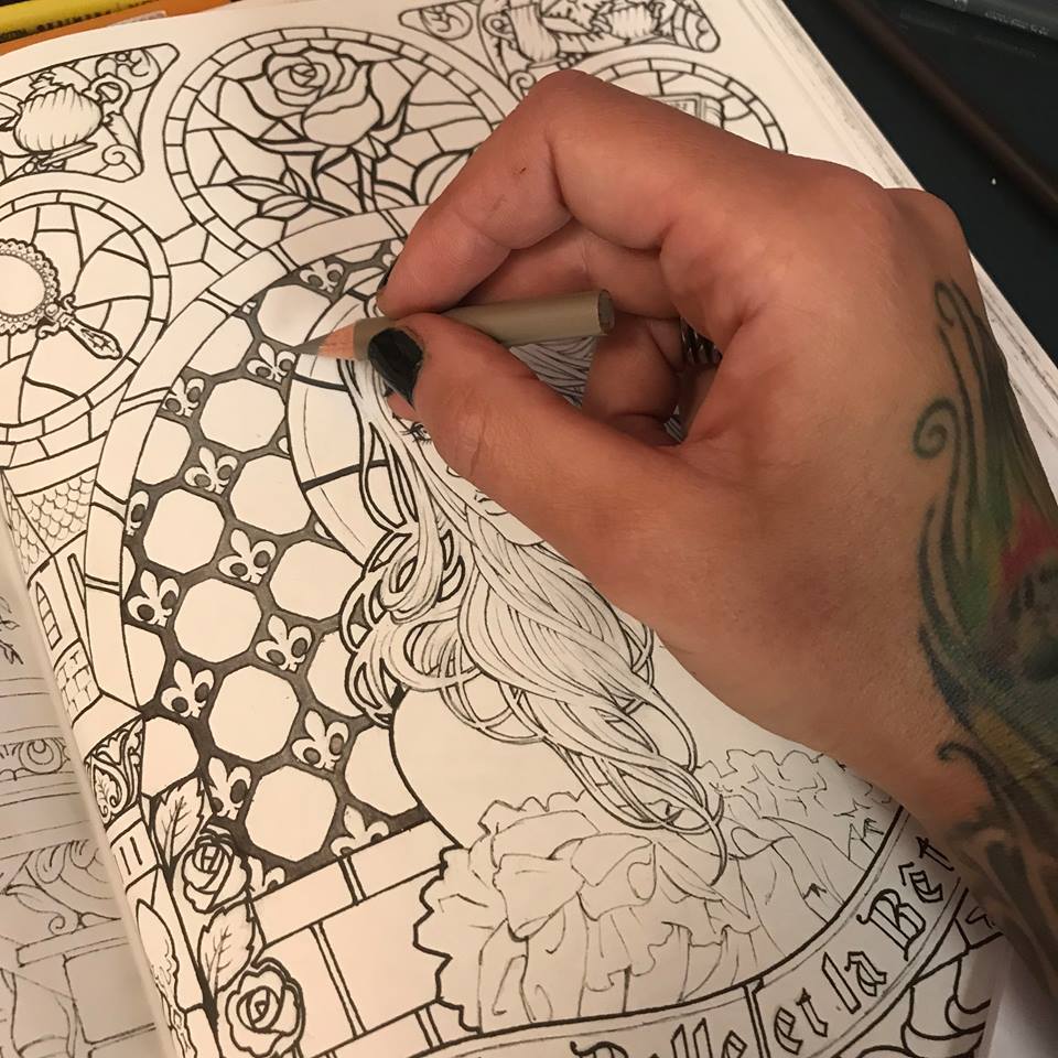
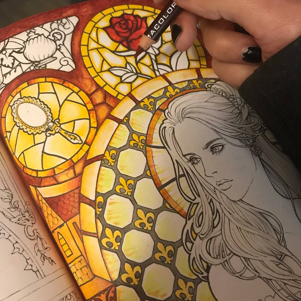
I now have a vision of what my stained glass window will look like. I imagine amber tones that are darker at the edges and golden in the center. I lay down a layer of auburn brown, kind of a middle town to my amber effect.
I proceed with a the brightest, most sunshine-like yellow I can find in my piles of art supplies, and I introduce the most vibrant tone of my honey glass.
I contrast it with a deep burgundy, beginning to establish structure and give my glass some body.
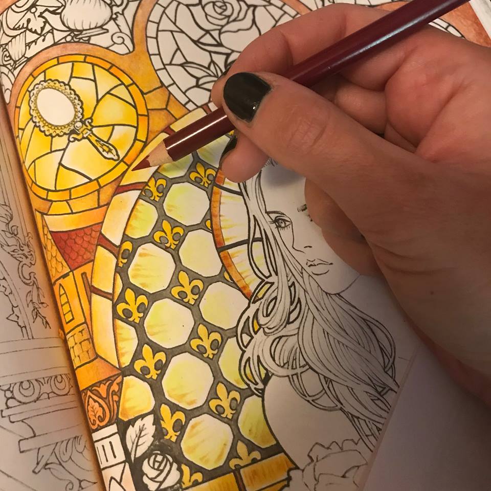
I use the same burgundy to begin the rose.
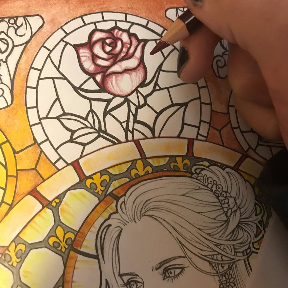
Here’s where having soft pencils comes in handy. I now use a light red for my next layer of the rose, using the pencil itself to bland the burgundy and create a nice gradient. In this particular case I am using Prismacolor pencils.
I find a deeper burgundy yet and add some more contrast to the rose. I want that light red to really look like it’s glowing in contrast to the darker reds.
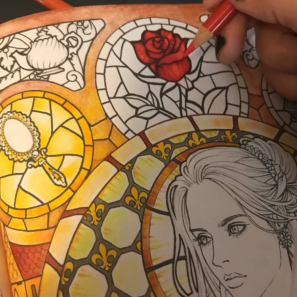
I approach the green leaves with the same principle of darker tones at the edges with lighter tones in the center. Here I use a turquoise green for the main color, the same dark burgundy for the edges and a touch of white for the center. Blending the whole time.
Now, because my artistic mind gets bored working on one element before moving on to another, I feel that I have enough background light and color established to begin coloring the face. I start with the same soft grey I used on the glass frame.
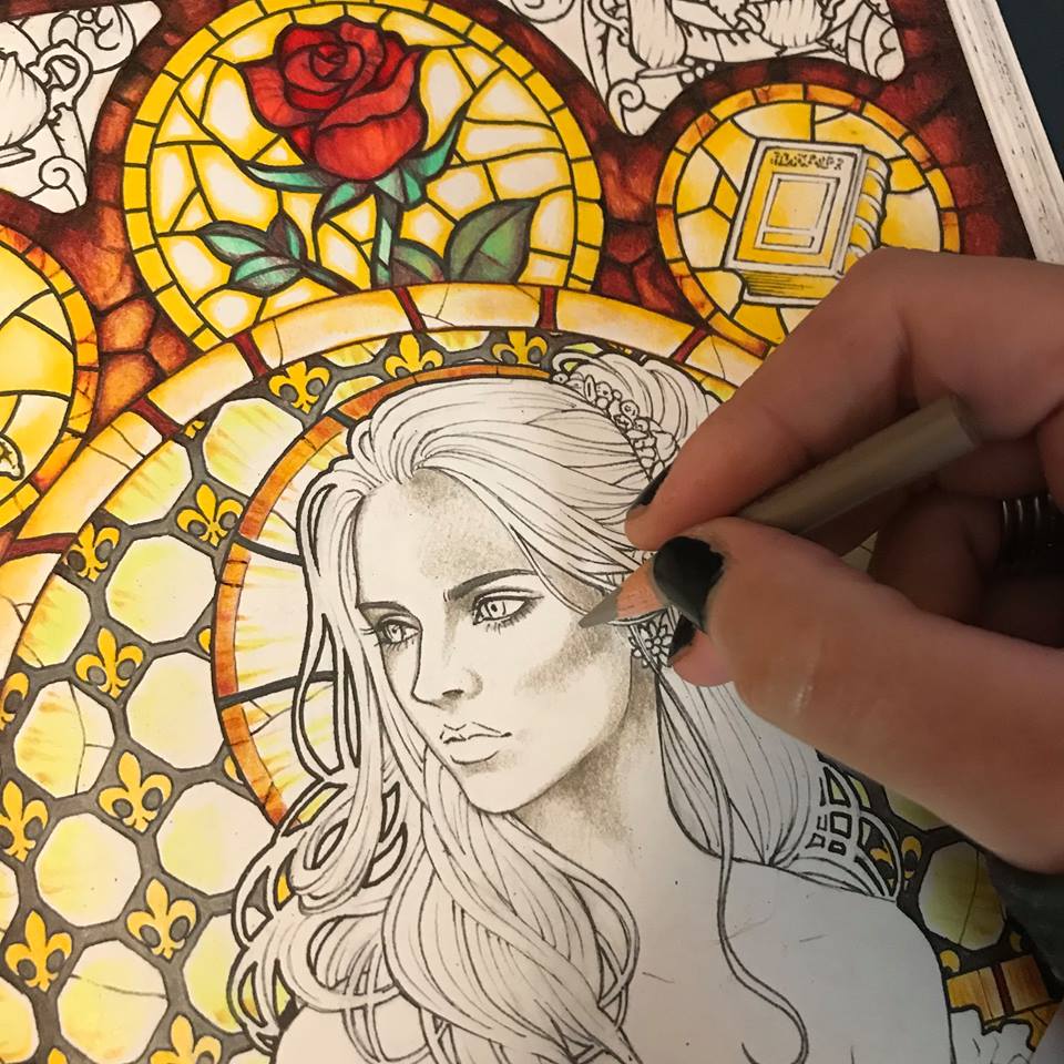
I then add some pale peachy pink as my main base color, playing a little bit with higher and lower saturation all throughout.
I move on to lilac. Just a few shadows here and there.
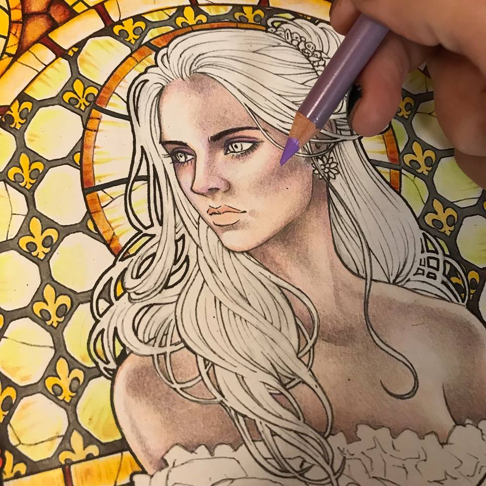
A touch of blue. Just a touch.
I use one of the lighter burgundy tones to give some volume to the cheek bones and also the eyelids.
Now it’s time to define the eyes a bit more. I have already been building them up with greys and browns. Finally I add black.
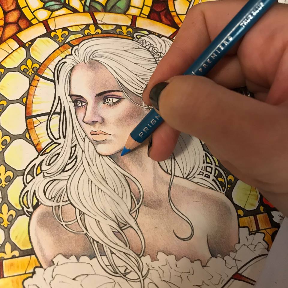
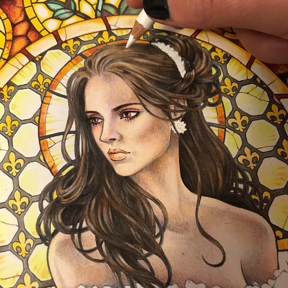
I look around at my yellow light and realize that her skin needs a lot more yellowish tones, so I add a soft layer of pale yellow.
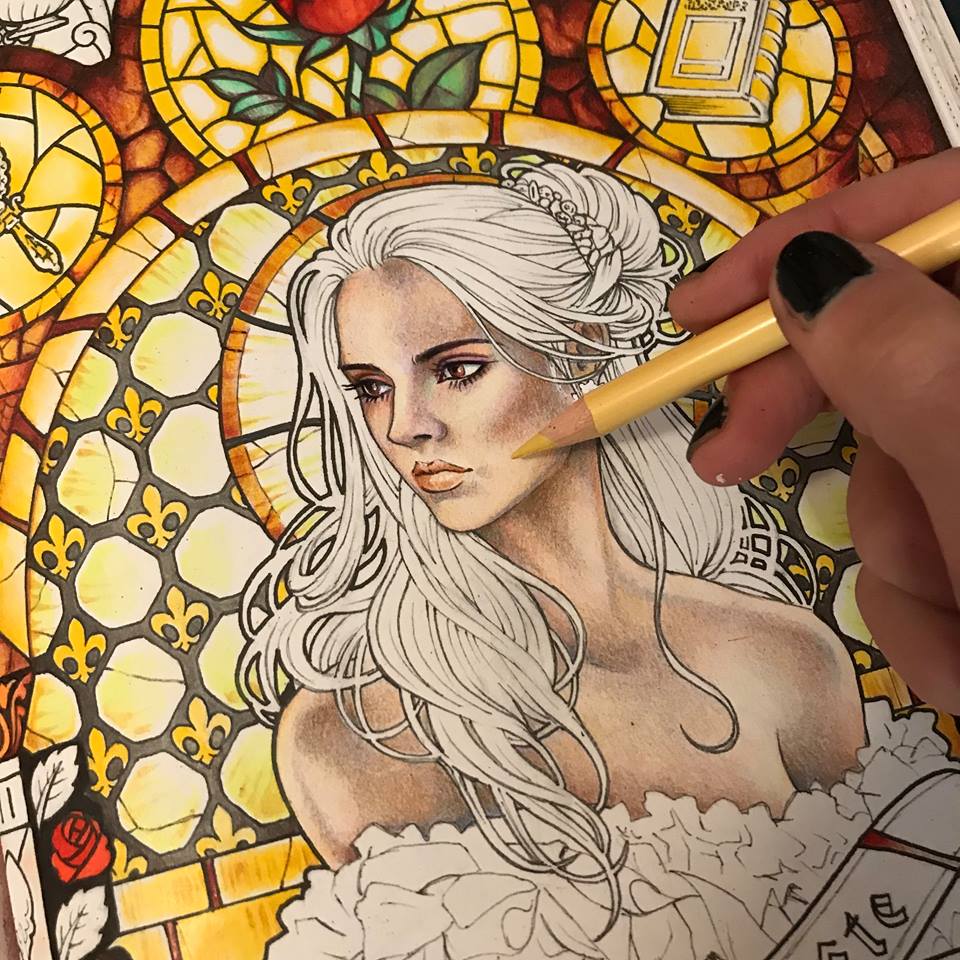
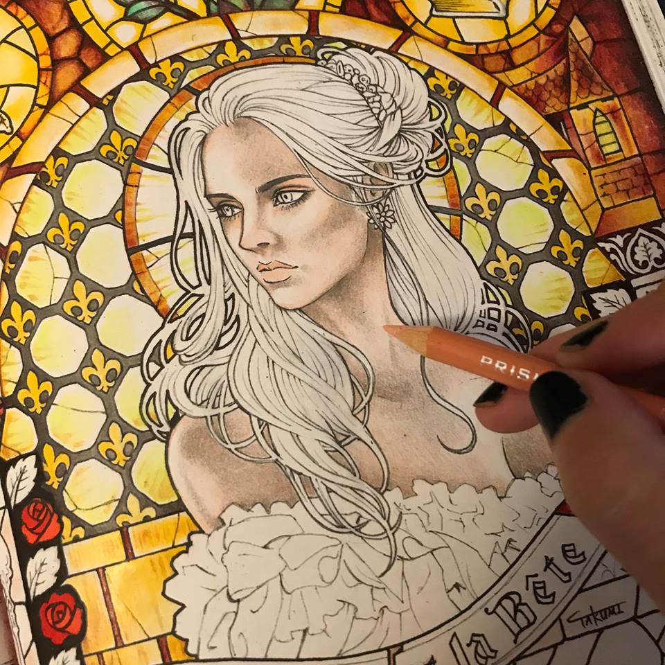
Now it’s time for the hair. I want her to have dark, but somewhat mousy brown hair. I begin with a solid layer or a dull light brown.
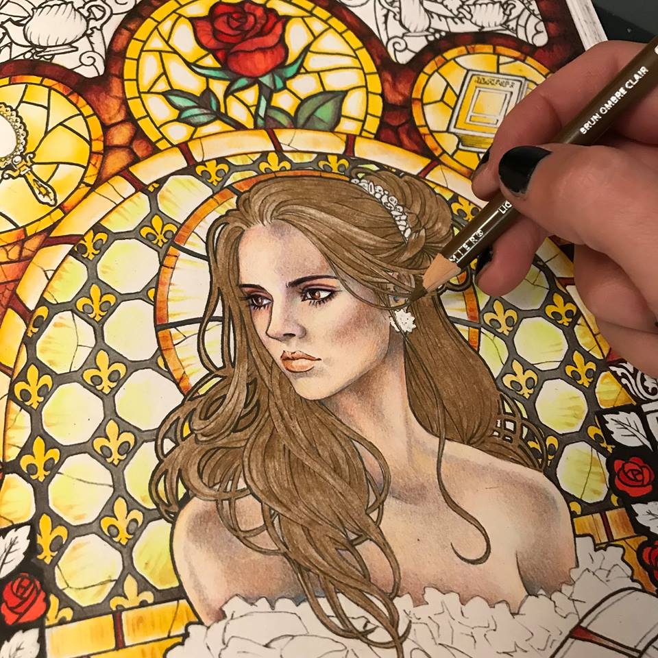
I proceed to give it volume by going over certain parts with a darker brown tone.
I emphasize the darker parts with actual black.
Now that her hair looks three-dimensional, I give it even more volume by adding an occasional white highlight. A soft white pencil is excellent for this purpose. It won’t actually “paint” white over your colors, but it will layer on a soft gentle highlight.
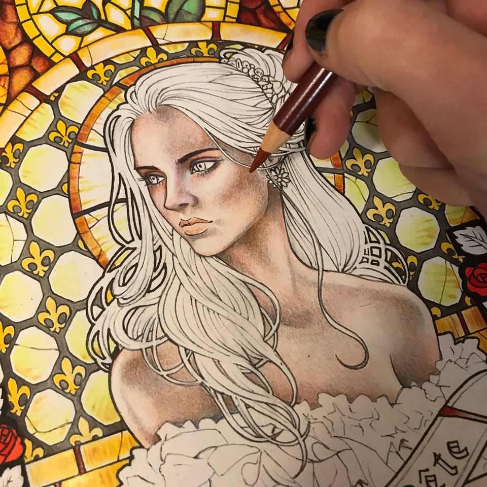
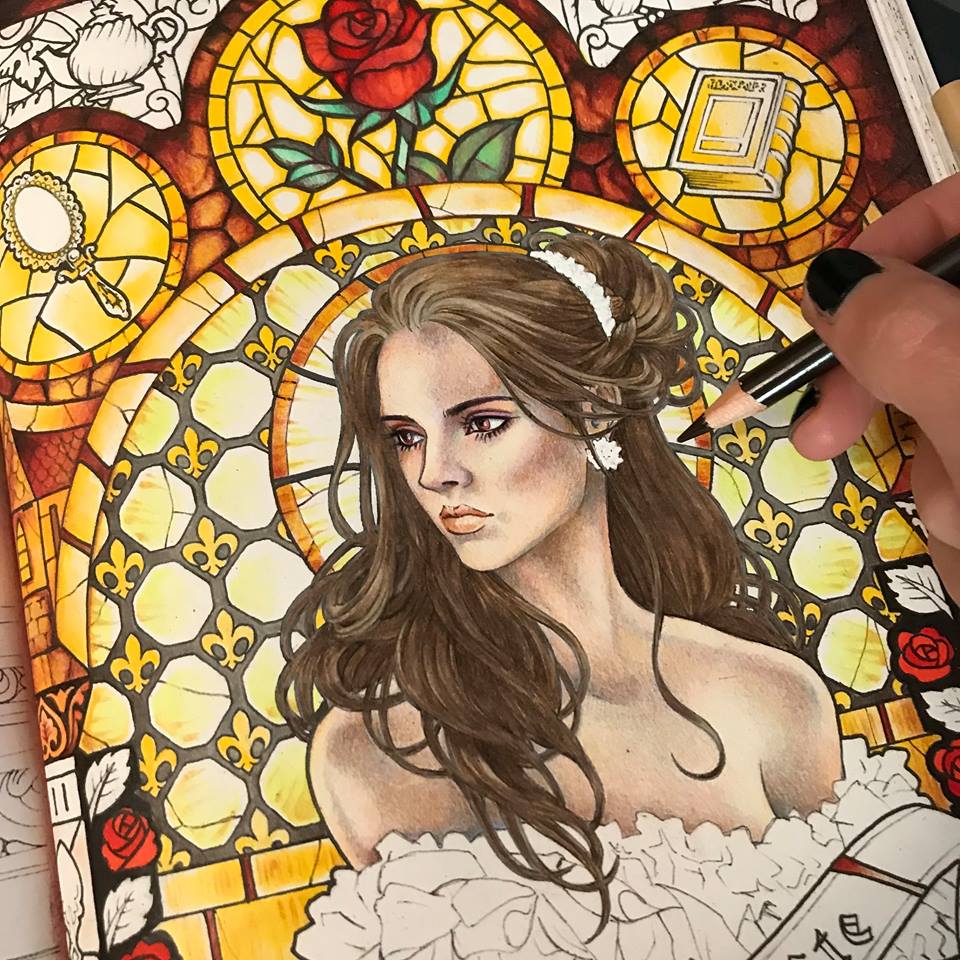
I look at her face and realize I want her to have more pink and peach tones. I want her to look alive and maybe even a bit flushed. Just a bit. I add some rose around her eyes, her cheeks, her lips and the tip of her nose. I also tweak her jewelry.
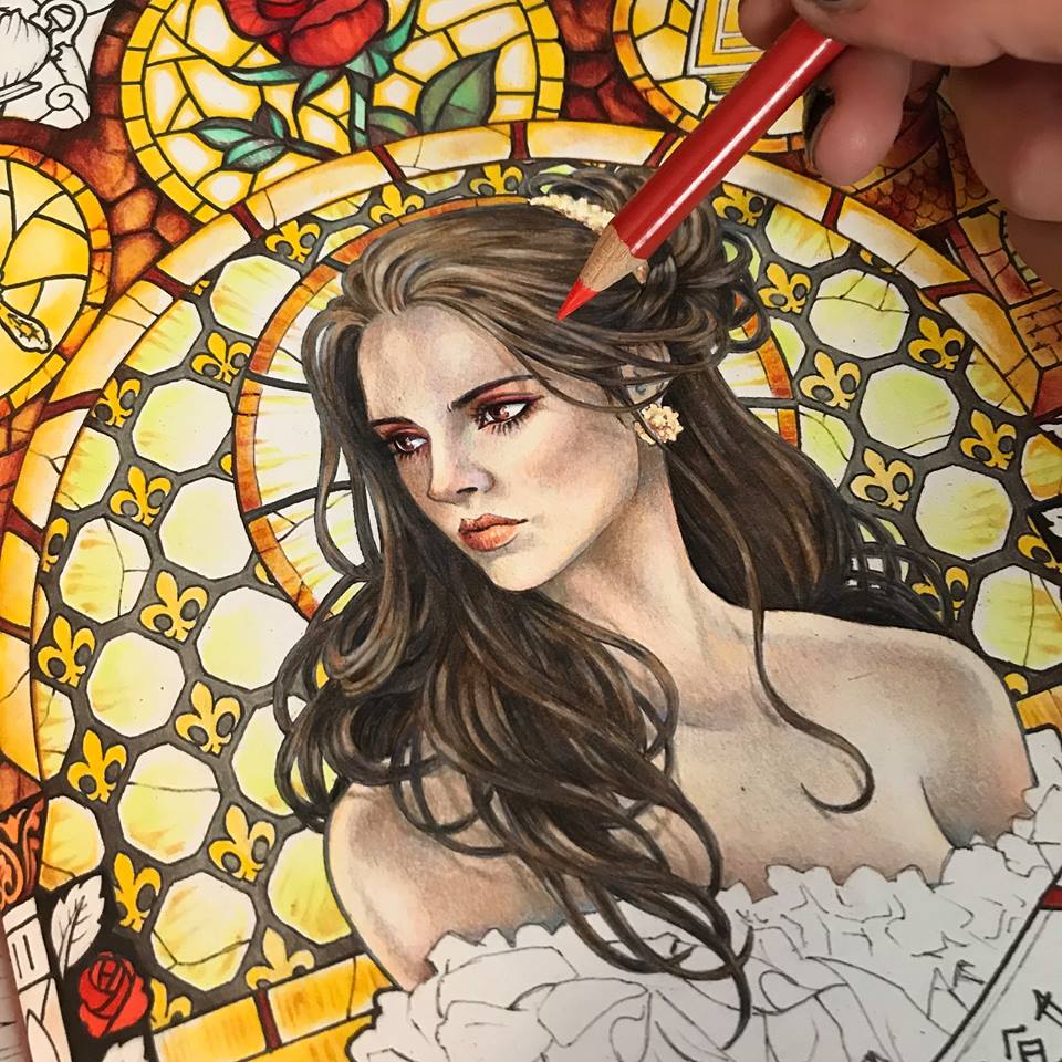
Now that I like her face and hair I feel that her outlines are too stark against the glowing background of the stained glass. The light does not look natural. I take a little bit of white acrylic paint onto a small brush and blur the edges around her hair where the light is the brightest.
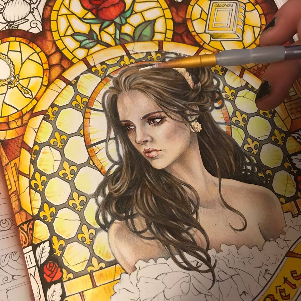
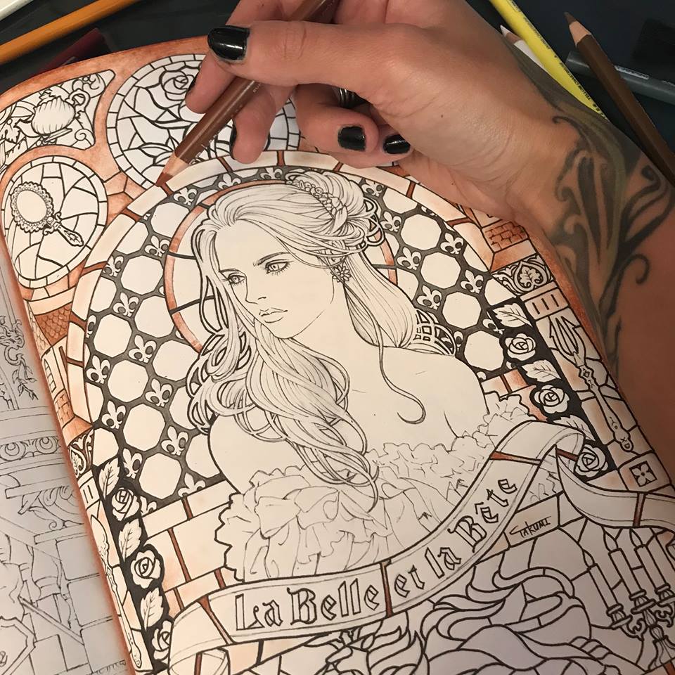
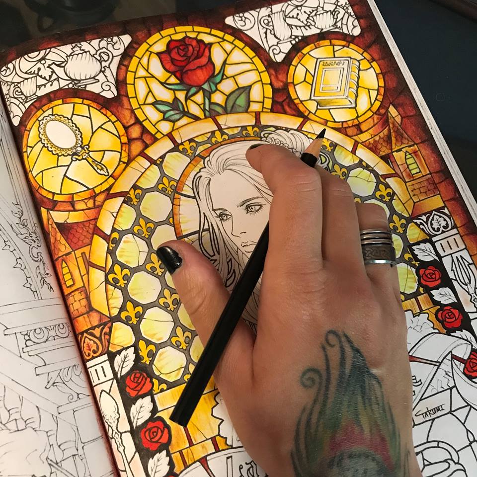
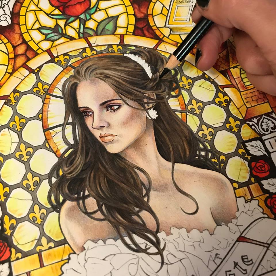
I decorate her dress with silk caramel colored ribbons to match her jewelry and return to the background. I feel that the whole composition is looking a bit monotone is all yellow and gold. It needs some zing. I decide that the turquoise green of the rose leaves needs to be balanced by similar tones. Just perfect to display our golden Beast.
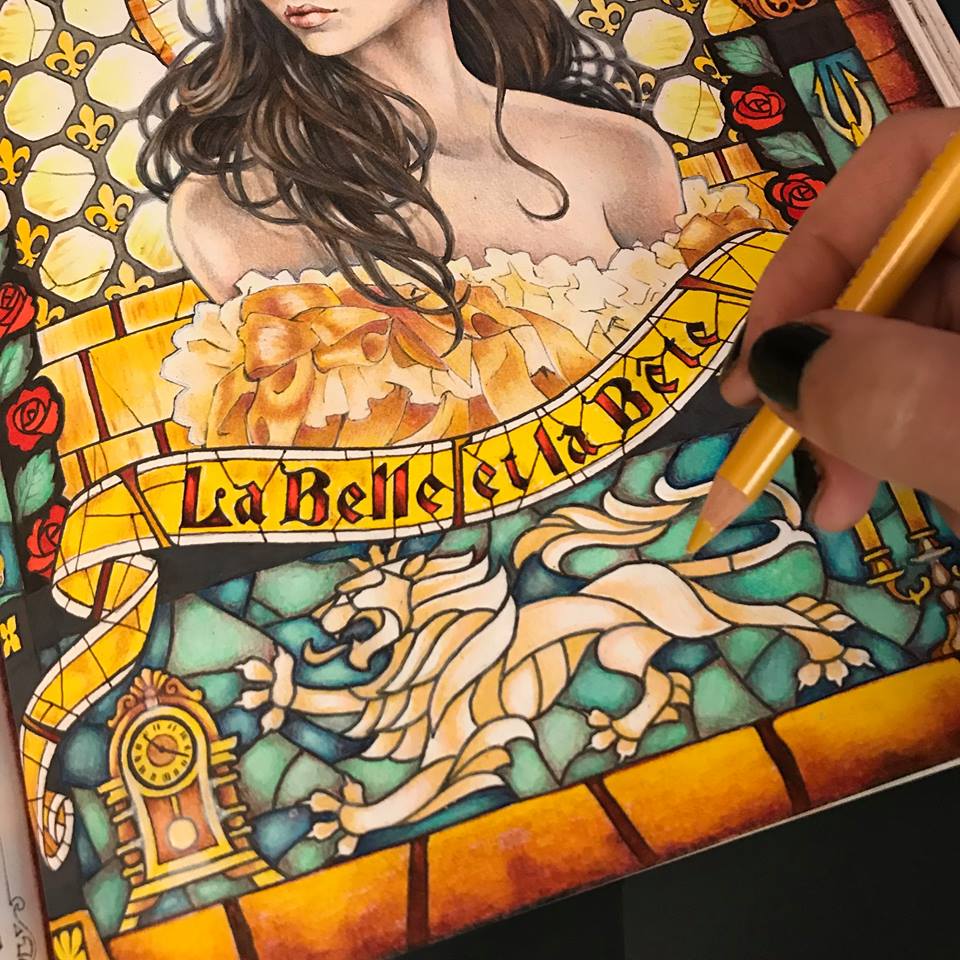
I notice that the stark yellow ribbon with bright red letters looks a little flat and boring, and way to bright. It was a good start, but it needs something else. I mute the colors with a white pencil and add some texture to the glass. You may have noticed that I have also been adding my own glass cracks and some occasional definitions missing in the original drawing. Just tiny tweaks along the way. I’ve also extended my stained glass pattern all the way to the edges of the page.
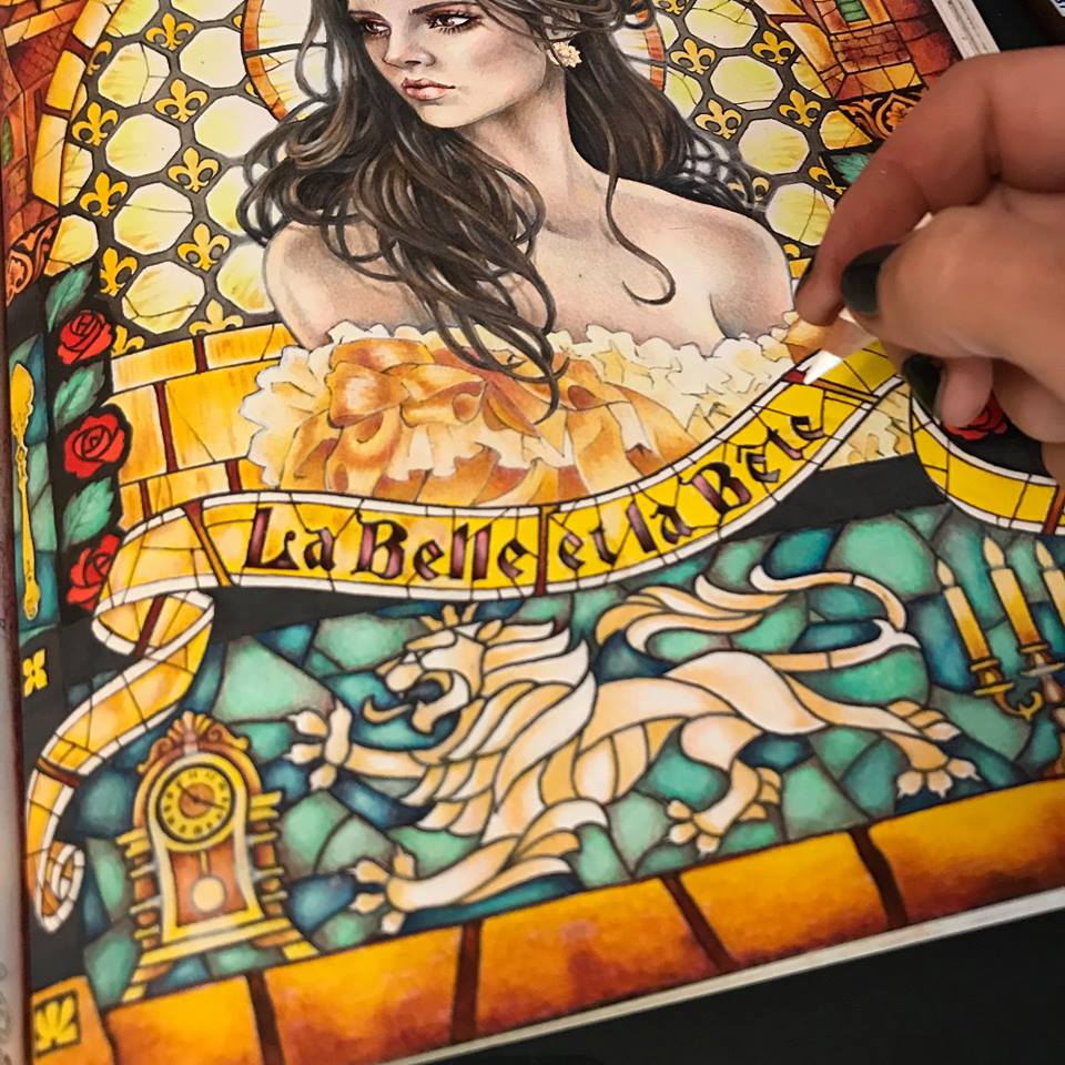
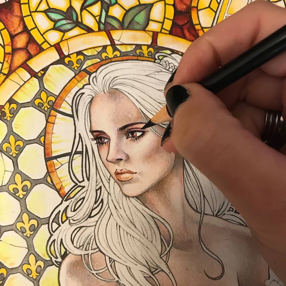
I now step back and look at my composition. The background is so vibrant it mutes all the intricacies of Beautie’s skin. She needs bold golden yellow highlights on her skin, mainly around the edges. That’s better.
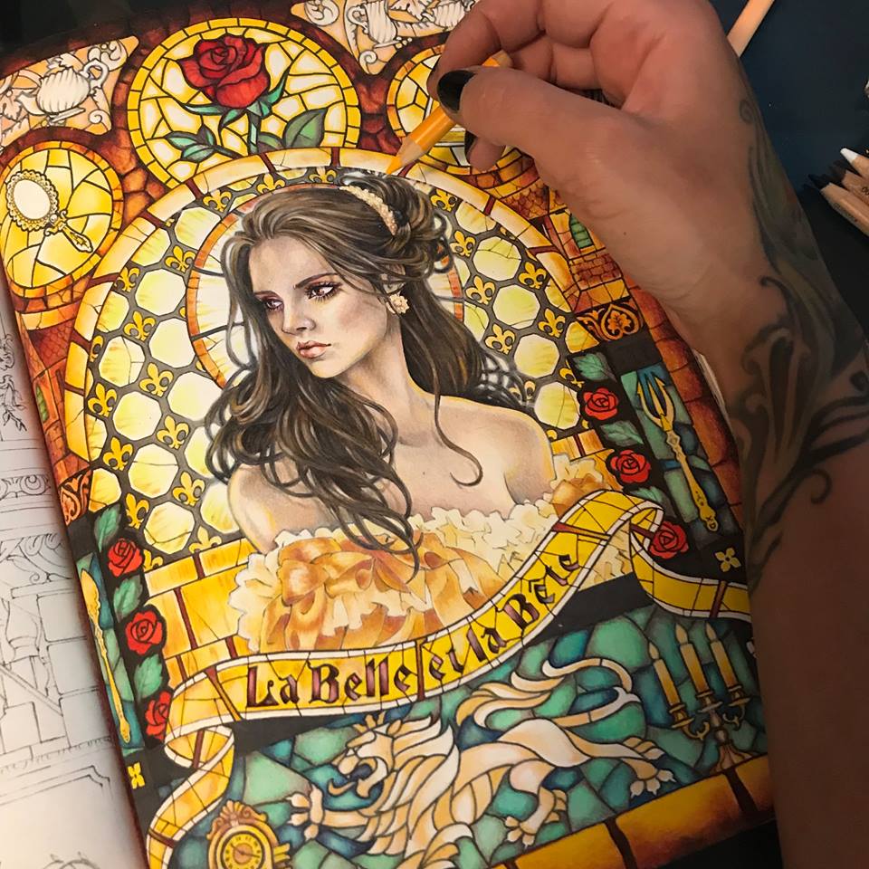
At last I think she is complete. I go over the entire page, scanning it, blending some parts with my rapidly disappearing white pencil, and adding the final highlights all over.
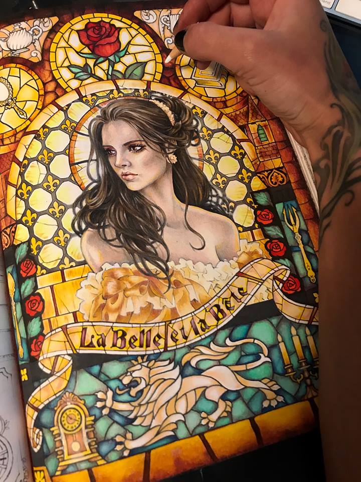
And there she is, in all her beauty, La Belle.
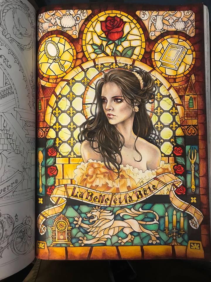
However, having spent three days on this image and feeling a bit overwhelmed by all these colors blasting back at me, I take a moment and run my photograph of the page through a black and white filter. That’s better. I can rest my overworked eyes now and just enjoy the darkness and contrast. If you’ve treated your light and color appropriately, respecting the light source and the saturation levels, resetting your image to black and white should not effect its appearance any more than a digital photograph of your own face may be effected by being suddenly switched to black and white. I rather like it this way.
I hope you’ve enjoyed following me on this little adventure as I colored Takumi’s Beauty. I hope to see some of your lovely ladies in all their colors soon. Cheers, and happy coloring.