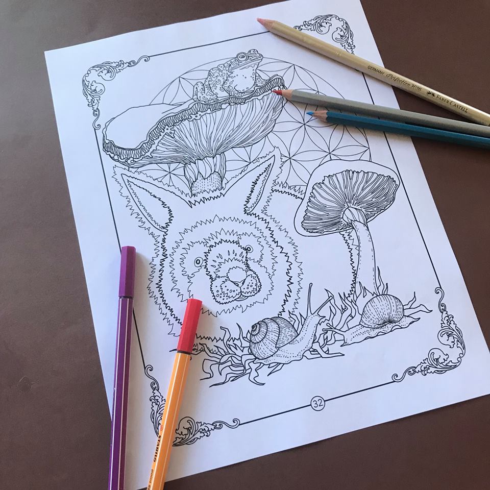
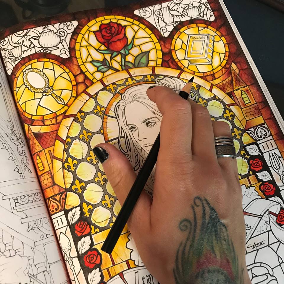
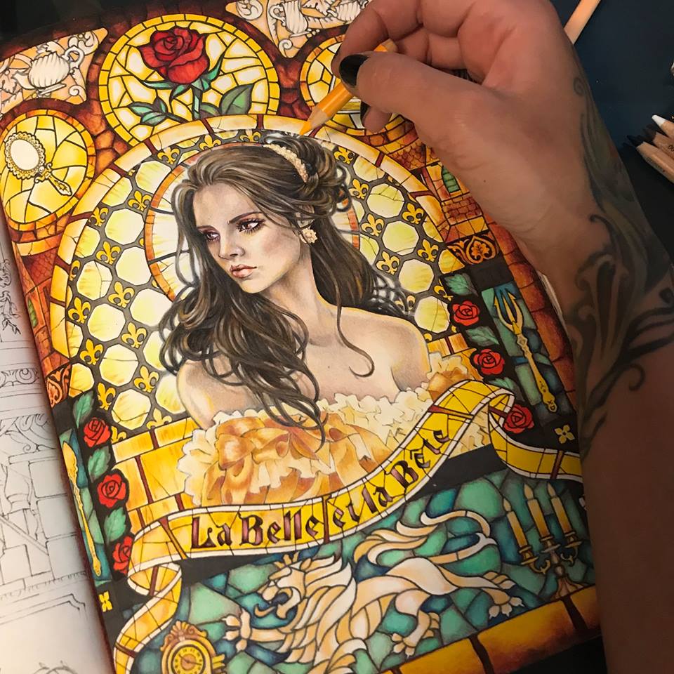
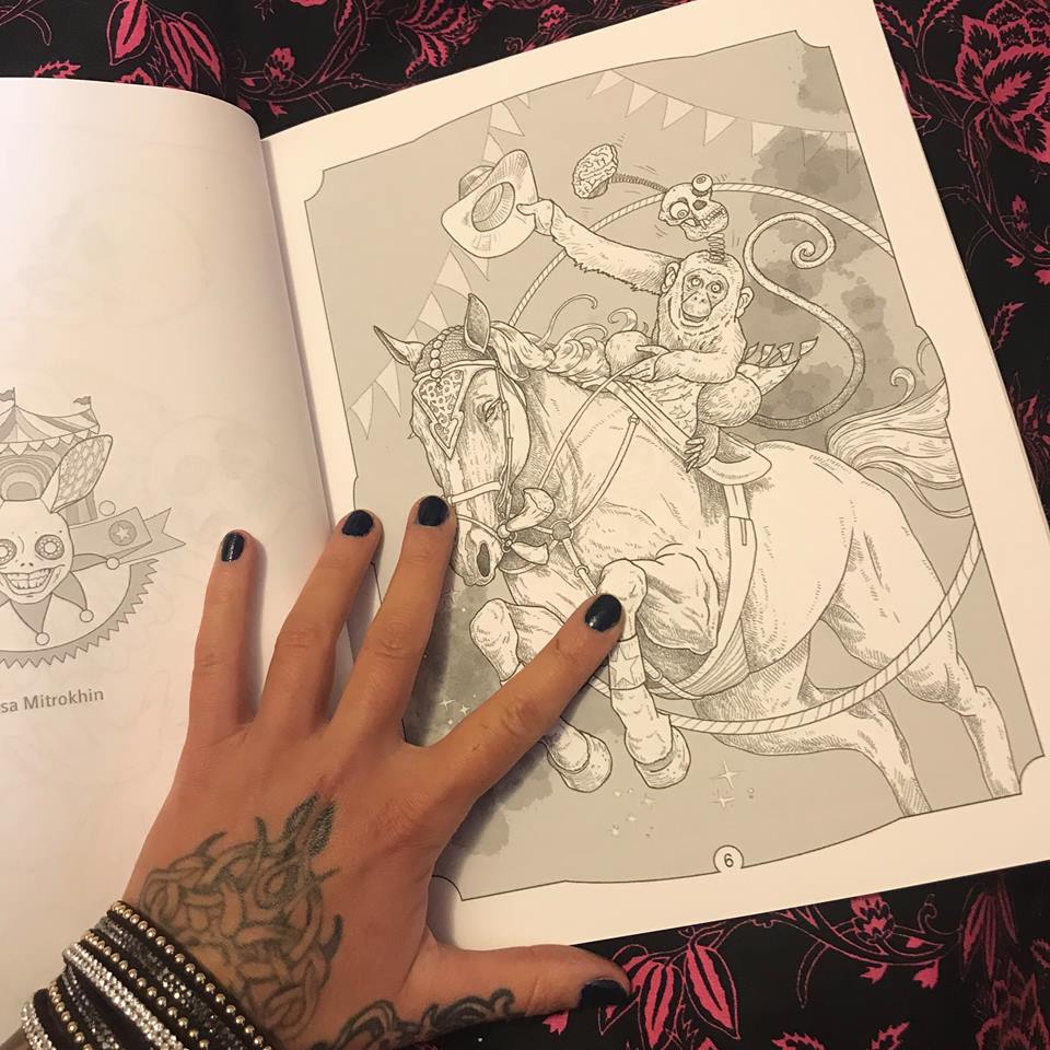
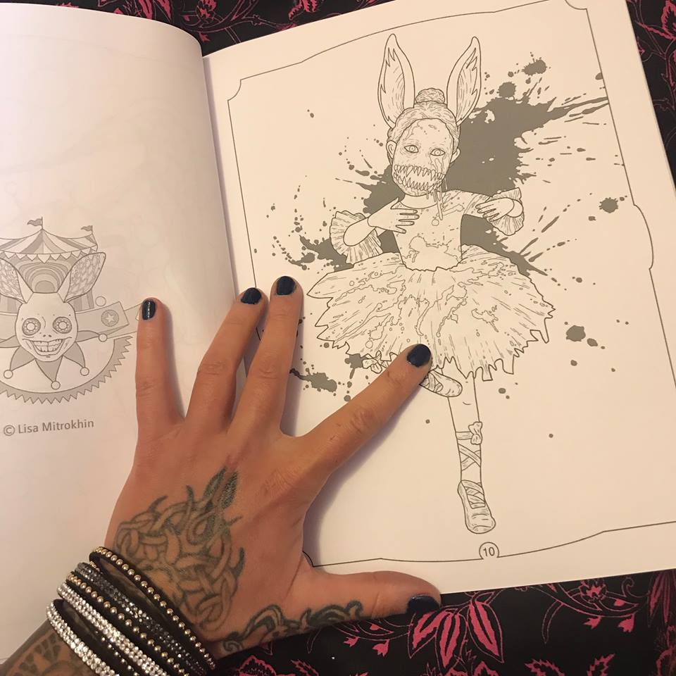
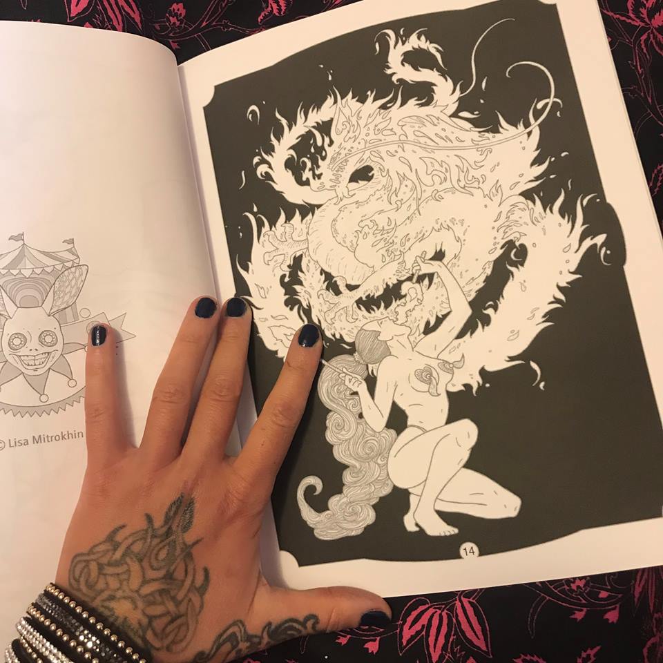
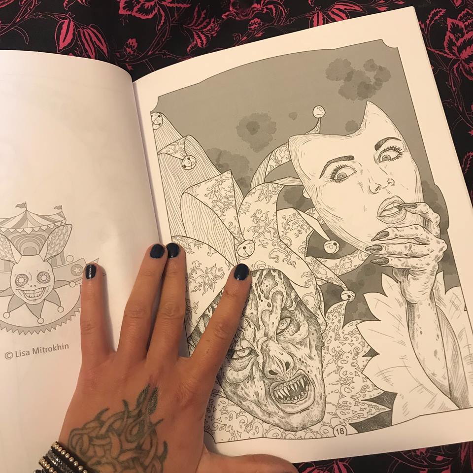
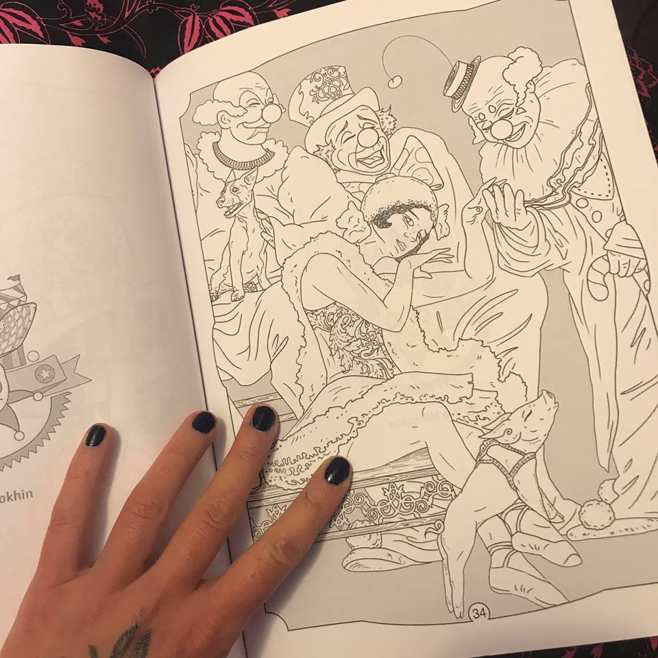
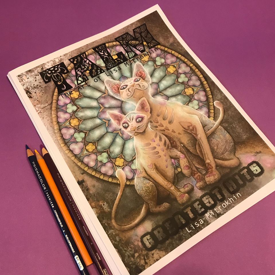
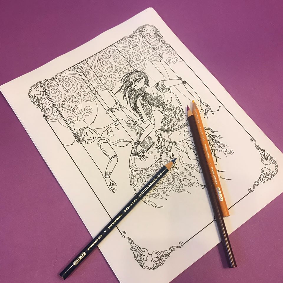
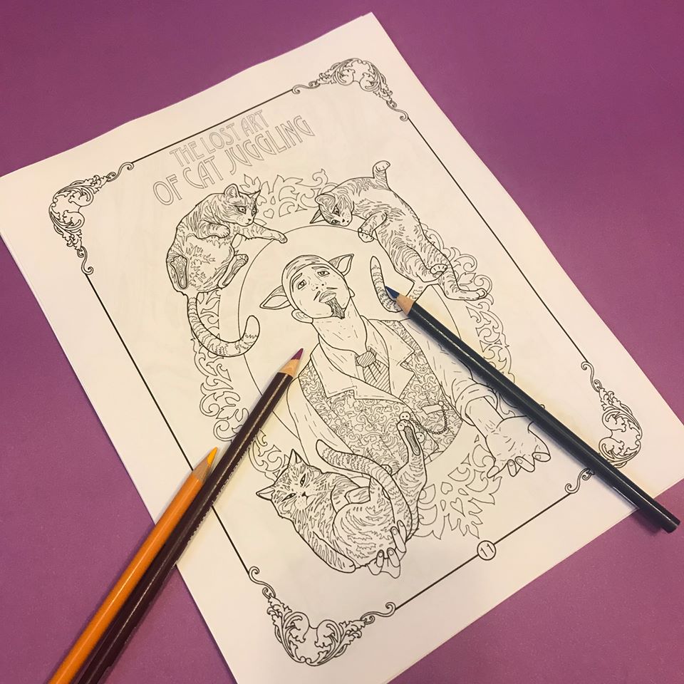
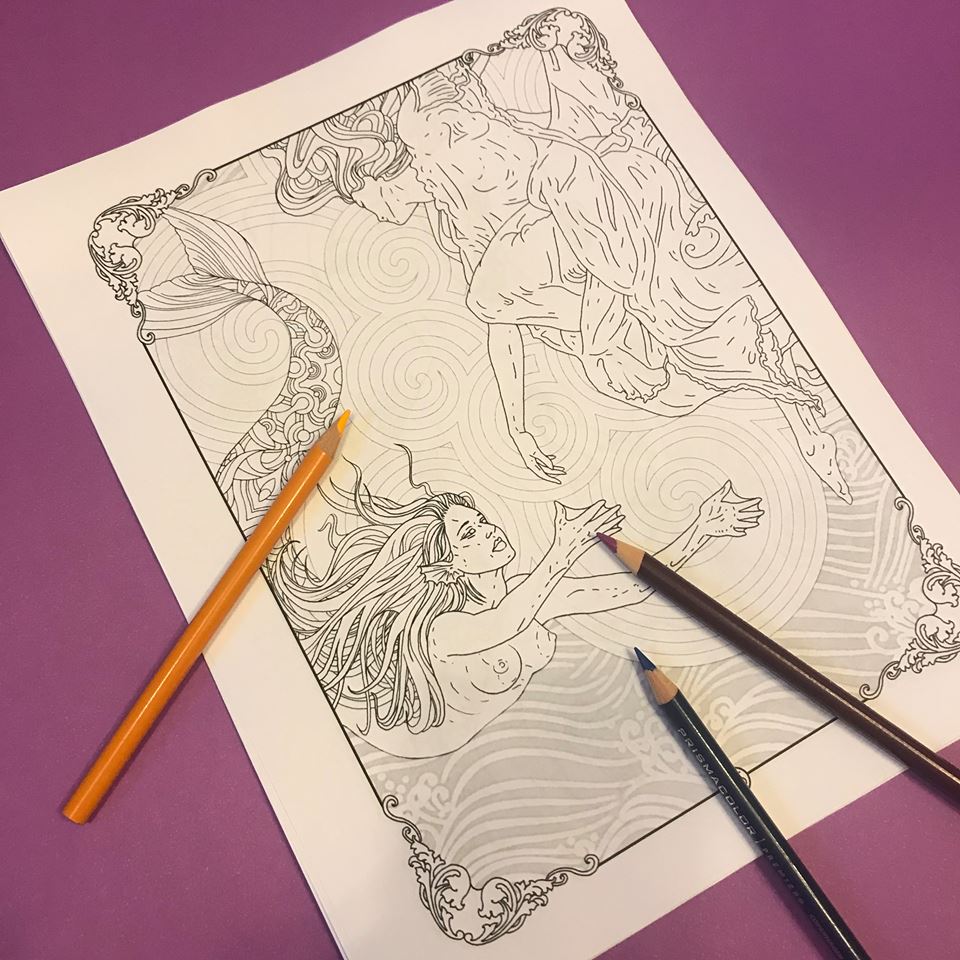
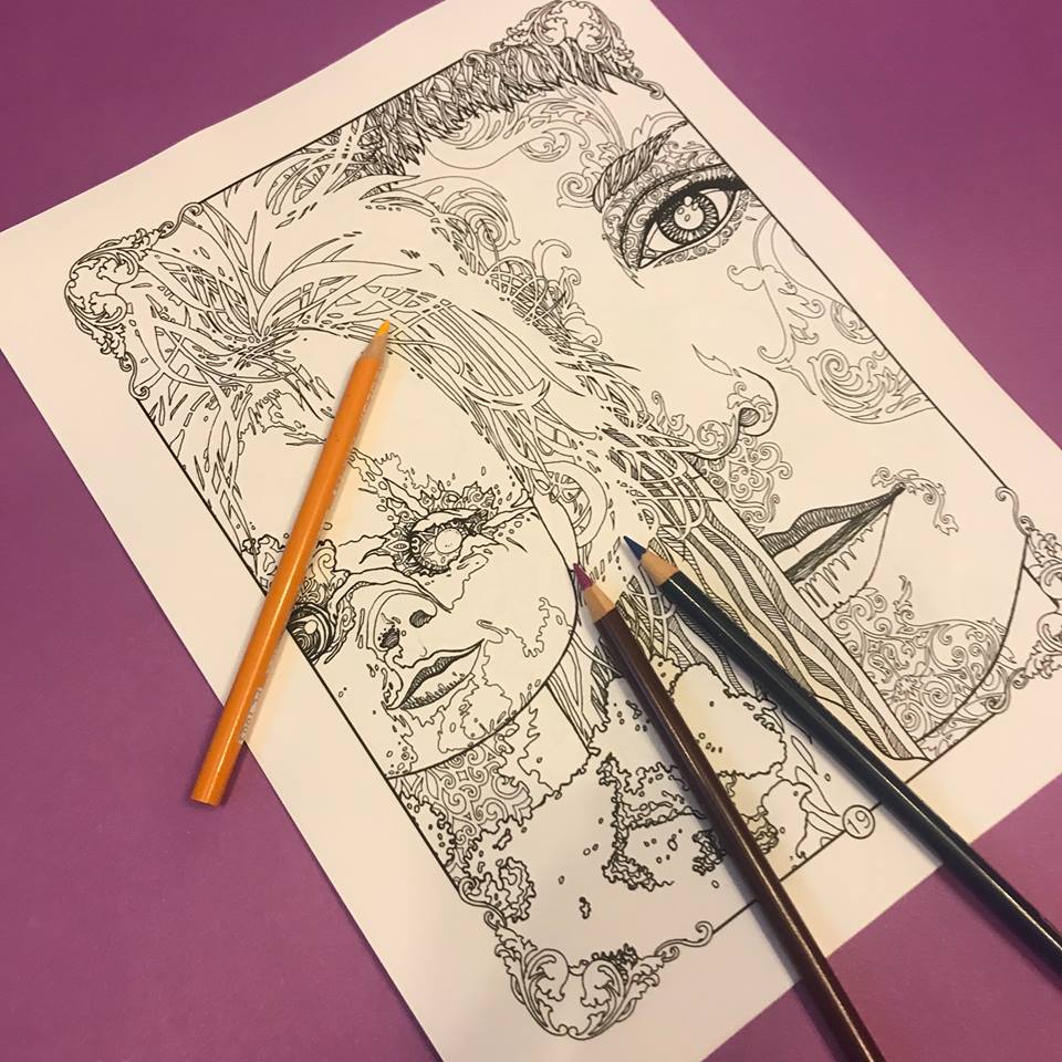
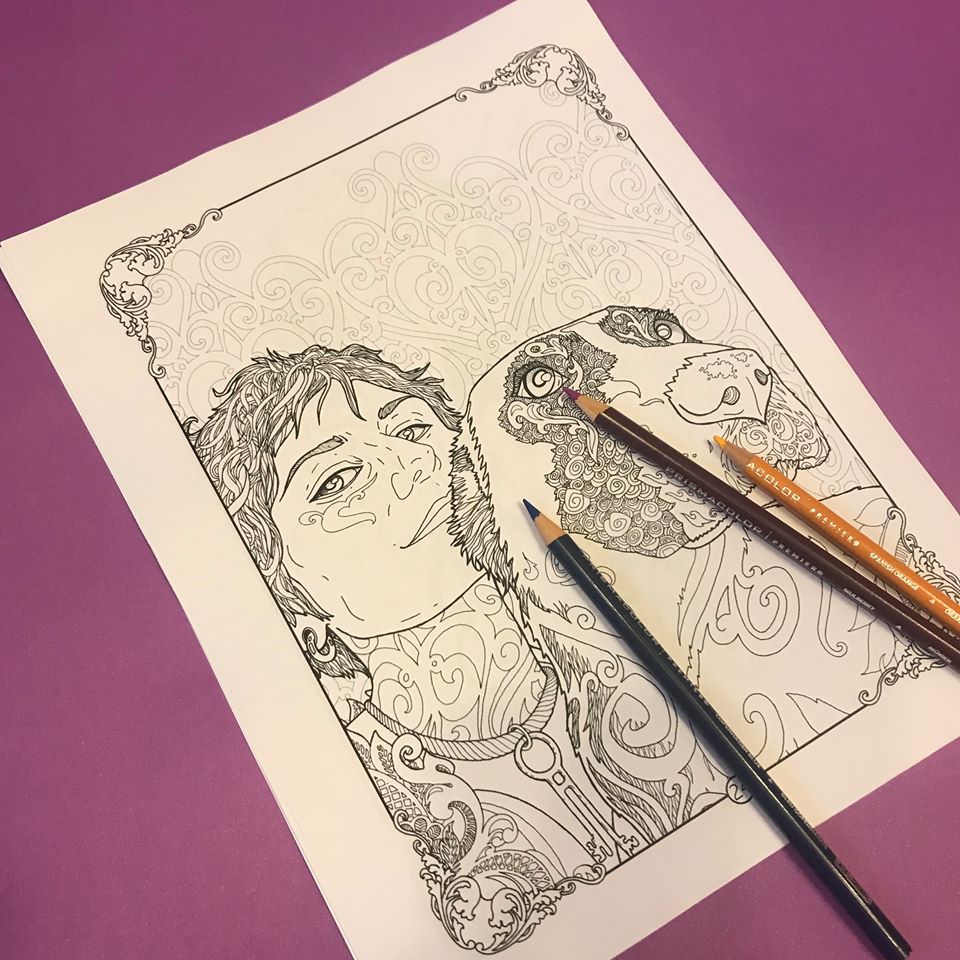
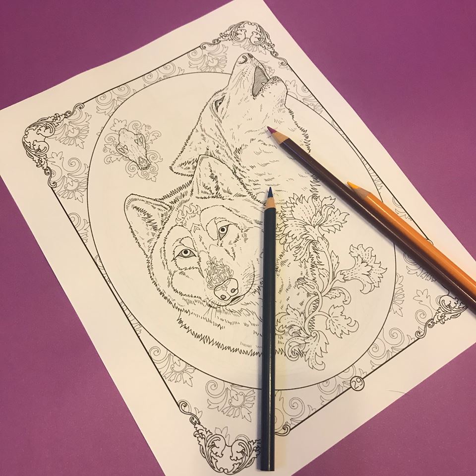
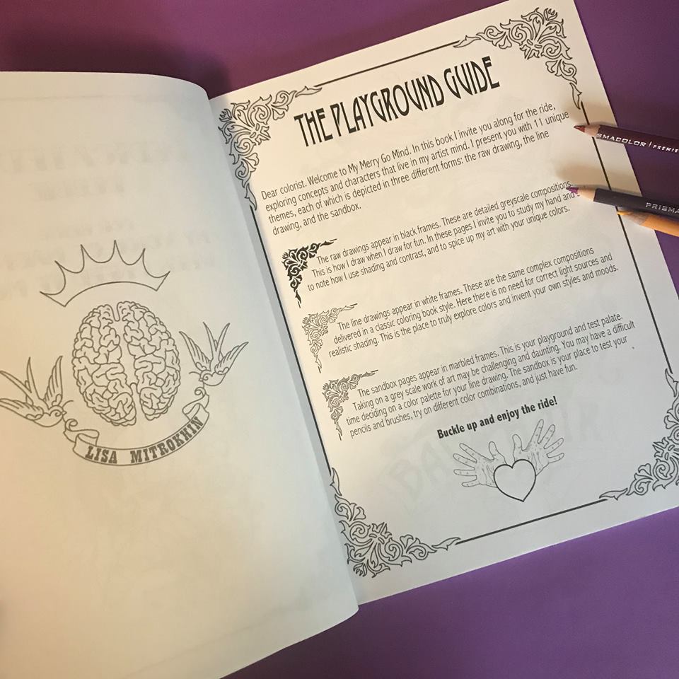
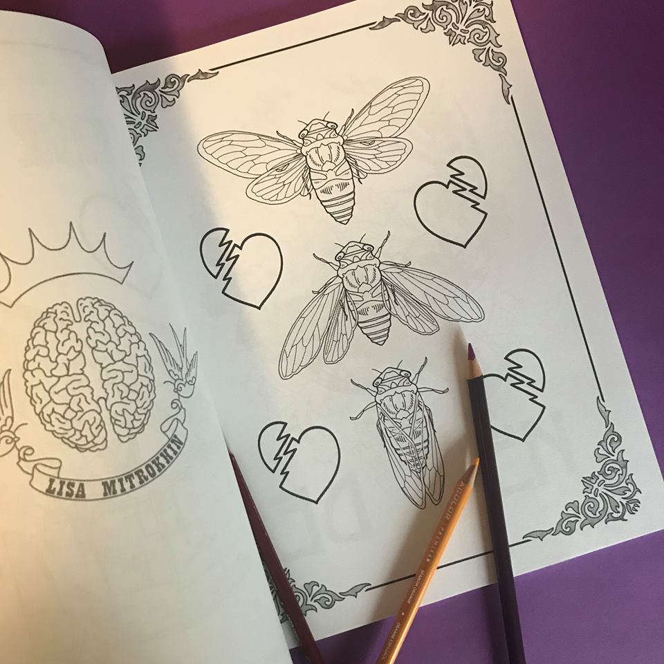
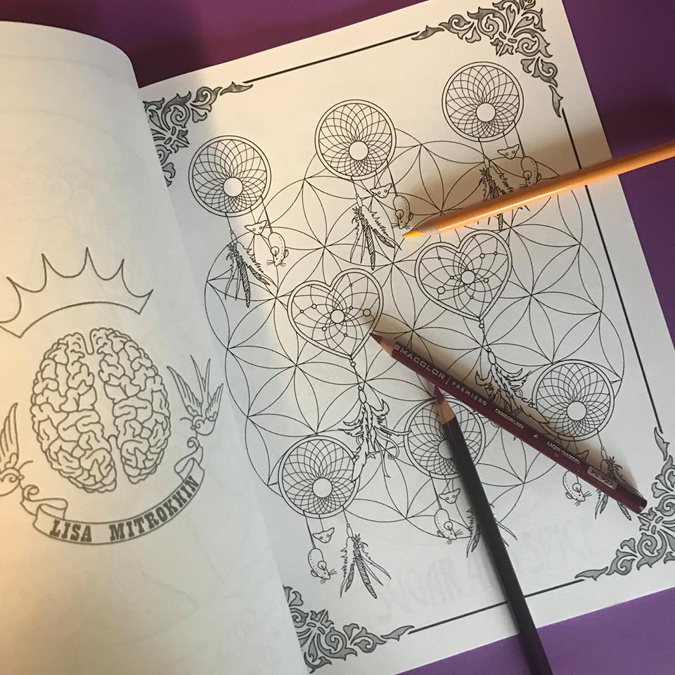
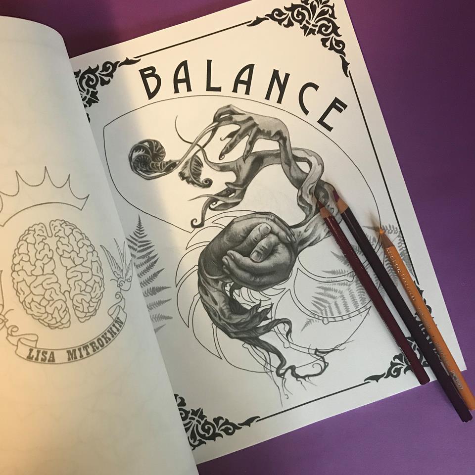
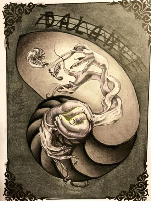
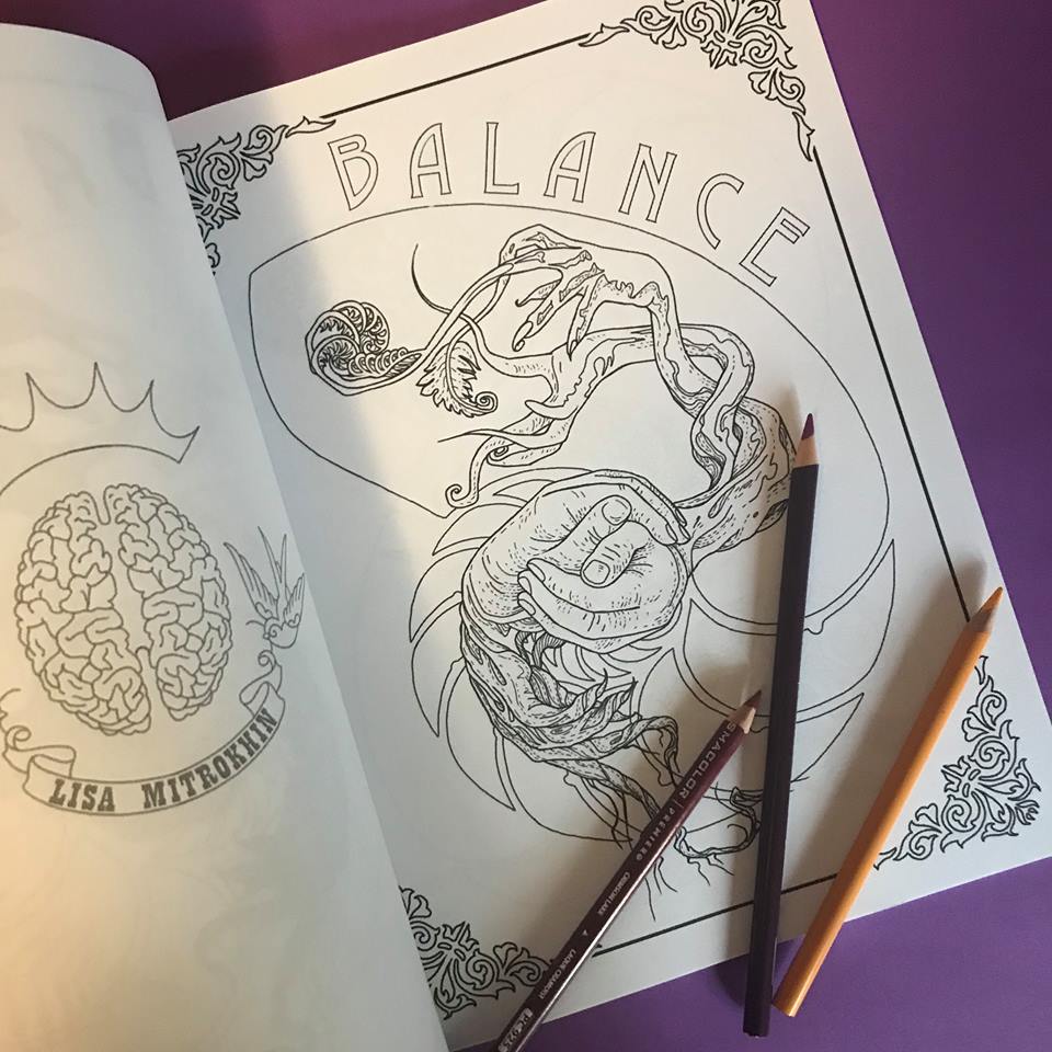
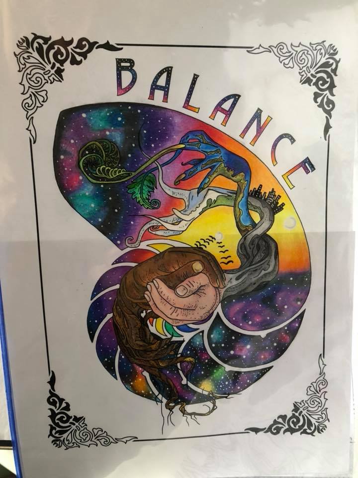
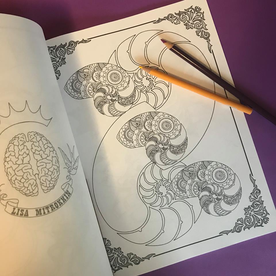
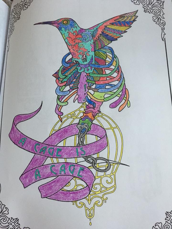
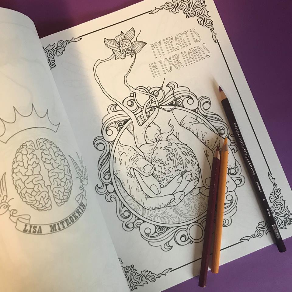
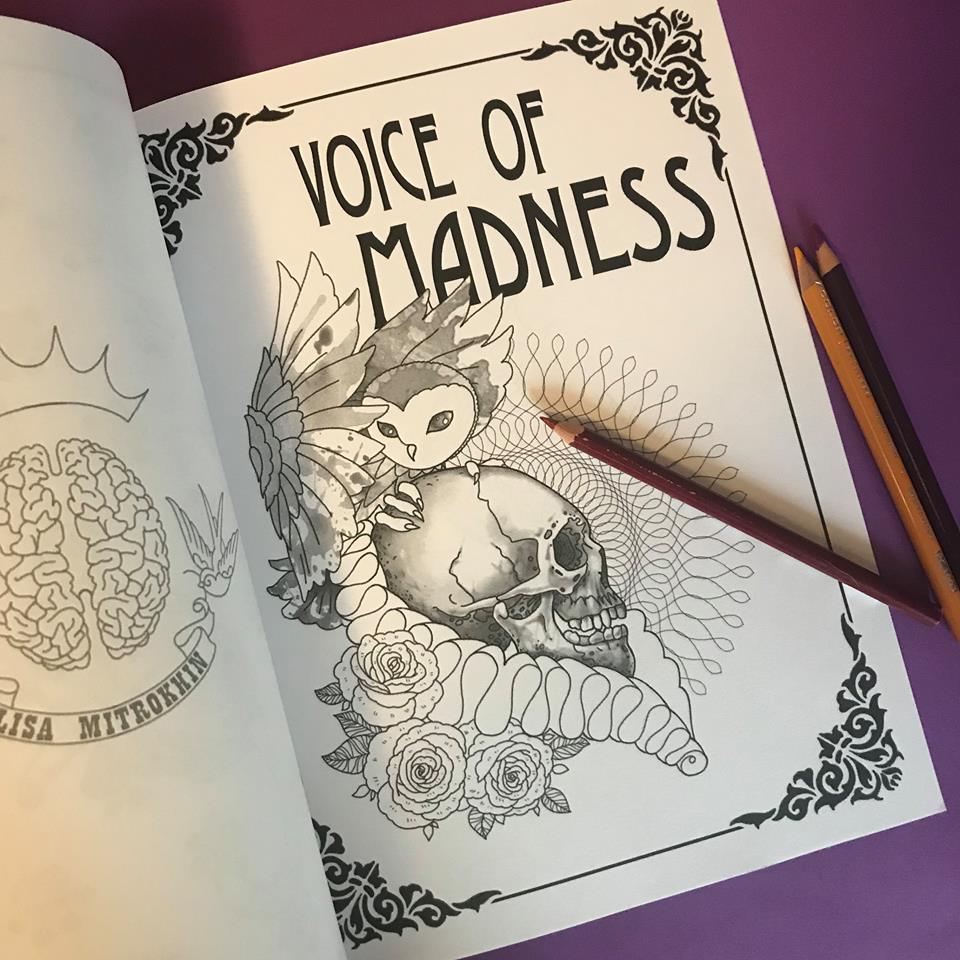
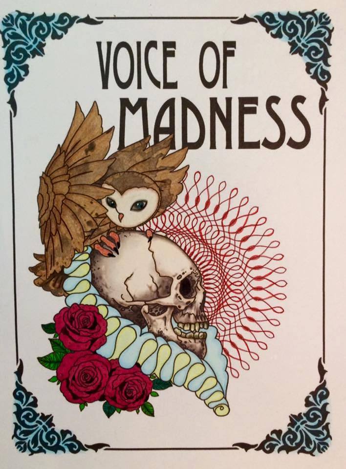
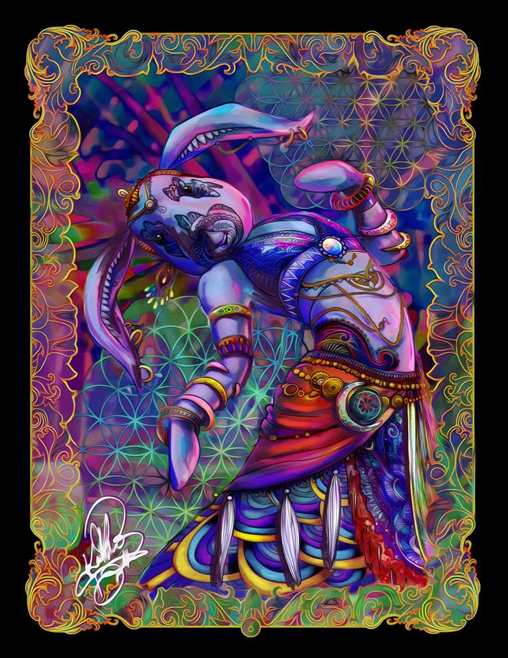
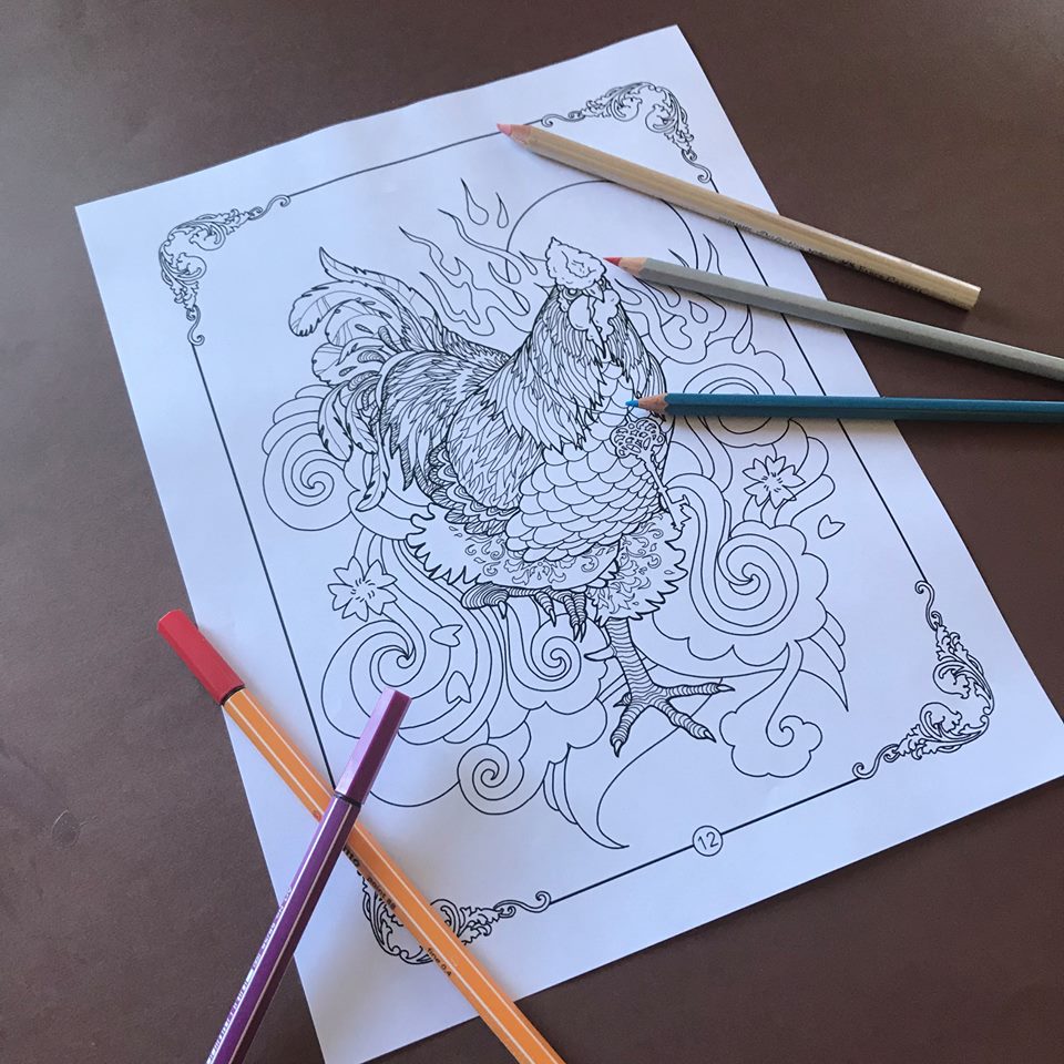
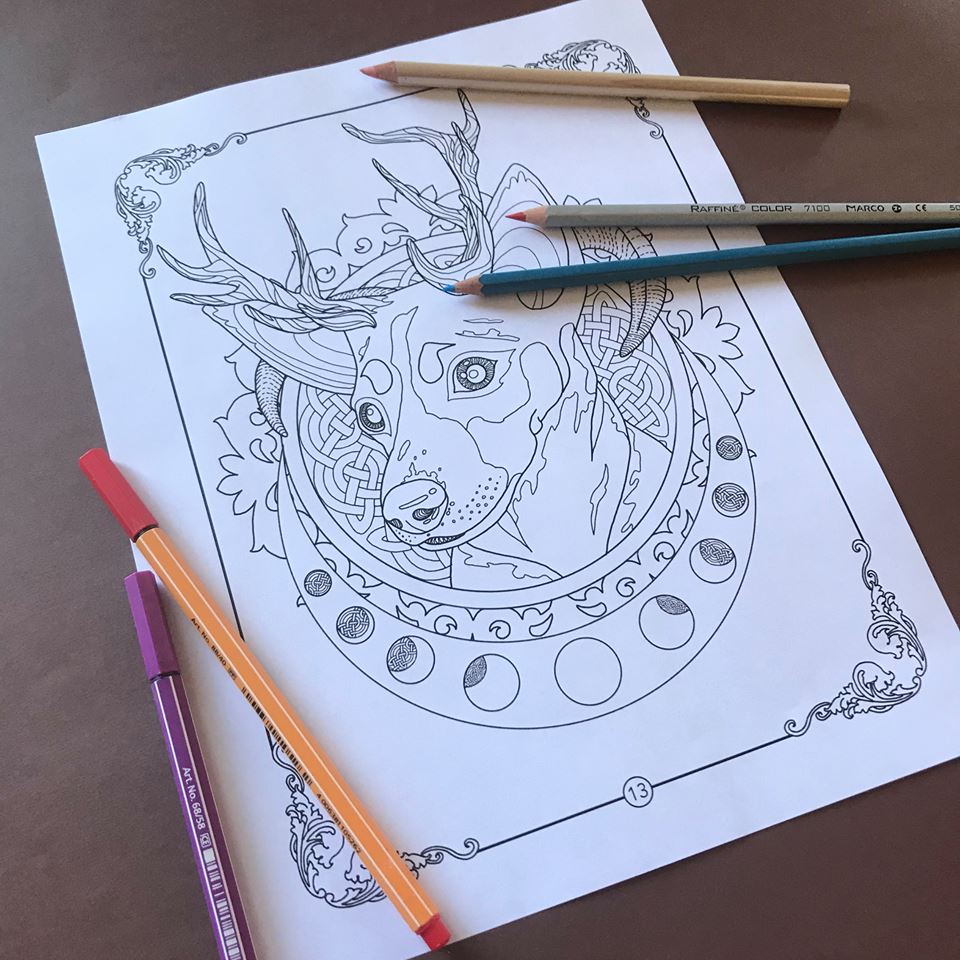
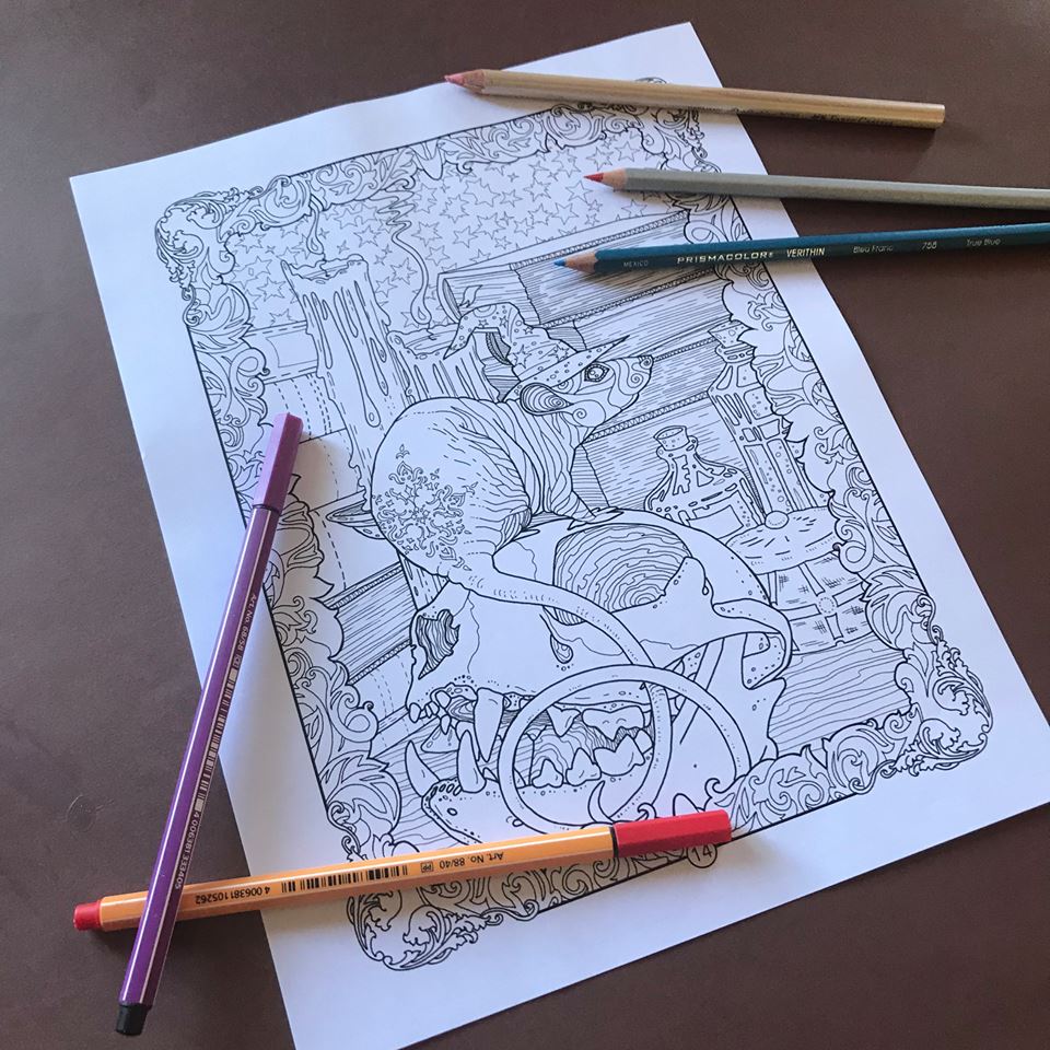
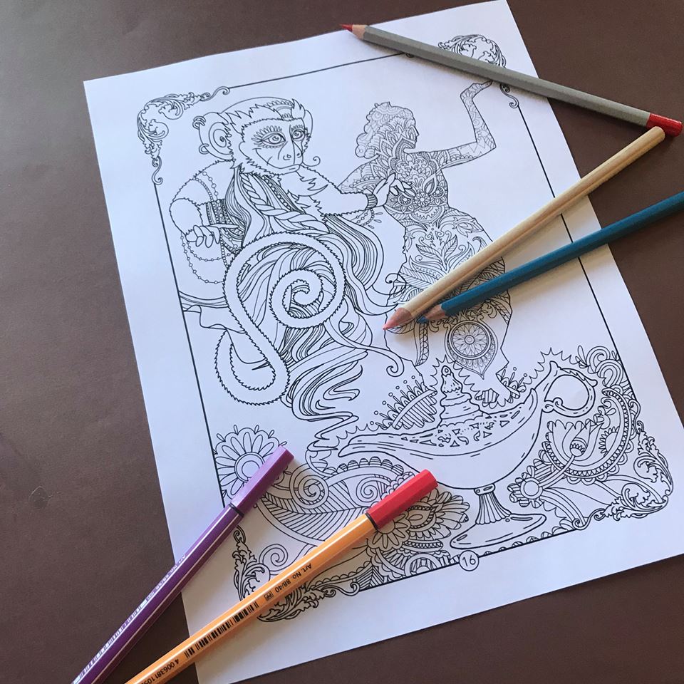
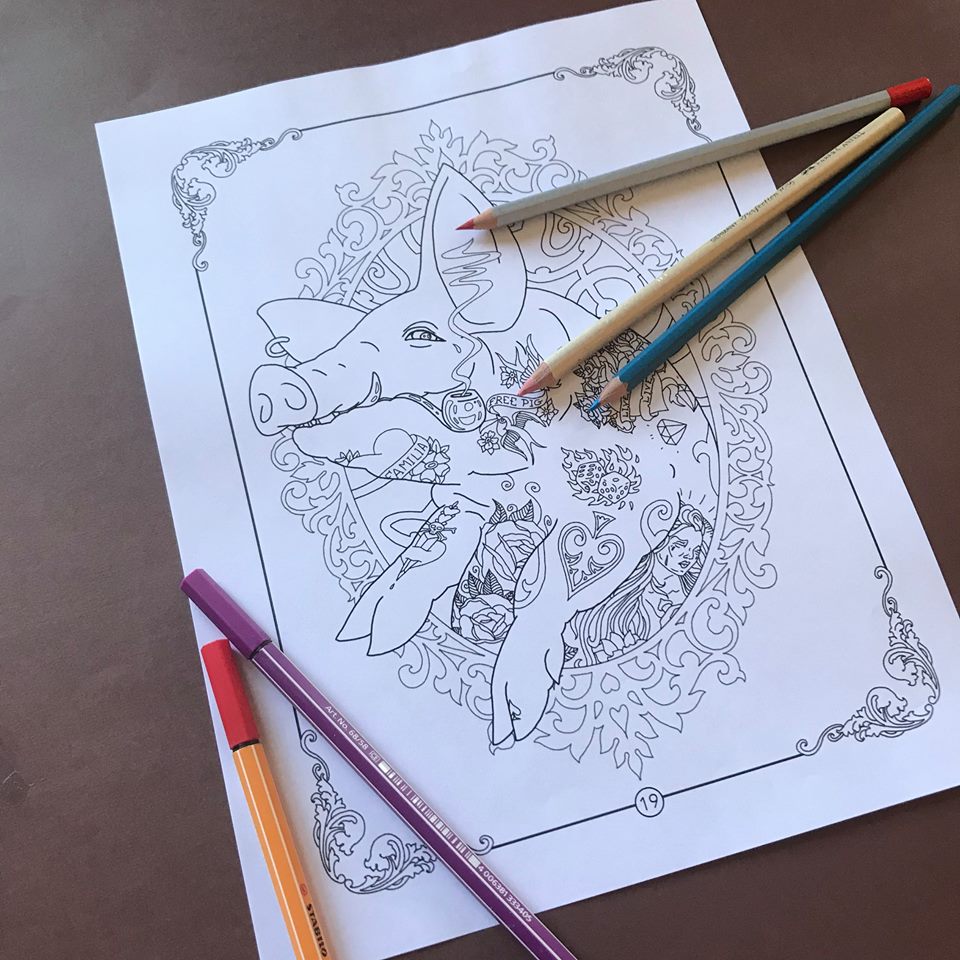
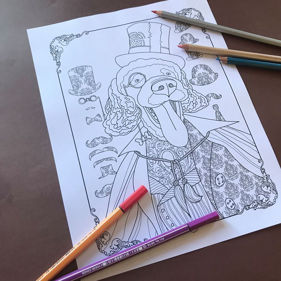
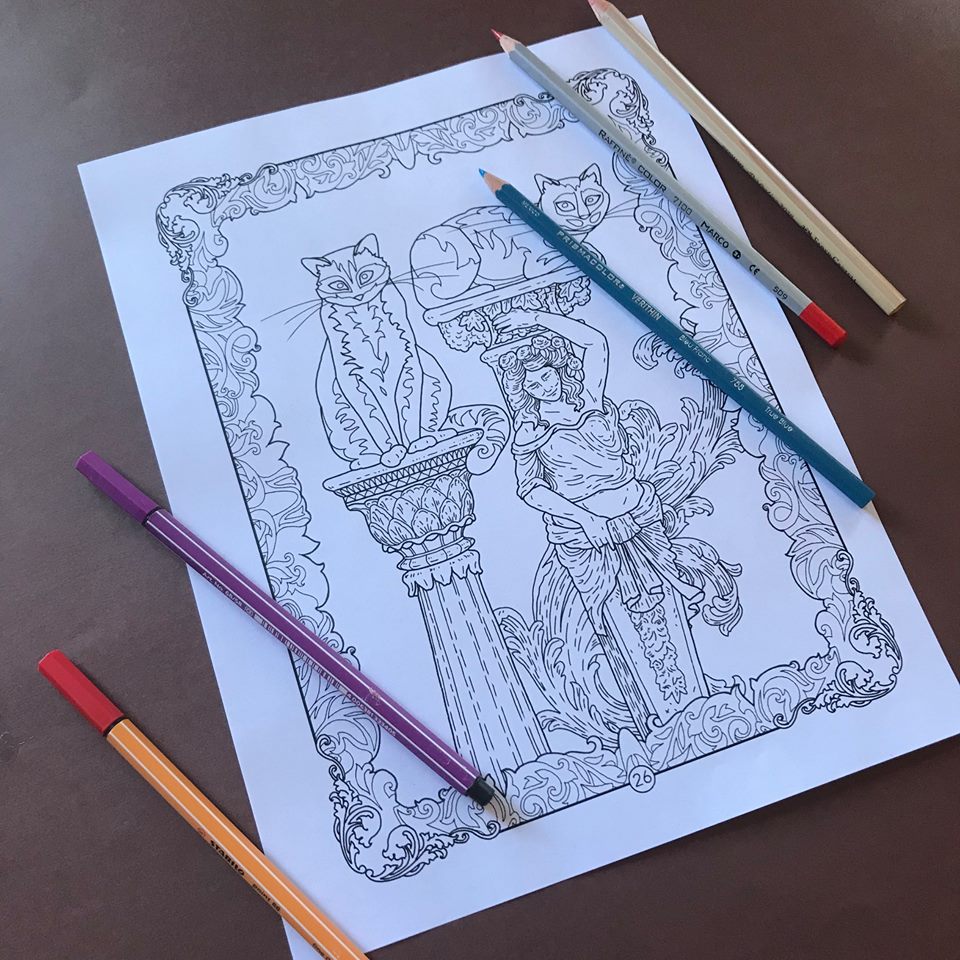
It is a rare occasion when I approach a coloring page with only minor or no alterations at all. Usually I add my own characters or even rearrange or remove some of the existing lines or patterns to create my own scenes with my own back stories. This page in my favorite coloring book by Takumi, however, is perfect the way it is. Not to mention it has hardly any space for additional characters.
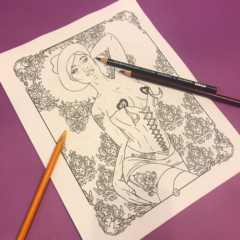
I decided to take you along on this coloring journey of Takumi’s Beauty, from Beauty And The Beast.

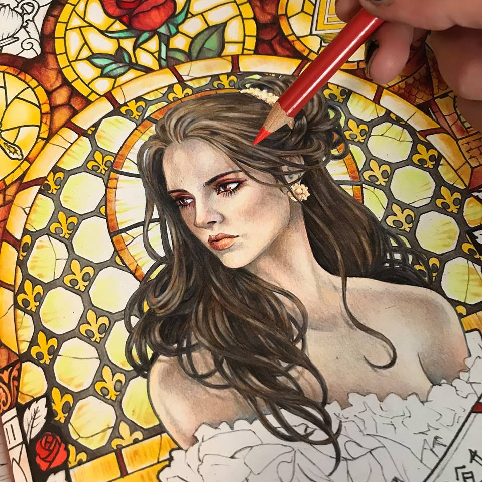
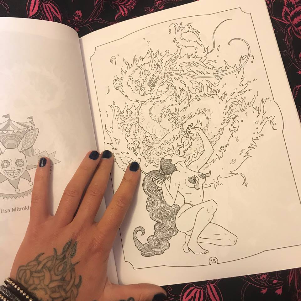
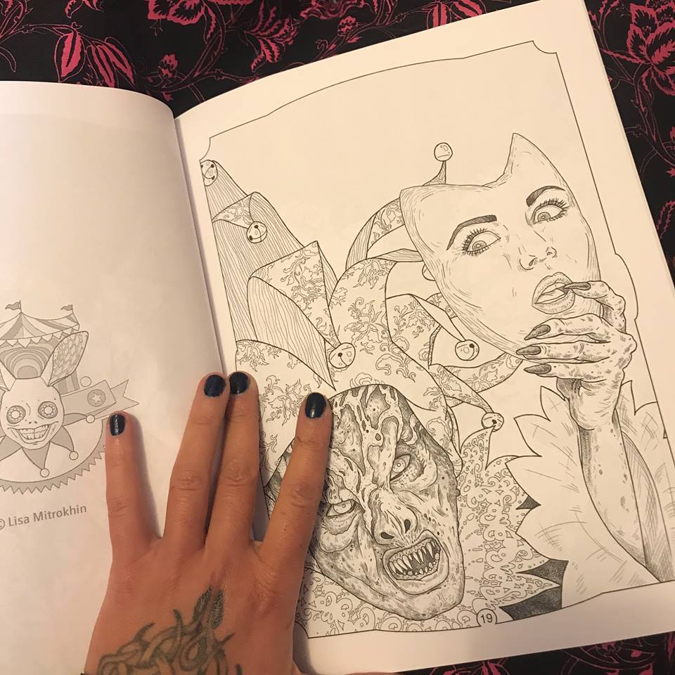
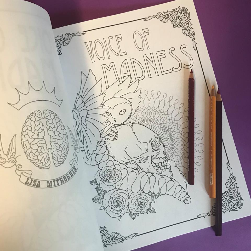
This is the original page. By the end of this journey you will notice that the delicate alterations I will impose on it will be minor, especially compared with my other coloring projects.
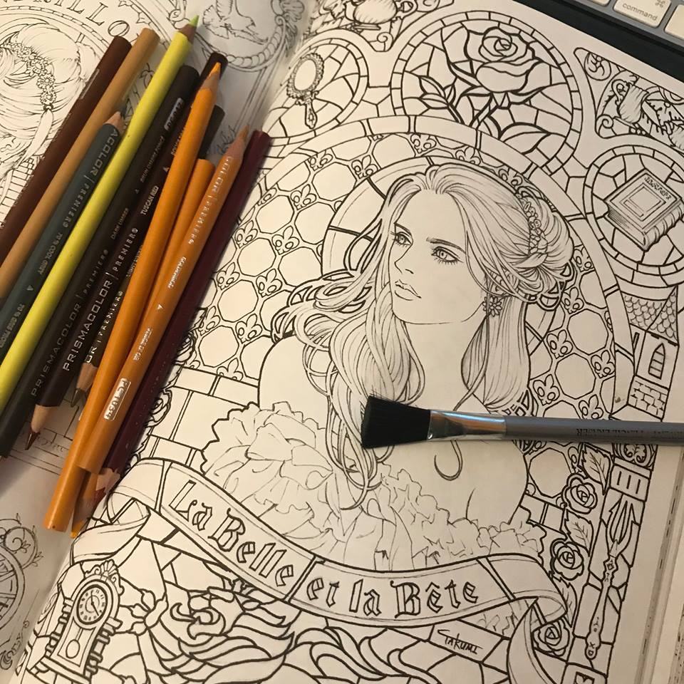
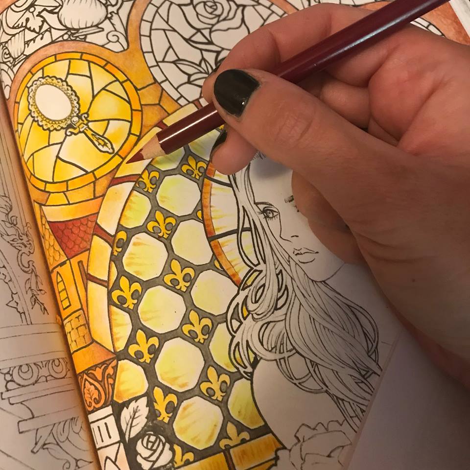
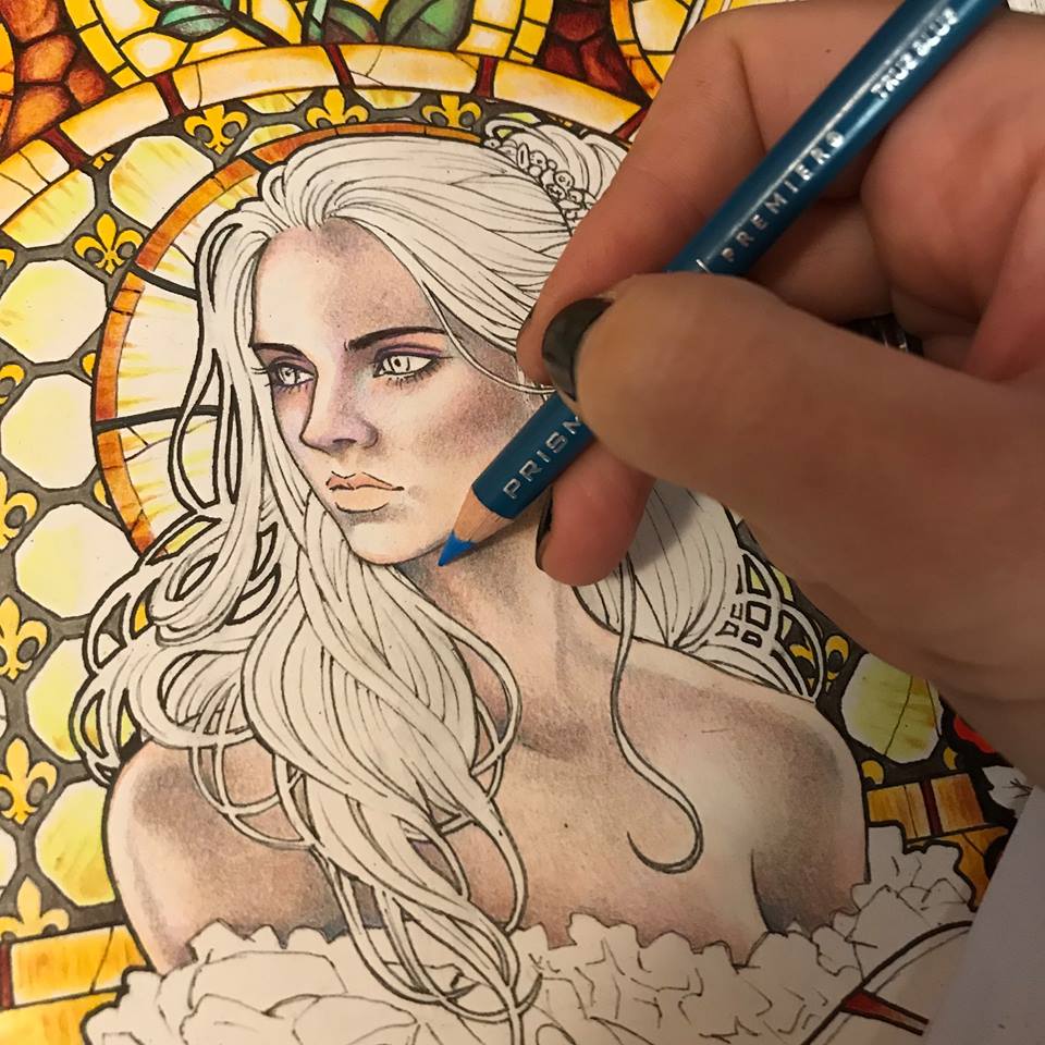
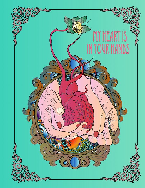
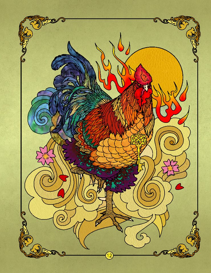
I don’t believe in pencil brands, but I do have my favorites in the towering piles of mixed and matched pencils, that occasionally collapse onto my work space and get pushed away with as a sweep of an arm. I tend to favor softer pencils that lay onto paper, colored or otherwise, almost like pastels, or oil paint. I decided to start with the background. I want it to be daytime and I want the stained glass window behind Beauty to be vibrant in color, but light in atmosphere. I begin with a soft grey.
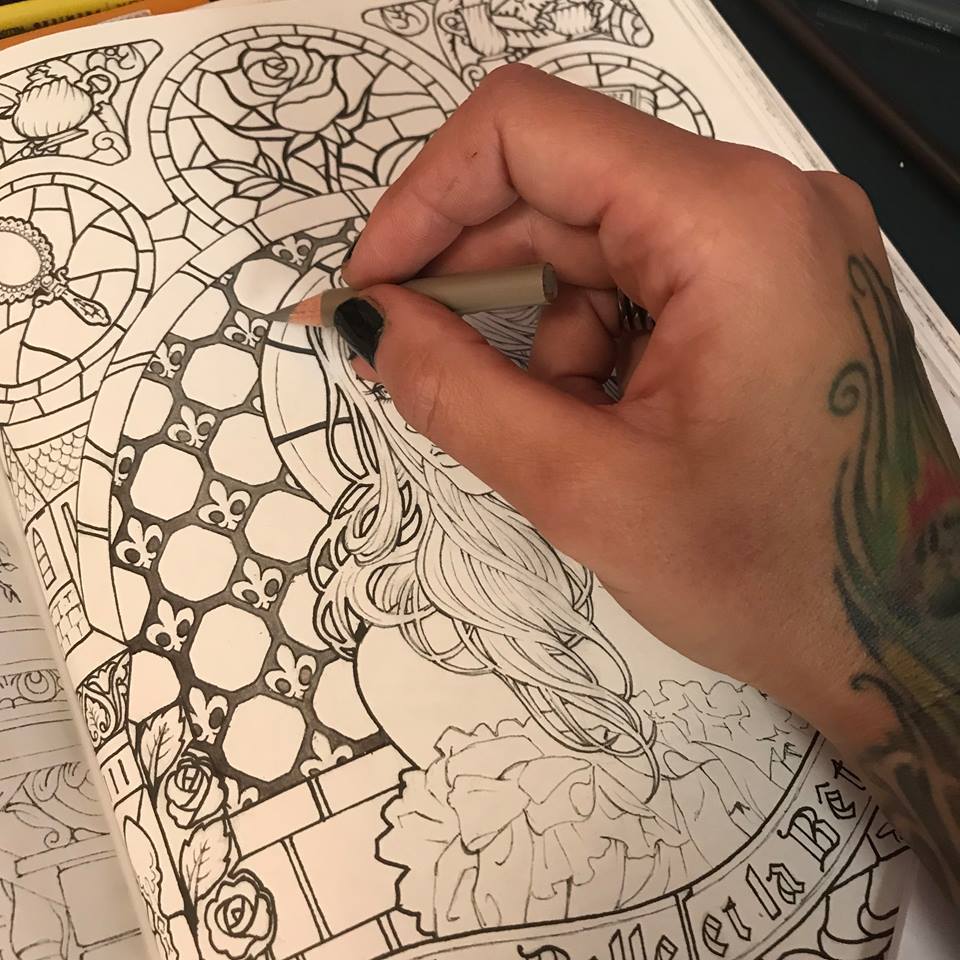
I now have a vision of what my stained glass window will look like. I imagine amber tones that are darker at the edges and golden in the center. I lay down a layer of auburn brown, kind of a middle town to my amber effect.
I proceed with a the brightest, most sunshine-like yellow I can find in my piles of art supplies, and I introduce the most vibrant tone of my honey glass.
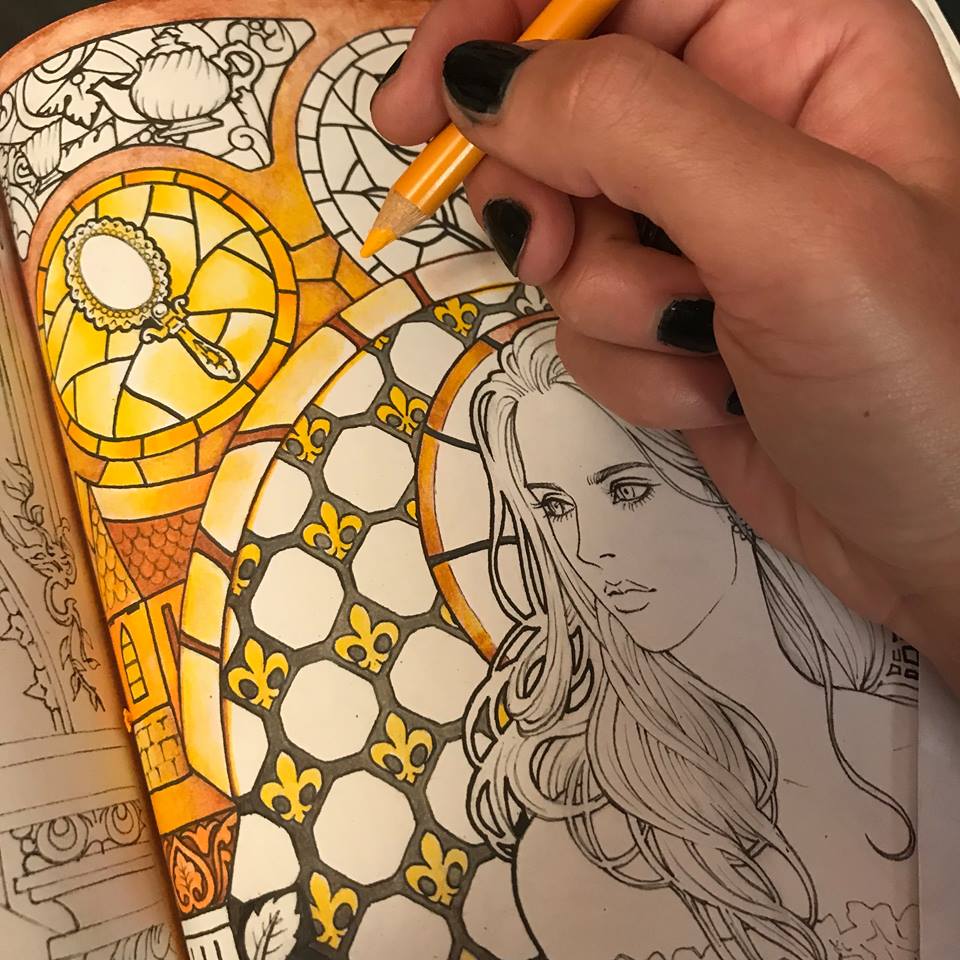
I contrast it with a deep burgundy, beginning to establish structure and give my glass some body.
I use the same burgundy to begin the rose.
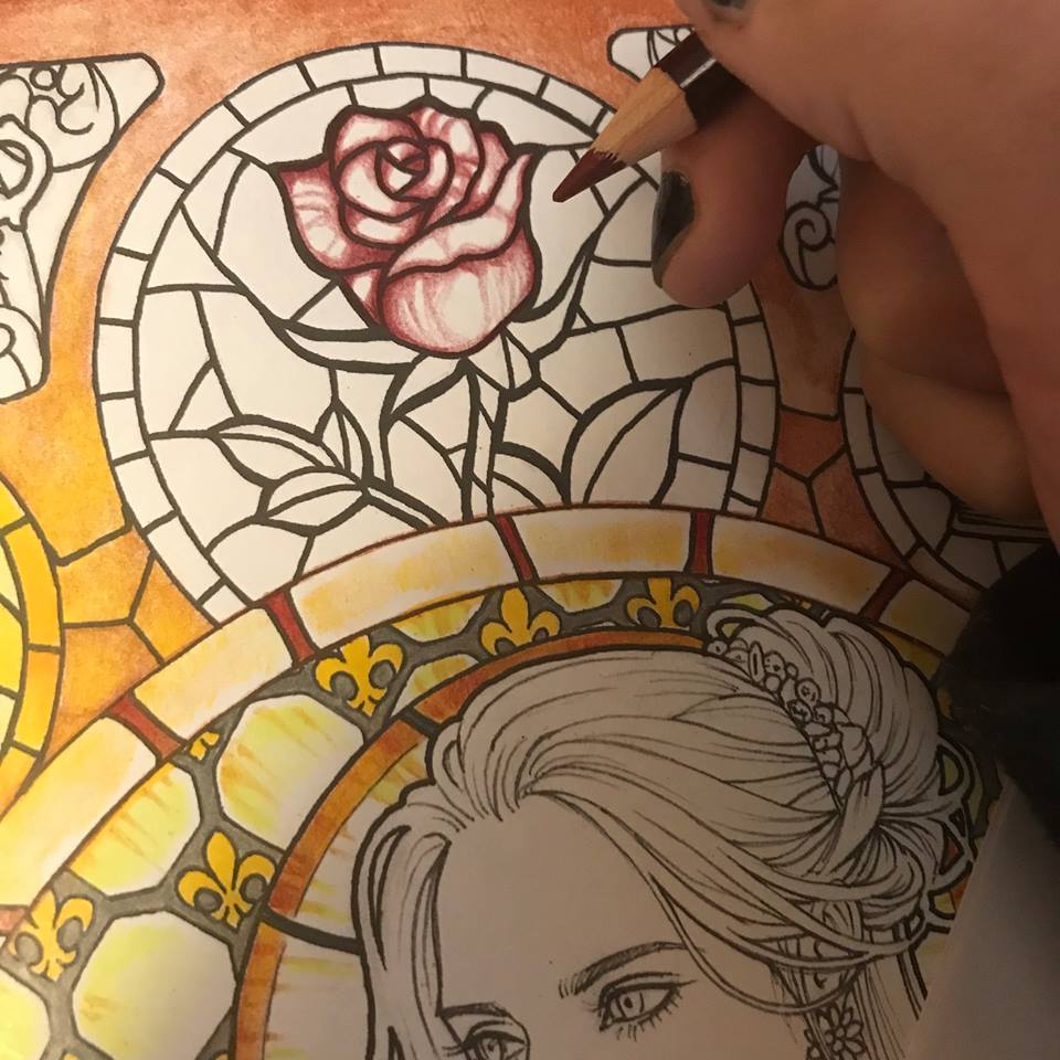
Here’s where having soft pencils comes in handy. I now use a light red for my next layer of the rose, using the pencil itself to bland the burgundy and create a nice gradient. In this particular case I am using Prismacolor pencils.
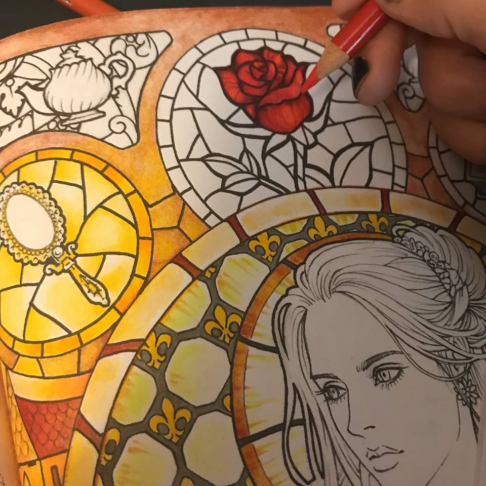
I find a deeper burgundy yet and add some more contrast to the rose. I want that light red to really look like it’s glowing in contrast to the darker reds.
I approach the green leaves with the same principle of darker tones at the edges with lighter tones in the center. Here I use a turquoise green for the main color, the same dark burgundy for the edges and a touch of white for the center. Blending the whole time.
Now, because my artistic mind gets bored working on one element before moving on to another, I feel that I have enough background light and color established to begin coloring the face. I start with the same soft grey I used on the glass frame.
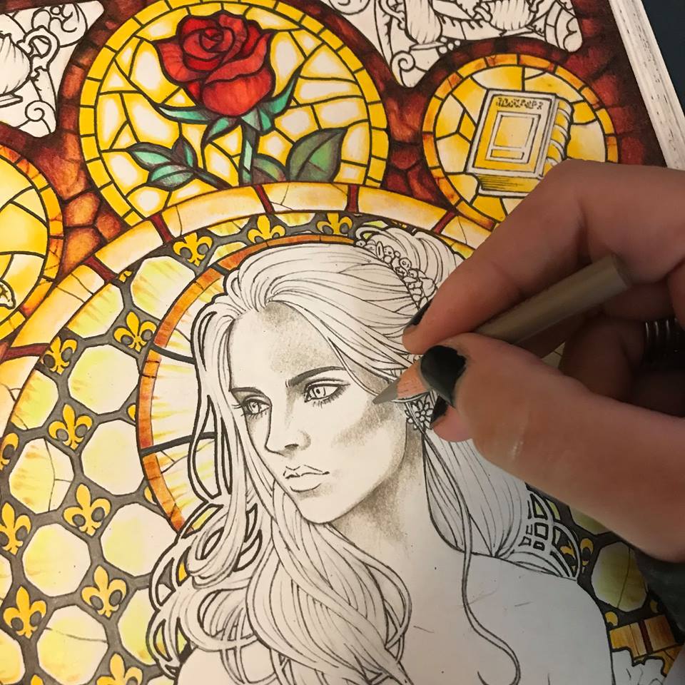
I then add some pale peachy pink as my main base color, playing a little bit with higher and lower saturation all throughout.
I move on to lilac. Just a few shadows here and there.
A touch of blue. Just a touch.
I use one of the lighter burgundy tones to give some volume to the cheek bones and also the eyelids.
Now it’s time to define the eyes a bit more. I have already been building them up with greys and browns. Finally I add black.
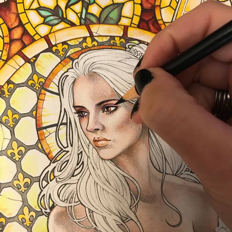
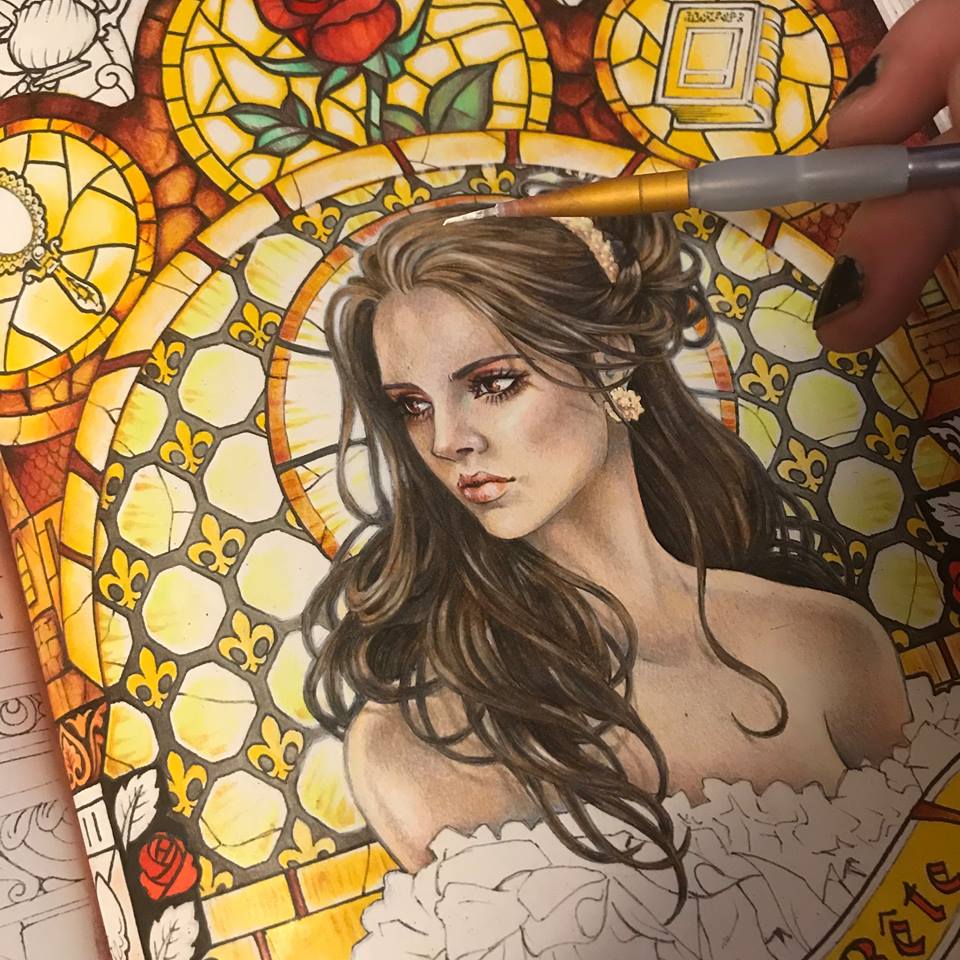
I look around at my yellow light and realize that her skin needs a lot more yellowish tones, so I add a soft layer of pale yellow.
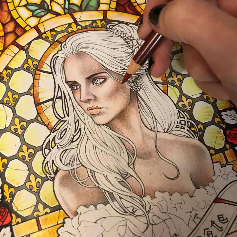
Now it’s time for the hair. I want her to have dark, but somewhat mousy brown hair. I begin with a solid layer or a dull light brown.
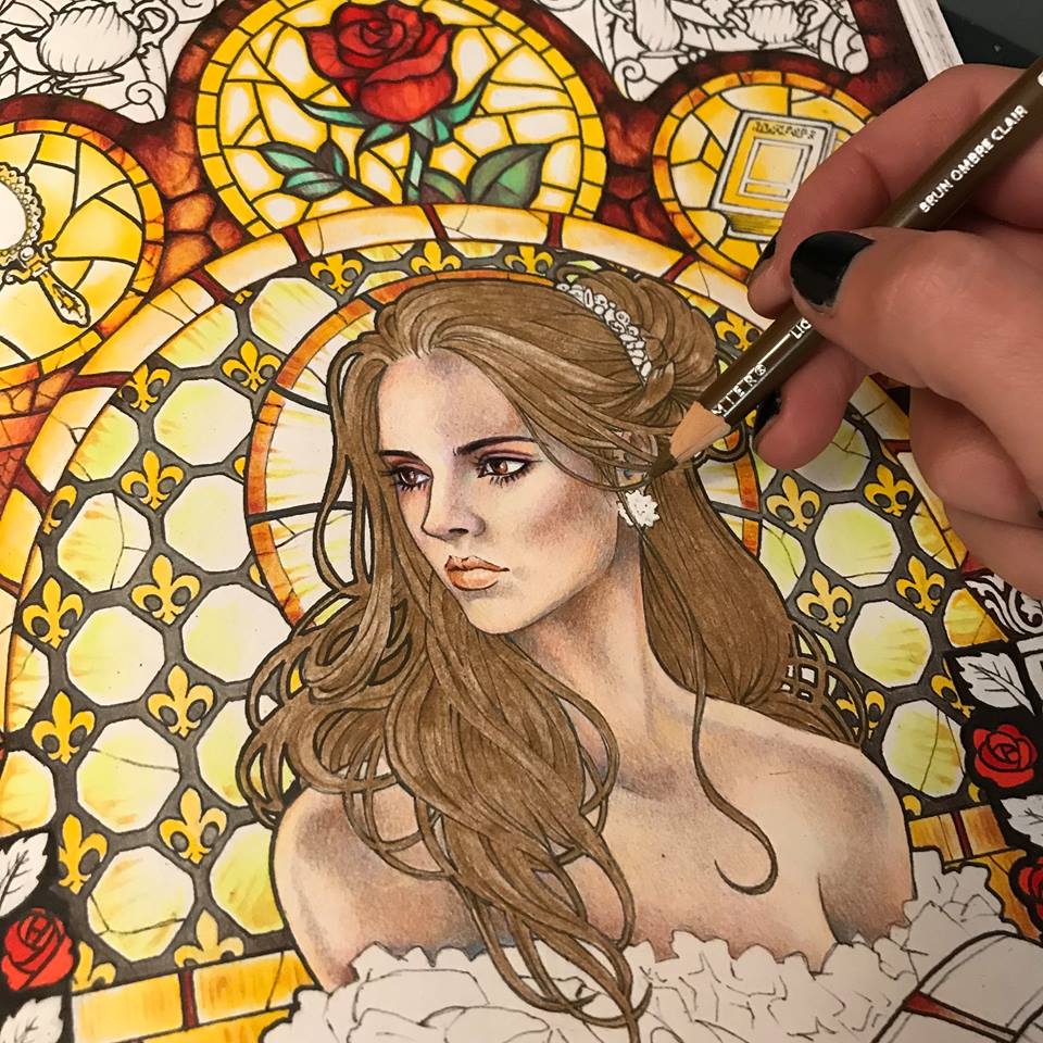
I proceed to give it volume by going over certain parts with a darker brown tone.
I emphasize the darker parts with actual black.
Now that her hair looks three-dimensional, I give it even more volume by adding an occasional white highlight. A soft white pencil is excellent for this purpose. It won’t actually “paint” white over your colors, but it will layer on a soft gentle highlight.
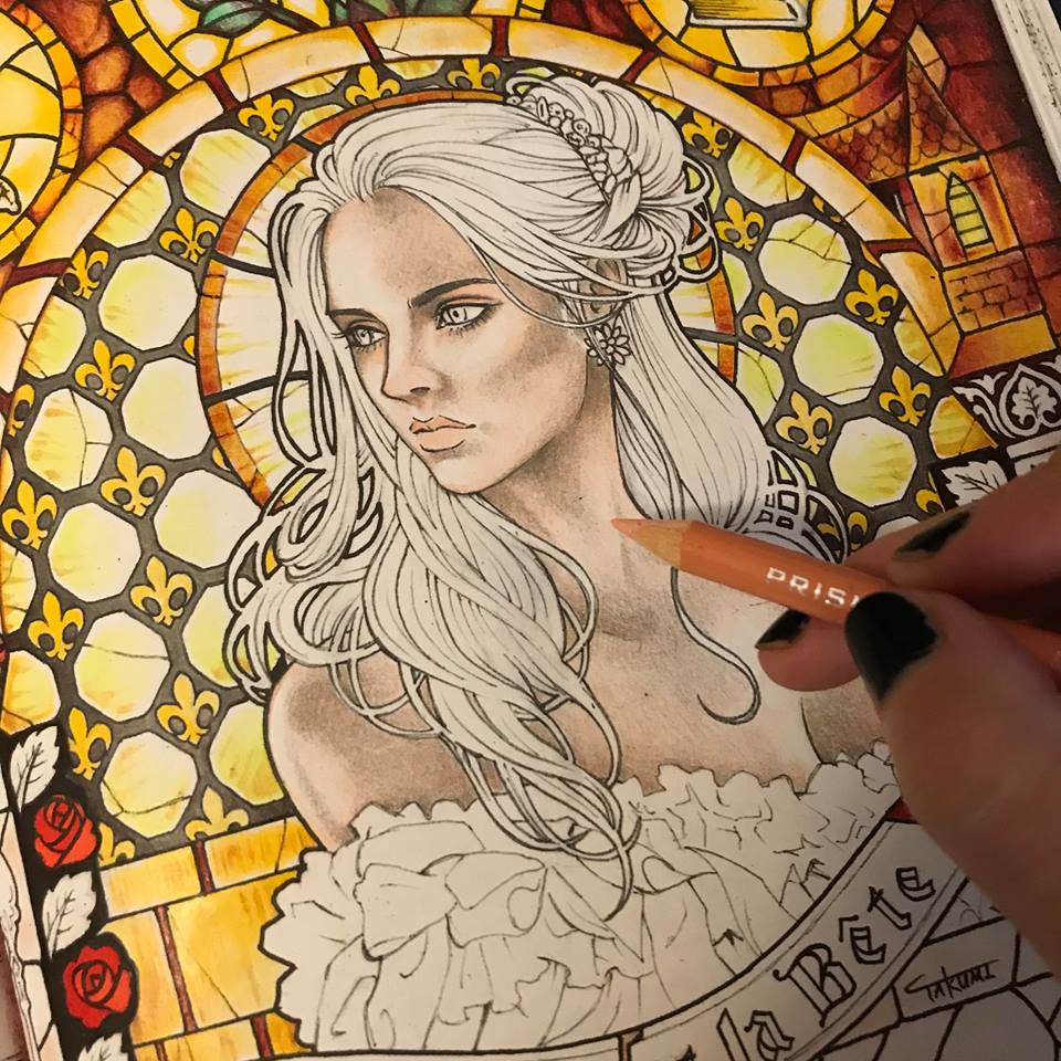
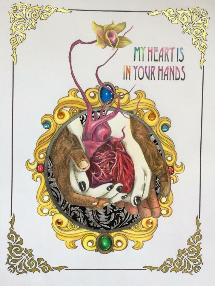
I look at her face and realize I want her to have more pink and peach tones. I want her to look alive and maybe even a bit flushed. Just a bit. I add some rose around her eyes, her cheeks, her lips and the tip of her nose. I also tweak her jewelry.
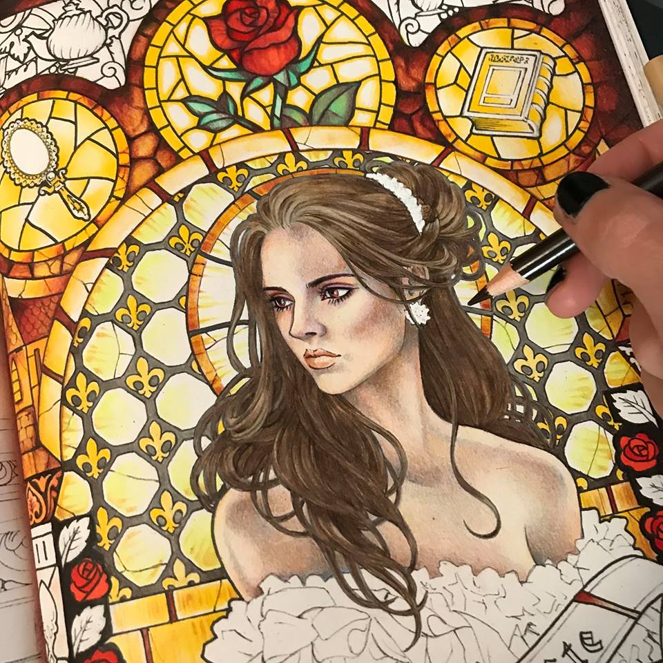
Now that I like her face and hair I feel that her outlines are too stark against the glowing background of the stained glass. The light does not look natural. I take a little bit of white acrylic paint onto a small brush and blur the edges around her hair where the light is the brightest.
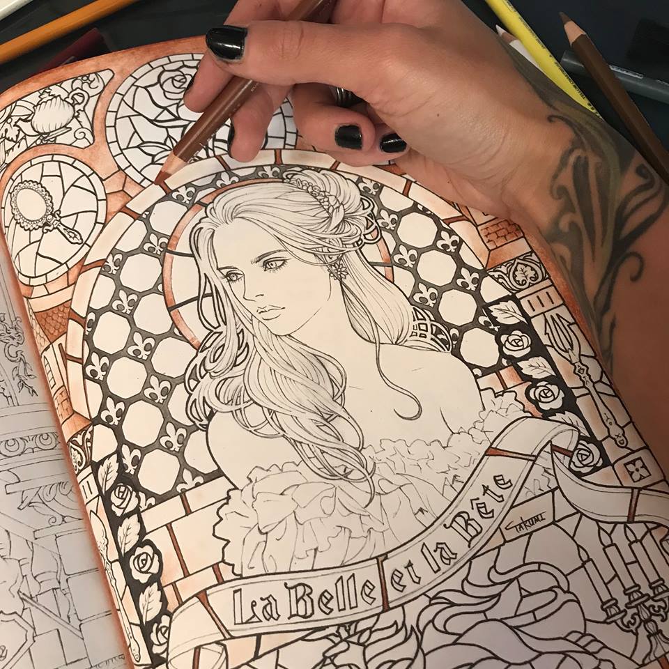
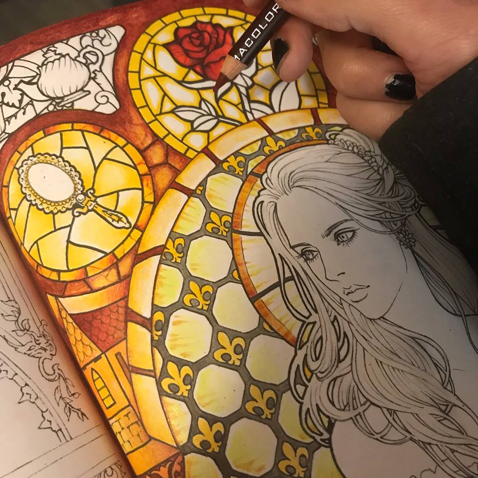
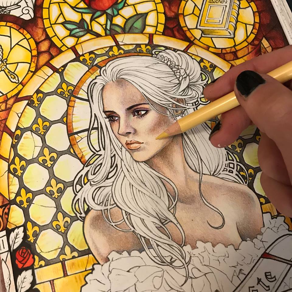
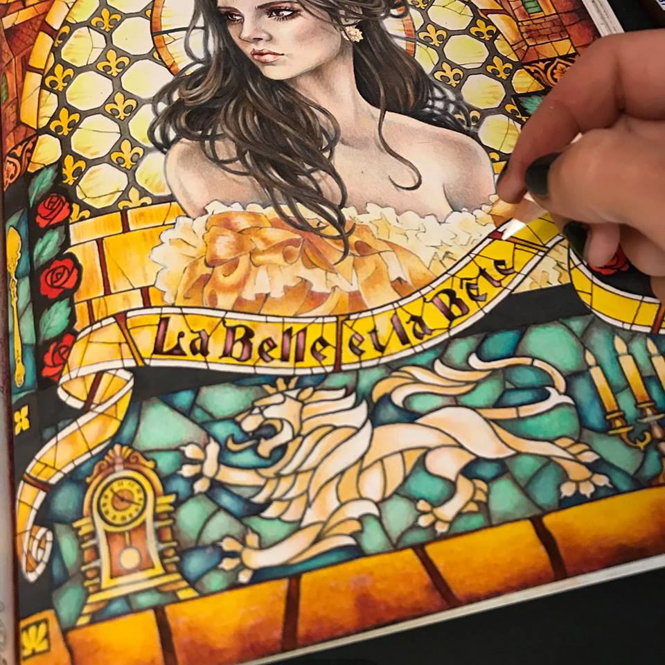
I decorate her dress with silk caramel colored ribbons to match her jewelry and return to the background. I feel that the whole composition is looking a bit monotone is all yellow and gold. It needs some zing. I decide that the turquoise green of the rose leaves needs to be balanced by similar tones. Just perfect to display our golden Beast.
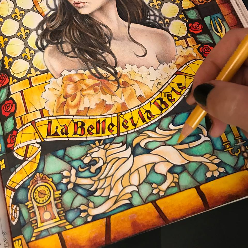
I notice that the stark yellow ribbon with bright red letters looks a little flat and boring, and way to bright. It was a good start, but it needs something else. I mute the colors with a white pencil and add some texture to the glass. You may have noticed that I have also been adding my own glass cracks and some occasional definitions missing in the original drawing. Just tiny tweaks along the way. I’ve also extended my stained glass pattern all the way to the edges of the page.
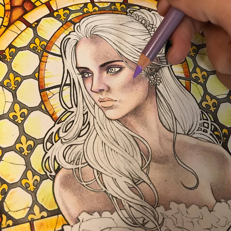
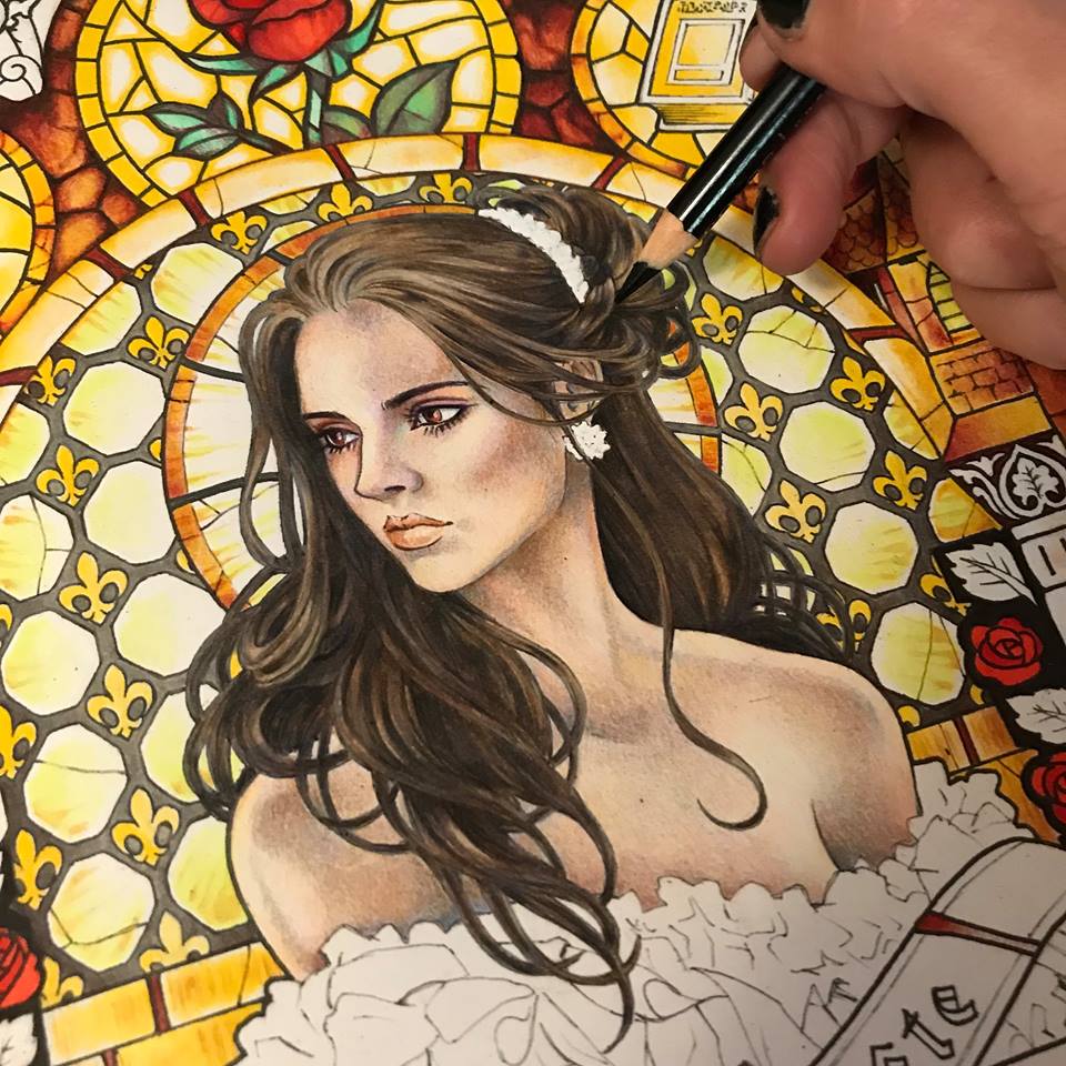
I now step back and look at my composition. The background is so vibrant it mutes all the intricacies of Beautie’s skin. She needs bold golden yellow highlights on her skin, mainly around the edges. That’s better.
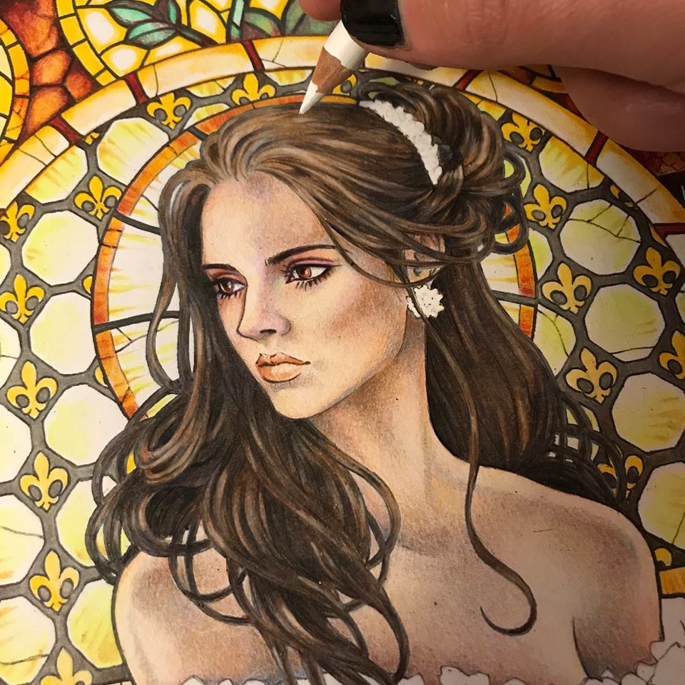
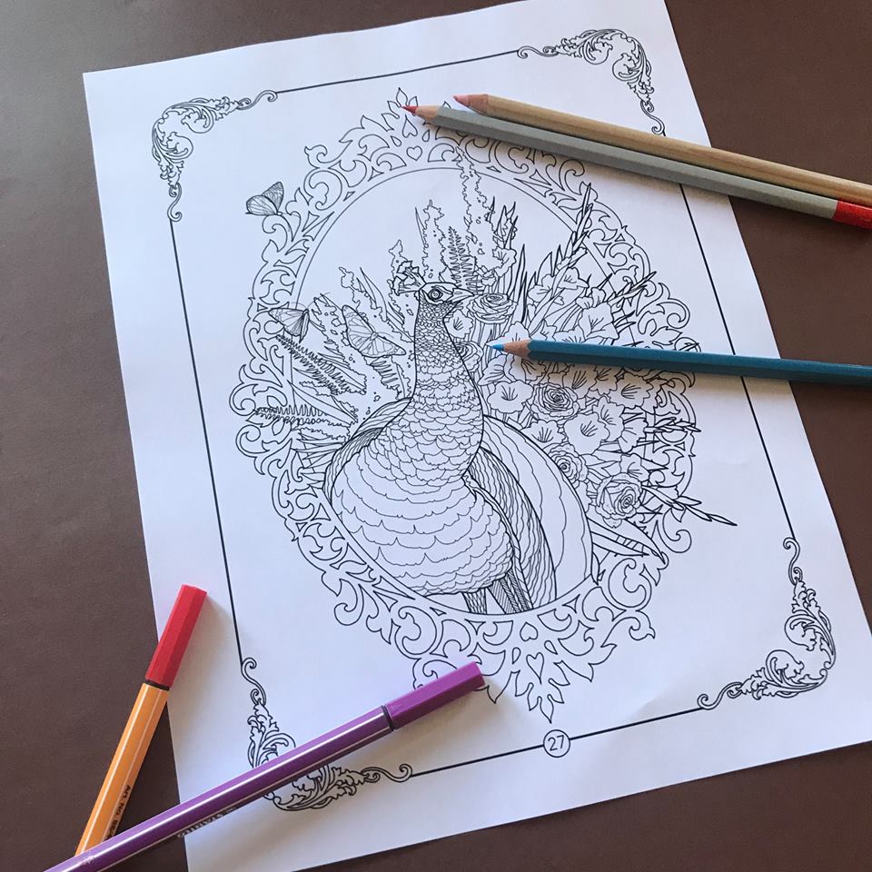
At last I think she is complete. I go over the entire page, scanning it, blending some parts with my rapidly disappearing white pencil, and adding the final highlights all over.
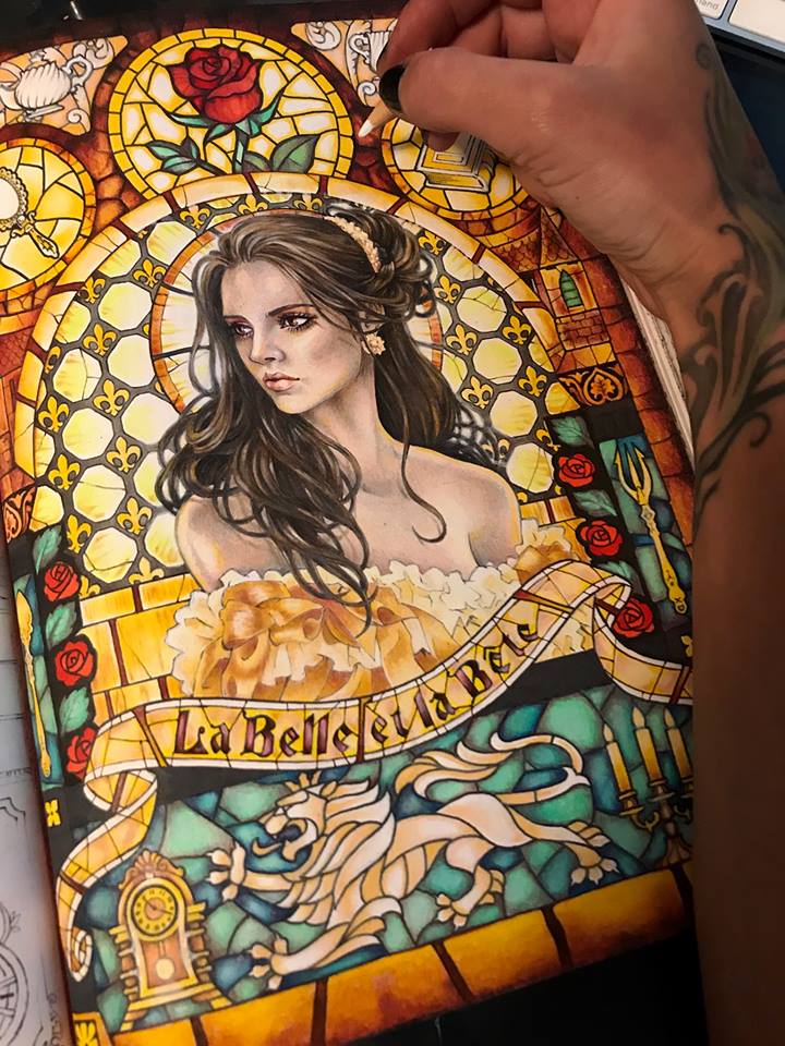
And there she is, in all her beauty, La Belle.
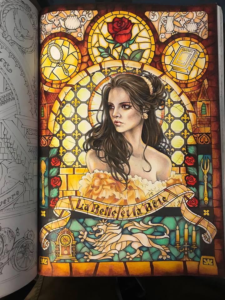
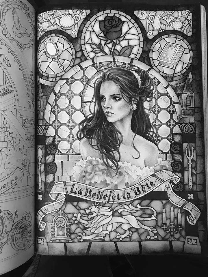
However, having spent three days on this image and feeling a bit overwhelmed by all these colors blasting back at me, I take a moment and run my photograph of the page through a black and white filter. That’s better. I can rest my overworked eyes now and just enjoy the darkness and contrast. If you’ve treated your light and color appropriately, respecting the light source and the saturation levels, resetting your image to black and white should not effect its appearance any more than a digital photograph of your own face may be effected by being suddenly switched to black and white. I rather like it this way.
I hope you’ve enjoyed following me on this little adventure as I colored Takumi’s Beauty. I hope to see some of your lovely ladies in all their colors soon. Cheers, and happy coloring.


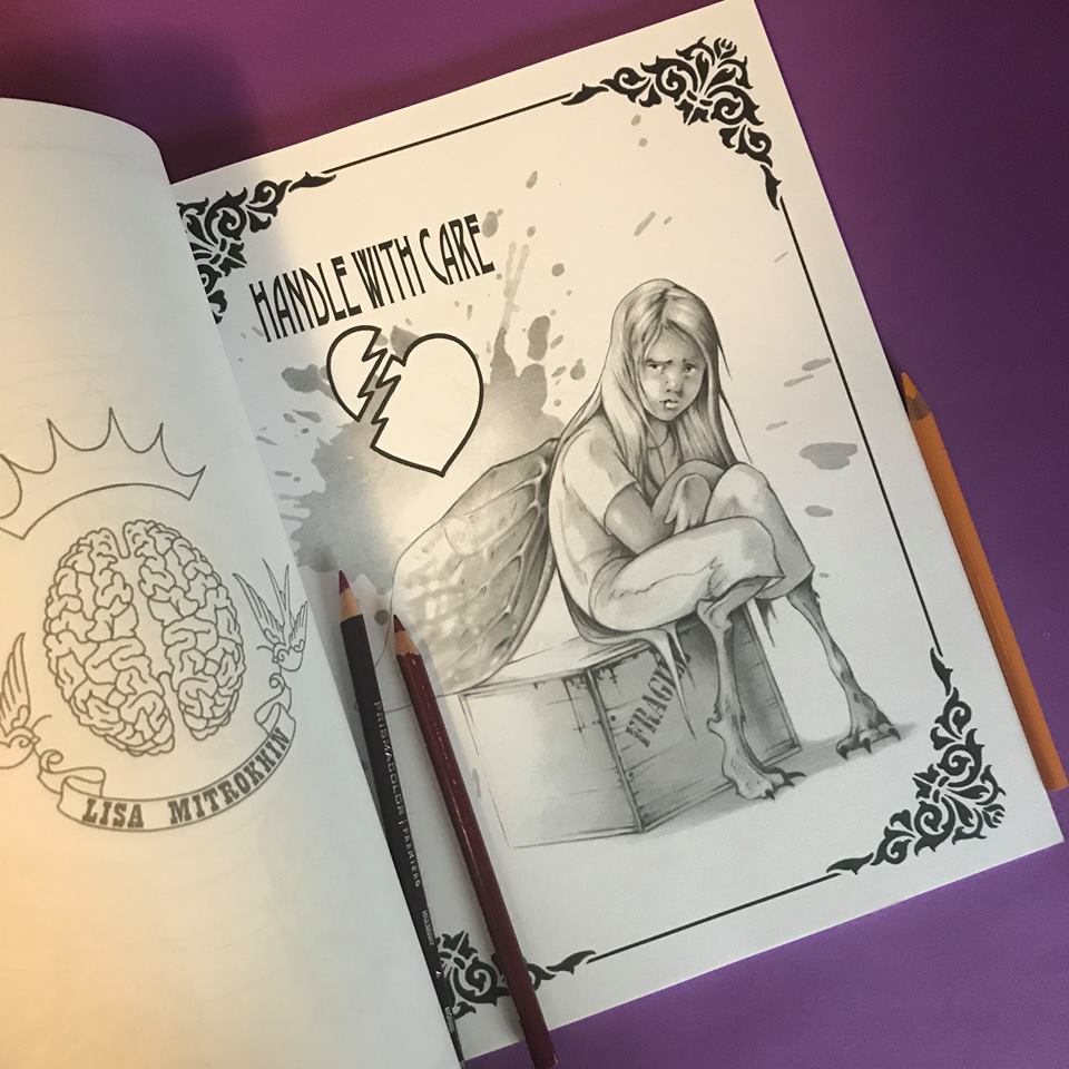
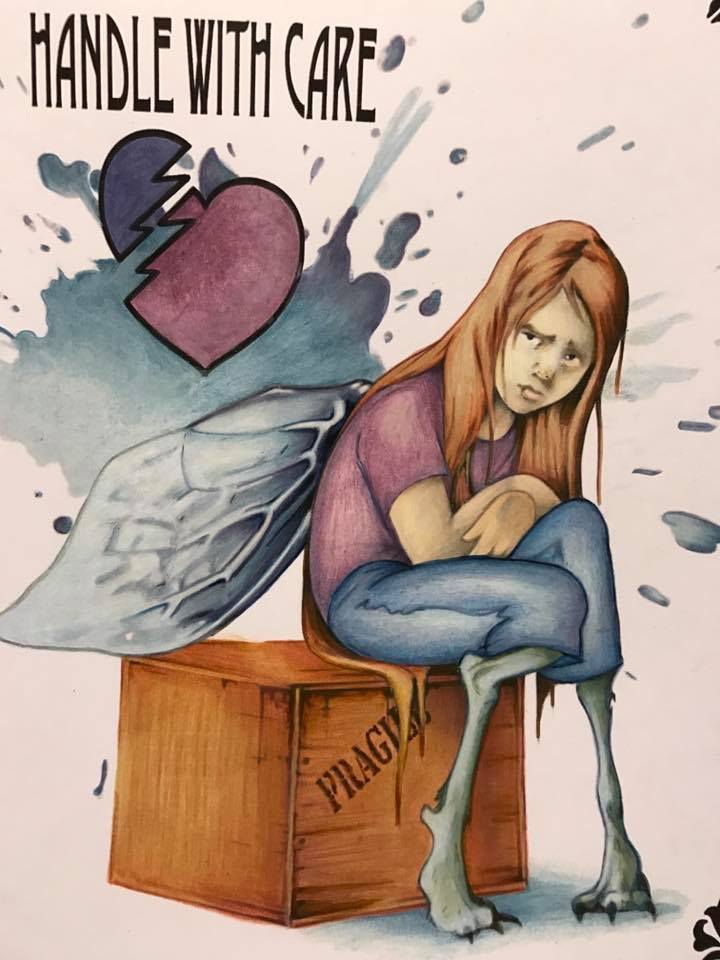
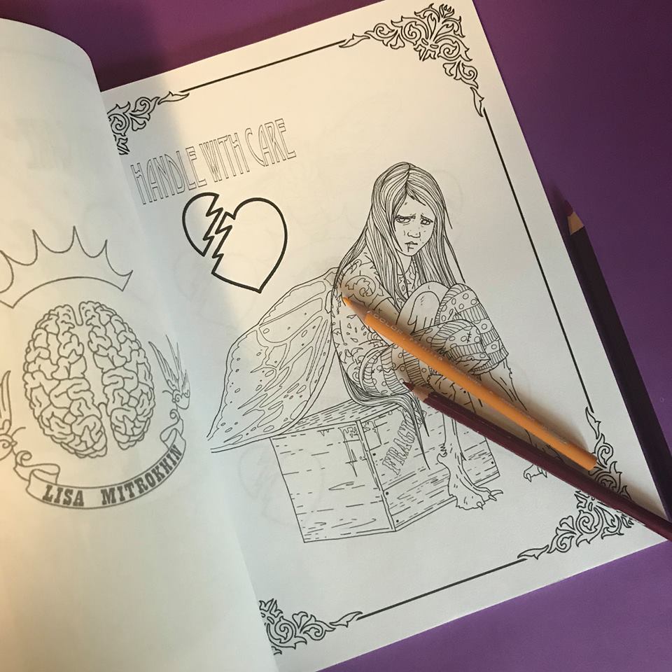
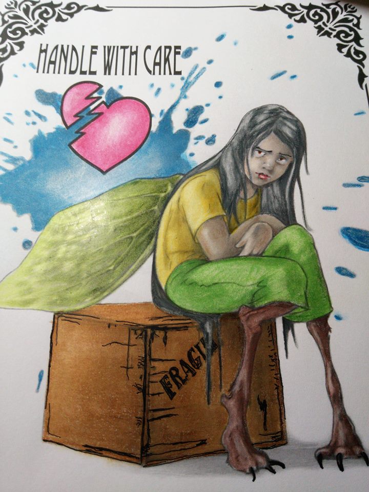


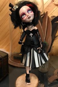 For instance, when reviewing these two dolls the audience will be pretty divided. Some will prefer the sparkly blond angel princess, while others will be drawn to the gothic poet with messy hair and piercings. Personally, I would never make or purchase the angel doll, but I recognize that this particular one is made just as well as my gothic poet. I see that her dress is made with equal care and attention to detail. If it is handmade doll, someone clearly spent a lot of time and care one it. It took skill to attach the wings and design the crown. The character has personality and is clearly beautiful in its composure, expression and pose. If it is factory made, it becomes significantly less interesting to me, but I still can’t argue the fact that is of good quality and well designed. If I knew a girl who likes angels, I would consider buying this doll as a gift. I am not so blown away by this doll to leave feedback on her listing, nor am I so bored and disgusted by her pure stereotypical beauty that I will care to negatively comment on her. Coming across work like this, I make some mental notes, but I do not take the time to comment or review. It’s not necessary. My feedback, in this case, is irrelevant. This doll is simply not in my style. Looking at my own gothic doll, on the other hand, many people may praise her just for being dark and unusual without paying attention to the detail or reading the back story which I create for all my characters. Some others may immediately get offended and leave nasty comments based on their personal preference, failing to consider the skill and care that was necessary to create her.
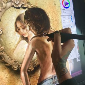 It turned out that Cally’s main character Sarah was in need of a custom-made tattoo from someone with experience in just that craft. The tattoo is so significant in this book that it’s almost its own character. Cally didn’t have to do a lot of talking for me to have enough mental images to begin my work. She simply shared with me three of the 662 pages of her novel, and I knew everything I need to know about what Sarah looked liked and enough about her personality to portray that through body language and choice of clothing. One of the advantages of working with an author is that they tend to be quite articulate. After all, the readers have to see her character in their minds just as clearly as I was about to see her on my digital drawing page (for a more technical description of my digital painting process check out my article
 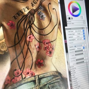 Now that I had Sarah’s body, face and hair painted and approved by Callystin, I moved onto the most important part – the tattoo. Sarah’s tattoo is complex enough for an artist to design for a real back. It would be a challenge to tailor it for a fictional 1200 by 2200 pixel painted character. I had to approach it the same way I would a real tattoo. Having read Cally’s description of it over and over again, I drew a fully detailed cat-o-nine tails whip with a braided leather handle and cherry blossoms scattered all around. I then wrapped the design around my character, curving and blurring it to match my painting style in this piece. Actually, the most time consuming and complicated part of the process was the amount of distortion I had to apply to my otherwise flawless and highly detailed tattoo design in order to make it look realistic in the given light and remaining true to my brushstrokes. The application of the tattoo to Sarah’s back was a week long project. After submission, Cally requested a few edits and adjustments, specifically in relation to individual tails and their direction, the placement and color of specific blossoms, and clearly readable text “Never Again”. After another few days of edits we arrived at the tattoo that we both agreed was perfect. The only final adjustment she asked for was the removal of visible scars from Sarah’s back. I imagined that most of Sarah’s scars would still be visible, if not for any other reason but for the reader to see that she has them. Cally had a very firm and specific request to remove the scars, explaining to me that the whole reason for the tattoo is to hide the scars all together. The audience does not need to know the full scar story from the cover. They will find out while reading. After discussing the technicalities of actually covering scars with tattoos, we came to an artistic agreement and I cleaned up Sarah’s back, while Cally cleaned up some textual details on the matter.
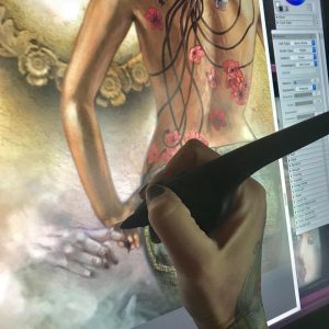 My next subject of interest was something that my author described as optional, but I immediately saw as inevitable. While Sarah is an obviously attractive young woman with an enticing full back tattoo, this is more than just a romance novel, it is a paranormal romance novel. I felt that the paranormal part was important to at least suggest visually. This is where Sarah’s glance direction comes into play. I specifically painted her looking down and at her hand, in order to have a platform to introduce a mysterious supernatural hand inviting her into its otherworldly haze. Now it all comes together. Now we know what seduces Sarah’s curiously. It is this human, yet animal-like, hand in the mist. This was probably my most favorite part of the project. I wanted the pale beastly hand to appear as mysterious as possible, revealing nothing of its character yet teasing the audience into having to find out. I wanted the viewers and the readers to be as intrigued by the hand as Sarah is.
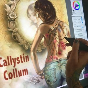 Now that the mysterious hand was done and approved by the author, I moved on to polishing up the details on the image as a whole. This is a part of any digital painting where I create a lot of new layers, each with very minute but vary valuable information on them. I spent a full day on making sure that my light source was consistent, the parts that needed to be in focus were clearly in focus, while the ones intended to be blurred were sufficiently blurred. I played with darkness, contrast, definition and saturation on my fused layers, and of course scanned the entire image for imperfections, artifacts and inconsistencies. After a couple more back-and-forths with Callystin, we were ready for formatting.
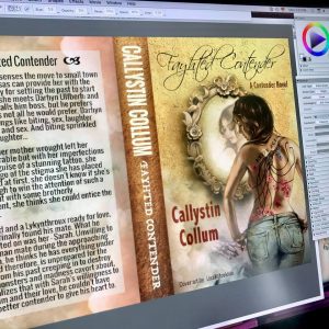 Formatting a book cover is surprisingly more complicated than people realize. Correct resolution is the single most important factor. You don’t want any detail to be lost in the print. Color balance is also essential. The printed version has to look exactly as the digital version does on the screen. Finally, sizing mistakes are unforgiving. Depending on the publisher’s format demands, you have to make sure that your full cover spread, plus the spine, will not be cropped even a millimeter off from the desired layout. In order to achieve this, one must know the exact thickness of the book’s spine, which is calculated by multiplying the number of double sided pages by the paper thickness. To do this you must know the paper your author has chosen for her publication and her manuscript length according to paper style and size. As Cally was making last minute edits and adjustments, the thickness of her book spine also kept changing, sometimes by a fraction of a millimeter, but every pixel counts when it comes to professional formatting. I think for Cally, this must have been the only frustrating part of the project, understandably so. Well, good things come to those who work hard, and in time we worked out all the nagging technical details and the Fayhted Contender was ready for publication.
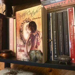 After three weeks of work and collaboration, Cally and I have become good friends and discovered that we share many similar views and opinions. I suppose it only makes sense, since we were able to work together so smoothly and quickly, understanding each other’s visions and motivations. This has been an incredibly rewarding artistic journey, but in the end nothing could have felt better than receiving my own copy of Fayhted Contender with a personal inscription from the author on the first page. Reading someone else’s novel with my art on the cover took some getting used to, but since this book is so easy to lose yourself in I soon had no trouble forgetting about the cover art and following Sarah on her journey.
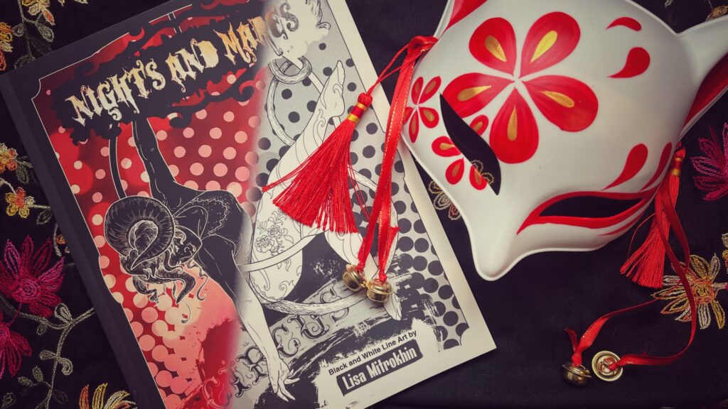
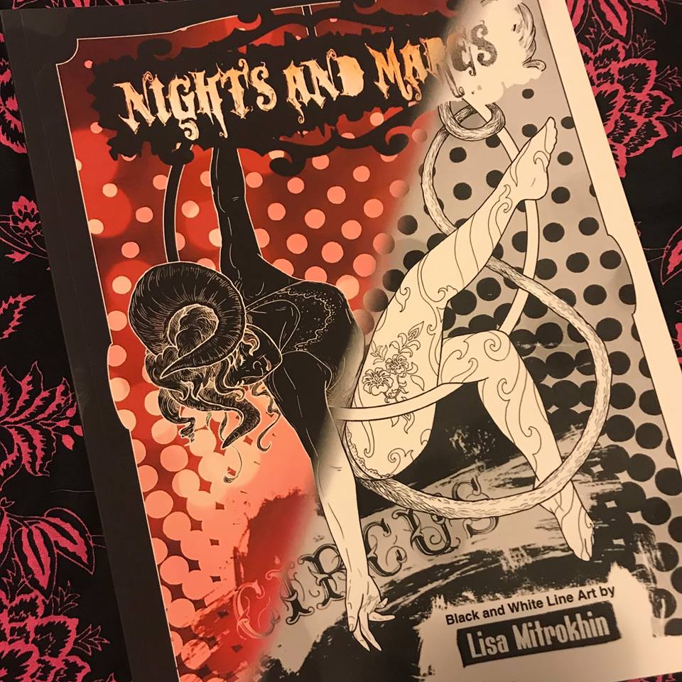
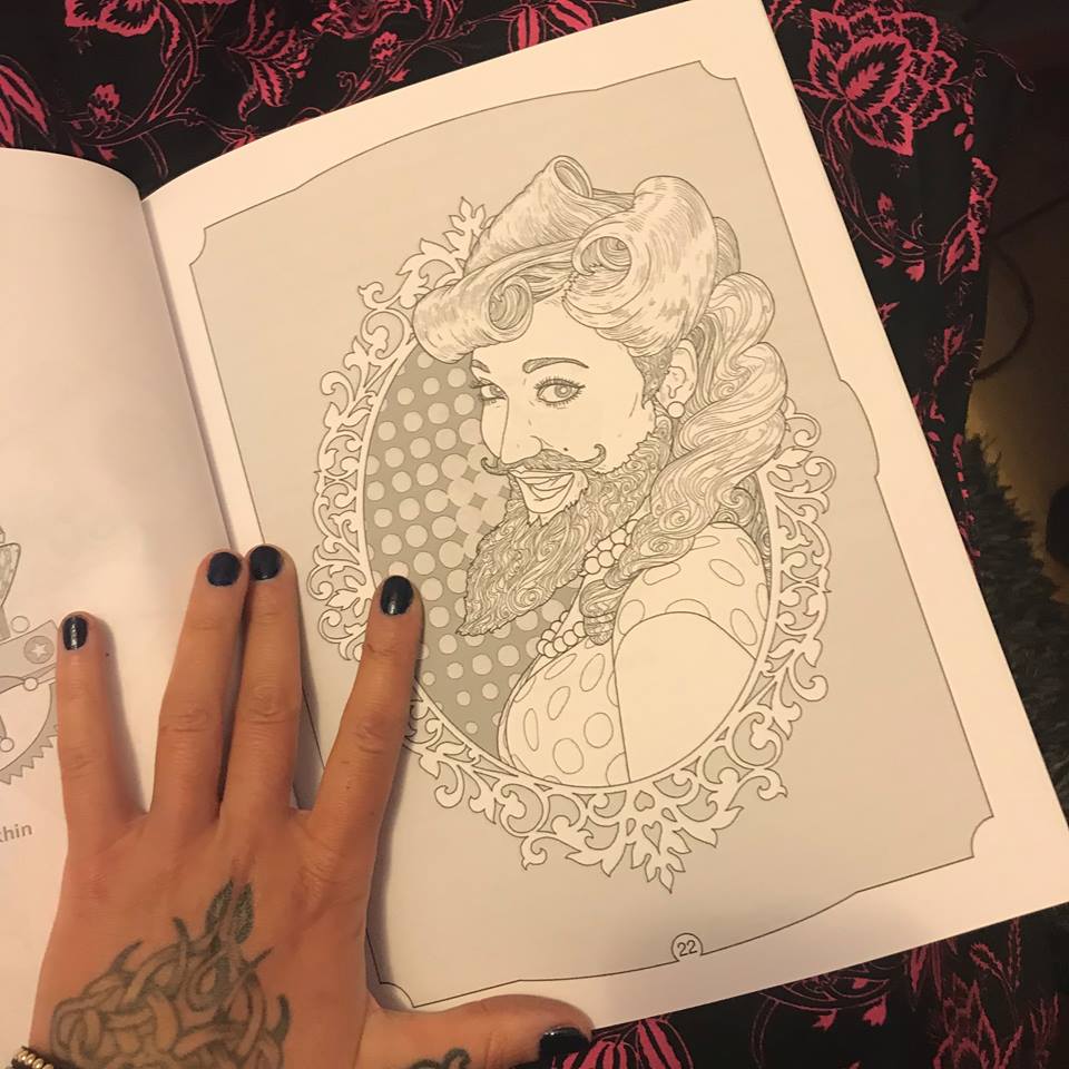
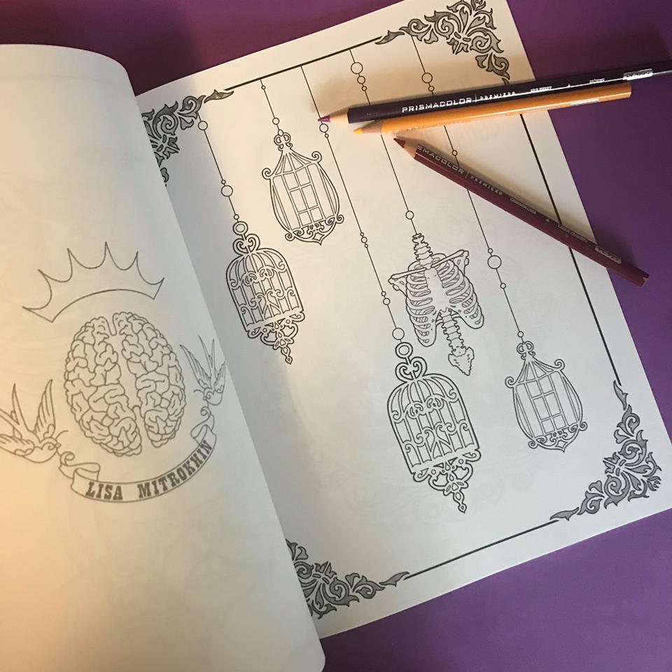
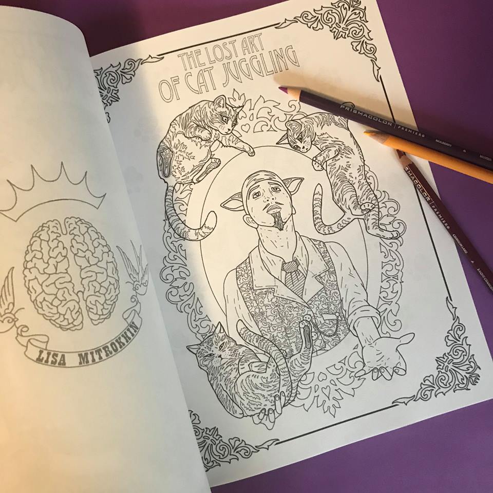
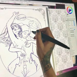 It all begins with an idea. Once I have a clear character concept in my head (which is teaming with ideas at any given moment) I open a new blank document and begin a rough sketch with my pencil tool set to a charcoal or a rough pencil, and usually in a color other than black. I tend to sketch in purple or brown. At this point I am only interested in working on the composition. I freehand my characters the way that I would on a notepad with an actual pencil. I erase a lot to correct my lines as I shape the desired composition. I continue sculpting in this manner for the next hour or so, depending on the complexity of my design. In this case, you will be following the creation of “The Musician” page for an upcoming book. Since this is a book project, instead of a blank page, I am working on a pre-made “frame” page that will be consistent throughout the book.
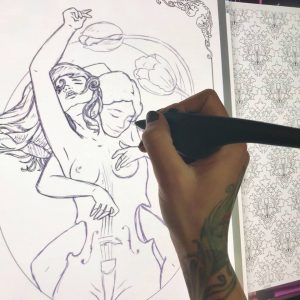 Once I have my composition I create a new layer. I dim the purple layer a bit, and begin drawing clean black lines over the transparent sketch. At this point I have my pencil tool set to “single, circular, (soft) cover” and, generally working on a 2400 x 3000 at a 300 px/in resolution, I set the pencil/brush in the range of 3.2 and 4.2 at a medium to lower opacity, with a rest value of 70%, bleed 40% and jitter at 0.04. The combination variations on these settings are of course unlimited, and every artist sets his own stats according to personal preference. This is by no means an instruction manual on how to set your controls. This is simply what I find to be the most effective given my screen with its wear and tear, the pressure of my hand as I draw, the current tip of my stylus, etc. These numbers are set and adjusted according to so many variables that it would take a book to explain it all. For our immediate purposes, let’s just say that I found my sweet spot and I work with it for best results and consistency, in coloring pages only. I have completely different preferences for other types of digital creations. As a matter of fact I have several palette layouts saved in my window arrangements, and I switch between them depending on my project.
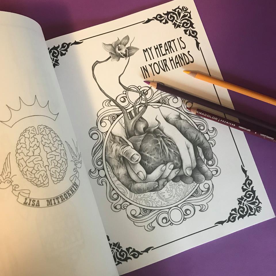
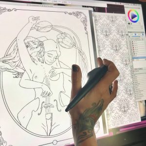 Once my clean black line work is done – a tedious and careful process – I can kill my purple layer. It is no longer needed. Of course I don’t have to erase it all together. I can dim it, or just make it invisible for the time being. Looking at just the black line work, I can see imperfections and inconsistencies. I now zoom in and out a lot, looking for anything that needs cleaner lines, smoother turns, etc. Because this is to be a coloring page, my lines need to be flawless.
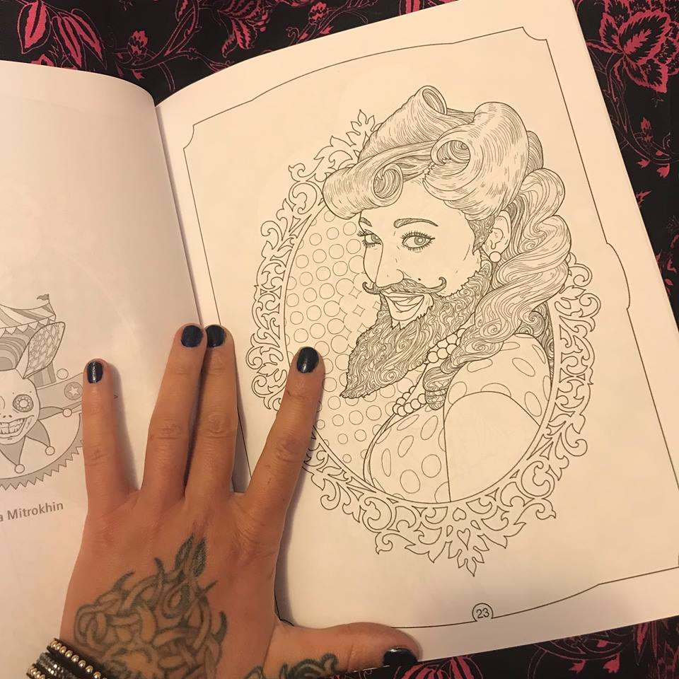
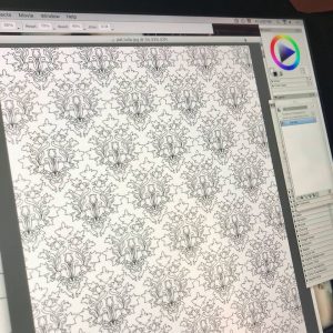 This particular book will be a character centered fantasy compilation, with each individual page presenting a new character drawn in a style closer to my natural drawing style rather than a traditional color-in mosaic page. However, to compensate for this fluidity that may be intimidating to some colorists, each page will also be embellished with elaborate background designs and patterns. Knowing that I will be drawing this character, I already created her background pattern days ago. All of my patterns are my original creations, drawn in the same manner as I am drawing this page, and saved as .jpg files for further use. Now that I have my background pattern, I can copy and paste it onto “The Musician”, resized, styled, and otherwise altered to suit my needs.
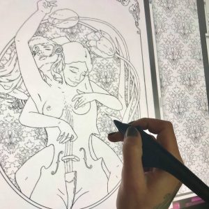 In this case, I minimize my pattern and make it into a gel layer, which I place under the main line layer. Now I can play with cropping and shaping it to appear just in the oval behind my characters. There are multiple ways of doing this. The first being simply starting my design with a patterned oval, then dimming it to comfortably draw my characters in a different layer, and once drawn filling my characters with white inside the outlines, and then bringing up the background pattern. There are many other methods of creating this effect using the fill tool and multiple layer arrangements, and even multiple file combinations, but I chose to do this in a bit of a primitive way this time. When I began this page I had a clear vision of my characters and their positioning in relation to each other and the page, but I did not yet know where and how I may use the pattern that I created days ago, or if I would even use that pattern at all. Having left my pattern work to the last minute, and having under-layed it in a gel layer, I just work around with my eraser tool, taking off all unwanted spill. A bit tedious, I know. With all this technology you would imagine that I can just click this and drag that and voila! a pattern fill, but no. Now I sit for nearly half an hour carving my pattern out to fit its shape. Sometimes that just feels like the better way to do it. This way I know I have complete control of my edges and their cleanliness.
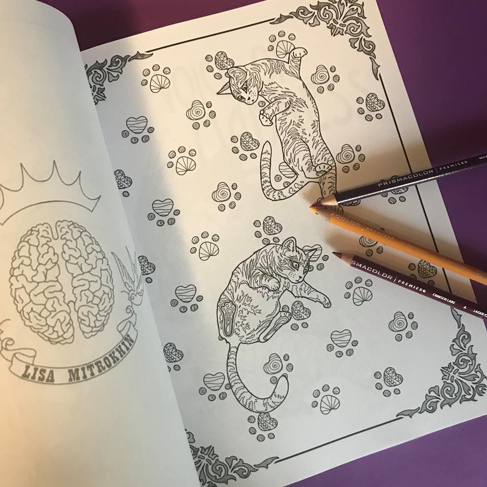
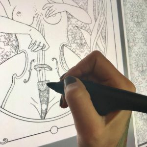 Now I look over my creation and take some time to add tiny detail and decoration. On this particular page, my characters are not wearing any fabrics nor ornaments, so my only decorative bits are the cello details. In some cases I like to draw very fine lines in the hair, giving it shape and volume that is almost realistic, but in this case the background is too thin and busy. If I add many new lines to the characters’ hair, It will be difficult to see its general shape. I chose to leave the hair on both girls nearly blank, with just enough lines to define its structure, allowing the colorist variation in coloring style. There will be many more characters in this book with very finely drawn hair.
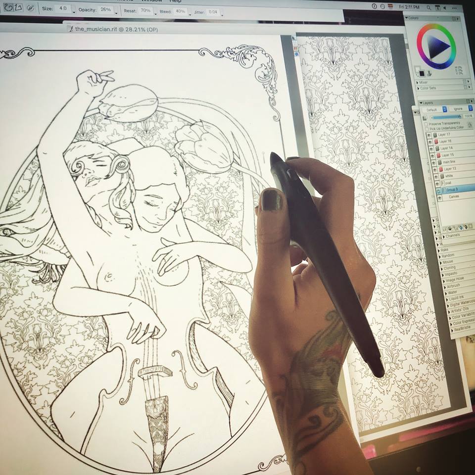
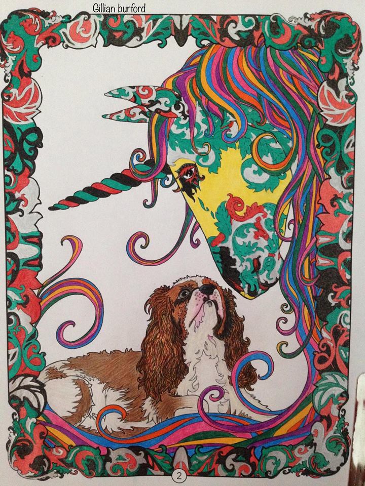
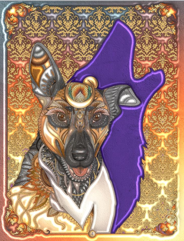
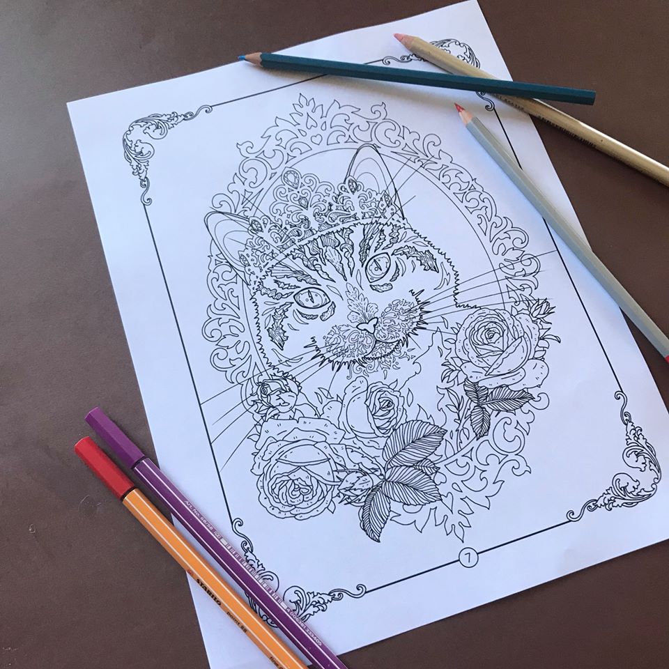
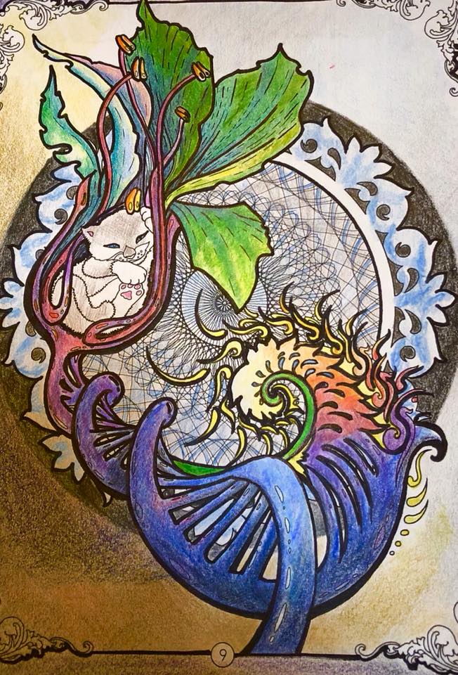
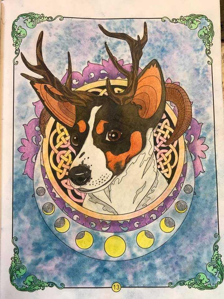
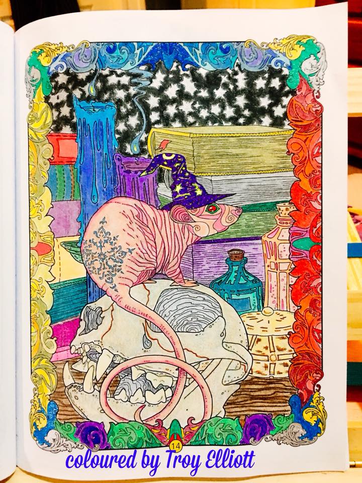
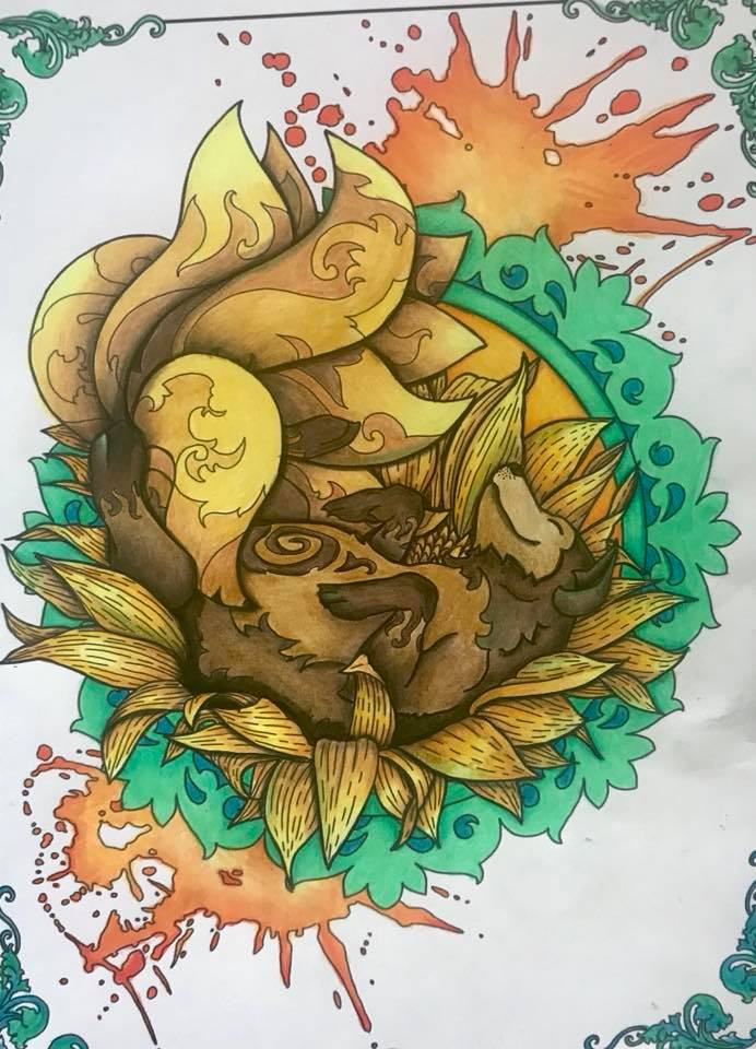
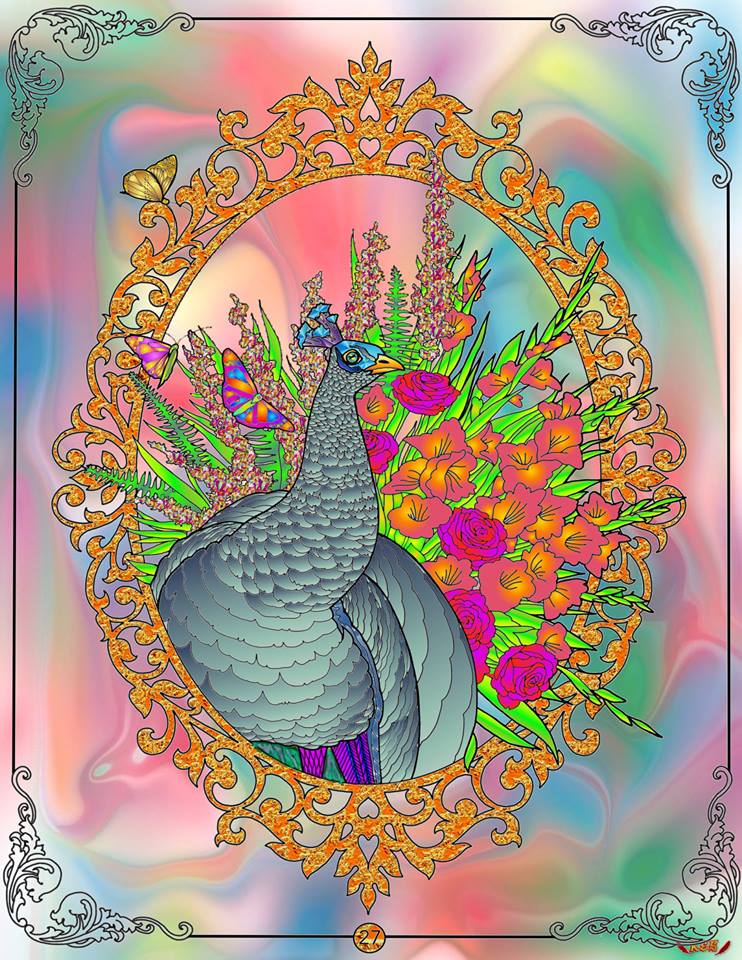
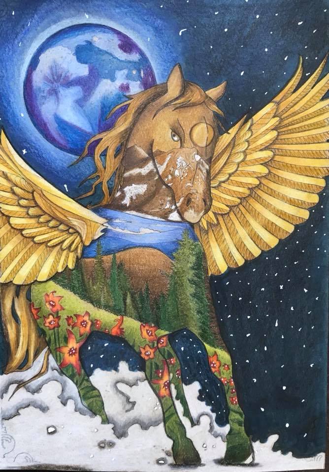
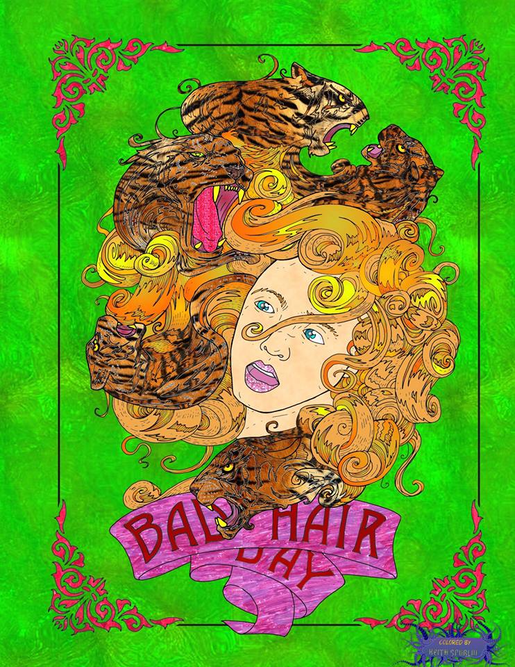
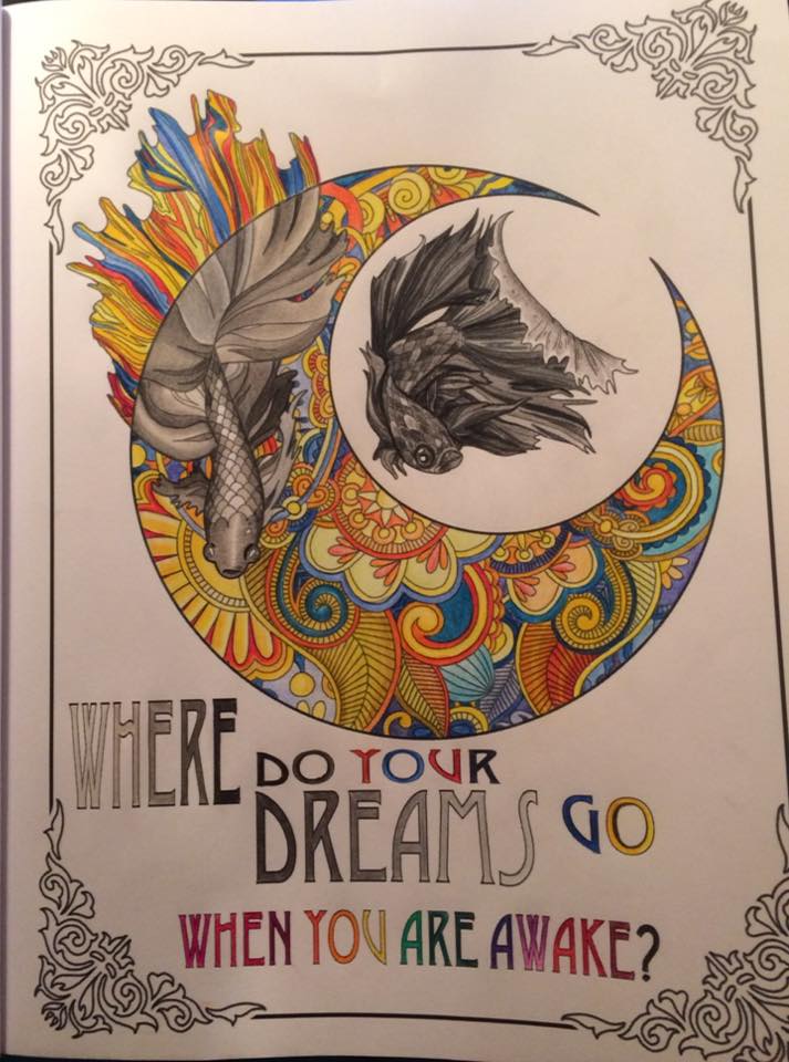
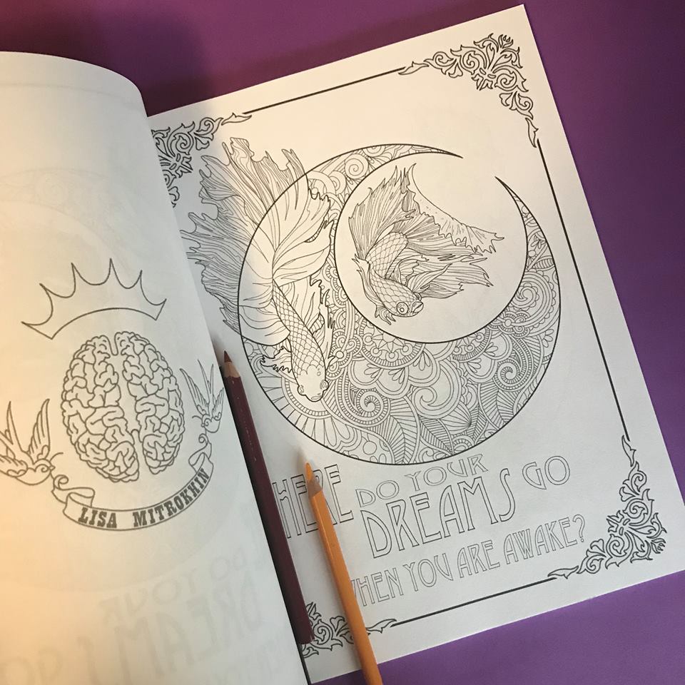
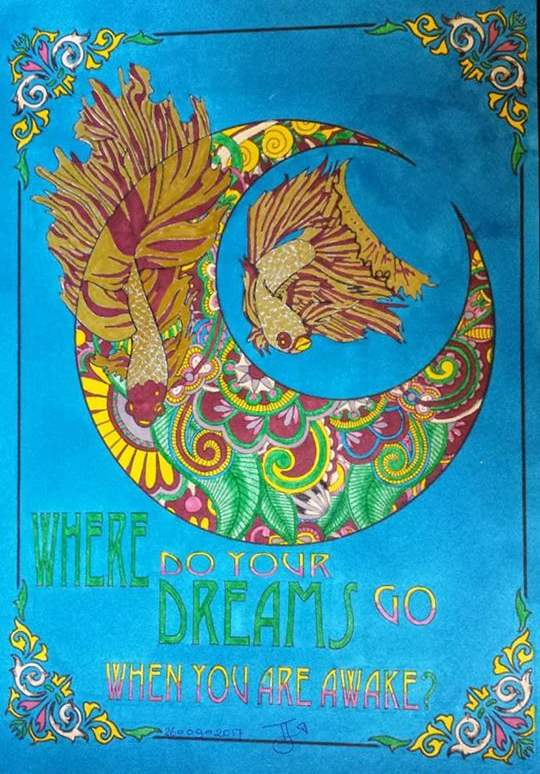
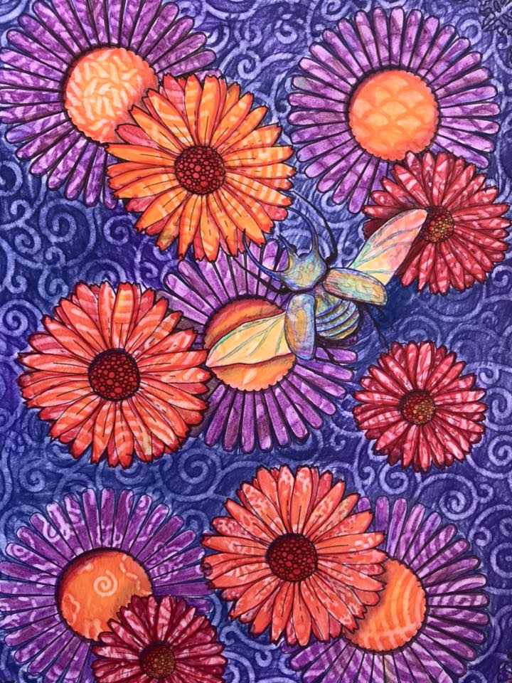
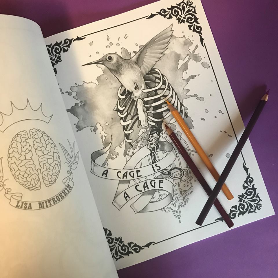
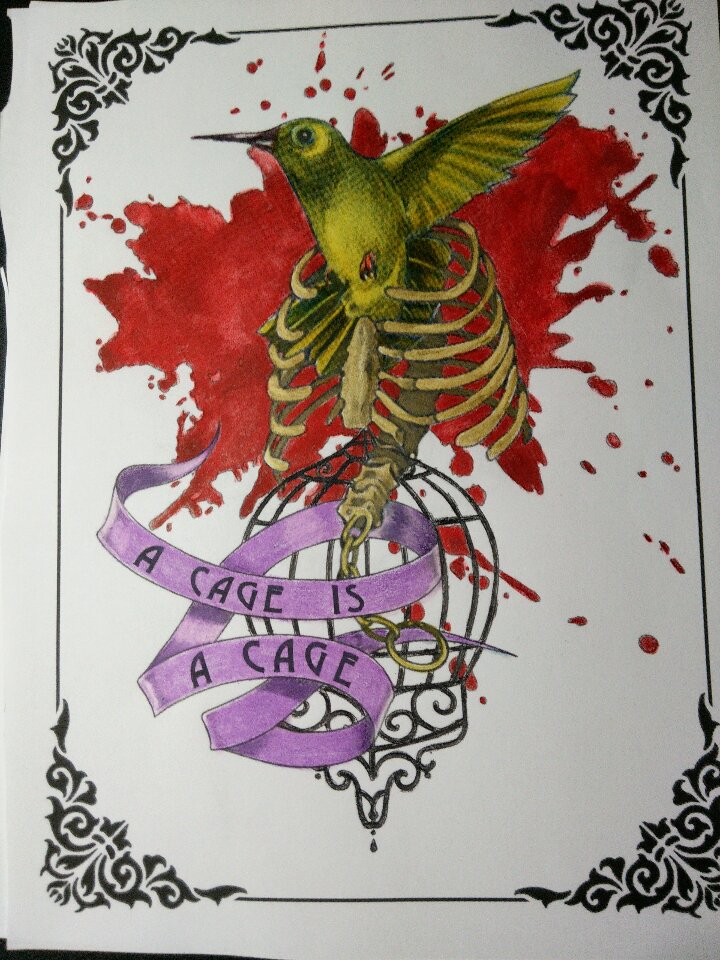
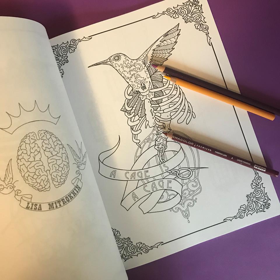
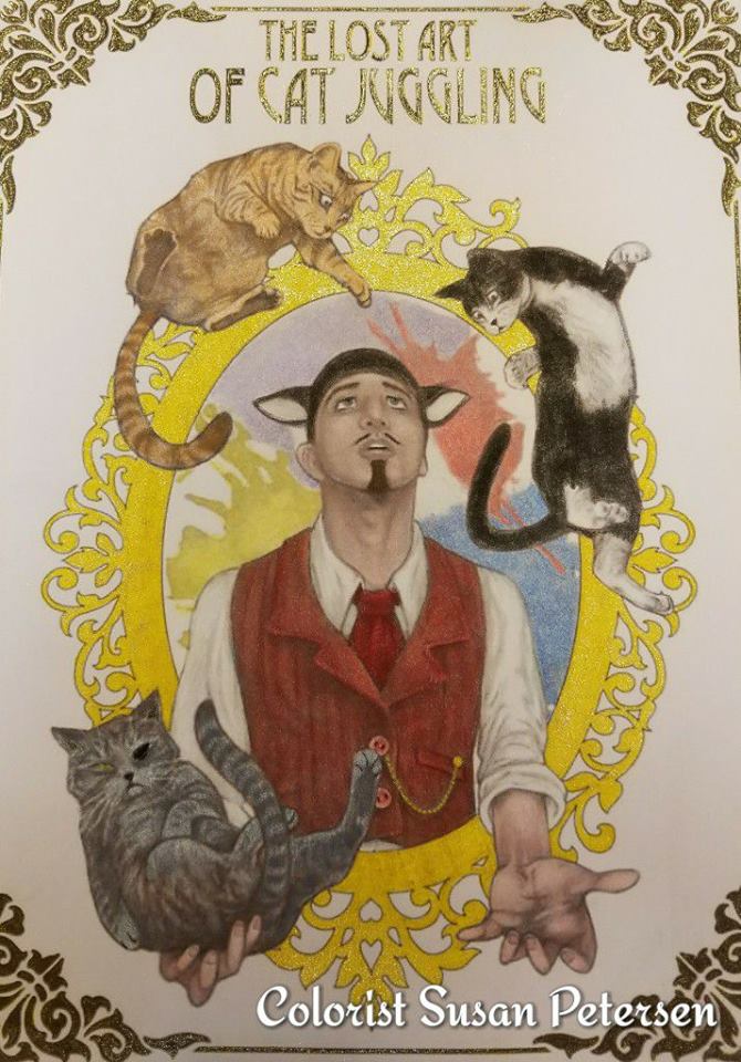
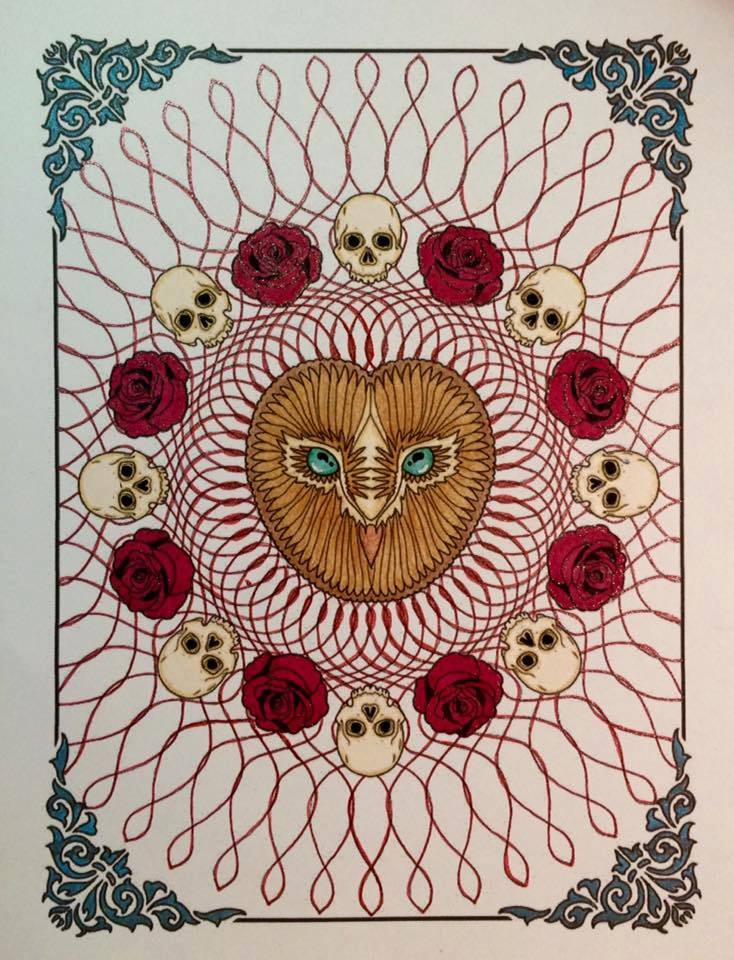
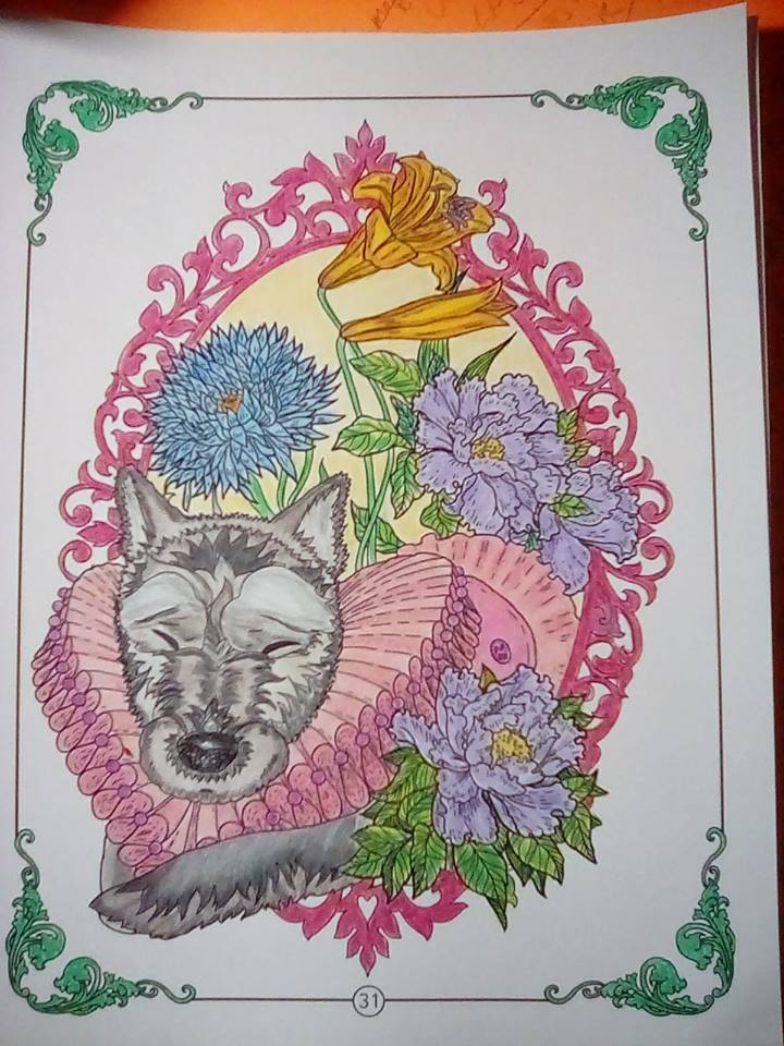 (Colors by Laurie Gregory)
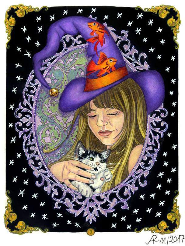
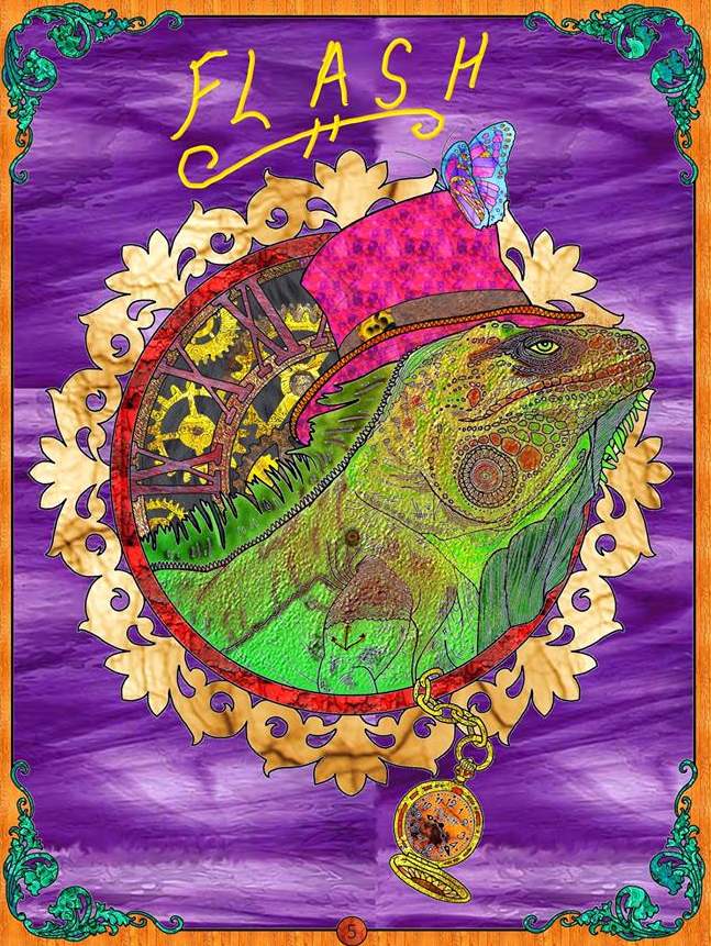
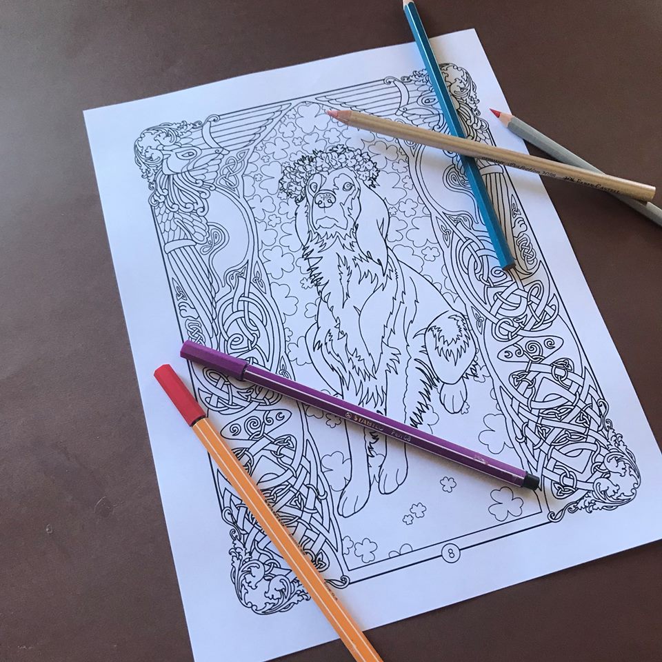
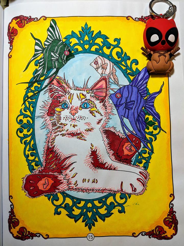
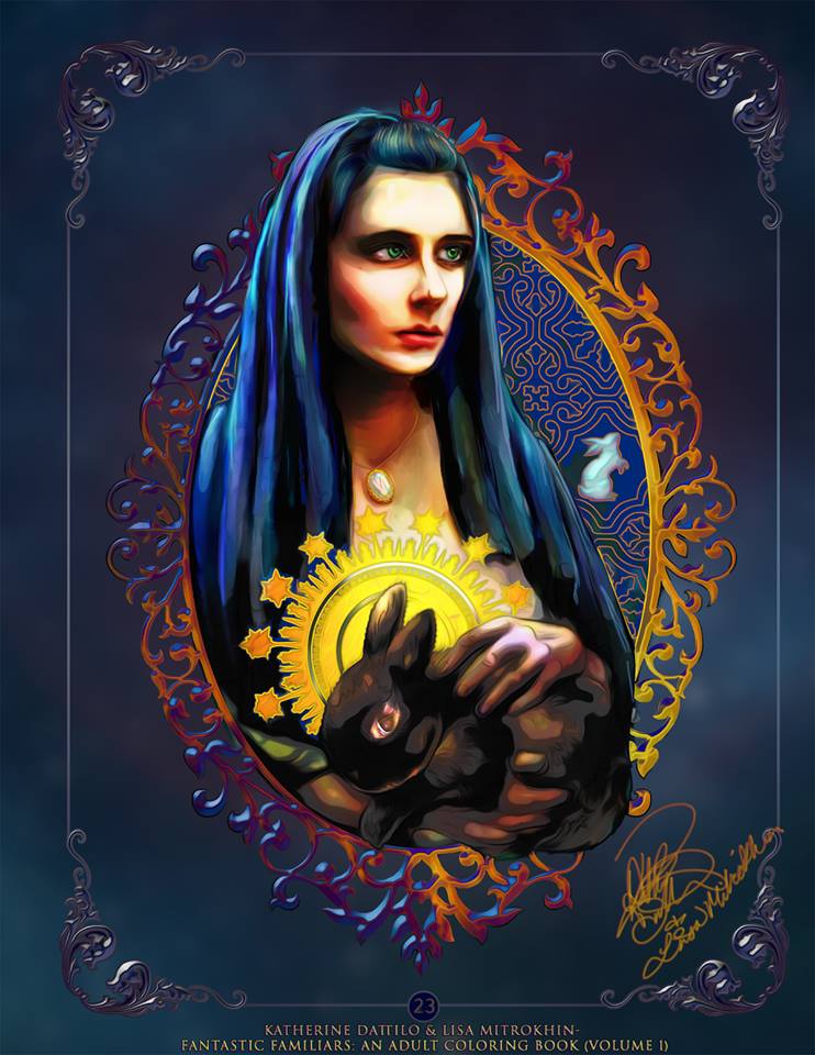