Greyscale coloring pages vs greyscale drawing vs black and white photography
Adult coloring has acquired a huge following all around the world in the past few years. Today, a new coloring book comes out every month, including some published by yours truly. While some artists enjoy this trend by exercising their skills and delivering a high-quality product, others ride the fashion wave and throw everything but the kitchen sink at their audience and call it “adult coloring books”. In the spectrum that ranges from professional artists to imbeciles there is a huge grey area in-between. This area is filled with artistically inclined people with, usually, honorable motivations to create and publish coloring books. However, many, even if somewhat skilled, are not in tune with their audience. They don’t consider the colorists when they deliver the product. Their sole objective is to be recognized as a published artist.
A lot of work and care goes into the creation of a book. A book, first and foremost, is always created for the audience, not the author. Coloring books are particularly personal because they are interactive. One must consider a multitude of elements in creating, formatting and releasing a coloring book. Things like subject matter, story line, continuity, consistency in style, thickness of line, amount of detail, element of surprise, originality, print quality, current interests and trends, all need to be accounted for in the creation of each and every page. Will a colorist enjoy working with this page? Will she learn something new during the process? Will coloring this page allow someone to lose themselves for a few hours and just relax, forgetting about their trouble? I aim to achieve all these things every time I sit down to draw a coloring page or compile an entire new book. This, of course, is a never ending learning experience. My audience guides and adjusts me, while also strengthening my style. I look at my work and I do not see perfection, but rather a journey to perfection. I am honored that my audience enjoys this journey with me.
There are truly professional and talented coloring book authors that I admire greatly. There are also those who, for the lack of a better term, are artistic criminals and should not be allowed to interact with people. The giant grey area, however, is of the most interest to me. Many of the individuals in that grey pool have actual potential to create good art, if only they had the artistic integrity to care about the needs of their clients. One of the styles of coloring pages that reveals a great deal about the integrity of the artist/author is the greyscale coloring pages.
There are three major types of greyscale images that colorists find themselves working with: greyscale coloring pages specifically designed for that purpose, greyscale drawings, and black and white photography. In this article I will present my reasons for why only one of these is suitable for coloring, while others are either used incorrectly or are a straight up scam by those “grey-area-artists.”
Greyscale coloring pages are designed with the colorist in mind
A Bennet Klein page colored by Laurie Gregory
Many successful and professional coloring book artists have well established artistic careers behind them already. These tend to be individuals who have been practicing various forms of art throughout their lives and are now applying their skills to this new book trend. These individuals have a clear and recognizable drawing style and have much to offer their audience. Some experiment with different presentations of coloring pages, some offer greyscale coloring pages in the likeness of their original art.
The greatest example of such art is the work of Bennett Klein. Whatever one might think of Bennett’s subject matter or composition, one cannot deny that he is a talented artist with a great sense of presentation. One cannot look at his coloring page and not have an emotional response to it. Whether it’s your style of not, it is well crafted illustration. So what makes Bennett’s greyscale so desirable? How did he achieve such a huge following?
Bennett Klein is a huge coloring world success because he knows how to please his audience. No matter who colors one of his pages, the result will be stunning, because the drawing is stunning, and because his placement of delicate shadows guides the colorists instead of limiting them. The shadows are there as mere suggestions of where the darker tones should be. An expert colorist will use these shadow suggestions to increase color saturation in those parts and to play with realistic shadow effects. An amateur colorist will simply apply a thin layer of transparent color, revealing all the grey shadows and still keeping Bennett’s beautiful sketch style image. It is virtually impossible to make a Bennett Klein look bad. For the colorist, working with a Bennett Klein page is constant reassurance of their skill, wether they are actually learning and improving or just playing around.
That is the whole point of adult coloring. The majority of the coloring world uses these interactive pages as therapy of one kind or another. Most use it as stress relief or a form of concentration practice. A professionally created line art coloring page allows the colorist to fill in the empty spaces in any media and practice different styles of coloring. A professionally created greyscale coloring page should offer the same without limiting the colorist. Ideally it should offer just enough information to allow the colorist to achieve the effect of a 3D drawing while not interfering with the quality and the saturation of their color.
Greyscale drawings are finished works of art
Illustrations that are drawn by artists in black and white as finished works of art are often appealing to colorists, but they are not suited for coloring, not without some minor but tedious modifications anyway. Before we continue, let’s take a look at the color wheel. 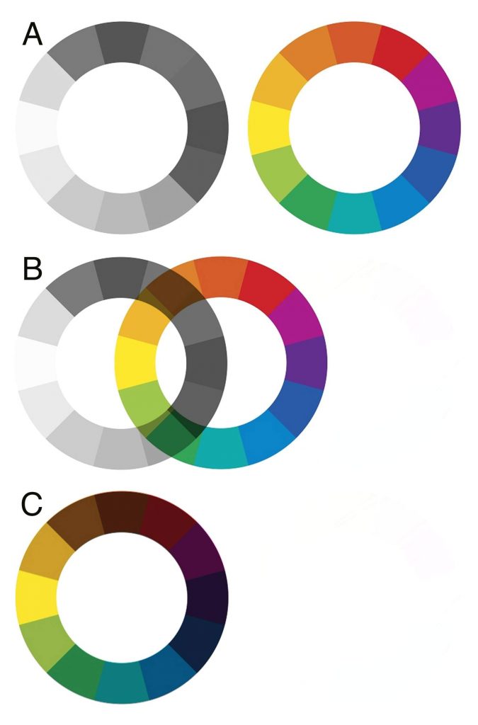 The greyscale color wheel on the left in example A represents the shades of grey used in a greyscale drawing. The colorful wheel on the right in the same example represents the hypothetical colors of that image had it been drawn in full color. When drawing a black and white image from scratch an artist imagines the picture in full color, or even draws from life which is in full color.
When I draw in greyscale I automatically translate the colors as I see them to their matching shades of grey. I do this in my head. This comes from years of practice and understanding of light and shadow and color saturation. When you look at a red shawl draped over a woman’s body, you see a solid red color, and the reason you perceive it as three-dimensional and draped over a body is because you can see the shadows on it. You examine the shadows and discover that they are a deeper tone of red. Perhaps a colder tone even, maybe deep burgundy or violet, depending on the light. They are not however grey or black. When drawing this shawl in black and white I, as the artist, will select a grey tone that is just as dark as the burgundy that you see to represent that shadow. Once it is set in that dark grey color, it cannot be made burgundy again.
In example B on my color wheel illustration I suggest placing color over greyscale. In example C you can see the colorful wheel laid over the greyscale one. If working with pencils, markers, or watercolors (the most popular coloring media choices) one simply cannot achieve the original level of saturation when laying that color over the greyscale version. Furthermore, one cannot achieve a pure saturation of any color when trying to use pencils over black and grey illustration. In example C you can clearly note that all colors become muddy and dark.
One might say that he is content simply filling in the lightest or the white areas of the greyscale drawing, allowing all shadows to be grey and black, but that won’t work. The reason it won’t work is because he will attempt to fill in the lighter areas with highly saturated vibrant colors where in reality those colors are delicate and muted. The real place for highly saturated colors has already been occupied by the dark grey and black shadows, leaving him with nothing to color. He is therefore not creating a color version of the same image because his shadows are not natural and his saturation levels are unrealistic. He will learn nothing of light and shadow in this process, and while he may enjoy the random application of colors to a complete composition, he will not produce a coloring that is visually appealing. This will be particularly obvious when working with skin tones.
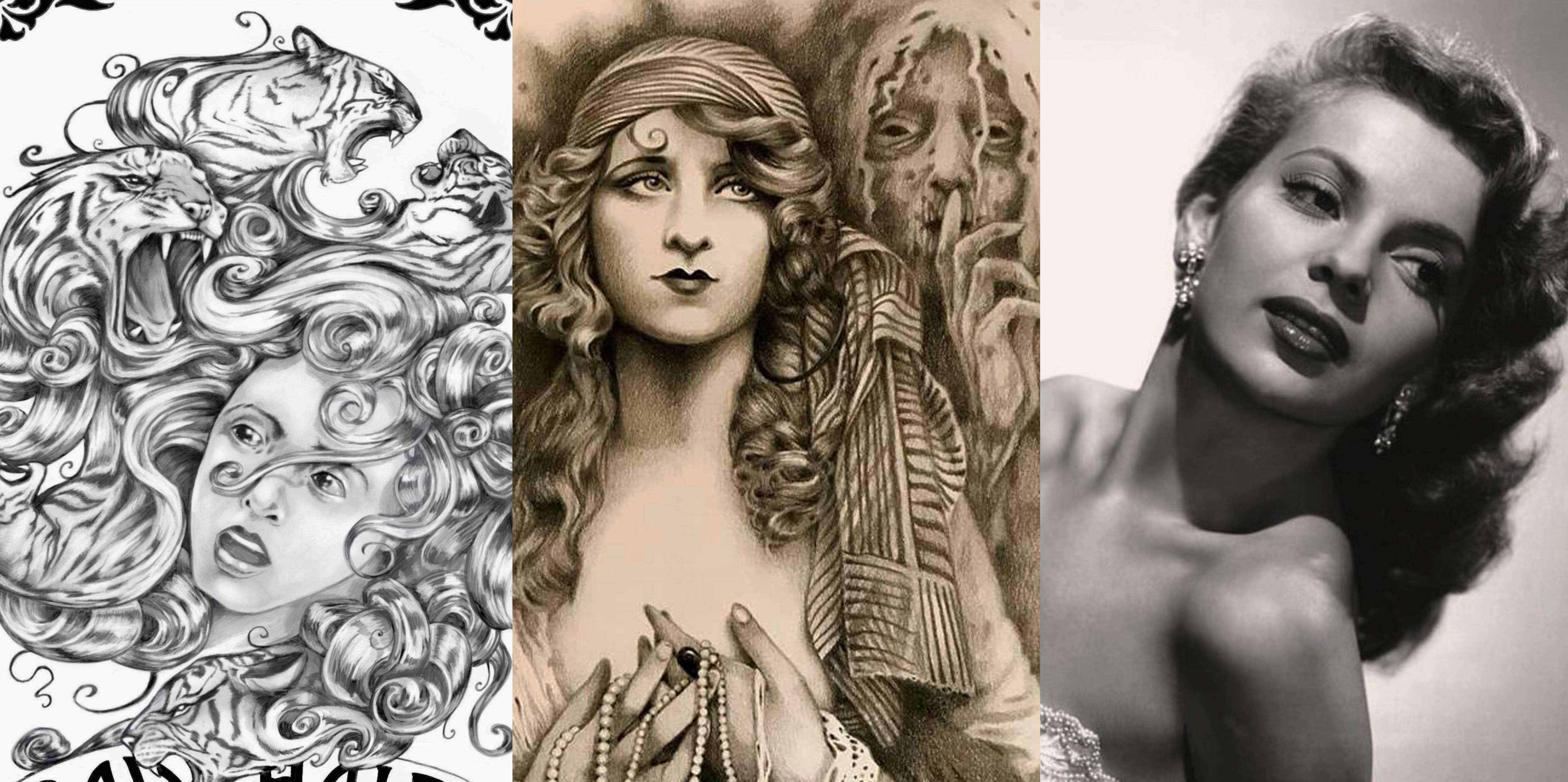
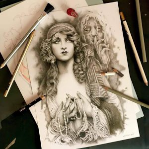 Let’s take a look at this greyscale drawing that I made a while back as a gift for an artist friend of mine. When I shared this image online, I got bombarded with requests to color it. While flattering, I had to patiently explain that this image is not a coloring page. It is a complete and finished work of art. Every shadow is where it is because that’s where it needs to be. The depth of every shade of grey is what it is because that’s what I want it to be. If I wanted to paint this subject matter in full color, all of the darkest and highest in saturation colors would be where the darkest greys are, and the face and the beads and the hands and the shiny locks of hair would remain nearly white, because that is the level of contrast that I wish for this drawing to convey. Some colorists got offended, thinking that I am overprotective of my art, or that I deprived them of a chance to “bring some life and color” to the image.” What they failed to see is that I was thinking of them and their experience. I cannot, in good conscience, give my audience an inferior image to color. This image is impossible to color successfully. It’s a trap. (I could certainly make it into a coloring page, but that would require restructuring and redrawing it completely, which I am not comfortable doing since the model in this particular image is not one of my live or imaginary models, she is the subject of a vintage photograph taken by a professional photographer. I will not get into copyrights and honor codes in this article.)
One would suggest simply making the image lighter and THEN it would be suitable for coloring, but that too is lie. It is not enough to make an image lighter. One must restyle the entire structure of darkness and contrast for the image to become suitable for coloring. The main outline, for instance, needs to be a full saturation black, and clean and solid. The shadows and the details then need to be redone to be gentle suggestions of where your contrast areas are to be worked on. Simply making the whole thing lighter will result in a complete loss of the current delicate details, not leaving the colorist enough information to make shadow choices. This image, the way it is, is not capable of guiding the colorist on a journey to creation of a colorful image, as a coloring page should. As an experiment I allowed one of my colorist friends to color a scan of this drawing. A very talented colorist, she struggled a great deal and in the end came to the same conclusions. She could not eloquently explain why it felt wrong exactly, but she described it as an “uncooperative” coloring page. I don’t think she ever even finished it.
A black and white photograph is NOT a coloring page
While some artists struggle to achieve the perfect greyscale effect in their illustration to be enjoyable to the colorists, others take a shortcut. Black and white photographs, or photographs made to look black and white by a single click of a button in Photoshop are an insult to the colorist. Every colorist wishes to complete a page and have it look amazing. One looks at a coloring page and tries to imagine what it will look like in full color. Some line art is beautiful but it is difficult for the colorist to foresee what can be done with it. Some line art is intimidating for that reason. The colorist struggles. Where do I begin? How do I select the right colors? What if it doesn’t look right in the end? Most colorists are not artists. It is our job as artists to guide them.
A photograph is an appealing goal for a colorist. Especially if a photograph has a familiar setting, like a landscape, or if a color version of a photograph is also provided. Colorists get excited about these images because they can clearly visualize all the colors that they need to use and because they believe that in the end they will produce a work of art comparable to a color photograph. Wrong! So wrong. I see colorists fall for this trap day after day. I see their mudded and faded grey-smear images, and their confusion at why this happened, and I can’t help but blame those who deliberately give them false hope that these images can be made beautiful. 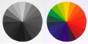
Let’s take a look at the color wheel again. Same concept. Your greyscale on the left and its matching color version on the right. When one makes a photograph black and white by sliding the saturation level all the way to the bottom in their digital program, of clicking “black and white” or simply setting their printer to “print in black only” and then scanning the image to use in a book (a terrible, cheap, unprofessional trick), one does not change the light and darkness of the image. All color levels remain the same as they were in the colorful image. Except now instead of color, you have the matching tones of grey. How on earth is one supposed to color that unless they paint over the image with acrylic or oil paints?
My favorite is the complete lie that is the greyscale photography cover art on such books. They always present the before and after version of the photograph. Except it’s really in reverse. It’s actually “now” and “before” and the “after” is not even represented. The true representation of after would be overlaying the color version onto the greyscale version and seeing if it makes any artistic sense at all. Look at the red on the color wheel, and now look at it’s matching shade of grey on the left. Does a pencil or a marker exist that will allow you to paint over that shade of grey and achieve the red on the right? No. It does not. Now look at the yellow, the green, the various shades blue… Get the picture? 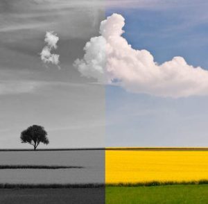
Let’s examine this photograph proposal. Do you think you can color this grey sky and achieve the same shade and saturation of blue as on the colorful version? You would if the sky was left blank, but it is not. How about that vibrant yellow of the wheat? Are you even given a chance to achieve this color? No, you are not. You are given a black and white photograph and told that you can do magic and transform it back to the original.
One could make this photograph into a coloring page if one had the artistic talent and the time and the care to do so. Clearly one does not when one publishes photography books, usually filled with not even their photography, and collects royalties for a coloring book. There is a place in the art world for beautiful black and white photography, but it is not here.

I believe that it is every colorist’s right to color whatever and however they want. It’s your playground. Play. If you recognize good art that is designed specifically for you to practice and to learn and to relax, use it. Color it in any way that makes you happy. If you come across a low resolution black and white photograph in your morning newspaper and are overcome with a desire to doodle on it with color crayons, by all means, color away. My appeal about greyscale photography is not to you, it is to those who abuse your lack of artistic knowledge and sell you inferior work or work that is not even their own. For those grey-area-artists out there, consider having a code. Consider your audience, and consider offering something worthwhile to them. Or else, offer your stolen Google Images made black and white for free and stop pretending to be anything but a leach in this artistic niche.
Now that you, the colorist, understand a lot more about the structure of greyscale images let’s go back to the banner picture of this article. It displays three images. From left to right they are: a greyscale coloring page that I drew with the colorist in mind, a black and white drawing that I made for a friend based on a vintage photo, and a photograph that appealed to me that I found online. All are attractive images, but which one do I actually have the right to sell to you for the purpose of coloring? Legally, all of them. Morally, I believe only the first one.
