How I came to design and ink tattoos
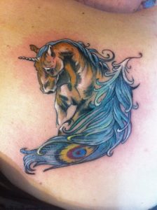
A commission unicorn and peacock feather tattoo. Santiago, Chile. Designed and inked 2014.
As a child, I was always drawing. Every day, everywhere. This habit carried well into high school. I had a big black sketchbook bound with actual stitching and a hardcover. I carried that book with me everywhere and spent most of my class, recess, and after-school time drawing. School was a pretty boring and alienating time for me. I was well ahead of the curriculum and I had only one friend, who was possibly an even bigger outcast than I was. At least she also enjoyed doodling and storytelling. I am pretty sure she was real. Despite not belonging to any groups or circles in high school, I was not hated by peers, just avoided most of the time, unless my drawing skills were needed. Soon my drawing skills became needed by nearly everyone. By my second year of high school, I was visited under my staircase hideout on weekly basis by students asking for portraits of their dates (real and fantasy), biology class illustrations, and eventually tattoo designs. By senior year people were commissioning me tattoo designs that they actually took to local parlors to get inked.
After graduation I lost my “staircase studio” and spent the first years of college hanging out in downtown Manhattan bars and pubs, keeping to myself and my drawing. Bars, especially Irish bars, are great for picking up tattoo customers. In no time at all I had a local following. Sometimes I drew for money, sometimes for drinks, sometimes just for fun. One time I designed a full chest piece depicting a tiger, for a local fireman whose chest was covered in burn scars. I designed the tiger to twist and turn around the scars to hide them convincingly. It looked amazing on paper. He was very pleased and declared that he will only get it inked if I do it personally. “Pffft,” I snorted. “I can’t ink. I just draw.” “Why don’t you learn,” he said. My mind was blown. Why don’t I learn? It wasn’t until two years later that I actually took an apprenticeship with a professional tattooist. I never did ink that tiger, but once I got a taste of tattooing I was hooked.
The industry
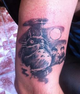
Commission portrait of kids with Totoro. Santiago, Chile. Designed and inked 2015.
Around the time that I was learning how to tattoo, life took me to Krakow, Poland. It was there that I began working in a popular local studio. For free at first, but soon I worked my way to my first studio station, and eventually to a manager’s position in the shop. While I enjoyed working with human skin I found shop work to be unsatisfying and unrewarding. A tattoo parlor is a business and a good tattoo parlor is a well-oiled machine designed to spend as little time as possible working with the client and as much time as possible getting paid. It makes sense. That’s how a business is run. My thoughts, however, were that if you invest a little bit more time into the customers, you can potentially collect even more money and build a better reputation, not to mention make real art.
Tattoo parlors are notoriously scary, clinical and impersonal. The people who walk into parlors know that they want ink, but most of the time they have very little clue as to what exactly they want. A typical parlor’s solution to this dilemma is to sit all walk-ins on a sofa and have them look through books, searching for the perfect design. If they find nothing that catches their eye, they leave without having wasted any of the artists’ time. If they are able to settle on a particular panther or anchor or heart design from a million of nearly identical images, they get processed and inked. Very few artists take the time to talk to the clients and even fewer take the time to design original artwork for them. My specialty was design work. I had no interest in inking copy/paste stars and flaming cobras for the rest of my life. By the time I returned to New York I was going solo.
Independent work
Working as an independent artist can be tough but ultimately rewarding. Back in New York City, I returned to my practice of meeting like-minded individuals who are drawn to my art, rather than inking strangers. Meeting people in New York is not difficult. In fact, it is difficult not to meet people. Three years into my tattoo career and I already had a self-inflicted left tattoo sleeve. A single ride on the subway wearing a t-shirt was guaranteed to land me a couple of customers weekly. All I had to do was go about my regular life. My clients gravitated to me themselves. Once we got to talking and discovered that we have similar artistic tastes, I would take my client to a bar or a coffee shop for a chat. In a friendly and relaxing atmosphere, we could talk like two friends instead of one being interrogated by the other. It’s amazing how much you can find out about what a person wants in a tattoo just by chatting about this and that and total nonsense. An hour or two of friendly conversation landed me free refreshments and a brand new client. Having gotten a rough psychological profile of my new prospect I could go home and begin sketching something really personal for them. My client and I would continue a back and forth conversation, tweaking the design until it was absolutely perfect, and then we would schedule an inking date at my home studio. I made a lot of good friends during these years. A tattoo session is a very intimate and personal time, during which client and artist can really bond through conversation.
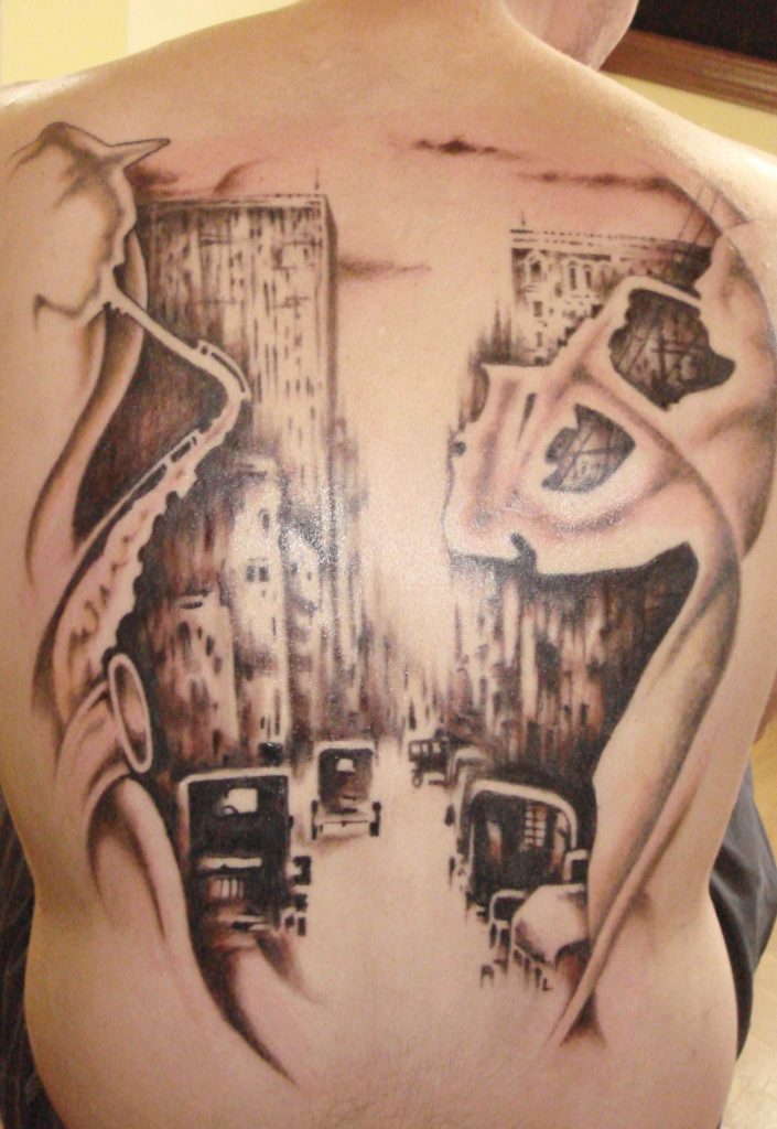
Commission full back piece. “Jazz City”. Krakow, Poland. Designed and inked 2010.
Moving to Santiago, Chile didn’t change things for me very much. A city is a city, and while a little bit more conservative, Santiago is full of young professionals who are looking for non-mainstream designs. My new following found me within just a couple of months. I was invited to work in a local shop and landed a station there. Unlike my previous shop experience, here I was my own boss and spent as much time as needed with clients, kept my own hours, and paid my share for the space. After moving to the countryside, I continued working with my established clients, but this time I traveled to their homes for personal home sessions. Boy, did they love that! Imagine, not having to sit on the awkward leather couch to the boom of the mandatory death metal music, waiting your turn for hours, while listening to other people’s screams and moans. Instead, your artist just shows up at your convenience, like a masseuse, rolls out her station, sanitizes everything, you can watch a movie or play your own music, drink tea, take as many smoking breaks as you want, and just let your artist work for as long as is necessary. Once she is done, she cleans up, packs up, leaves, and you get to just recline on your couch and take care of your tattoo in the clean and quiet atmosphere of your own home. Getting tattooed is tiring no matter how many times you’ve done it. After your session is done, all you want to do is lay on the couch and drink something cold and refreshing. The last thing you want to do is make your way home on the dirty, loud subway train.
My clients
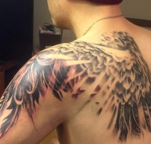
Free-hand “light through wing feathers” shoulder tattoo. Santiago, Chile. Designed and inked in 2016.
The individuals who reach out to me for a tattoo design tend to be creative and open-minded people. They have very clear feelings, motivations and sometimes even visions of their unborn ink, but they are not skilled in drawing, designing, mapping or tattooing images. In a way, they hire me as a messenger, to translate their internal desires into something visible to other people. This is why heart to heart conversation is such an important part of my work. I rarely tattoo ready designs that are brought to me. In my entire career as an independent tattooist, I may have done five or six designs that were brought to me. Even when I do portraits, I embellish them with something not present in the photograph.
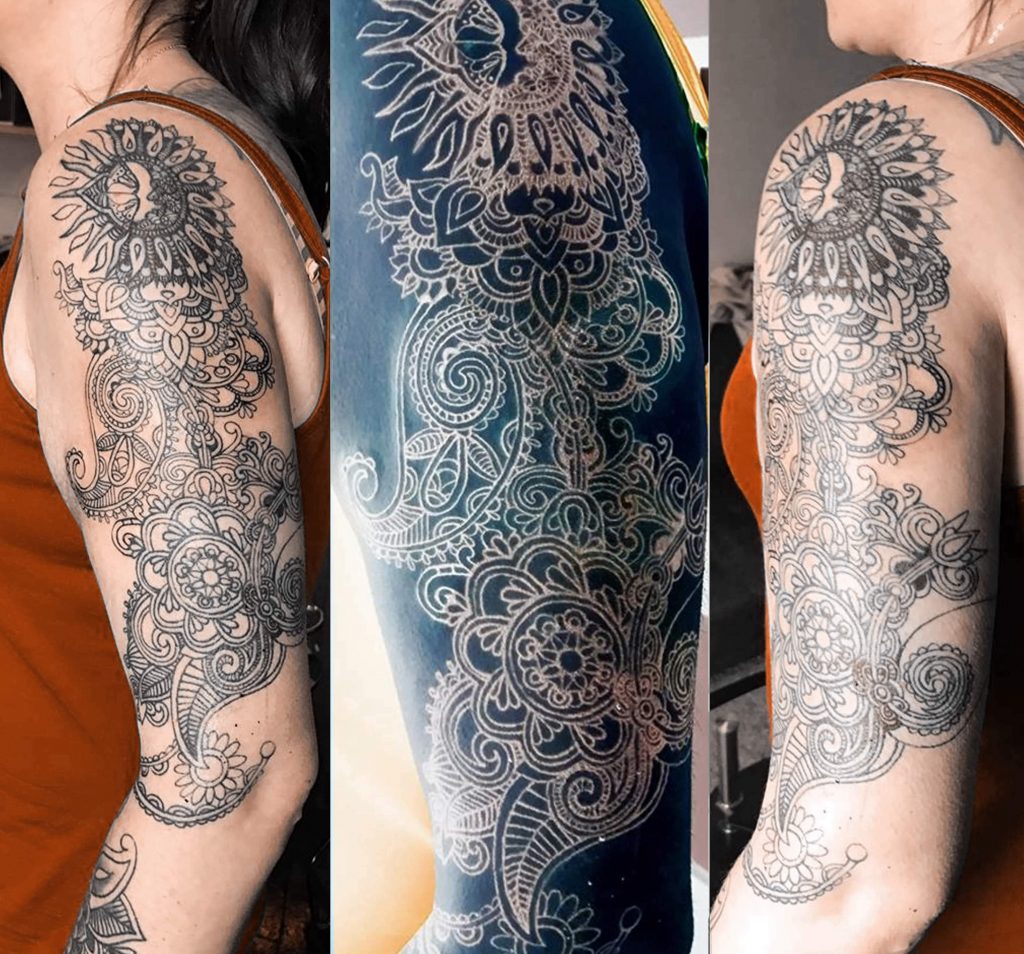
A line work sleeve in progress, including a hidden cover job. Santiago, Chile. Designed and inked in 2017.
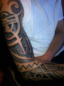
A free-hand custom designed tattoo sleeve. New York City, USA. Designed and inked in 2011.
During my ten year run as a tattooist, people often asked me what my style is. My response was always “My style is YOUR style.” You tell me what emotion you want your tattoo to evoke, how much detail you want in it, etc. and I will craft something to fit that mood. Obviously, my artistic hand has its own personality, my attention to detail, my lines, my manner of shading, but I never impose a single on my clients. I do make professional suggestions in terms of size, placement, and very rarely on the subject matter. There have also been clients whom I had to turn down for various reasons. Some wanted tattoos for all the wrong reasons. Some were clearly making a horrible mistake that I did not want to be responsible for. Some simply had ideas that did not interest me.
While in 2017 I retired from actually inking people, I still take on design drawing and mapping commissions from clients all over the world. In today’s world of internet communication, it is no longer necessary for me to meet my clients in bars and coffee shops. We can chat over Facebook or Skype, or e-mail. As a matter of fact, written-form of communication has its benefits. I can read my clients’ stories over and over again while working on their design. Today I have design clients in Brazil, Australia, United States, UK, New Zealand, Spain, South Africa, and Chile. After agreeing on the placement of their future tattoo, I ask my clients to send me photos of that part of their body so that I can map their design onto the photo, to help them envision what it will look like ink. Also for them to take that mapping to their tattooist so that they too can have a clear vision of the final result. Obviously, they also get a formatted and perfectly sized drawing that is print ready.
Here’s an example of a tattoo process with me
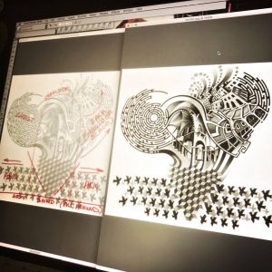
My first design proposal to Daniel. 2013.
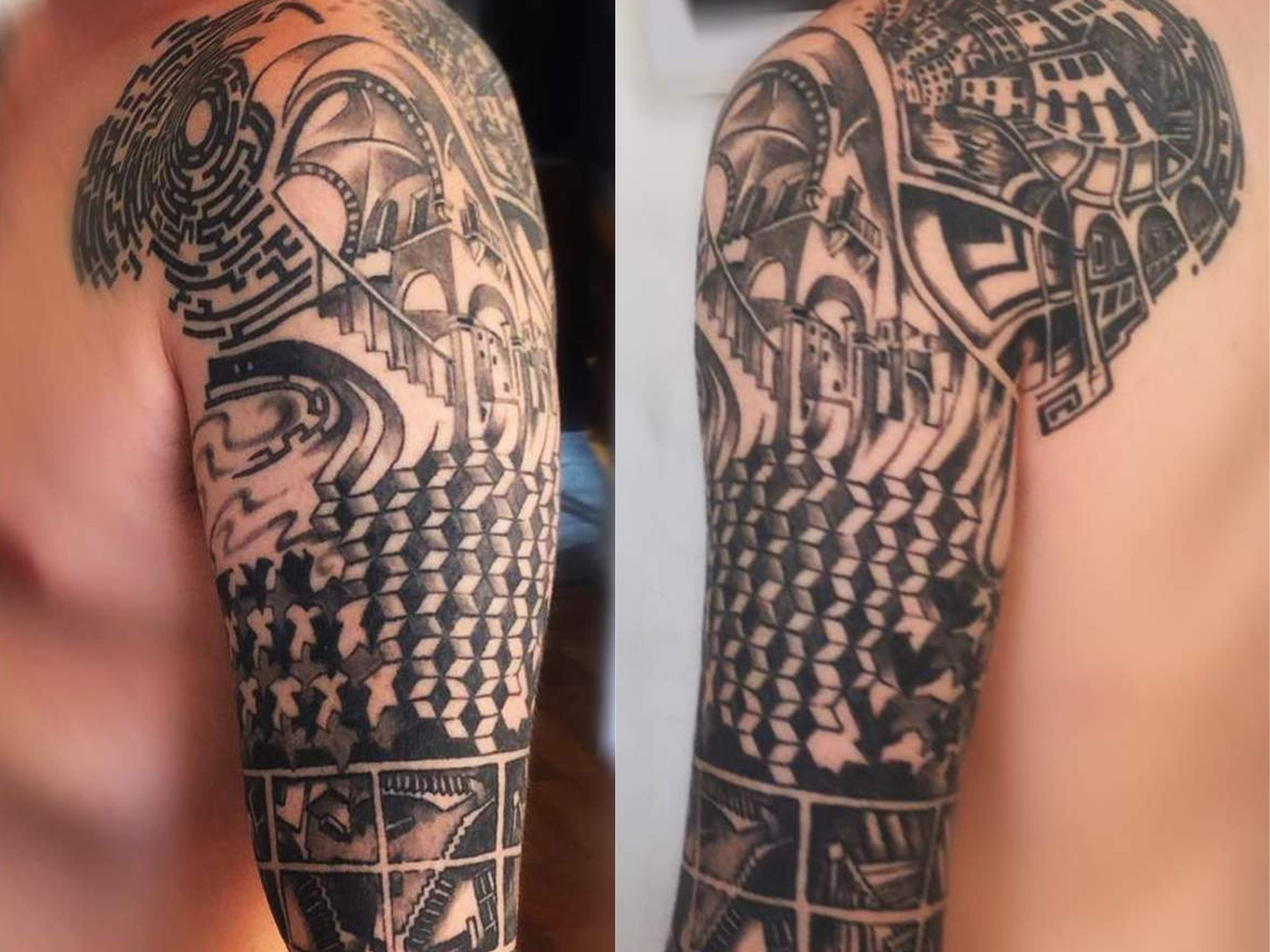
Daniel met me in 2013 in Santiago, Chile. I was referred to him by a friend. When I sat down with him and his two buddies, equally interested in personalized tattoos, I had no idea that we were about to embark on a four-year inking journey, and a life long friendship as an added bonus. Unlike most of my clients whose tattoo ideas are based on feelings, emotions or memories, Daniel’s was mostly based on architecture and geometry. For him wanting ink wasn’t about commemorating a life event or honoring a dead relative. He simply liked this art form and wanted a shoulder piece that reflected his mindset, love of geometrical patterns, and architecture. He wanted his tattoo to feature elements of Escher’s art, but be tailored to suit his muscle tone, allowing the ink to move as he moves. I took that commission immediately and began drawing and mapping as soon as I got home.
The mapping of the design as I presented it to him to demonstrate size and placement. 2013.
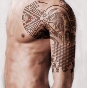
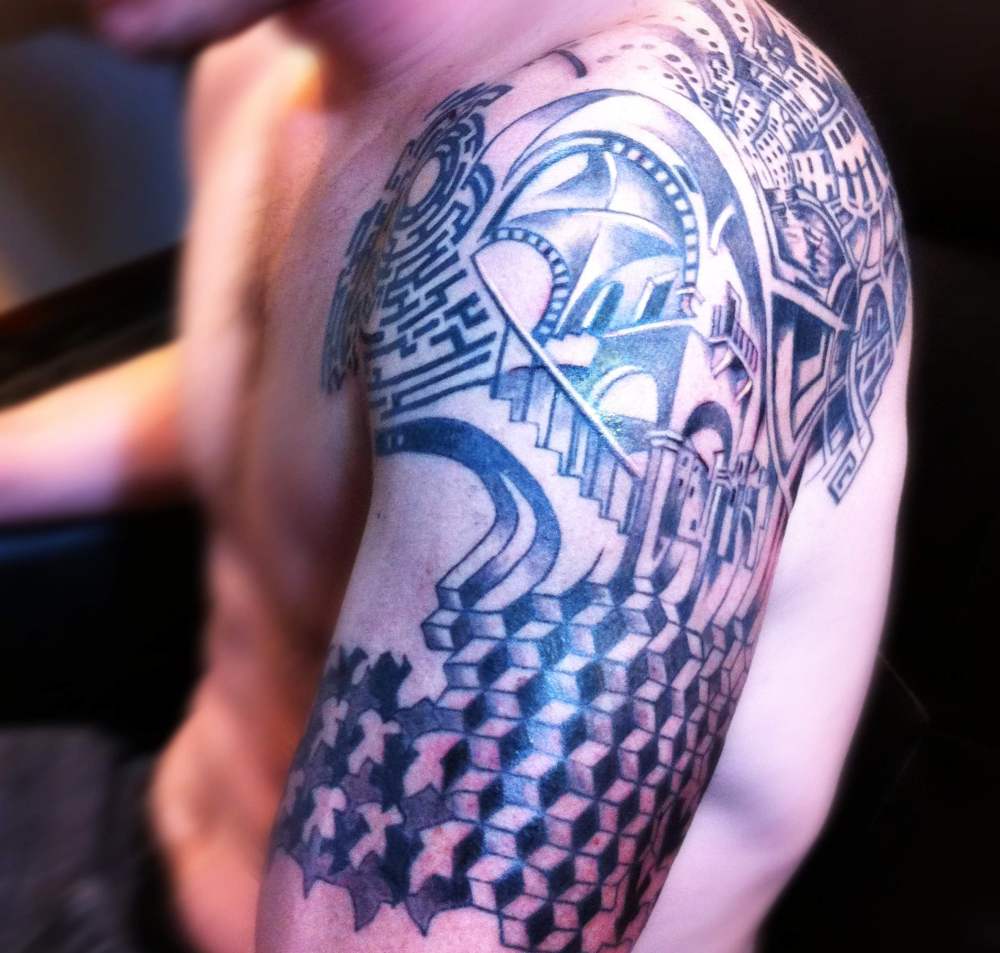
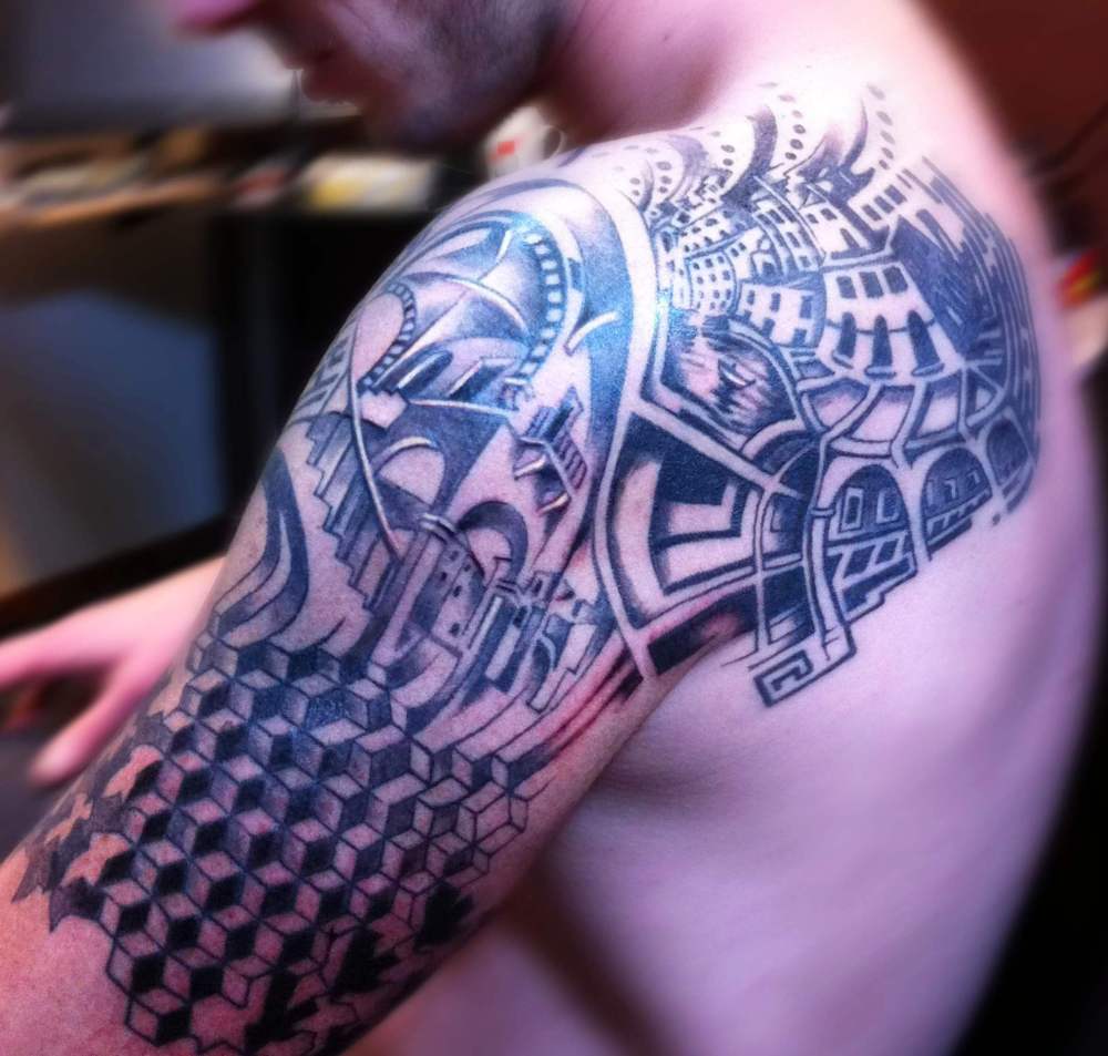
As with my other clients, I first presented Daniel with the design for his shoulder and a projection mapping of how the design will wrap around his upper arm and shoulder. Once we agreed on the details we proceeded with two to three-hour tattoo sessions, meeting every three or four weeks. I completed the agreed upon the design in six sessions, but little did I know that this was just the beginning. Tattoos are addictive, and good tattoos continue growing on you like a healthy plant. As we spent more time together, Daniel learned enough about the art of tattoo to be his own artist were he to ever chose to do so. He knew techniques, mapping strategies, he even had favorite needle types and shading strategies. As we designed more of his left arm together and later continued onto his right arm, shoulder, and back, he was more in control of the design process than I was. I was just the delivery vehicle. His confidence level in design decision-making grew dramatically, and his eye for precision was very helpful to me in my drawing process. While we have somewhat different mindsets, we function on the same level of detail and precision. Sometimes, when we can’t agree on something, all we have to do is meet in person, and within minutes of bouncing ideas back and worth, a new and brilliant design is born. It is a very satisfying process. In this way, the rest of his tattoos literally grew around him, as he was growing and maturing as a tattoo wearer.
The fifth session on Daniel’s left arm. 2013/2014.
The sixth session on Daniel’s left arm. 2014.
Left arm design complete. Now with added elements nor present in the original design. A total of over 10 sessions. 2015.
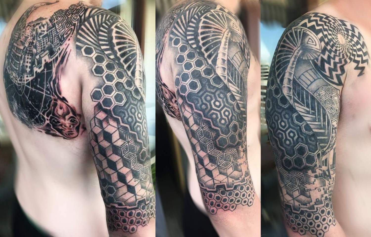
Daniel’s right arm and part of back. Completed in over 10 sessions. 2017.
And so concludes my journey of inking, but not of design tailoring. If you have an unborn tattoo that you can’t quite visualize but that you know has to exist, shoot me a message here and maybe I am the person to bring your vision to life. Operating tattoo equipment is a technical skill. Any professional tattooist should be able to transfer any skillfully designed image onto human skin. Creating that design, however, is an art form.

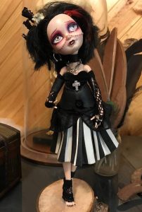 For instance, when reviewing these two dolls the audience will be pretty divided. Some will prefer the sparkly blond angel princess, while others will be drawn to the gothic poet with messy hair and piercings. Personally, I would never make or purchase the angel doll, but I recognize that this particular one is made just as well as my gothic poet. I see that her dress is made with equal care and attention to detail. If it is handmade doll, someone clearly spent a lot of time and care one it. It took skill to attach the wings and design the crown. The character has personality and is clearly beautiful in its composure, expression and pose. If it is factory made, it becomes significantly less interesting to me, but I still can’t argue the fact that is of good quality and well designed. If I knew a girl who likes angels, I would consider buying this doll as a gift. I am not so blown away by this doll to leave feedback on her listing, nor am I so bored and disgusted by her pure stereotypical beauty that I will care to negatively comment on her. Coming across work like this, I make some mental notes, but I do not take the time to comment or review. It’s not necessary. My feedback, in this case, is irrelevant. This doll is simply not in my style. Looking at my own gothic doll, on the other hand, many people may praise her just for being dark and unusual without paying attention to the detail or reading the back story which I create for all my characters. Some others may immediately get offended and leave nasty comments based on their personal preference, failing to consider the skill and care that was necessary to create her.
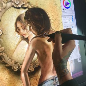 It turned out that Cally’s main character Sarah was in need of a custom-made tattoo from someone with experience in just that craft. The tattoo is so significant in this book that it’s almost its own character. Cally didn’t have to do a lot of talking for me to have enough mental images to begin my work. She simply shared with me three of the 662 pages of her novel, and I knew everything I need to know about what Sarah looked liked and enough about her personality to portray that through body language and choice of clothing. One of the advantages of working with an author is that they tend to be quite articulate. After all, the readers have to see her character in their minds just as clearly as I was about to see her on my digital drawing page (for a more technical description of my digital painting process check out my article
 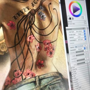 Now that I had Sarah’s body, face and hair painted and approved by Callystin, I moved onto the most important part – the tattoo. Sarah’s tattoo is complex enough for an artist to design for a real back. It would be a challenge to tailor it for a fictional 1200 by 2200 pixel painted character. I had to approach it the same way I would a real tattoo. Having read Cally’s description of it over and over again, I drew a fully detailed cat-o-nine tails whip with a braided leather handle and cherry blossoms scattered all around. I then wrapped the design around my character, curving and blurring it to match my painting style in this piece. Actually, the most time consuming and complicated part of the process was the amount of distortion I had to apply to my otherwise flawless and highly detailed tattoo design in order to make it look realistic in the given light and remaining true to my brushstrokes. The application of the tattoo to Sarah’s back was a week long project. After submission, Cally requested a few edits and adjustments, specifically in relation to individual tails and their direction, the placement and color of specific blossoms, and clearly readable text “Never Again”. After another few days of edits we arrived at the tattoo that we both agreed was perfect. The only final adjustment she asked for was the removal of visible scars from Sarah’s back. I imagined that most of Sarah’s scars would still be visible, if not for any other reason but for the reader to see that she has them. Cally had a very firm and specific request to remove the scars, explaining to me that the whole reason for the tattoo is to hide the scars all together. The audience does not need to know the full scar story from the cover. They will find out while reading. After discussing the technicalities of actually covering scars with tattoos, we came to an artistic agreement and I cleaned up Sarah’s back, while Cally cleaned up some textual details on the matter.
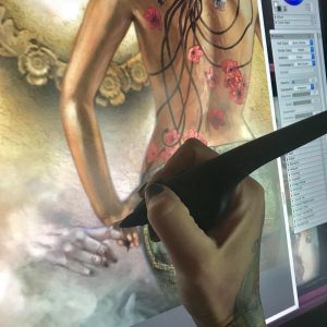 My next subject of interest was something that my author described as optional, but I immediately saw as inevitable. While Sarah is an obviously attractive young woman with an enticing full back tattoo, this is more than just a romance novel, it is a paranormal romance novel. I felt that the paranormal part was important to at least suggest visually. This is where Sarah’s glance direction comes into play. I specifically painted her looking down and at her hand, in order to have a platform to introduce a mysterious supernatural hand inviting her into its otherworldly haze. Now it all comes together. Now we know what seduces Sarah’s curiously. It is this human, yet animal-like, hand in the mist. This was probably my most favorite part of the project. I wanted the pale beastly hand to appear as mysterious as possible, revealing nothing of its character yet teasing the audience into having to find out. I wanted the viewers and the readers to be as intrigued by the hand as Sarah is.
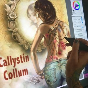 Now that the mysterious hand was done and approved by the author, I moved on to polishing up the details on the image as a whole. This is a part of any digital painting where I create a lot of new layers, each with very minute but vary valuable information on them. I spent a full day on making sure that my light source was consistent, the parts that needed to be in focus were clearly in focus, while the ones intended to be blurred were sufficiently blurred. I played with darkness, contrast, definition and saturation on my fused layers, and of course scanned the entire image for imperfections, artifacts and inconsistencies. After a couple more back-and-forths with Callystin, we were ready for formatting.
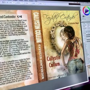 Formatting a book cover is surprisingly more complicated than people realize. Correct resolution is the single most important factor. You don’t want any detail to be lost in the print. Color balance is also essential. The printed version has to look exactly as the digital version does on the screen. Finally, sizing mistakes are unforgiving. Depending on the publisher’s format demands, you have to make sure that your full cover spread, plus the spine, will not be cropped even a millimeter off from the desired layout. In order to achieve this, one must know the exact thickness of the book’s spine, which is calculated by multiplying the number of double sided pages by the paper thickness. To do this you must know the paper your author has chosen for her publication and her manuscript length according to paper style and size. As Cally was making last minute edits and adjustments, the thickness of her book spine also kept changing, sometimes by a fraction of a millimeter, but every pixel counts when it comes to professional formatting. I think for Cally, this must have been the only frustrating part of the project, understandably so. Well, good things come to those who work hard, and in time we worked out all the nagging technical details and the Fayhted Contender was ready for publication.
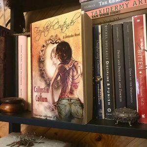 After three weeks of work and collaboration, Cally and I have become good friends and discovered that we share many similar views and opinions. I suppose it only makes sense, since we were able to work together so smoothly and quickly, understanding each other’s visions and motivations. This has been an incredibly rewarding artistic journey, but in the end nothing could have felt better than receiving my own copy of Fayhted Contender with a personal inscription from the author on the first page. Reading someone else’s novel with my art on the cover took some getting used to, but since this book is so easy to lose yourself in I soon had no trouble forgetting about the cover art and following Sarah on her journey.
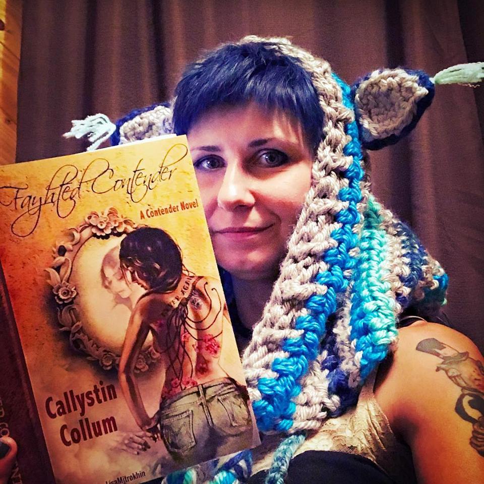
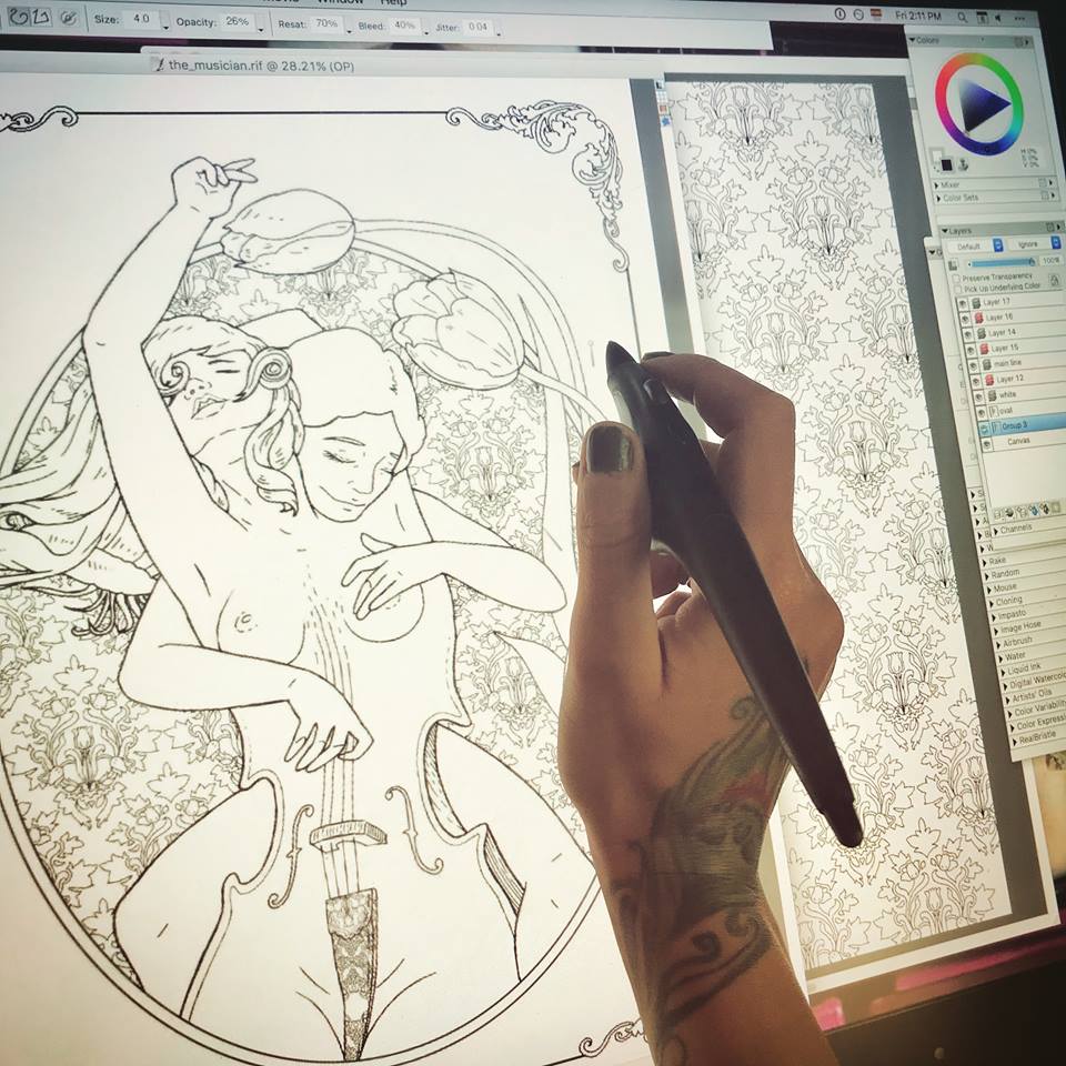
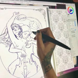 It all begins with an idea. Once I have a clear character concept in my head (which is teaming with ideas at any given moment) I open a new blank document and begin a rough sketch with my pencil tool set to a charcoal or a rough pencil, and usually in a color other than black. I tend to sketch in purple or brown. At this point I am only interested in working on the composition. I freehand my characters the way that I would on a notepad with an actual pencil. I erase a lot to correct my lines as I shape the desired composition. I continue sculpting in this manner for the next hour or so, depending on the complexity of my design. In this case, you will be following the creation of “The Musician” page for an upcoming book. Since this is a book project, instead of a blank page, I am working on a pre-made “frame” page that will be consistent throughout the book.
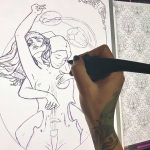 Once I have my composition I create a new layer. I dim the purple layer a bit, and begin drawing clean black lines over the transparent sketch. At this point I have my pencil tool set to “single, circular, (soft) cover” and, generally working on a 2400 x 3000 at a 300 px/in resolution, I set the pencil/brush in the range of 3.2 and 4.2 at a medium to lower opacity, with a rest value of 70%, bleed 40% and jitter at 0.04. The combination variations on these settings are of course unlimited, and every artist sets his own stats according to personal preference. This is by no means an instruction manual on how to set your controls. This is simply what I find to be the most effective given my screen with its wear and tear, the pressure of my hand as I draw, the current tip of my stylus, etc. These numbers are set and adjusted according to so many variables that it would take a book to explain it all. For our immediate purposes, let’s just say that I found my sweet spot and I work with it for best results and consistency, in coloring pages only. I have completely different preferences for other types of digital creations. As a matter of fact I have several palette layouts saved in my window arrangements, and I switch between them depending on my project.
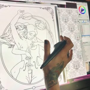 Once my clean black line work is done – a tedious and careful process – I can kill my purple layer. It is no longer needed. Of course I don’t have to erase it all together. I can dim it, or just make it invisible for the time being. Looking at just the black line work, I can see imperfections and inconsistencies. I now zoom in and out a lot, looking for anything that needs cleaner lines, smoother turns, etc. Because this is to be a coloring page, my lines need to be flawless.
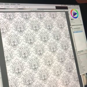 This particular book will be a character centered fantasy compilation, with each individual page presenting a new character drawn in a style closer to my natural drawing style rather than a traditional color-in mosaic page. However, to compensate for this fluidity that may be intimidating to some colorists, each page will also be embellished with elaborate background designs and patterns. Knowing that I will be drawing this character, I already created her background pattern days ago. All of my patterns are my original creations, drawn in the same manner as I am drawing this page, and saved as .jpg files for further use. Now that I have my background pattern, I can copy and paste it onto “The Musician”, resized, styled, and otherwise altered to suit my needs.
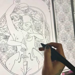 In this case, I minimize my pattern and make it into a gel layer, which I place under the main line layer. Now I can play with cropping and shaping it to appear just in the oval behind my characters. There are multiple ways of doing this. The first being simply starting my design with a patterned oval, then dimming it to comfortably draw my characters in a different layer, and once drawn filling my characters with white inside the outlines, and then bringing up the background pattern. There are many other methods of creating this effect using the fill tool and multiple layer arrangements, and even multiple file combinations, but I chose to do this in a bit of a primitive way this time. When I began this page I had a clear vision of my characters and their positioning in relation to each other and the page, but I did not yet know where and how I may use the pattern that I created days ago, or if I would even use that pattern at all. Having left my pattern work to the last minute, and having under-layed it in a gel layer, I just work around with my eraser tool, taking off all unwanted spill. A bit tedious, I know. With all this technology you would imagine that I can just click this and drag that and voila! a pattern fill, but no. Now I sit for nearly half an hour carving my pattern out to fit its shape. Sometimes that just feels like the better way to do it. This way I know I have complete control of my edges and their cleanliness.
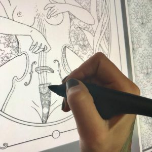 Now I look over my creation and take some time to add tiny detail and decoration. On this particular page, my characters are not wearing any fabrics nor ornaments, so my only decorative bits are the cello details. In some cases I like to draw very fine lines in the hair, giving it shape and volume that is almost realistic, but in this case the background is too thin and busy. If I add many new lines to the characters’ hair, It will be difficult to see its general shape. I chose to leave the hair on both girls nearly blank, with just enough lines to define its structure, allowing the colorist variation in coloring style. There will be many more characters in this book with very finely drawn hair.