As a followup to one of my recent articles, I have been asked to write more in depth about my personal digital painting process. This is not a tutorial or a step by step guide on how to create the same image that I am about to share to with you. I cannot tell you which software to purchase, or recommend one drawing tablet over another, nor can I insist on order of operations. Creating art is a very personal process and is unique to every individual. I can, however, share with you some of my own secrets and perhaps they will inspire you to try new techniques or even new drawing platforms.
My Setup
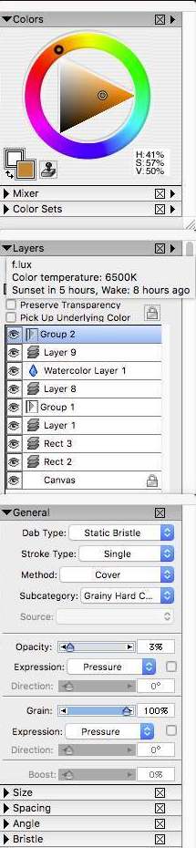
I work in a program called Corel Painter. I have a pretty old version, version X, but it is quite effective for my purposes and I’ve gotten very comfortable with it over the years. In my studio, I have a work desk that houses my computer as well as a 21″ Cintiq drawing screen by Wacom. I use a stylus to draw and paint directly onto the screen. I have many operations hot-keyed and the side of my screen is also equipped with buttons and a scroller for direct common commands. Additionally, the stylus itself has multiple buttons that can instantaneously carry out basic commands like “enlarge brush size”, which really comes in handy when immersed in your work.
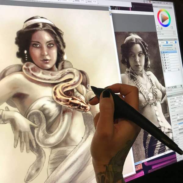
I begin any digital painting the same way I would an oil painting – with a blank canvas and an inspiration image or collection of images. My ideal preferred way of working is to paint from life, however, that is not always an option. Thankfully we live in an age of nearly limitless information, including visual information. Pretty much anything can be found online. This particular project is my submission to the Ms. September drawing event in an art circle that I belong to. My guidelines are to take this old photograph of an exotic performer and to create my own original art based on her composition.
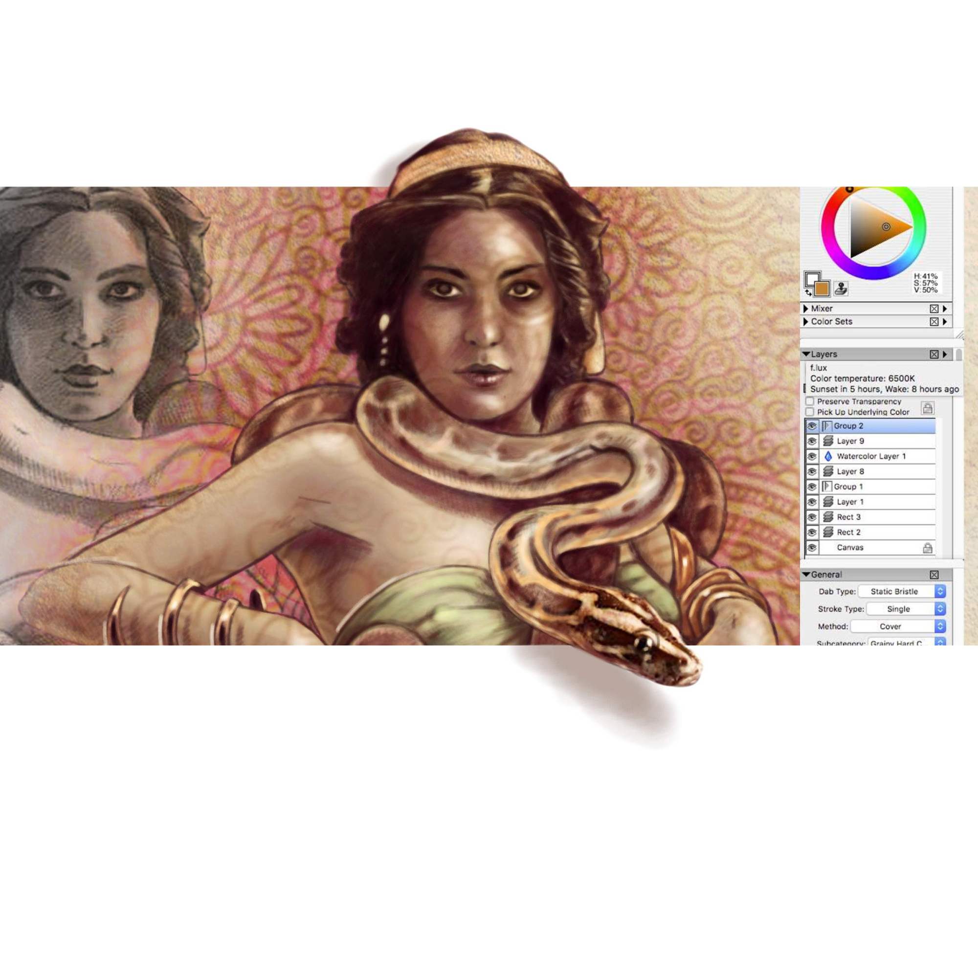
The first thing I do is organize my workspace. On my screen I arrange the main inspiration photo along with some others that are thematically and mood related. I have manually created a “palettes arrangement” and saved it as “work” to use every time I am working on a similar project. In my arrangement, I placed palette windows all around my screen, with the most used ones in the upper right corner as I am right handed and that is a natural direction for my stylus to go when I need to grab a new tool. This is very important. Know your workspace. If you spend more time looking for a certain tool than it takes for you to use it, you should study your program more to really get to know it well. Imagine that you are set up to draw, but every time you reach for a new pencil you have to go to another room or even to another house and search for it, and once you find it you have to learn how to hold it and how to use it, because every pencil has different and illogical physical properties. Drawing wouldn’t be very much fun, now would it? Same exact principles apply here. I don’t think about where all my buttons and effects are. I intuitively reach for them the way that I would reach for a dab of oil paint without even looking.
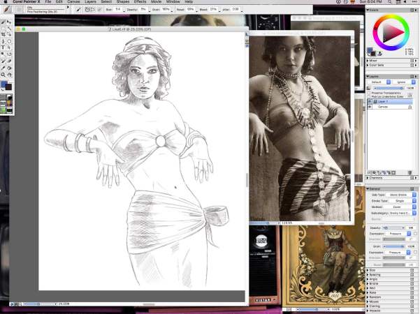
I usually create a new document at 2400 x 3000 px at a 300 px per inch resolution. I can always crop and resize it later. Now that my workplace is all set up and I am happy with my blank page, I just begin sketching. I like to set my brush to either one of the pre-created charcoals or a static bristle brush. I find that they actually look and feel more like real pencils than the pencil tools. I draw out my outline and add basic shading. Obviously, you can slap a blank transparent layer over your inspiration photograph and trace it, but what’s the fun in that? I like to challenge myself with every creation, and that requires not cutting corners. I am a firm believer in the fundamental importance of basic drawing skills. Digital painting is not just about cool effects, layers, and screens. Anyone can click buttons and watch things happen. When you paint digitally, you should actually paint. Not to say that there is no room for playing around with effects, but effects alone won’t make you a digital painter.
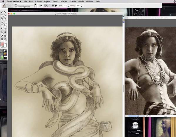
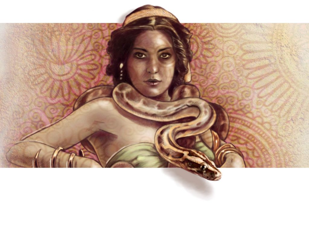
Here I am working off a black and white photograph, but I aim to create a colorful image. Since I have no skin tone reference I begin my sketch in dark brown, adding a little bit of lighter brown tones to the background and shadows. That’s a nice neutral color to work with. I decided to present my girl as a snake charmer, so I add some snakes around her neck in place of the jewelry. This stage is all about construction. I am sculpting a form. Only when I am happy with my composition and proportion can I move on to the next step of adding color and detail.
This is where the fun of digital painting begins for me. From now on I will be mostly playing with my brush tool. Over the years I have constructed and perfected the brushes that I like, setting their hardness, number of bristles, resistance to pressure, consistency of bristles, etc. I have my favorites and know exactly how to get to them at a click of a button. I don’t notice switching tools anymore. They seem to just magically switch on their own in my hand as I wish for them. I will use wider strokes of soft brushes at a mere 4 % to 6 % opacity to begin building up my skin tones, light and shadow, and thus my 3D effect.
Sometimes I will use “motion blur”, “soften” or “zoom blur” to soften those strokes even further. For the finer detail, I switch to harder, smaller brushes at higher opacity. I build many layers as I paint. Pretty much each new type of paint goes onto a newly created layer, just in case I want to blur or otherwise alter only that one layer and not my entire painting. Learn to love your layers, but don’t get buried in them. If you have 36 layers and none of them are grouped, numbered or named, editing will be a nightmare. Group related images into bundles. Name them appropriately if are having a hard time keeping track of numbers. I tend to create over 40 layers per digital painting, but in grouping or merging them I end up working with 10 or less. Remember to save your work as often as you can while you are painting. There is nothing more disappointing in digital art than to have your program get overwhelmed, crash, and set you back multiple hours or even days. Save, save, save. Very hard lesson learned here.
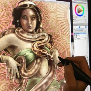 In this particular project I want to show off the photorealism of the snake face, and some realism on the girl’s features, while leaving most of the rest of my drawing in near sketch form. I am only interested in these two characters. The snake is in the foreground and thus gets more attention. I want the snake to nearly leap off the page so I concentrate most of my efforts on this one element. I look at hundreds of photos of snakes before I finally get all the detail just right. Now that my composition and my details are complete I can afford to play with backgrounds, textures, and effects. This is window dressing. The main work is done.
I have a library of backgrounds, designs, surfaces and textures, and I use tools like “gel”, “colorize”, “shadow map”, “magic combine”, “pseudocolor”, “screen”, “overlay”, and many others to play with fun effects to create the mood and style that I desire. In this case, I want my piece to obviously be a sketch or a drawing that just happens to have a hyperrealistic snake head reaching out of it, so I don’t go for anything that will create depth. On the contrary, I am aiming for a flat and fabric-like backdrop.
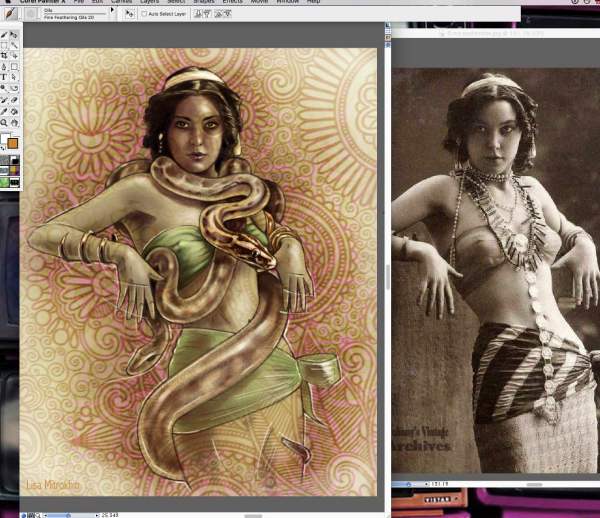
My snake charmer is now complete, but I am still looking for ways to make that snake stand out even more. A couple more layer tricks and a very dramatic crop with some shadow effects, and I am finally satisfied. Do not be afraid to scrap over 50% of your creation. Many artists become overly protective of each and every brush stoke, thus preventing themselves from achieving better compositions and presentations. I think of a final version of any illustration as of a photograph. I first create the entire scene that I wish to look at, and then I zoom in and snap a nicely framed photo. In this case, while I did enjoy working on the hands and the lower torso, those elements are completely irrelevant to the focal point of my image, thus they are also disposable. This illustration is now complete for our purposes, but I find that with digital painting a piece is never really finished. There is still so much more than I can do with this, treating it as a single complete element.
I hope you enjoyed our little journey and picked up some tricks along the way.