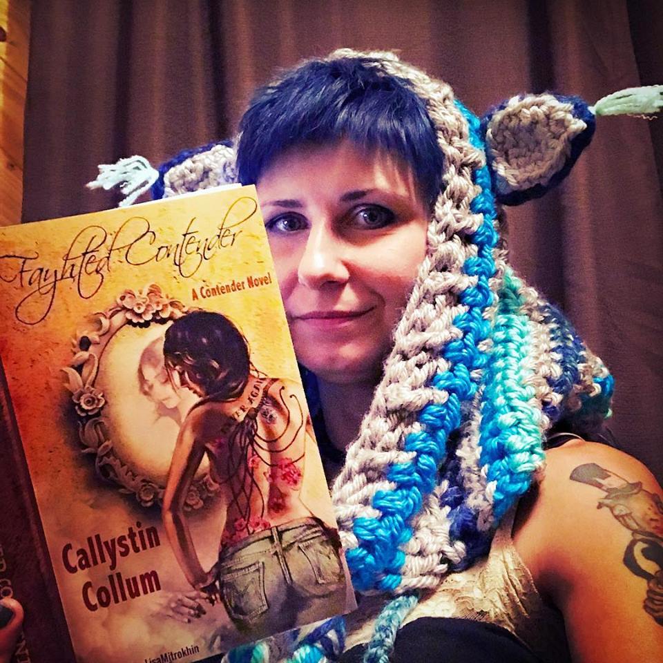
When Callystin Collum approached me about painting her main character Sarah for a paranormal romance book cover, neither of us suspected how magical our working relationship would become. Before accepting the job I wanted to introduce myself and explain a little bit about how I work and where my inspiration and skill come from. I explained that I am a self-taught, life-long artist, who just happens to also have a classical art university degree which I hate giving any credit to. I described briefly how I work one-on-one with my commission clients, and how after ten years of working as a high-end exclusive tattoo artist “my style” is always primarily “my client’s style.” While my artistic hand is clearly recognizable no matter what work of art I create, the actual feel and mood of any creation is governed by the desires of my client. If I wasn’t able to adjust to various required styles I wouldn’t be much of an artist. Mentioning my tattoo career is alway hit or miss when talking with new potential clients. Some people still harvest very narrow and negative stereotypes about this art form, and about all those who participate in it. As always, I was prepared to be uninvited from this project based on my work history, but I was pleasantly surprised by Callystin’s response. She was very excited to hear about my experience in creating tailored tattoos for people all over the world, saying that she wanted to hire a tattoo artist to do her book cover since before she even completed the manuscript. Naturally I was intrigued and now it was her turn to tell me about herself, her book, and her characters.
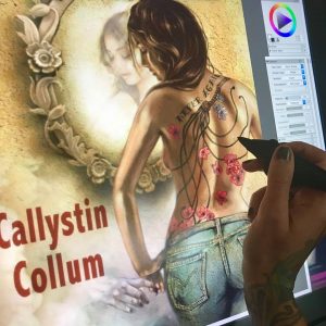
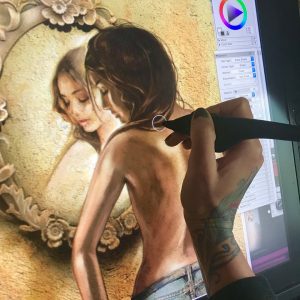 It turned out that Cally’s main character Sarah was in need of a custom-made tattoo from someone with experience in just that craft. The tattoo is so significant in this book that it’s almost its own character. Cally didn’t have to do a lot of talking for me to have enough mental images to begin my work. She simply shared with me three of the 662 pages of her novel, and I knew everything I need to know about what Sarah looked liked and enough about her personality to portray that through body language and choice of clothing. One of the advantages of working with an author is that they tend to be quite articulate. After all, the readers have to see her character in their minds just as clearly as I was about to see her on my digital drawing page (for a more technical description of my digital painting process check out my article How I Paint Digitally). Cally had a few basic requests about composition and pose. She imaged Sarah with her back turned to the audience, which is a reasonable choice for a character with a meaningful full back tattoo. However, I felt that the requested glance over the shoulder was not enough to show Sarah’s personality. I wanted to reveal more of her face, so I took a chance and painted a wall mirror that would show a little bit more of her gentle girlish features with a daring splash of curiously, and also to show where her eyes are pointing (the next part of the arrangement I was to work on). Even though Cally did not imagine a mirror in the composition she fell in love with the concept and picked one of the three versions I provided her with. The version she selected, which is also my preference, is the one where the mirror reveals only suggestions of facial features, but not in full photographic detail. This book is clouded in mystery after all. Suggestions would work better on this cover than straight up full focus hyper details.
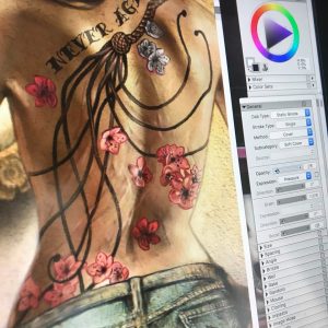 Now that I had Sarah’s body, face and hair painted and approved by Callystin, I moved onto the most important part – the tattoo. Sarah’s tattoo is complex enough for an artist to design for a real back. It would be a challenge to tailor it for a fictional 1200 by 2200 pixel painted character. I had to approach it the same way I would a real tattoo. Having read Cally’s description of it over and over again, I drew a fully detailed cat-o-nine tails whip with a braided leather handle and cherry blossoms scattered all around. I then wrapped the design around my character, curving and blurring it to match my painting style in this piece. Actually, the most time consuming and complicated part of the process was the amount of distortion I had to apply to my otherwise flawless and highly detailed tattoo design in order to make it look realistic in the given light and remaining true to my brushstrokes. The application of the tattoo to Sarah’s back was a week long project. After submission, Cally requested a few edits and adjustments, specifically in relation to individual tails and their direction, the placement and color of specific blossoms, and clearly readable text “Never Again”. After another few days of edits we arrived at the tattoo that we both agreed was perfect. The only final adjustment she asked for was the removal of visible scars from Sarah’s back. I imagined that most of Sarah’s scars would still be visible, if not for any other reason but for the reader to see that she has them. Cally had a very firm and specific request to remove the scars, explaining to me that the whole reason for the tattoo is to hide the scars all together. The audience does not need to know the full scar story from the cover. They will find out while reading. After discussing the technicalities of actually covering scars with tattoos, we came to an artistic agreement and I cleaned up Sarah’s back, while Cally cleaned up some textual details on the matter.
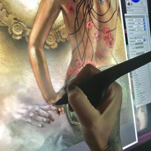 My next subject of interest was something that my author described as optional, but I immediately saw as inevitable. While Sarah is an obviously attractive young woman with an enticing full back tattoo, this is more than just a romance novel, it is a paranormal romance novel. I felt that the paranormal part was important to at least suggest visually. This is where Sarah’s glance direction comes into play. I specifically painted her looking down and at her hand, in order to have a platform to introduce a mysterious supernatural hand inviting her into its otherworldly haze. Now it all comes together. Now we know what seduces Sarah’s curiously. It is this human, yet animal-like, hand in the mist. This was probably my most favorite part of the project. I wanted the pale beastly hand to appear as mysterious as possible, revealing nothing of its character yet teasing the audience into having to find out. I wanted the viewers and the readers to be as intrigued by the hand as Sarah is.
 Now that the mysterious hand was done and approved by the author, I moved on to polishing up the details on the image as a whole. This is a part of any digital painting where I create a lot of new layers, each with very minute but vary valuable information on them. I spent a full day on making sure that my light source was consistent, the parts that needed to be in focus were clearly in focus, while the ones intended to be blurred were sufficiently blurred. I played with darkness, contrast, definition and saturation on my fused layers, and of course scanned the entire image for imperfections, artifacts and inconsistencies. After a couple more back-and-forths with Callystin, we were ready for formatting.
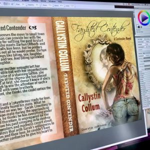 Formatting a book cover is surprisingly more complicated than people realize. Correct resolution is the single most important factor. You don’t want any detail to be lost in the print. Color balance is also essential. The printed version has to look exactly as the digital version does on the screen. Finally, sizing mistakes are unforgiving. Depending on the publisher’s format demands, you have to make sure that your full cover spread, plus the spine, will not be cropped even a millimeter off from the desired layout. In order to achieve this, one must know the exact thickness of the book’s spine, which is calculated by multiplying the number of double sided pages by the paper thickness. To do this you must know the paper your author has chosen for her publication and her manuscript length according to paper style and size. As Cally was making last minute edits and adjustments, the thickness of her book spine also kept changing, sometimes by a fraction of a millimeter, but every pixel counts when it comes to professional formatting. I think for Cally, this must have been the only frustrating part of the project, understandably so. Well, good things come to those who work hard, and in time we worked out all the nagging technical details and the Fayhted Contender was ready for publication.
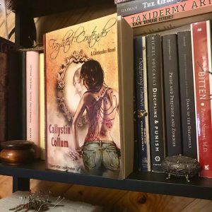 After three weeks of work and collaboration, Cally and I have become good friends and discovered that we share many similar views and opinions. I suppose it only makes sense, since we were able to work together so smoothly and quickly, understanding each other’s visions and motivations. This has been an incredibly rewarding artistic journey, but in the end nothing could have felt better than receiving my own copy of Fayhted Contender with a personal inscription from the author on the first page. Reading someone else’s novel with my art on the cover took some getting used to, but since this book is so easy to lose yourself in I soon had no trouble forgetting about the cover art and following Sarah on her journey.
Callystin Collum’s Fayhted Contender is available on Amazon in print and in kindle versions.